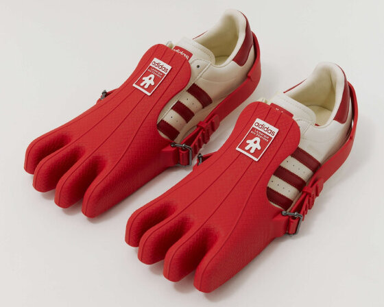
football bag, 2002
— ben casey of the chase tells designboom what he’s learned about graphic design since he set up shop over 25 years ago.
DB: please can you tell us a bit about the chase, how did it start, how many people work there, how is work divided etc. BC: the chase started in 1986. I was working in education at the time and I finally succumbed to a friend who ran a type setting company called ‘quick brown fox’ and had been trying to persuade me to set up a design group in manchester. it seems strange now but people in the business at that time with whom I discussed the idea almost all had serious doubts that it was possible for a design company to succeed outside of london. ignoring their advice I approached lionel hatch, a freelance designer whose work I really admired, and asked him if he would consider joining me.
fortunately, lionel said yes. I also recruited two talented young designers who i knew from my teaching days at preston polytechnic. they were hugh adams, who was at pentagram and jim williams, who worked in advertising at collett dickenson pearce. which is interesting really as it was CDP’s work, rather than a graphic design company, that was probably our biggest creative influence. anyway, we got off to a flying start – but only for a couple of years!
then, to everyone’s shock and horror, our parent company QBF went into receivership. they say that naivety is the driving force behind progress. well I still have nightmares about how lionel and myself put our houses up as security for a loan to buy the chase from the receivers – in times of recession! we did of course survive and it certainly taught us how to run a tight ship.
our total staff now numbers around 40 of which 24 or so are designers. although our main office is in manchester we also have an office in london and keeping to our original plan of taking quality design services out into the provinces, we have opened an office in preston.
 preston north end football club stationery, 1991
 small illustrations linked common correspondence and football phrases. a yellow card was added to invoices followed by a red card when payment was overdue.
 alan kelly,1997 the seating is treated like pixels to create a large portrait of alan kelly after whom the stand at deepdale stadium was named.

how has the chase evolved in terms of your output? since we started the industry has gone through a revolution so we’ve obviously had to keep pace with that. technology has not only transformed how we work it’s also offered new media channels and we’re now having to re-establish the boundaries we should work within.
but would our early work stand up today? being a company with a strong conceptual focus you’d think perhaps it would. in fact we are just about to launch our new website so going through some of our early case studies raised the internal debate of do some ideas go out of date?
although we’ve yet to reach any firm conclusions i think it’s fair to say we think that although ideas don’t date in the same way as fashion changes in typography and imagery some of our early visual metaphors could be accused of looking a little tired.
what has definitely changed over the years though, is that we’ve become a lot more proactive in our relationship with clients, a creative consultancy rather than a team of graphic designers.
what has been your defining project so far? our most defining project and possibly still my favourite is our very first mailer. having the same dilemma that all start-ups have, no portfolio or case studies, we felt we had to produce something that would describe and hopefully demonstrate our approach to work. with this on my mind I was driving home one evening, listening to the local radio station. someone was giving an account of a recent trip to india and told a story about a woodcarver who sold beautiful little elephants on the streets. when asked how he made them from simple blocks of timber he replied ‘I just cut away the wood that doesn’t look like an elephant.’
to me this epitomised the bedrock that underpinned our creative process. we quickly produced a mailer, complete with wooden elephant, which won us a lot of business, our first awards and has guided our thinking ever since.  elephant mailer, 1986 sent out to announce the arrival of the chase’s manchester office
 coastal erosion, 2004 the last pages and back cover of photographer jason orton’s book on coastal erosion have also begun to erode.
 yorkshire water identity, 2002 the largest water utility company in the UK
 applications of the yorkshire water identity
 advertising for yorkshire water
 ’26&26′, 2010 a week-by-week calendar showing 53 different typeface available from font shop, font works and atomic type. chosen by 53 of the UK’s leading designers and typographers.
 freedom travel logo, 2009
 home, 2010 branding for a furniture retailer, selling returned and slight second goods while employing local, homeless and long term unemployed people.
 vinyl in store promotions for royal mail year pack (of postage stamps), 2008
 hostage logo, 2004
what is the essence that you strive to achieve in your work? another story. years ago a relative was on holiday in ireland and went into a shop and asked the shopkeeper if they sold english newspapers. the lady asked:
‘do you want today’s or yesterday’s?’
a bit puzzled, my relative said she would prefer today’s. the lady replied:
‘well you’ll have to come back tomorrow.’
now some would argue that it’s an example of a poor piece of communication. why couldn’t she have simply said it takes a day for them to arrive from england? but if she had I wouldn’t be recounting the conversation all these years later. by being thought provoking and using whatever device that is appropriate, like humour for instance, we always try to enhance the message in order to engage the recipient in some way through all our communication.
what do you consider the most important part of your design process? for me, it’s getting the agency and the client to agree on a precise brief. if they can do that and stick to it then most of the subjectivity can be taken out of the discussion and assessment of the creative presentation. the part of the process that i enjoy is always cracking the concept because only then can you relax. of course, you always worry that one day your ideas will dry up and then I imagine it would be the part of the process I would like least.
 d&ad graduate scheme, 2011 promotional material for a scheme aimed at getting the best design graduates ‘a look in’ at the best studios.
 d&ad graduate scheme, 2011
 promotional chase posters
 almost extinct, 2011 to raise awareness of the number of endangered animals there are, as well as the work BBC wildlife fund do to save them.
 people are asked to cross off a different species every day of the year.
 year of the dog diary, 2006 2006 was the chinese year of the dog; we produced a diary for manchester dog’s home that highlights key dates and features celebrities that have a connection with dogs as well as being born in the year of the dog.
 manchester dog’s home report, 2003 combines the annual report and accounts with fundraising information by focusing on the different aspects of the charity’s work.
 spread from the manchester dog’s home report, 2003
 christmas tree card, 1993 in this self promo christmas card, the sum of the stamps conveniently amount to the cost of first class mail.
 royal mail collectibles packaging, 2011

 lowther castle timeline 2012 situated in the cafe, these large panels make up part of the timeline depicting the history of the newly reopened lowther castle.
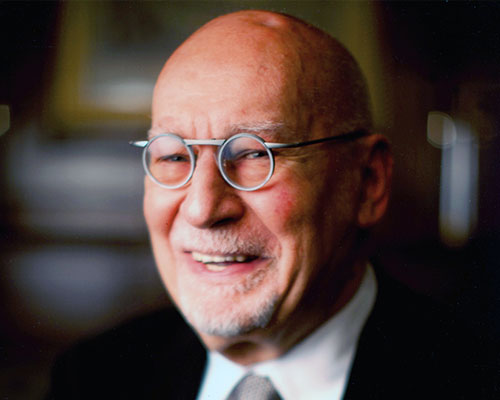
 ben casey, founder of the chase
what qualities do you look for in a new employee or intern? looking back, the few designers we have employed that have failed to live up to expectation has not been due to a lack of talent, but more likely down to a lack of enthusiasm.
you can teach and help young designers develop in almost all areas except enthusiasm.
what should every graphic designer remember? every graphic designer should remember to continue to observe because concepts don’t come out of an empty tank.
what should every designer disregard? finally, to paraphrase bob gill, ‘every graphic designer should disregard all the theories and rules being thrown at them’ …especially the ones in this article!
![]()
DESIGN-AEROBICS – GRAPHIC DESIGN 2012 ONLINE COURSE – STARTS MAY 17
GRAPHIC DESIGN 2012
duration may 17 – july 17, 2012
make graphic design work for you. with this course you’ll enhance your understanding of the basics and learn more about current and emerging developments within the field.
• brush up on the basics of graphic design such as composition, color, typography and representation • further your knowledge of print and on-screen applications • gain practical knowledge that you can apply to real-world problems • have the opportunity to enhance your portfolio by developing several design projects related to the theme • our instructors will help you verify your ideas so you can optimize them as much as possible during the course • you also have the opportunity to share your work with other participants on the course
graphic studio interviews (193)
logo design (246)
PRODUCT LIBRARY
a diverse digital database that acts as a valuable guide in gaining insight and information about a product directly from the manufacturer, and serves as a rich reference point in developing a project or scheme.

