hermès on Tressages équestres for milan design week
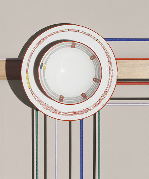
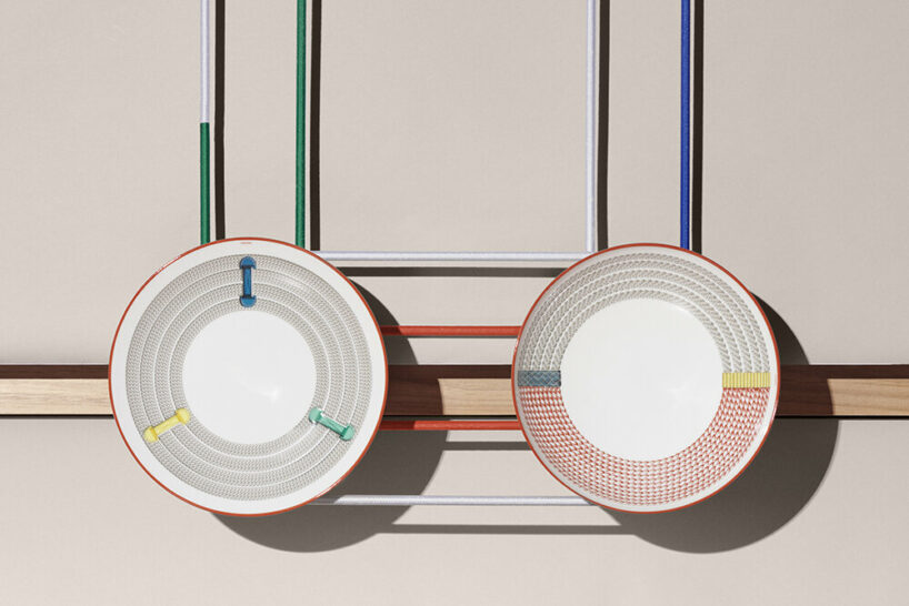
On the occasion of Milan Design Week 2024, Hermès launches a new tableware collection, Tressages équestres, inspired by the rich patterns of the equestrian world. From dinner plates to bowl, the designs bear the imprints of intertwined cotton and leather threads — an ode to the artisan’s hand but also to the horse, the rider, and the ties that bind them. Tressages équestres particularly recalls the passementerie and braiding used in the harness-making that lies at the house’s very origins. ‘Each new collection is a way to tell a new story, to make reference to our heritage,’ Benoit Pierre Emery, creative director of La Table Hermès, tells designboom.
all images © Matthieu Lavanchy
a subtle mix of figurative and abstract representations
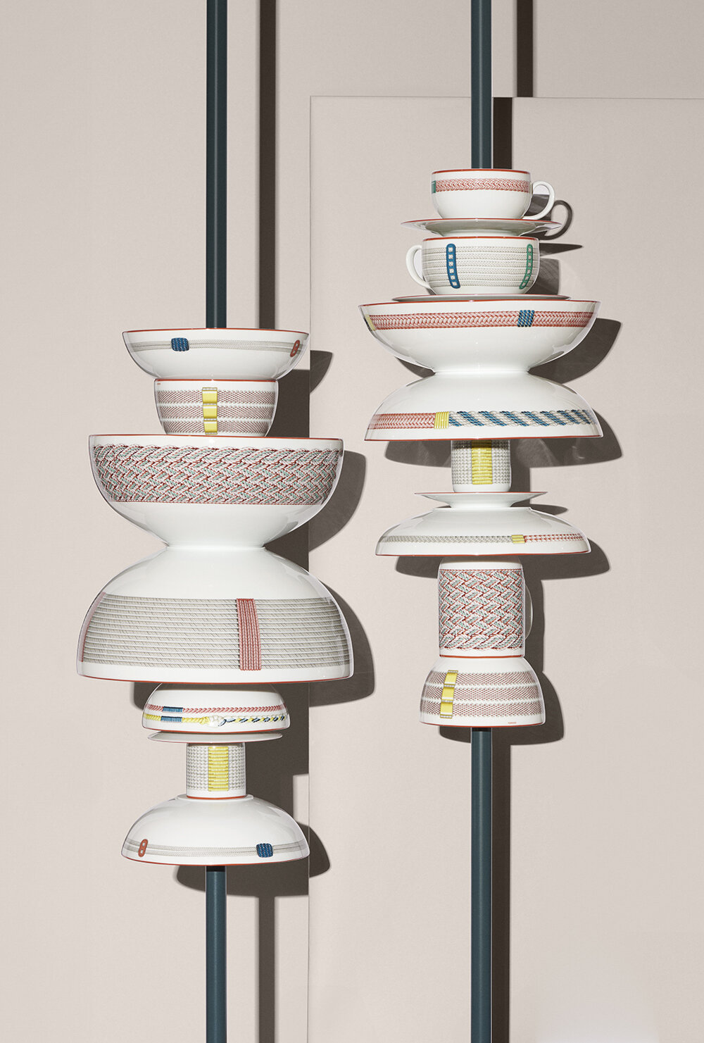
This latest Hermès dinner service, designed under the artistic direction of Benoit Pierre Emery, offers a subtle mix of figurative and abstract representations. Comprising twenty-seven pieces, including ten new hollow-ware pieces, it is designed to complement cuisines from all over the world. The omnipresent kaolin white of the porcelain is a perfect showcase for French artist Virginie Jamin’s drawing designs. Her lines – fine or dense, but always precise – give volume to the textures they illustrate. Zesty colors of lemon and mint contrast with petrol blue and the natural shades of fibres and leather. Playing with scale, motifs differ from one piece to the next. Each combination of objects is balanced, creating as many stories as there are compositions. Read on as designboom delves into the house‘s new and vibrant tableware collection with Benoit Pierre Emery and Virginie Jamin.
Tressages équestres, a new tableware collection
interview with Benoit pierre emery and virginie jamin
designboom (DB): Can you discuss the inspiration behind the Tressages équestres collection and how does it tie back to Hermès’ heritage?
Benoit Pierre Emery (BPE): Each new collection is a way to tell a new story and reference our heritage. For this collection, we particularly wanted to express a tribute to craftsmanship and the beauty of objects linked to the equestrian world. We’ve also wanted to work with Virginie for quite some time now. I’ve always admired her creations. She’s been working for the house for nearly 20 years, designing many beautiful scarves, always with this incredible talent of bringing objects to life in very graphical ways and translating an archive.
Virginie Jamin (VG): I like to bring Hermès objects back to life because they are rich in history and craft. I want to express them in my way, abstractly, and through a narrative. I think that abstraction makes objects more approachable as it provides a more universal language — something that is both timeless and spaceless. I really like the modular structure of braided shapes; everything here is about details and repetition. Starting with a small detail and through repetition, you can create an entire world, and I particularly enjoyed playing with that. There were so many braiding options, and I could have done plenty more pieces if I wanted. It’s a great mix of simplicity and complexity.
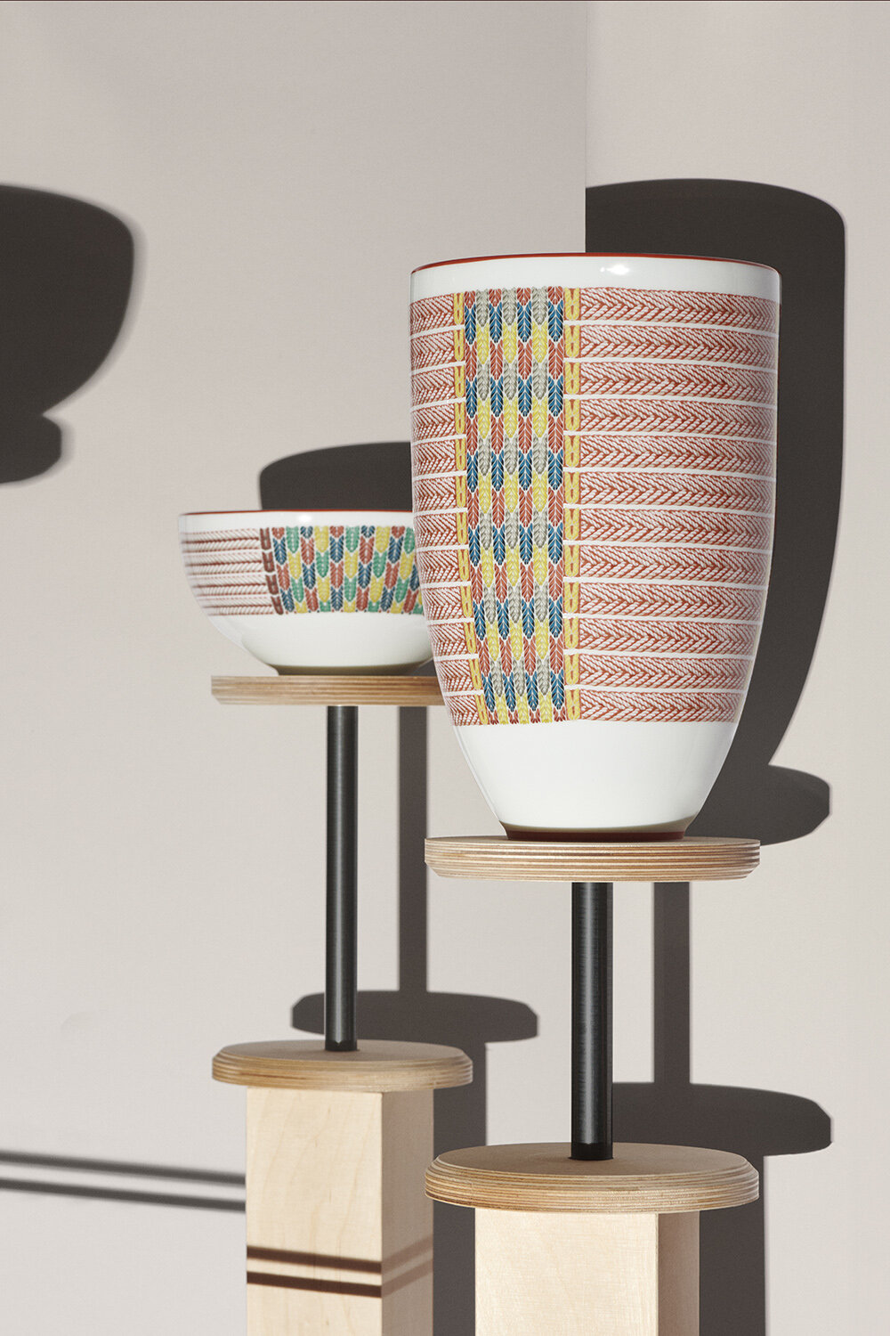
inspired by passementerie and braiding used in harness-making
BPE: We store all previous collections in an archival place called the Conservatoire. We often go there — most designers and art directors head there regularly. The idea is to take an archival inspiration and build a story from it. One of the first objects we saw together was this beautifully crafted equestrian belt; it’s important because you don’t see it. It’s a belt placed under the horse to ensure the rider’s security as it maintains the saddle attached to the horse. Despite being hidden, it still presents itself with a beautiful design — well crafted and made with so many details and attention that truly reflect the sense and feel of Hermès. With this belt as a starting point, we went through many other elements from the equestrian world to complete and create this vocabulary of shapes and geometric elements, ultimately composing a range of 27 tableware pieces.
VJ: We also wanted to celebrate the purity of porcelain and create space to play with food. The new and very pure shapes of the dining pieces were perfect to celebrate and express this kind of simplicity and space to play with the designs and make these objects your own — to experience each piece differently every time you use it. This collection is a step-by-step process; it’s about discovering something by doing, which is a reference to craftsmanship. It’s part of the magic, because you start off surprised and want try to recreate that feeling for others.
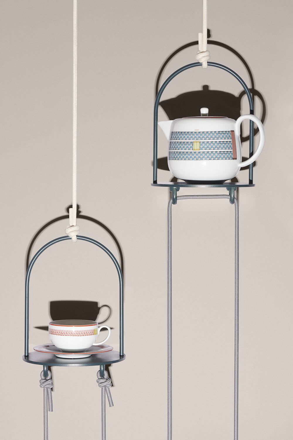
the patterns are drawn by Virginie Jamin
DB: How did you approach the balance between maintaining the traditional craftsmanship of Hermès while infusing modern elements into the collection?
BPE: It was a long process, with many discussions, adjustments, and meetings. We needed to find the right balance and the right tone to create something that is both contemporary and timeless. The colors are probably the most modern aspect of the collection as they add a kind of kick and twist, but the overall designs are created in such a way to ensure they will last for quite a bit of time, at least 10-15 years, maybe even 20. You could probably pass down the collection to the next generation. We tried to make it as simple and pure as possible, but transferring onto porcelain was our main challenge. Transferring is a complex process with many technical problems, quarrels, and details. It takes a lot of courage and patience. The prototypes are always tough to look at, but the ambition for quality is so high. We push ourselves each time, and the craftspeople in the atelier are fantastic because they try their best to translate an artist’s work and put it on porcelain.
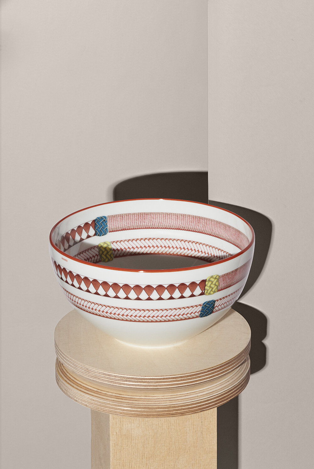
porcerlain white shapes, each printed with unique motifs of the equestrian world
DB: How does the process of translating work?
BPE: Once we got the final artwork from Virginie, we passed it to a first atelier who translated and decomposed the drawings into different colors; it was a very long process. We then carefully printed them on a transfer film Developing the colors was a challenging task because we are limited to specific components, like the cobalt. But even thought the palette has been reduced over the last few years, we still produce excellent results. In another atelier, we held the development of white shapes and designs. All in all, we have three ateliers operating simultatenously: One for shapes, one for engraving, color, and printing, and a third one that deals with transferring the print onto the porcerlain.
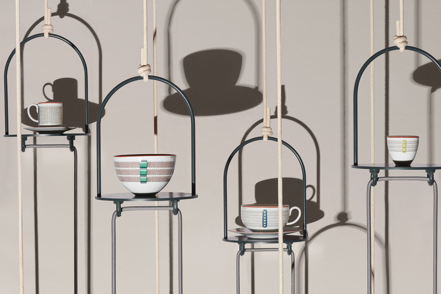
DB: Can you elaborate on the ratio between illustration / color and white space?
VJ: From the beginning, we were clear about the fact that the less we would do, the better it would be. We had to adopt the right gesture, the right line, the right bright white space to express the light. Every step was about balance — about doing but not doing too much. As mentioned earlier about repetition and details, if you do too much on just one module, it won’t work. You have to focus, then step back, return, and look again. We wanted to create something close to perfection because perfection is not life. We wanted to feel this liveliness and materiality; we wanted to feel the hand of the craftsman, the hand of the drawer. For example, with some pieces, you can see how the light and shadow keep changing; you can feel the light turning around.
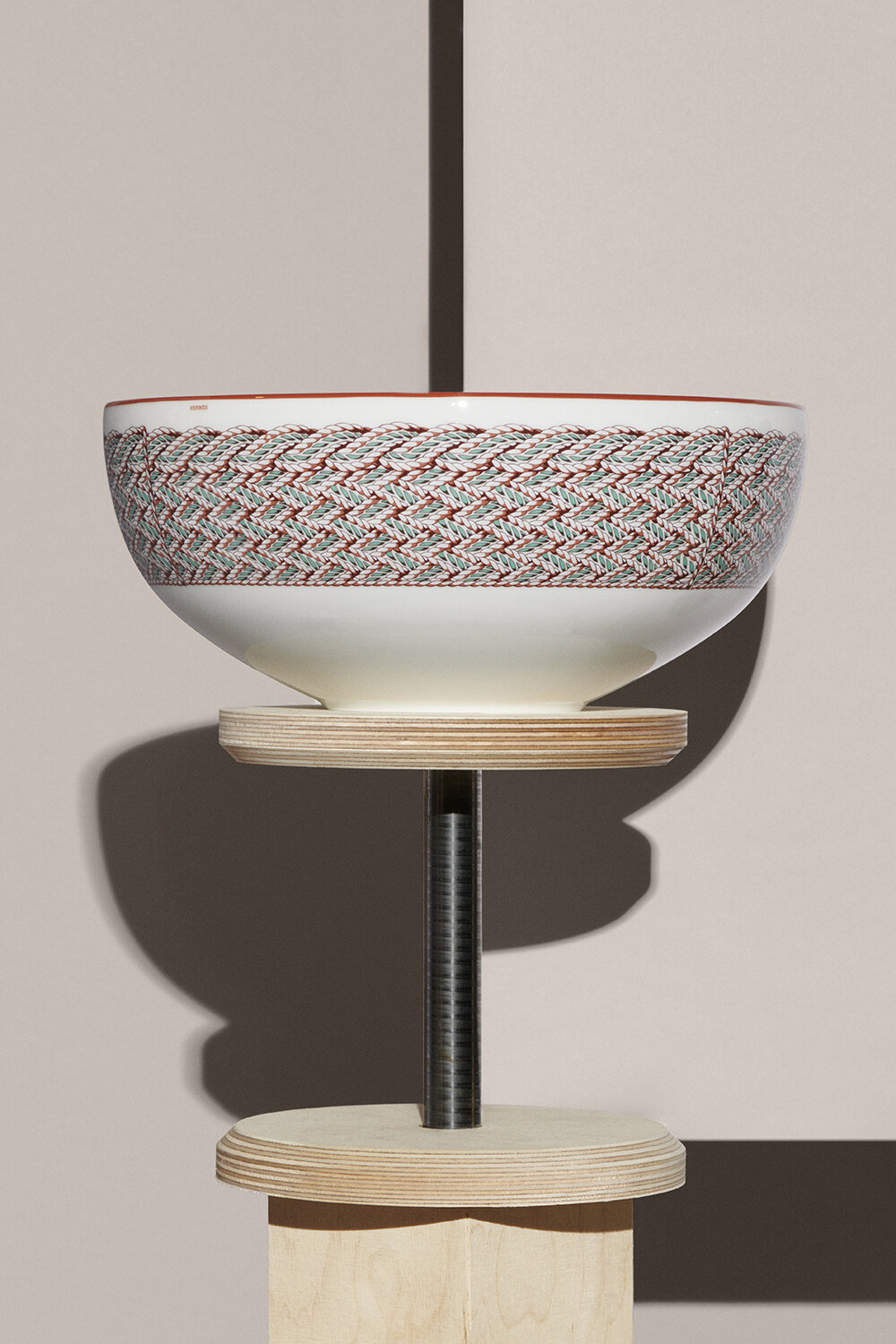
every new collection is a nod to the house’s heritage
DB: And what about the balance between the different patterns illustrated on the tableware pieces?
VJ: These patterns have to work individually but also together. You can play with each pattern in many ways. You can keep it very simple and just have one piece at home or compose a big table set. While we chose to prioritize space, we covered certain pieces with more patterns to create rhythms and contrasts. It’s kind of like a melody and symphony, where each object plays its part to create something bigger. The shapes are also quite singular because they’re not symmetrical. It’s as if you don’t know what the object is at first glance; we wanted to exude that kind of poetry and abstraction.
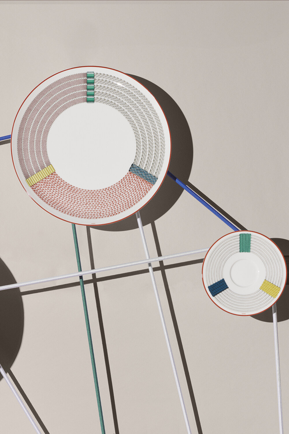
playing with abstraction and figuration
DB: Talk to us a little more about the Conservatoire and its importance to the house.
BPE: The archive was really a starting point for us to start and play. This is always the case when you design an Hermès scarf; there are many scarves that beautifully reference the equestrian elements while revealing something new. That’s the vitality of the archive. It’s like a secret dialogue between pieces from the 30s and pieces from today.
VJ: The essential values are the same; it’s about excellence, craftsmanship, and shapes. The shapes evolve but the spirit stays the same.
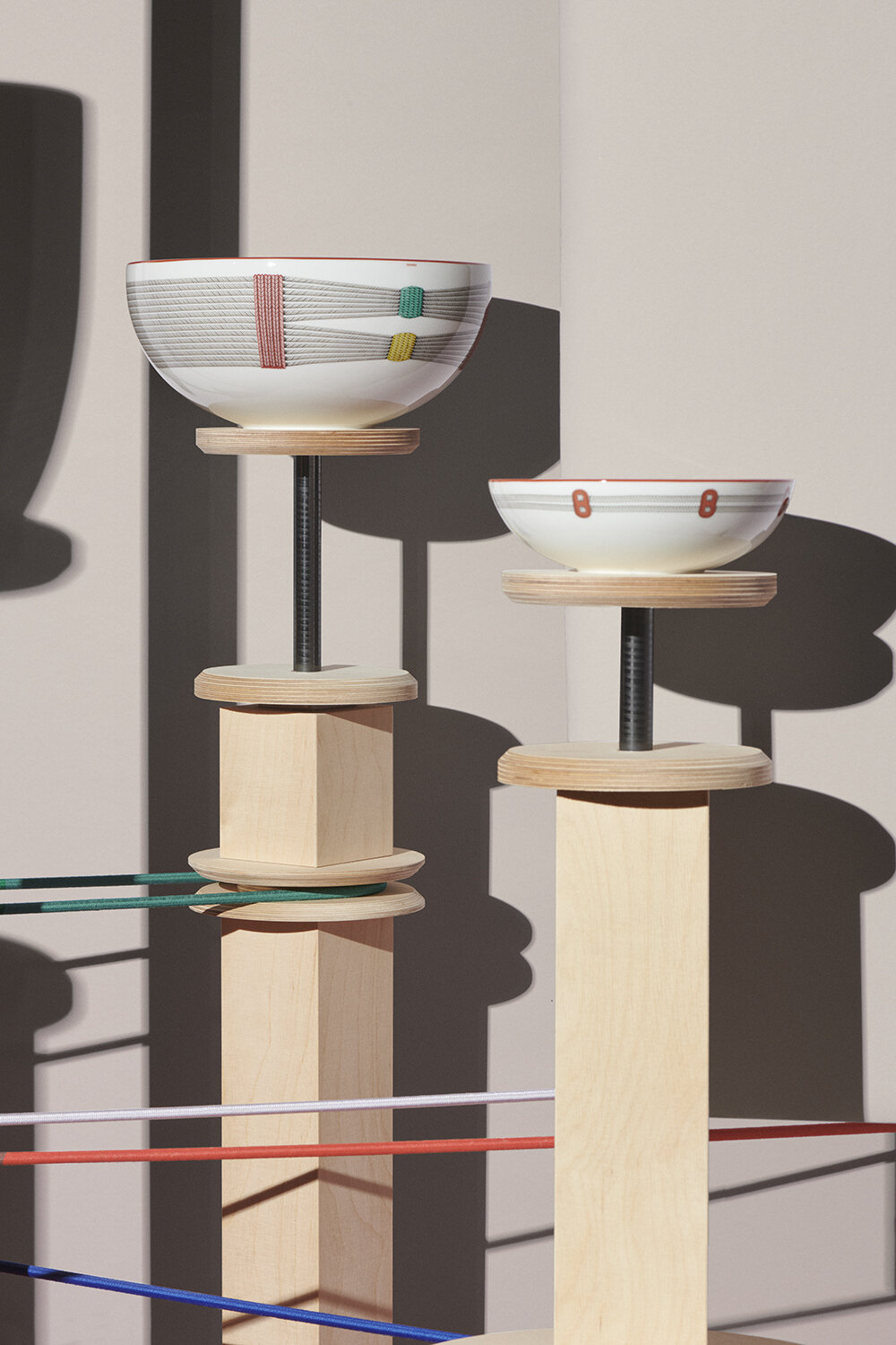
Tressages équestres is launched during Milan Design Week 2024
project info:
name: Tressages équestres
interviewees: Benoit Pierre Emery | @benoit.pierre.emery and Virginie Jamin | @jamin.virginie
program: Milan Design Week 2024
happening now! thomas haarmann expands the curatio space at maison&objet 2026, presenting a unique showcase of collectible design.
