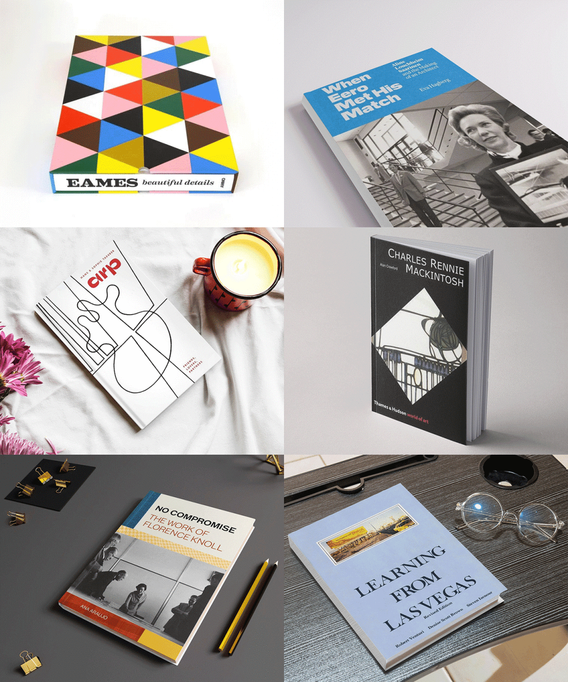
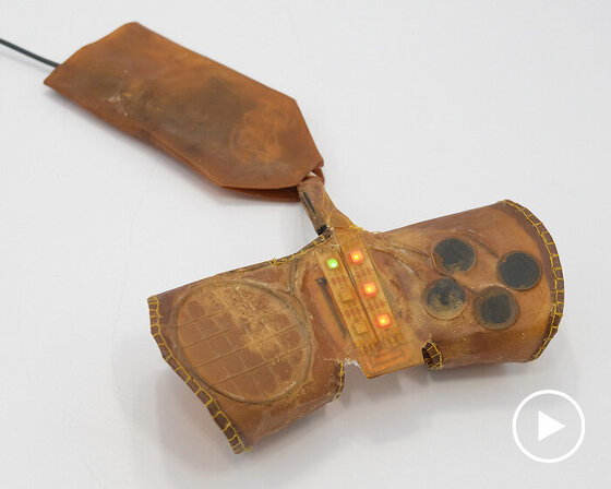
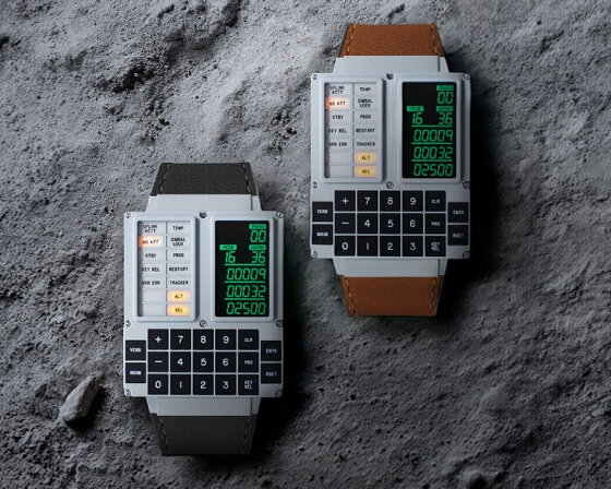
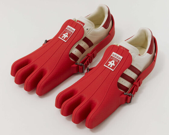
mind design team and various examples of their work.
holger jacobs of mind design tells designboom his thoughts on graphic design, strategy, cycling and more…
DB: could you tell us briefly about the evolution of mind design? HJ: after graduating from the royal college of art I worked in japan for a year. when I came back to london I still had a lot of work to finish and other small jobs came in for clients that I couldn’t meet while I was in japan.
I never planned to start a design studio it was more that I was always too busy to look for a job. the studio started 12 years ago from my bedroom. now we have a nice big space in east london. as a company we have always been deliberately small to avoid large overheads and all the compromises that come with those. at the most we were six people and at the moment we are just two, romilly and me. claire, who has been with us for two years left the studio last week. we miss her already.
everyone who works in the studio is responsible for every aspect of a project from writing the initial estimate to production. we do not have specific roles or responsibilities.
 black cow vodka identity and packaging – vodka made from milk in the dorset countryside, the logo was inspired by branding irons for cattle.
the work you produce is quite diverse, what are your thoughts on specialization vs generalization? we always tried to avoid specializing. I get bored easily, so I want to design something I haven’t before. we need to keep ourselves entertained.
in the broadest sense we specialize in corporate identity and print but this can mean a lot of different things. we’ve designed quite a few restaurants, because we are very interested in interior design and applying an identity to many different formats. in future we would love to apply that knowledge to other types of projects such as exhibition design and wayfinding.
we recently published ‘poopoo strategy‘ – your satire of the elaborate lengths that some studios go to to justify there designs… this was just a bit of fun but I do think that the term strategy and all the rituals of presentation coming with it are overrated. I am annoyed by the split between strategy and craftsmanship. thinking and doing are part of the same process, often ideas develop in the process of making. nowadays designers are often reduced to the role of stylists or technical operators that just execute the ideas of strategists. when it comes to bigger jobs nobody trusts intuition anymore and every decision needs to be backed up by data and research. as if the success of a project could be guaranteed that way. larger committees on the clients side seem to demand equally large teams on the design side. the days where individuals like otl aicher or lance wyman were in charge of massive projects like the olympics seem very nostalgic.

MOST – mind design were responsible for the identity of the exhibition that took place at the 2012 milan design week and was curated by tom dixon.

horizontal version of the MOST logo
 znips hair salon identity – references locks of hair and hand-cut lettering found in a 80s punk fanzine.
 as part of the interior design we created an art piece made from chopped books curled into strands of hair resembling the curved shapes in the logo.
 identity for a chain of tea shops, simply called ‘tea’.

 belmacz jewlers – the identity relates to the process in which raw minerals and diamonds are more and more refined until they become a piece of jewelry.
 the shop sign can also be altered in keeping with the concept.
 different configurations of the shop sign.
are you conscious not to develop a specific house style? I would say our work is idea and production based. especially with smaller jobs we often work backwards and start thinking about the production process first, considering what is the most we can do with the budget. ideas often develop on this basis. I don’t think we are in danger of developing a repetitive house style since every brief and budget is different. I want all our work to be recognised as well executed on every level, but not as cold or too perfect. it should always retain a certain friendliness subtle sense of humor.
do you think the popularity of online design resources has heightened or lowered the quality of design being produced today? I don’t know about quality but everything starts looking the same. in the studio we refer to design styles by the names of the blogs they are typically shown on.
how do you make sure you are able to get useful and insightful feedback on a project? we like to involve our clients in the design process. if we are unsure about the direction we’re completely open about it and like to discuss the project with them. sometimes that can mean showing hundreds of versions to the client and sometimes just one. it all depends if we feel they can handle it.
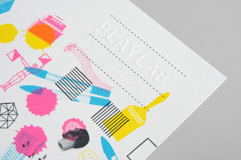 play lab identity – a workshop space aimed to be a creative playground for stressed adults.
 tess identity – a london based model agency.
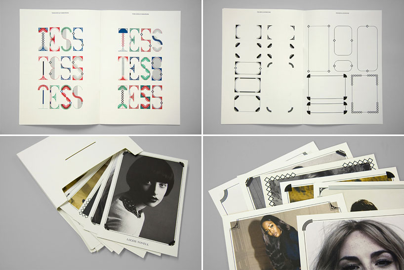 the solution uses several logo variations based on a modular system of art-deco inspired elements. the same elements are being used for frames which overlap images of the models on various printed applications.
 the collection identity – restaurant, cultural event and retail space in collaboration with tom dixon.
 the collection stationery.
 the collection menus.
 2010 tom dixon catalog cover

drop caps for the 2009 tom dixon catalog – most furniture designers organize their collection by product groups (chairs, tables, lamps, etc). so mind design decided to split tom’s collection into material groups (steel, copper, brass, etc) as he often produces many different items with the same industrial production method.
 how the drop caps were used in the 2009 tom dixon catalog…

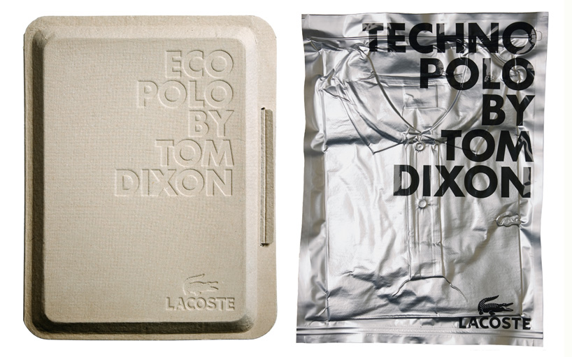
eco polo by tom dixon packaging – in collaboration with tom dixon mind design worked on the packaging and launch graphics for two special edition polo shirts commissioned by lacoste. tom’s concept was to explore two very different materials and the technology used in the production process of the garment. the most eco-friendly way to package the eco polo was not to print on the packaging at all but use embossing instead. the techno polo is vacuum-packaged in screen-printed foil.
 since the eco polo was hand-died in india mind design worked with a group of bollywood painters for the launch graphics. based on research into this particular style mind design came up with three collages as templates for the artists. hey were then emailed to india, hand painted on a large format canvases and later displayed at dover street market in london.
 D100 identity – dentistry practice in london – the client contacted us at a time when holger was in japan visiting zen gardens in kyoto. the identity is inspired by the raking patterns around stones that are a common feature of zen gardens and reminded him of protective layers of enamel around teeth.
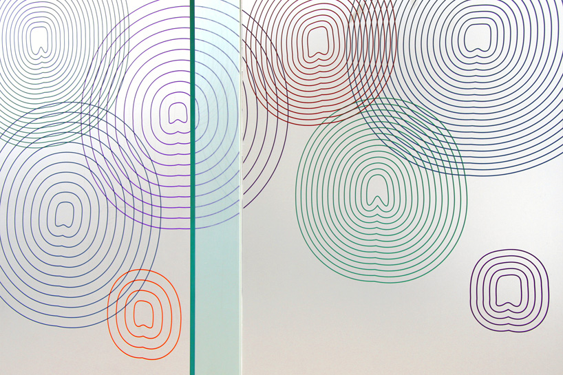 interior of the D100 practice.
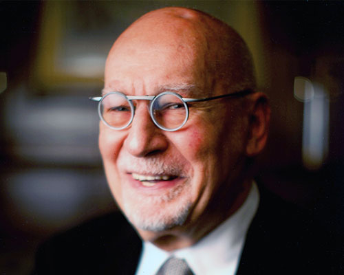
 mind design team portrait: holger jacobs and romilly winter.
besides design what do you have a passion for? romilly and I are both passionate cyclists and at times the studio resembles a bike workshop. cycling has a lot to do with design in that when you ride down oxford street on a fixed gear bike, you learn to make decisions fast and intuitively.
what lessons have you learned from a project that has changed your outlook on life? there is no particular project but living in japan has changed my view of design. it made me understand that content and form can be the same thing. I am also not afraid anymore to describe something simply as ‘pretty’ without feeling intellectually inferior.
what advice would you give to young designers? don’t take design too seriously but always consider that work should be measured by a long history and not by the opinion of your client.

