‘untitled’, 2004 image © hideki inaba
the self-taught tokyo-based designer and graphic artist hideki inaba gave a presentation at the kuala lumpur conference, during the local design week 2010.
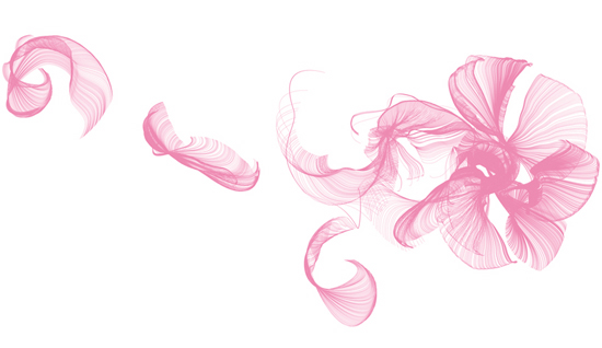
 ‘BTB24 mutsuki’, 2007 image © hideki inaba
the delicate quality of hideki inaba’s work from his exhibition cannot be achieved unless the combination of ink, printer and even paper quality is just right.
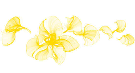
 ‘BTB24 hazuki’, 2007 image © hideki inaba
at first he was not so picky, he was used to working on the computer, viewing the images on the monitor. now the transformation from monitor to paper is crucial for hideki inaba. if the original art is data, you can make as many prints you like, but what you print is never an original, unless the act of printing becomes an artwork itself. not unlike the historical japanese ukiyo-e school of printmaking which depended on the good relationships among painter, woodblock carver, printer and paper maker.
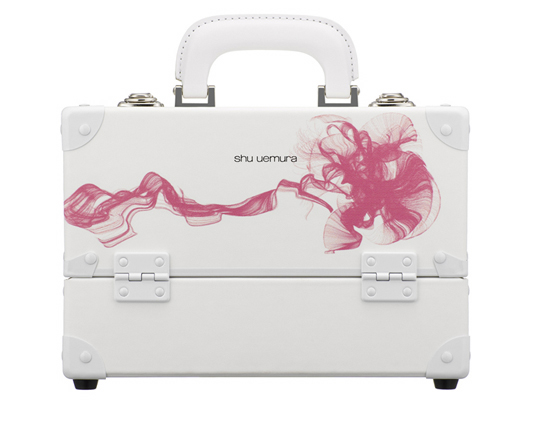
‘BTB24’ shu uemura make up box, 2007 image © hideki inaba, shu uemura
in 2007, hideki inaba starts to collaborate with japanese cosmetic brand shu uemura. this is shu uemura 24th birthday box, decorated with artwork by hideki – it has been a limited edition.
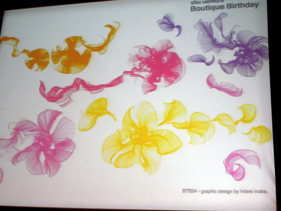 BTB24 graphics for the cosmetic brand shu uemura’s omotesando boutique window display, slide showcased at kuala lumpur design week 2010
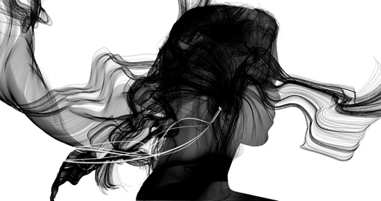
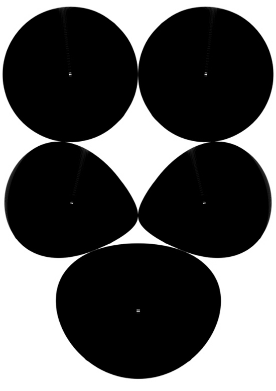
 ‘relax’, 2004 image © hideki inaba
during his presentation, hideki inaba enchanted us all with his complex line drawings, but despite numerous questions from malaysian students – about how he creates them – he’s keeping his trade secret close to heart. he only admits that it takes a very long time to create these images.
 ‘relax’ 2004, print line version 2008 image © hideki inaba
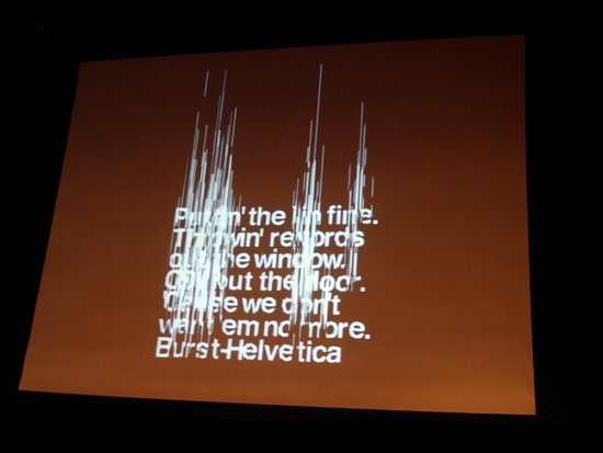
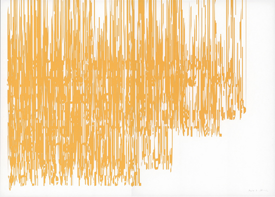 ‘burst helvetica 2′ 9010 exhibition, 2010 image © hideki inaba
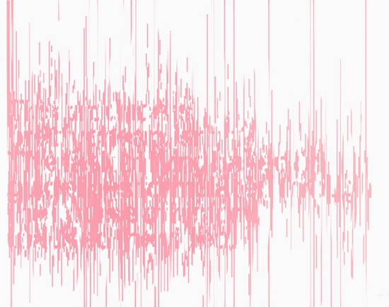 ‘burst helvetica 2’, 2010 image © hideki inaba
 ‘burst helvetica 2’, 2010 image © hideki inaba
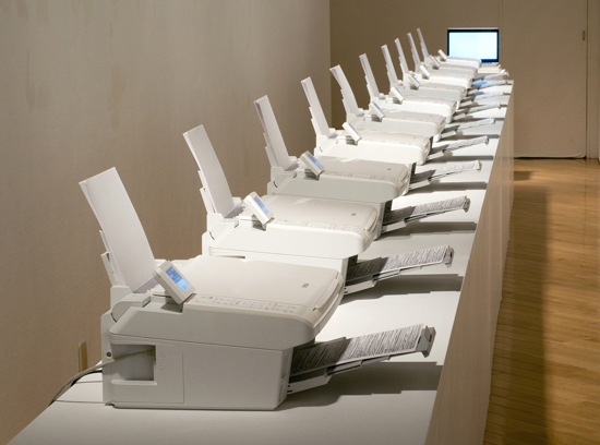 ‘printer’ 9010 exhibition, 2010 image © hideki inaba see more info (in japanese)
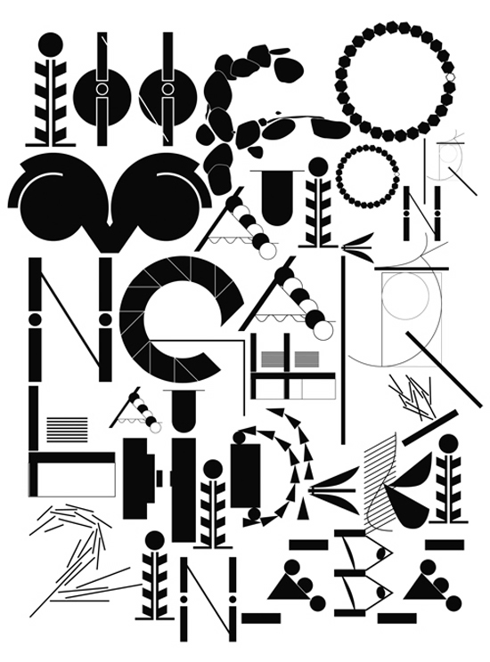
his NEWLINE exhibition in 2004 marked a transition from presence to motion. the fluid manner of his planar typography added the axis of time and motion to two-dimensional text. while the illusion of motion was well within the tradition of op art, the patterns’movements perhaps suggest a new, digital species of kinetic art.
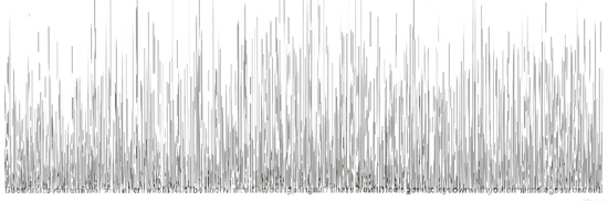
 ‘burst helvetica’, 2004 slide showcased at kuala lumpur design week 2010
how do you work with the roman alphabet? ‘I ask my assistant or I use the web translation’. I don’t understand english and also don’t know difficult japanese words. I don’t think I’m interested in language much. I recognize both english and japanese as a picture. H.I.
‘untitled’, 2008 image © hideki inaba
 “untitled”, 2004 image © hideki inaba
hideki also works with japanese online magazine shift on various collaborative projects. see the shift article on hideki’s NEWLINE exhibition.
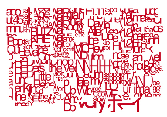
 ‘NEWLINE 2’, 2005 image © hideki inaba
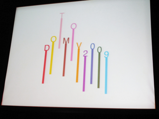 dotmov logo by hideki inaba, slide showcased at kuala lumpur design week
 hideki inaba portrait © designboom
hideki inaba was born in 1971, he is currently working as one of the leading graphic designers in japan. he never received any proper education in design and studied on his own. while contributing for +81 magazine and SAL magazine, he received a high attention for his innovative work.