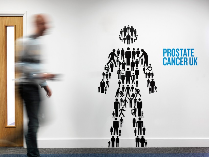
prostate cancer UK identity applied to one of the charity’s office spaces
hat-trick design recently created a new identity for prostate cancer UK (formerly the prostate cancer charity). jim sutherland explained to us the reasoning behind their solution and how it was applied to theoffices of the charity.
 prostate cancer UK identity
‘only men have a prostate, so only men will get prostate cancer. rather than create a new male symbol we set about finding as many male symbols that were in the public domain as we could. the result was the ‘man of men’ symbol – a male symbol made up all lots of male symbols – representing all men.’
‘the identity extended into their london and scotland offices where life size symbols of men were placed around the workplace. these included quotes from people affected by prostate cancer and facts and statistics about the disease such as 1 in 9 men in the UK will get prostate cancer.’
‘as part of the identity other symbols can be created using multiple symbols of men. around the offices we put up a big question mark – to highlight the need for research, a speech bubble – to highlight the need for dialogue on the subject and a map of the UK to highlight the number of men in the UK affected by the disease.’
‘we also created a clock in the reception highlighting the fact that one man is diagnosed with prostate cancer every 15 minutes in the UK.’
‘the back boardroom wall contains a giant tapestry/pattern of all of the found symbols. ’
 t-shirt
 lapel pin
 annual review DVD packaging
 pamphlets
 manifesto
 manifesto
 identity newspaper
 mugs
mugs
 environmental graphics applied to the prostate cancer UK offices…

 boardroom
 info graphic clock