
yotel brand identity by GBH featured on the new manhattan capsule hotel 
GBH recently designed the branding and signage for the new ‘yotel‘ in manhattan. the interiors were developed in collaboration with softroom.
— following text from GBH
GBH have been working with the yotel capsule hotel brand for the last 12 months, helping redefine its proposition, identity and environmental graphics ready for its expansion outside of europe.
yotel was originally the brain child of simon woodruff, founder of yo-sushi and was positioned as part of the ‘yo’ brand. as such, it’s original identity reflected the futuristic, japanese influence of the sushi restaurants, but featured a cube icon to represent the compactness of the hotel rooms. initially the hotels were located only at airports and offered a mix of innovation and utility wrapped in a futuristic style.
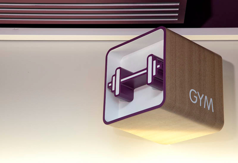
with plans to expand the brand into a 650 room building in new york, situated between the 4th and 22nd floors, offering much larger and more luxurious rooms, a stylish roof terrace, bar, restaurant, lounge and gym, there was a requirement to rethink the way the concept communicated, which of its elements to to build upon and which to leave behind.
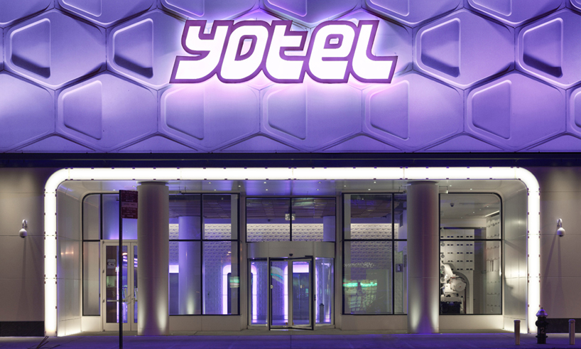 yotel exterior
from the start we saw the opportunity to build on the original values and personality. it was time for the capsule story to evolve to accommodate the upgrade in the offer without losing the core concept of innovative use of space with a futuristic, japanese aesthetic. the first step was to rationalise the existing identity and create a full set of guides for use by marketing teams as well as hotel staff. the cube was removed from the logo to move focus away from ‘capsules’ but importantly the phrase ‘smartspace’ was introduced into the yotel vocabulary as a way of communicating the innovative functions and features that each room comes with, such as space saving fold-away beds and clever storage areas.
working closely with london based interior design agency softroom,
of particular excitement was the exterior entrance at ground level,
which now takes on the look of an illuminated building from the future
and sets up the customer expectation. once inside the lobby though,
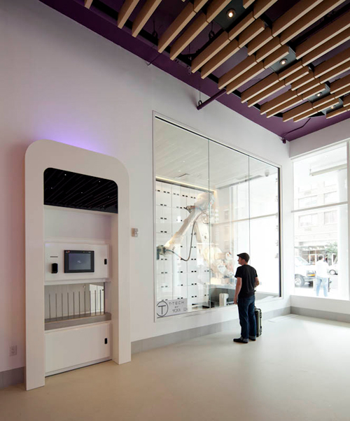
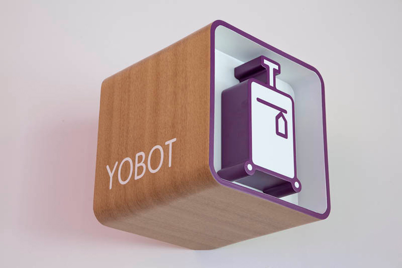
it’s the yobot, a fully working robot which takes, handles and stores luggage,
that steals the show. with such a large space to be filled, there was
a wonderful opportunity for drama and the yobot makes no mistake
in communicating the modernity, innovation and style of the brand.
inside the hotel itself we identified the areas and touch points of the
environment that we felt could best communicate the brand personality
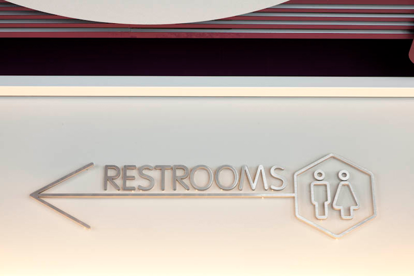
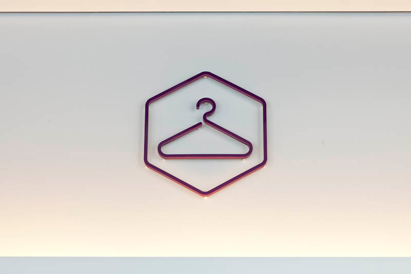
and allow us to treat mandatory information in a fresh way. design work
included signage (over 1200 in all), in-room items, staff uniforms and
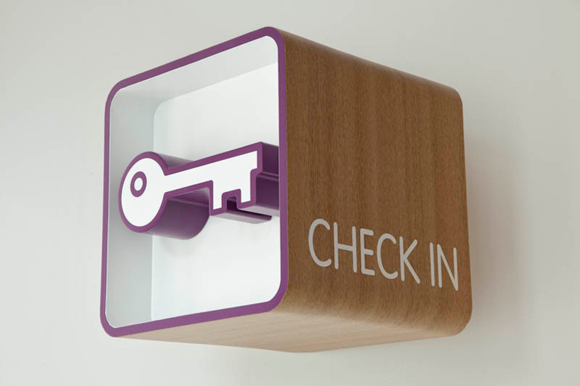
communal area graphics. many services which are normally staffed
in a hotel are self-service at yotel; automated check-in/out, a galley
kitchen and ‘take-out’ restaurant and provided perfect opportunities
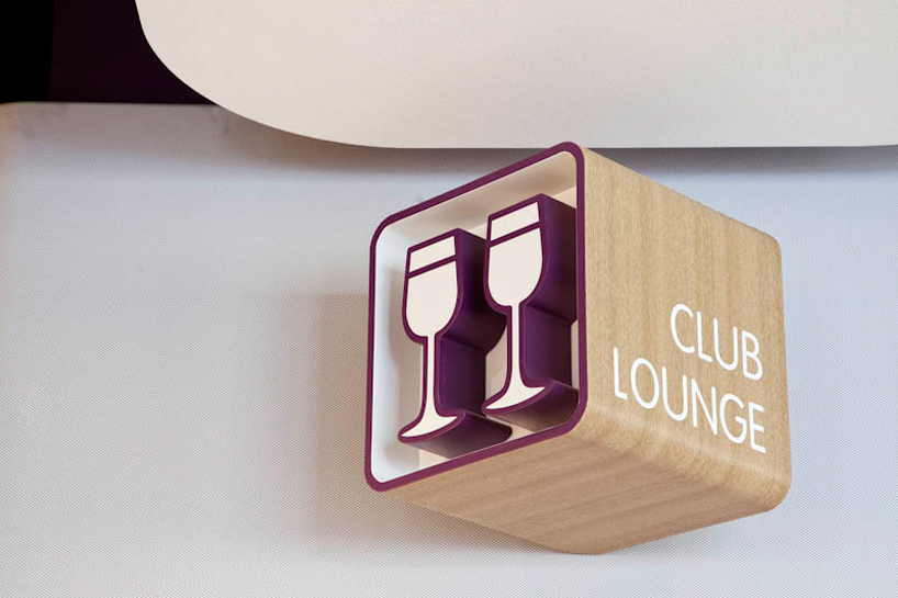
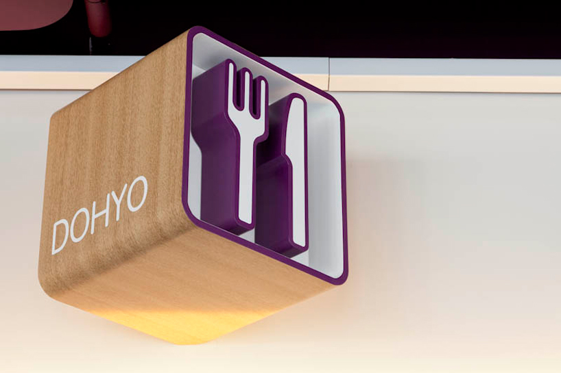
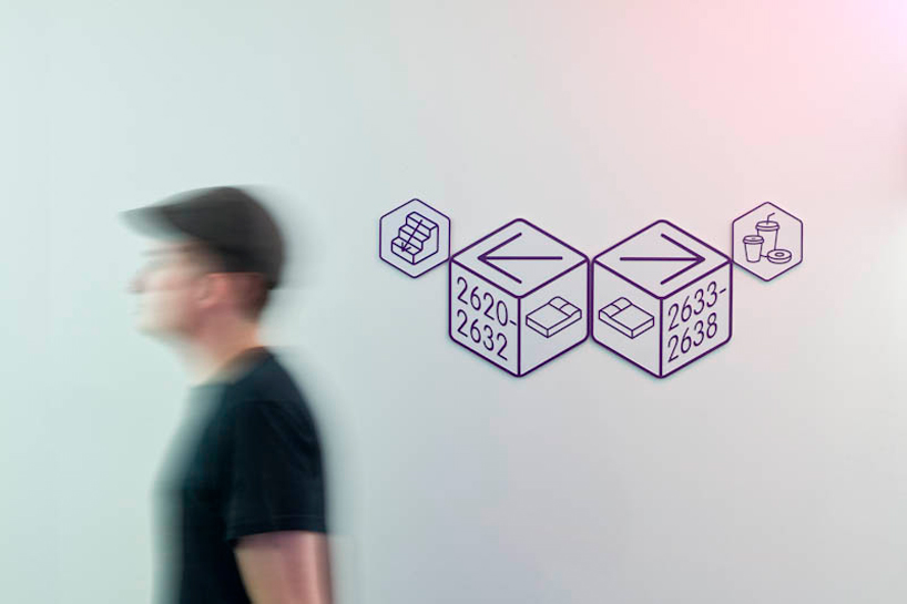
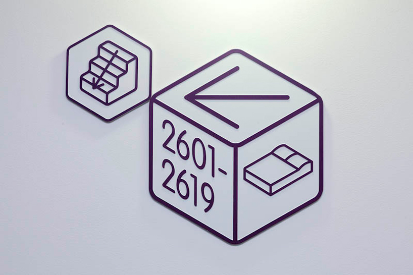
to marry a futuristic form with operational functionality. the cube icon
from the original logo was re-instated within 3D signage (a subtle reminder
of the room aesthetic) while graphics were kept to a minimum and echo
the clean, futuristic lines and modern materials of the interiors. meanwhile
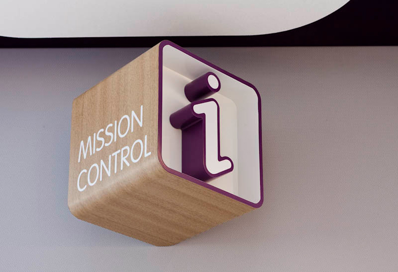
this influence even extended to language, with the naming of the 24 hour
concierge desk as ‘mission control’ and the rooms as ‘cabins’.
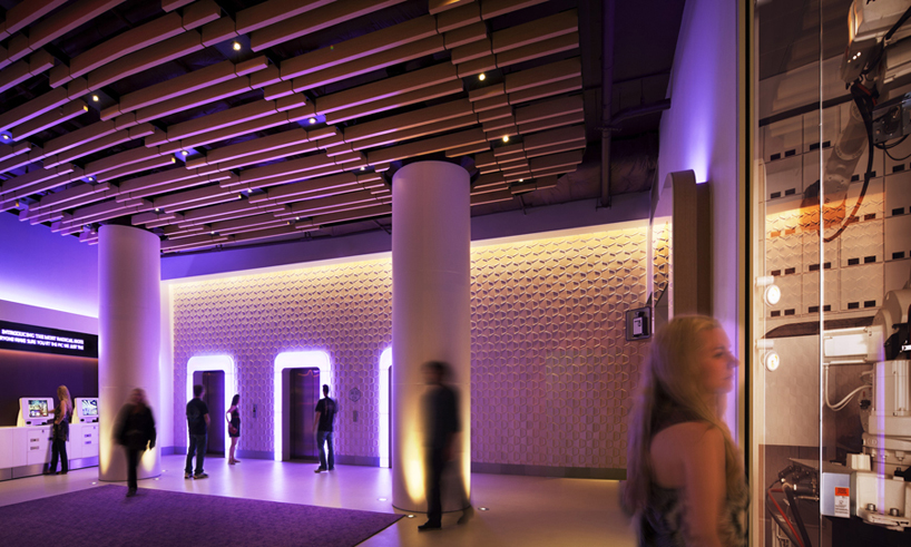 lobby
lobby
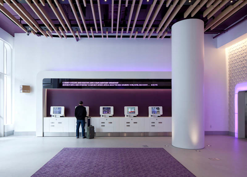 check-in
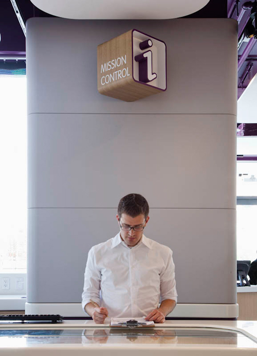 mission control (concierge desk)
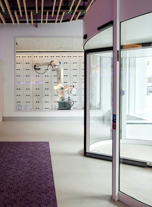 yobot – a fully working robot which takes, handles and stores luggage
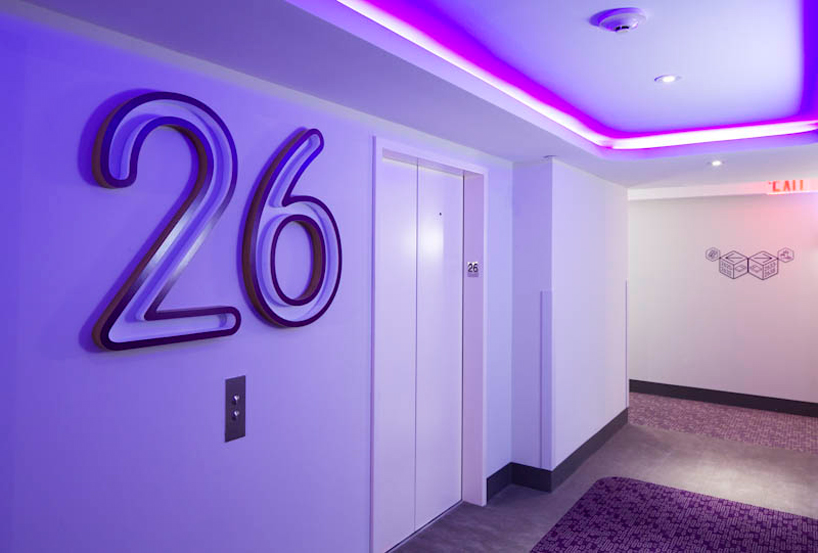
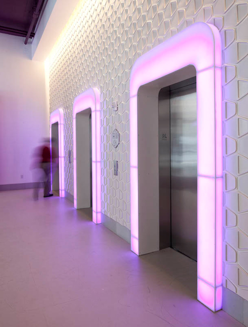 elevators
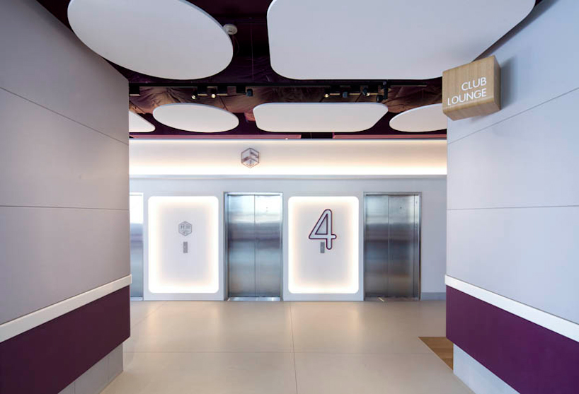
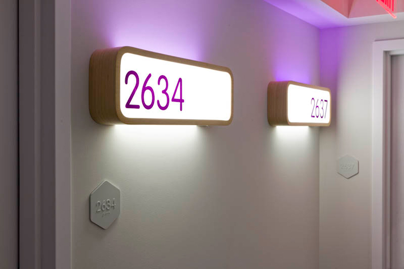
 details of the wayfinding signage…
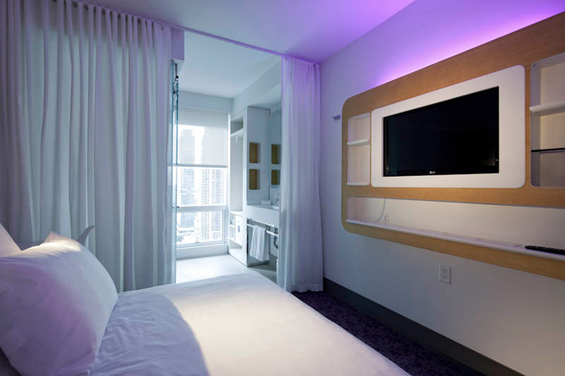 room interiors
happening now! thomas haarmann expands the curatio space at maison&objet 2026, presenting a unique showcase of collectible design.
GBH (6)
 Sep 08, 2014
 Sep 18, 2013
 Aug 09, 2013
 Feb 21, 2013
 Jun 28, 2012
hotel architecture and design (751)
 Jan 13, 2026
 Jan 10, 2026
 Jan 09, 2026
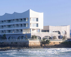 Jan 06, 2026
 Dec 16, 2025
 Jan 02, 2026
 Dec 28, 2025
 Dec 17, 2025
 Dec 04, 2025