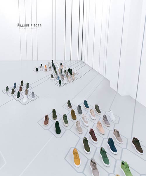
amsterdam-based flip ziedses des plantes or FZDP design studio reveals the design for luxury sneaker brand filling pieces’ showroom in soho, new york. sticking to the belief that beauty lies in simplicity, the studio creates a clear white space with graphical pattern spreading over the floor and walls.

a dynamic grid of lines and hexagonal shapes covers the floor and walls of this new york city gallery
apart from interior design, FZDP takes care of the brand’s general identity and the iconic hexagonal shape is part of the visual language the studio created for filling pieces. the grid is divided into five separate ‘islands’ in five grey tones, each representing a series within the brand’s collection.

the collection of the brand was on display in a soho NYC showroom
the space is free of any type of furniture or any kind of interaction besides the graphical decoration. the designers made a distinctive showroom with a minimum amount of material, yet clearly expressing the client’s philosophy.

the grid is divided into five separate ‘islands’ in five grey tones

the iconic hexagonal shape is part of the unique visual language that FZDP created for the sneaker brand
designboom has received this project from our ‘DIY submissions‘ feature, where we welcome our readers to submit their own work for publication. see more project submissions from our readers here.
edited by: maria erman | designboom
