KEEP UP WITH OUR DAILY AND WEEKLY NEWSLETTERS
happening now! thomas haarmann expands the curatio space at maison&objet 2026, presenting a unique showcase of collectible design.
each chair reflects an individual child’s input and imagination.
connections: +910
the spiral structure follows principles of fluid dynamics and thermodynamics to optimize heat distribution.
connections: 94
from 3D printed coral reefs to eggshell composite butterfly nests, designboom looks back at the top 10 social impact stories that defined 2025.
connections: 23
amid the rush of a hyper-accelerated world, the hue stands in for a blank canvas.
connections: 45
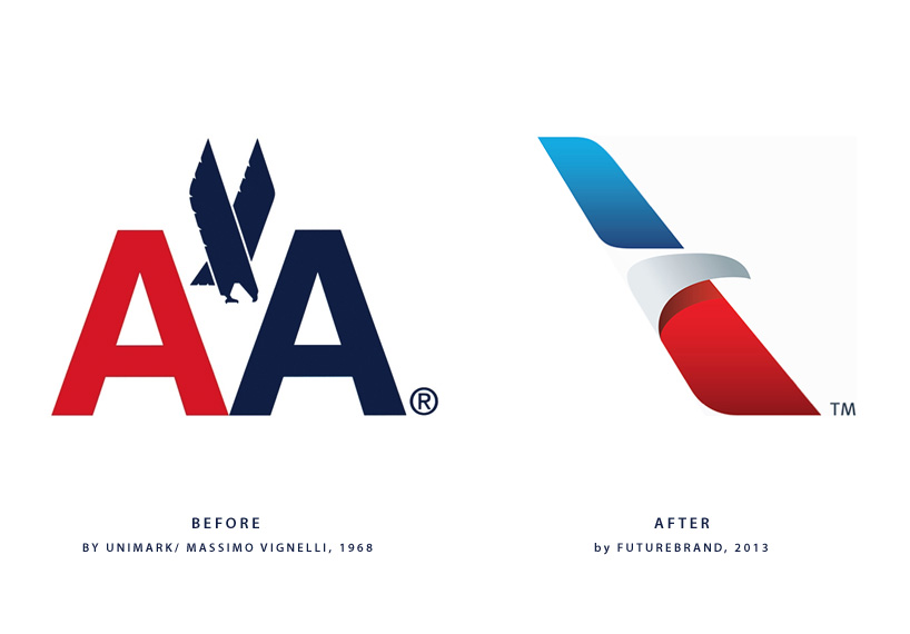
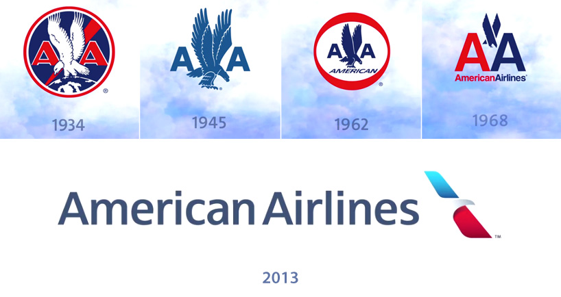
 the new wordmark with the ‘flight symbol’
 the ‘flight symbol’
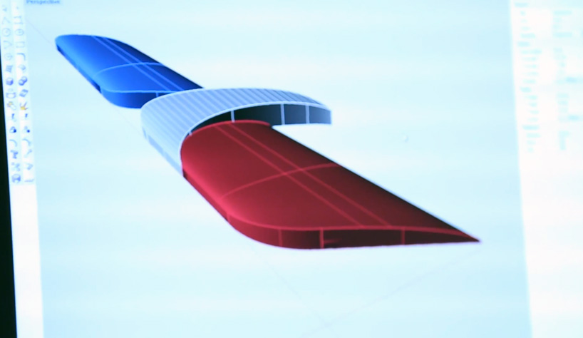 3D model of the the ‘flight symbol’
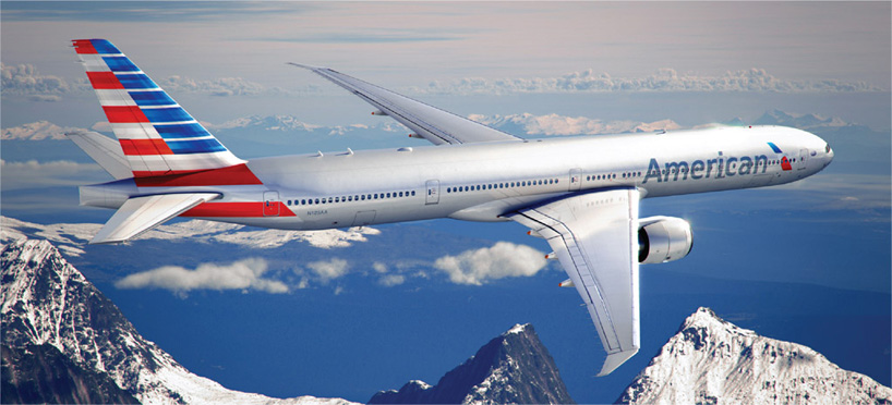 the new AA livery sees the logo removed from the tail and red and blue stripes introduced
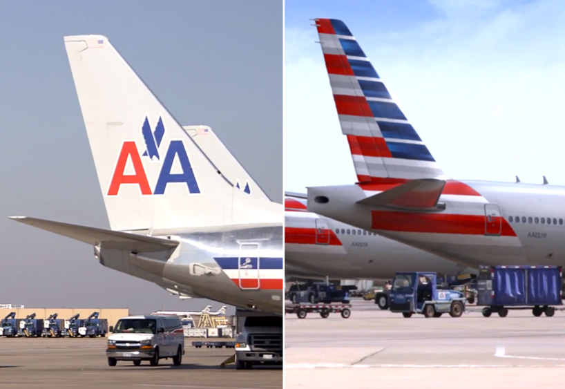 how the old tail (left) compares with the new design (right)
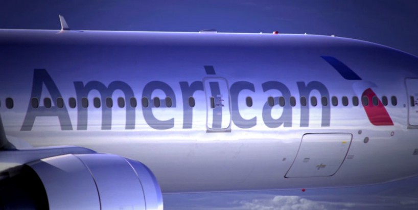 new logo applied to the famous silver planes of AA


