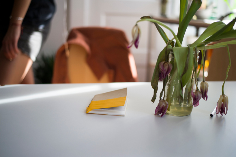
nothing is sexier/more-intimidating than a fresh notebook. well-bound. untouched. perfectly-stitched. clean and pristine. it’s an absurd romanticization. it would be useless to keep notebooks that way, but ‘sketchbook phobia’ is a common ailment among designers. warning signs include: anxiously staring at blank pages and — in dire cases — buying more notebooks for no reason. those suffering shouldn’t feel ashamed. if you’ve experienced any of the above symptoms, you may want to try RIP by eric primo.
all images courtesy of charlotte masters
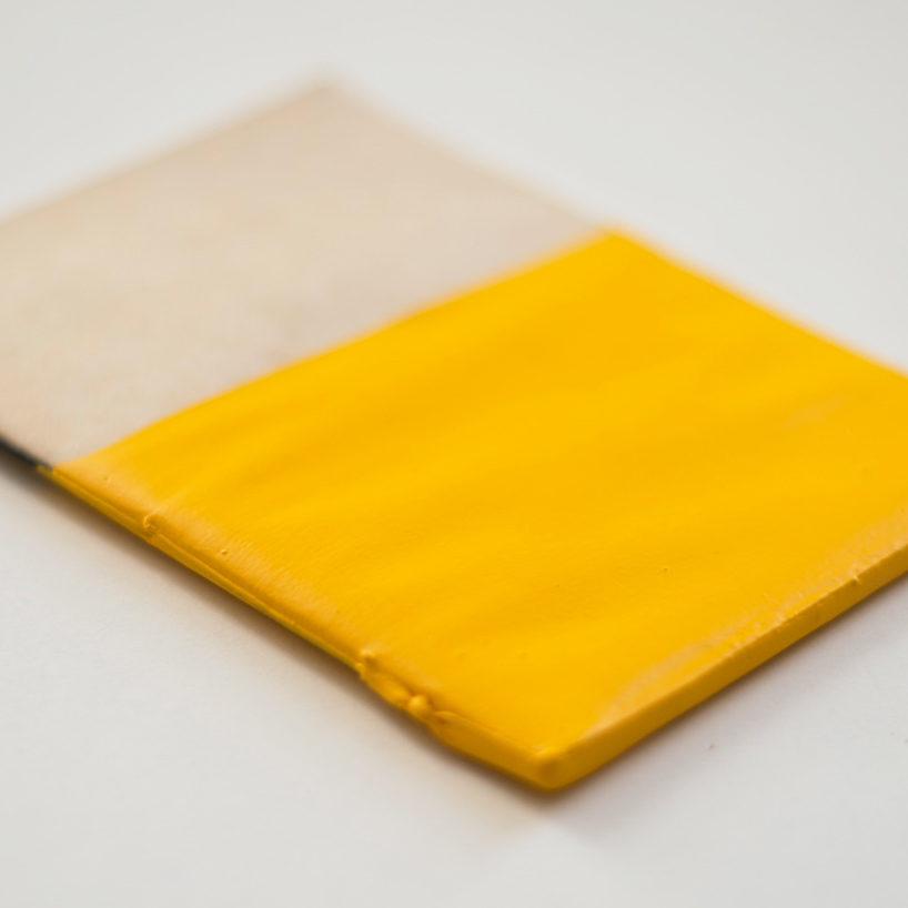
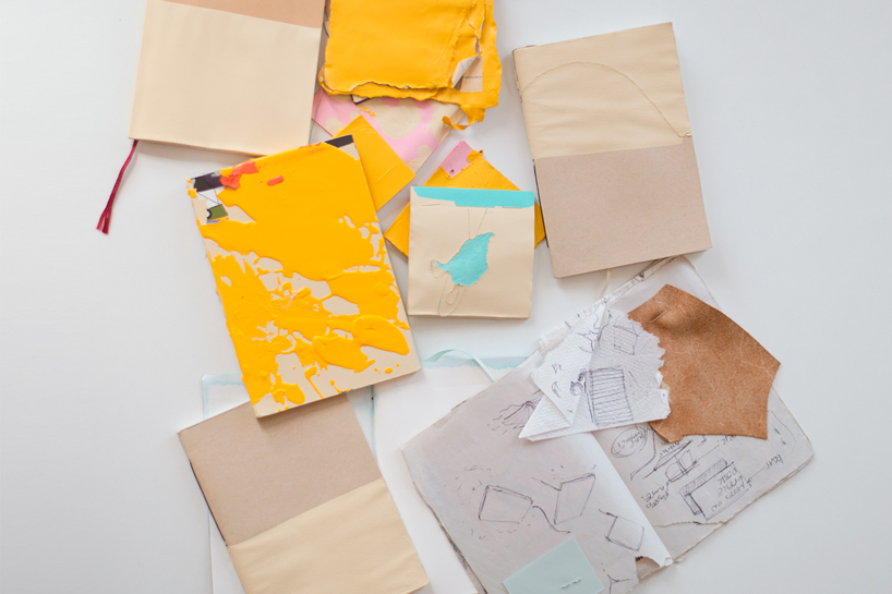
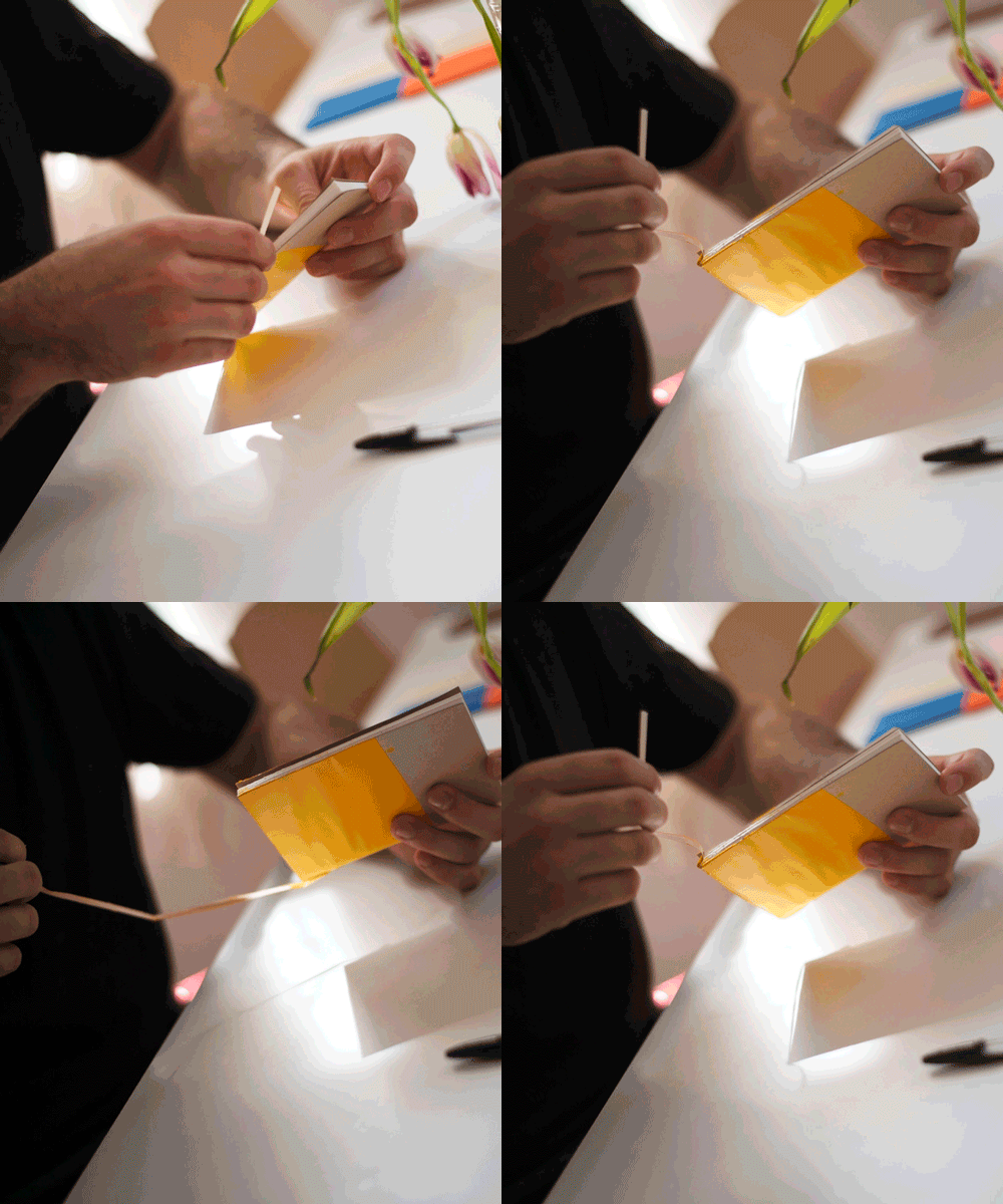
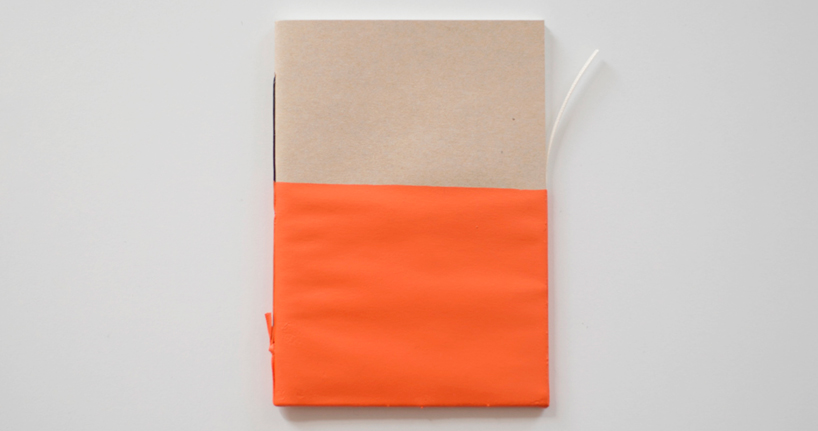
RIP is a minimally designed sketchbook. it’s as pretty as any other notebook (at first it may even be triggering) but the therapeutic nature of this product is not in its aesthetic. quite the opposite. you have to rip RIP open in order to use it.
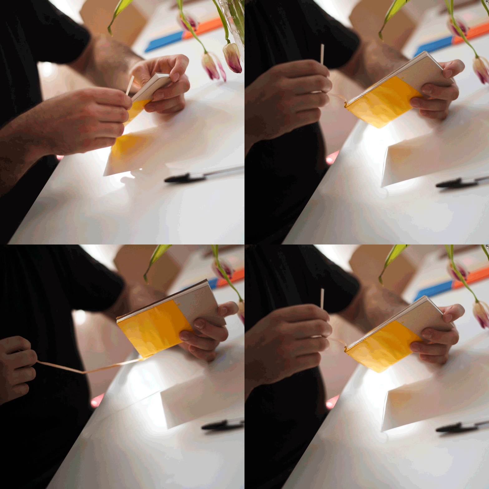
as the patient tears the painted seal off of the notebook, they are making the product their own. they’re facing their fear. the product still holds its shape and function but it is no longer intimidating. at this moment, the value of the notebook exists in its use, not its design. sketchbooks aren’t sexy; ideas are. side effects of eric primo’s RIP include: actually using your notebook, and discovering thoughts you didn’t know you had.
