8 acclaimed designers reinterpret xavier pauchard’s tolix chair
image by fabian frinzel
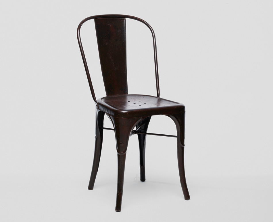
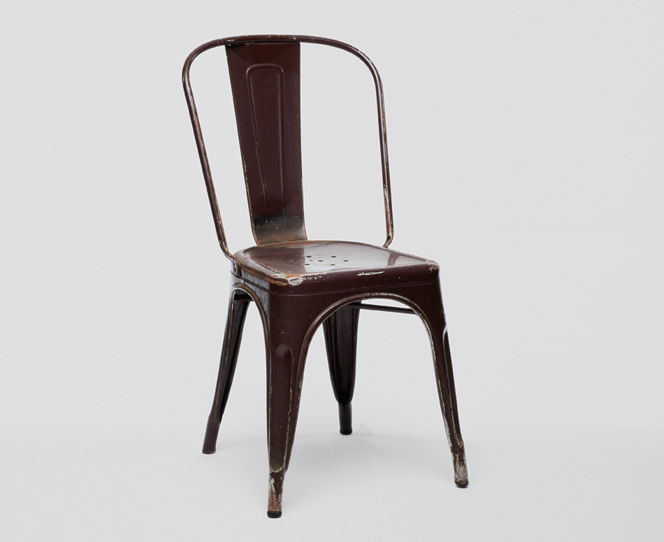
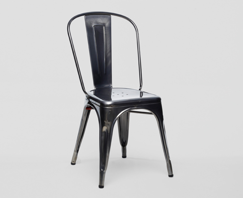
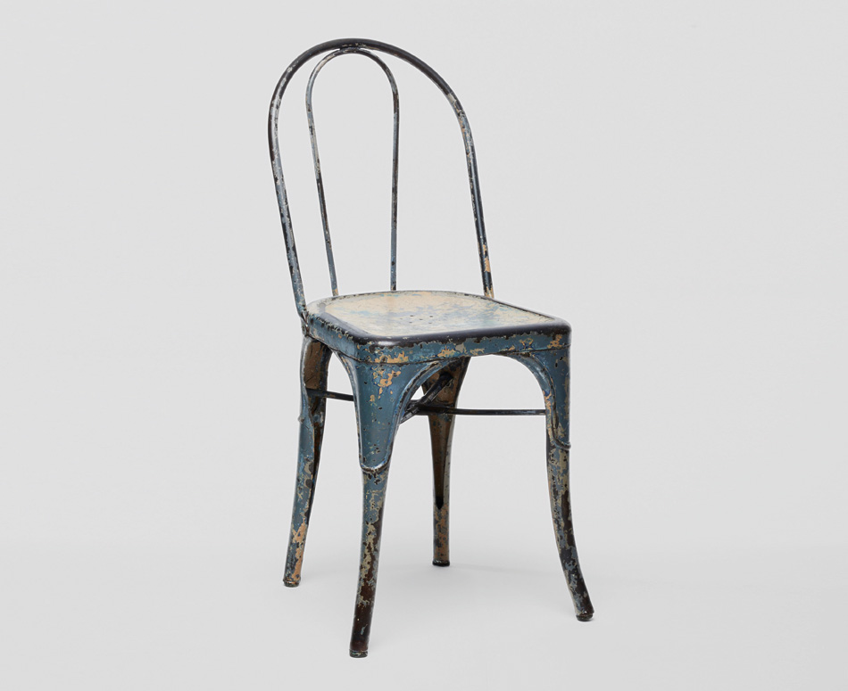
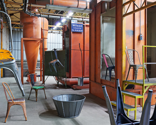
the ‘chaise A’ by french company tolix is an icon in the history of chairs. made of sheet metal and tube, it combines lightness and strength, industrial aesthetics and craftsmanship. xavier pauchard, a pioneer of the galvanizing process and a visionary manufacturer created this metal chair, available today in 45 different colors and 5 varnish coating. now turning 80, tolix honors this galvanized piece of history by collaborating with eight esteemed designers to release several special editions. ‘face to face‘ created by konstantin grcic, bethan laura wood, sebastian herkner, lex pott, studio formafantasma, julien ceder, julie richoz and giulio ridolfo.
edition by konstantin grcic
image by fabian frinzel
‘the chair’s beauty and significance are due to its industrial aesthetics and resulting intrinsic poetry. the evident simplicity of this chair is the outcome of the underlying production process and the tools used.’
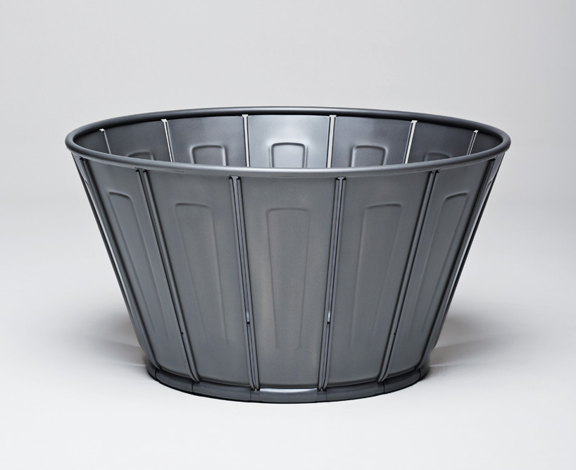
germany based industrial designer konstantin grcic was asked to reinterpret the ‘chaise A’ as an object. the result is a large vessel which combines the lightness, strength and craftsmanship recognized in the chair. resembling the form of a bucket, it simply uses the chair’s sheet metal spine and tube, establishing a visual connection with chaise A but at the same time, renders its individual identity.
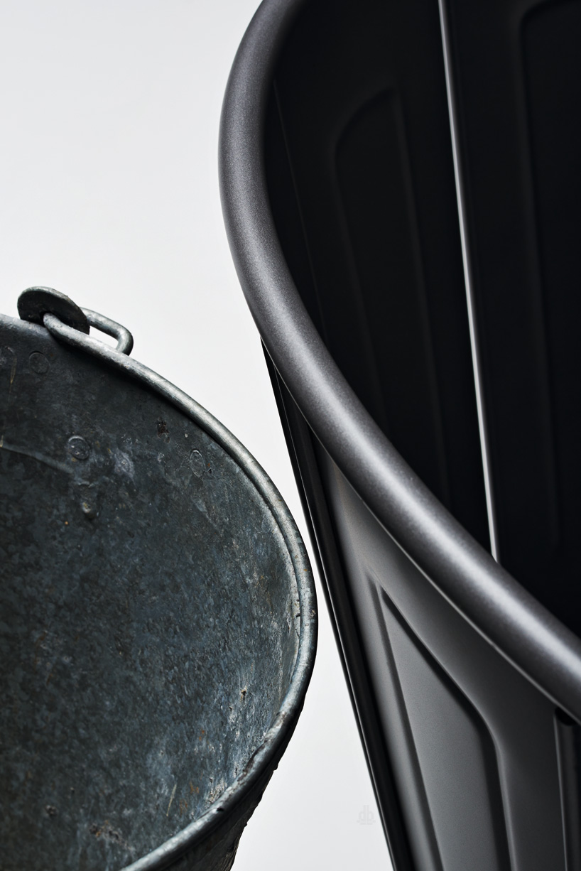
the construction of the large vessel is made of the chair’s sheet metal spine (tolix refers this as the ‘palmette’)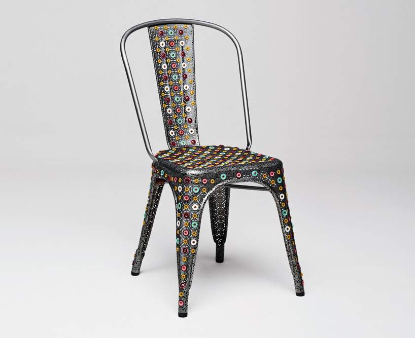
edition by bethan-laura-wood
‘what i like about it, is its femininity. its success was due to a mix of a very controlled industrial process and a certain softness, particularly in the curved back rest.’
british designer bethan laura wood celebrates femininity in her version of the chaise A, where the use of material and molding is complemented with a delicate inline and form which results in a chair which marries the industrial wit the domestic. using two female icons in history as a source of inspiration: maria in metropolis and elizabeth I. the chair references their powerful allure, their style of dressing to create the highly detailed intervention seen with the perforated and embellished metal surface.
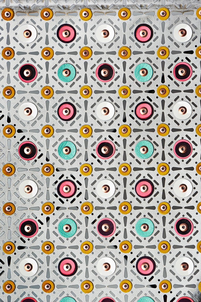
the embellished surface
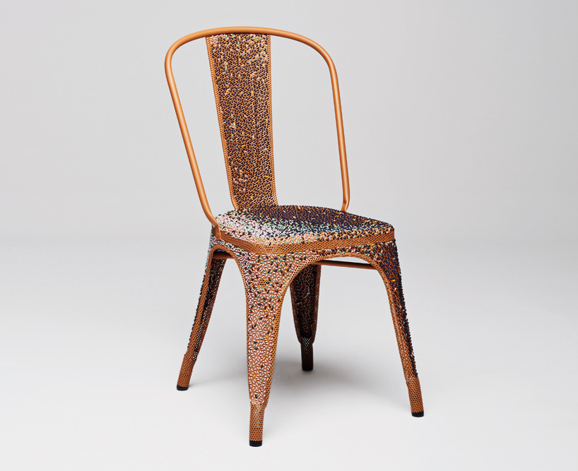
edition by sebastian herkner
‘I remember a trip to france with my parents more than 20 years ago when, sitting in tolix chaise A’s on a café terrace, we were drinking orangina and eating crepes! the ‘chaise A’ is such a classical, sophisticated and well-designed seat – it’s a natural part of our environment.’
sebastian herkner‘s design marries paradigm with composition and conjunction. his ‘chaise A’ combines its original industrial aesthetic with something hand crafted- in this case the use of different colored leather laces to soften the chair made of perforated sheet.
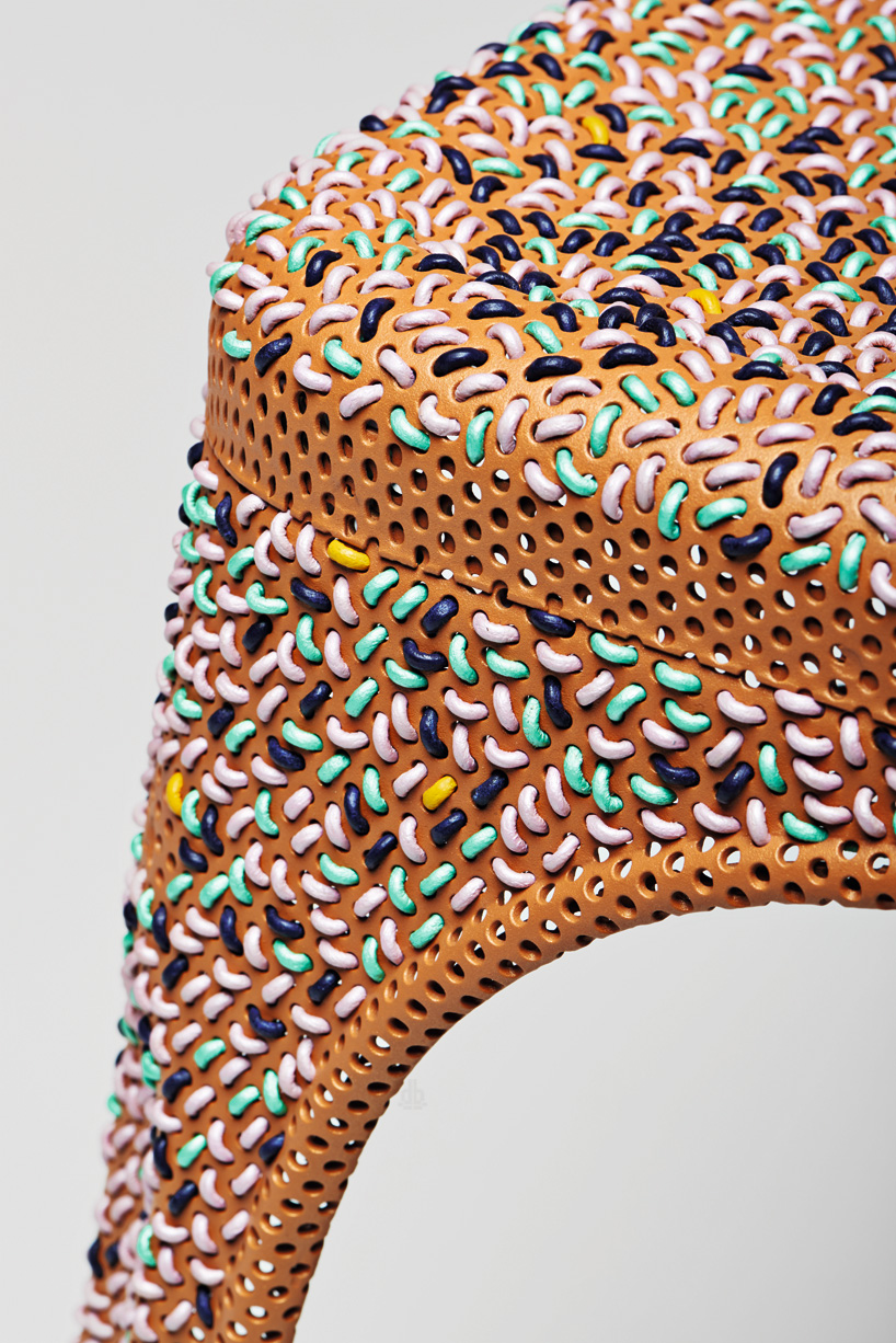
herkner has softened the chair by sewing leather into the perforations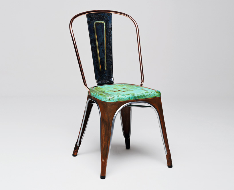
edition by lex pott
image by fabian frinzel
‘it’s a fine example of how to use metal elegantly. the metal sheets are embossed and folded to become a very robust rigid construction. I am a fan of its timelessness.’
lex pott is known for employing a raw and intuitive method, bringing design “back to nature” and uncovering the organic origins of industrially produced items. his elegant reinterpretation uses surface and treatment to distinguish its own identity. the chair is given a weathered look by using a combination of metals like oxidized steel, copper and brass to achieved this effect, with an added patina to accelerate the process.
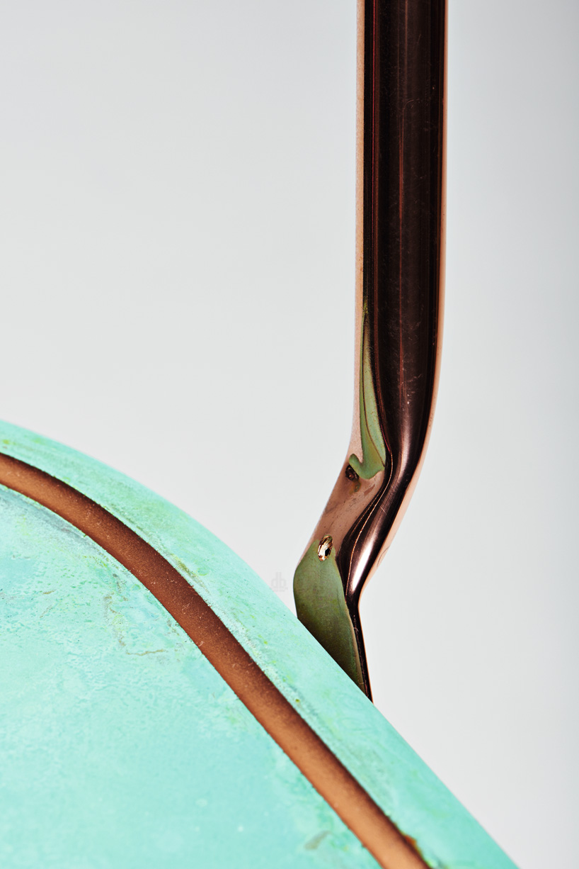
the chair has been given a weathered look
edition by giulio ridolfo
image by fabian frinzel
‘I used to sit on an “chaise A” for a long time! to me, it is a convivial and reliable manufactured object. it’s always just enough, never too much – a tranquil presence. like a good screwdriver or a pair of scissors, a tool you always need.’
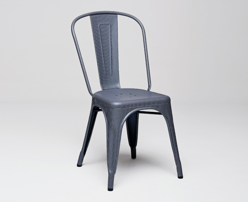
italian textile designer giulio ridolfo –known for working with a color system in his design where he has developed his own personal and intuitive method of composing color schemes to carefully match his clients’ needs. for this porject, he explores the theme of connection in his ‘chaise A’. his version is completely wrapped with a blue patterned fabric.
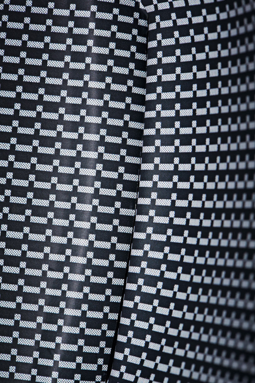
the italian designer has appropriately incorporated fabric into his chair
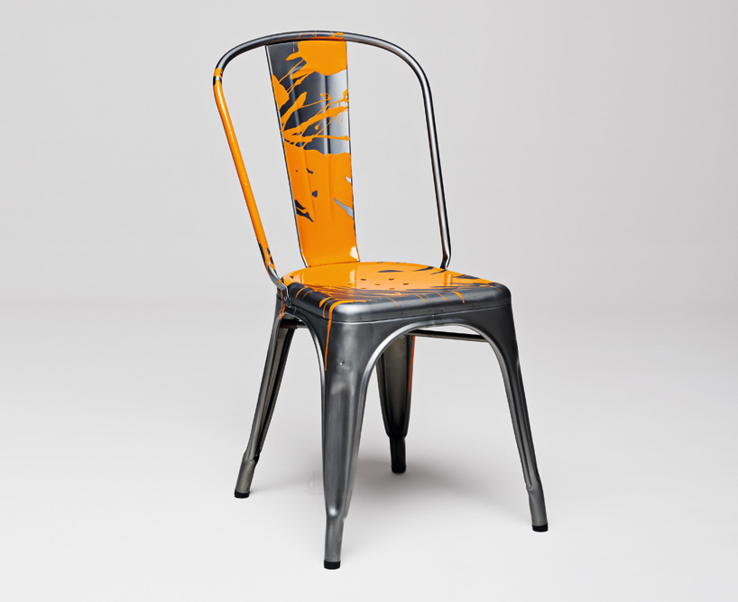
edition by julien ceder
image by fabian frinzel
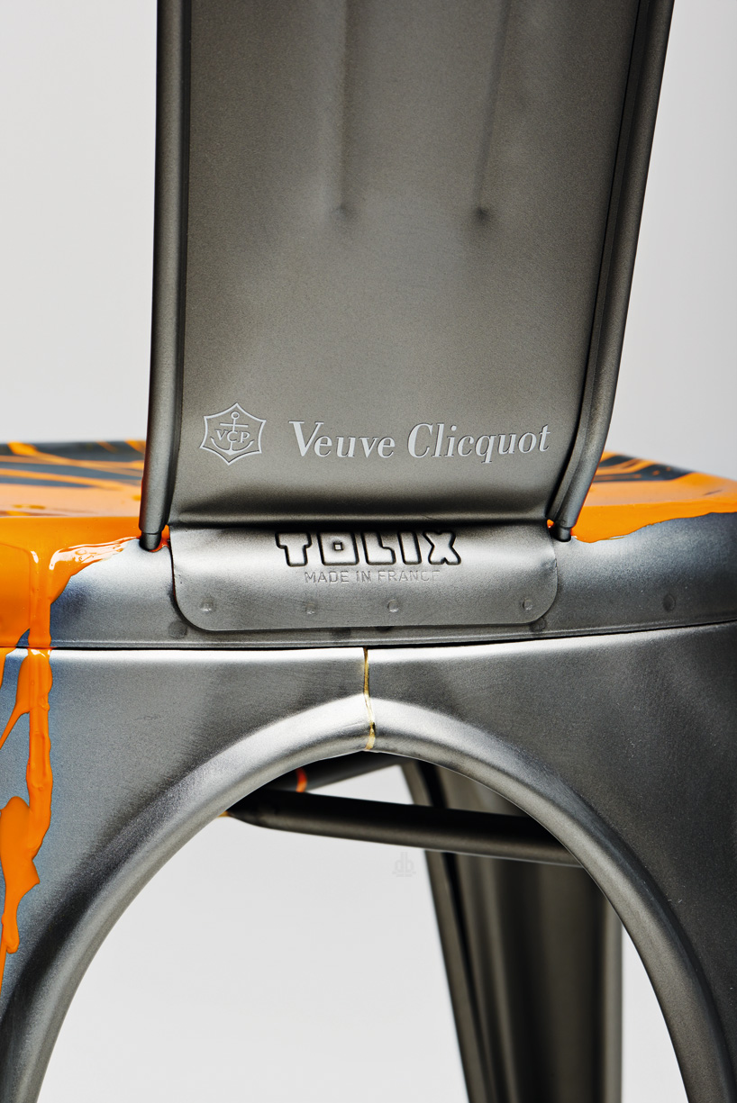
“I chose to simulate the effervescence of champagne by creating a splashing effect through a spray of yellow paint. this dark yellow color has been connected to the veuve clicquot house since 1877; it expresses the dynamic spirit of the brand, the color of the grape, the inventiveness typical of their innovations. for champagne, as for the “chaise a”, it is about heritage but also about modernism and dynamism.”
edition by julie richoz
image by fabian frinzel
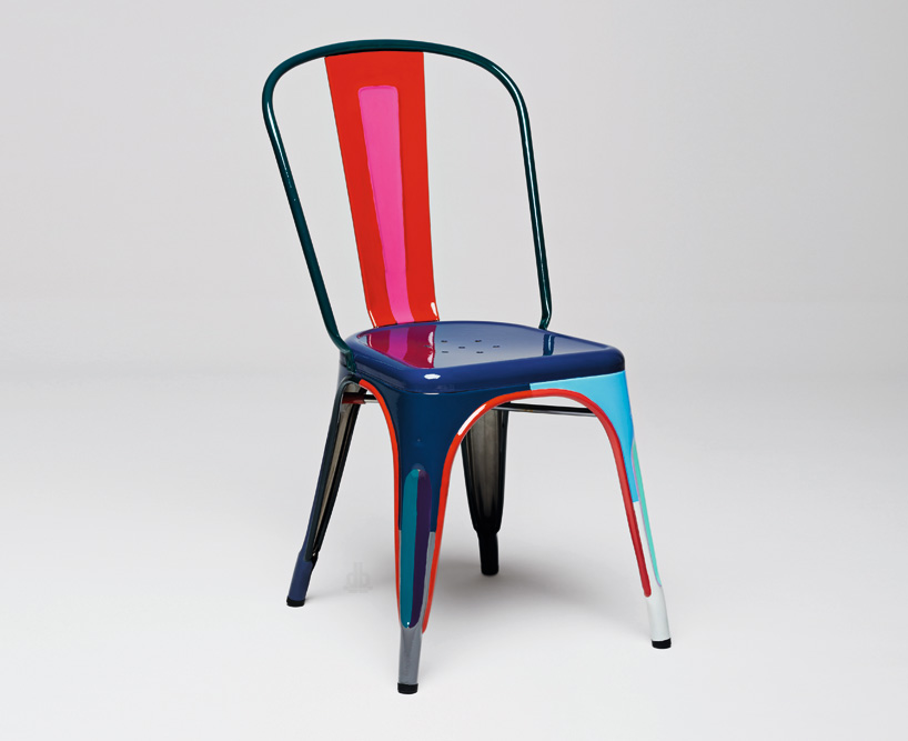
‘on the first look, the tolix “chaise a” is very far from a decorated and painted wooden chair. although, it immediately reminded me of a wooden chair i had bought at a flea market when I was seventeen. I loved it because of its bold colours. each detail, each volume was underlined by a color. even if the “chaise A” evokes another imagery, it nevertheless carries a certain type of decoration deeply related to its production. the sheet metal embossed for strength, the perforated seat to let the water flow, the numerous visible welds… all these little marks tell the story of its making and decorate the chair– composing its personality. these are the elements i painted by hand. and as the chair has a volume and not just a surface like a carpet, its décor becomes dynamic. this gave me the opportunity to evoke the popular art of “customization” of an object. and because it’s for an anniversary, my colour palette is vivid and festive!’
edition by studio formafantasma
image by fabian frinzel
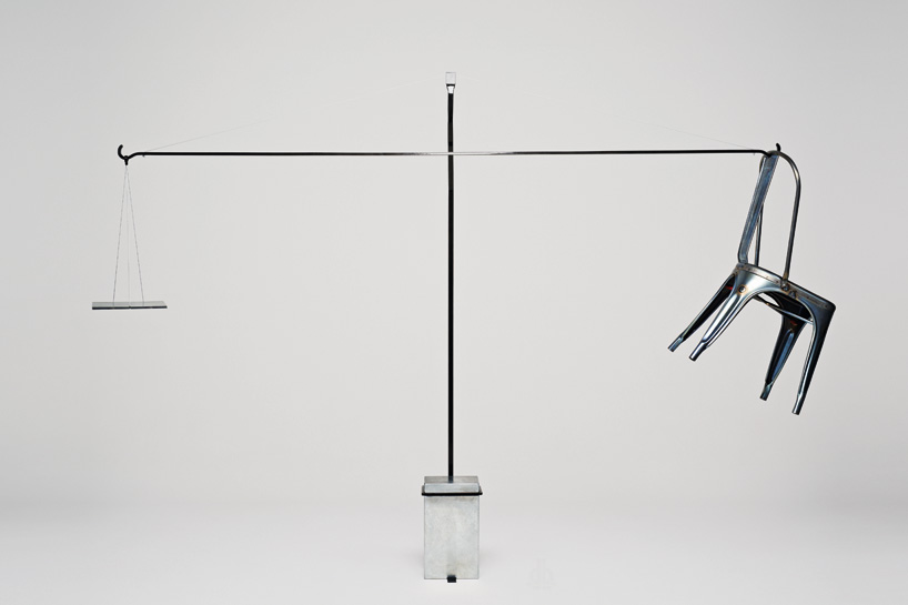
‘our idea was to allow the public to learn more about the chair. we have neither altered nor added any element to the original design. we just hung the chair on a pendulum arm balanced against a piece of metal of the same weight on the other side. this way, the public has the opportunity to discover the production process and experience the clever use of the metal.’
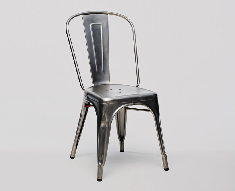
the original ‘chaise A’ chair by xavier pauchard
image by fabian frinzel


