‘typomaps’ by dirk schächter
german designer dirk schächter has created typomaps,which is exactly what it sounds like: a map that combines the elements of geography with typography. the shape and size of the countrys’ names are set to correspond with the respective land mass. to attain a level of likeness that couldn’t be achieved with automatically generated computer program, each letter is carefully handset. dark blue on one side and light blue on the other, the double-sided poster uses helvetica neue black condensed as its font of choice.
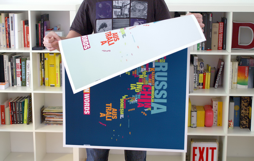 double-sided
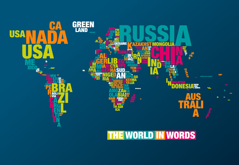 in dark blue
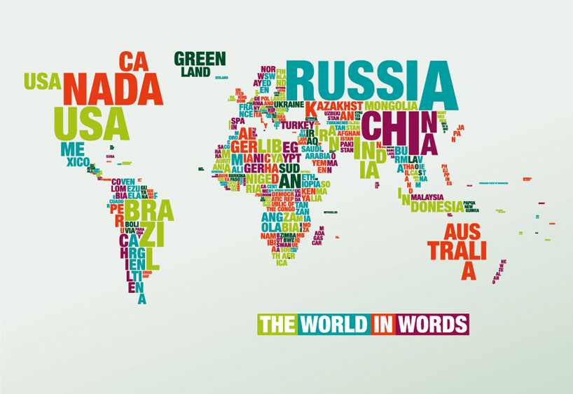 in light blue
KEEP UP WITH OUR DAILY AND WEEKLY NEWSLETTERS