DEUTSCHE BANK future banking competition winners revealed


the DESIGNBOOM x DEUTSCHE BANK competition saw more than 2000 participants from 80 countries submitting proposals, each offering up their vision of ‘future banking’. the brief sought out smart ideas, applications, gadgets, products or services provided by the bank that were aimed at supporting and enhancing customers’ experience in relation to the branch experience or their digital day-to-day and life planning bank transactions; or that surprised and inspired them in a positive manner.


the jury was comprised of:

katharina berger – DEUTSCHE BANK, head of design thinking
nadin chucher – DEUTSCHE BANK, director q110 (die deutsche bank der zukunft)
michael tirpitz – DEUTSCHE BANK, director marketing
nikolaos alexopoulos – DEUTSCHE BANK, project manager branch design
massimo mini – DESIGNBOOM, CEO
stefan diez – stefan diez office, industrial designer
emmanuelle moureaux – emmanuelle moureaux architecture + design, architect


after much deliberation, we announce the top three winners of the DEUTSCHE BANK ‘future banking’ competition!:


 first prize winner
‘LIFEWIRE’ by marita mitrovic from the netherlands

lifewire marita mitrovic designbooom


designer’s own words:


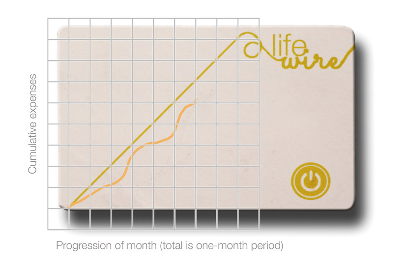
the ‘LIFEWIRE’ debit card shows you how much money has been spent, relative to the amount of money that you could have spent.


first, the definition ‘true balance’ has to be integrated into the online banking environment. instead of receiving information concerning our liquidity situation, more information should be provided on how much money we can actually spend. this means that our fixed expenses need to be subtracted from our monthly income, as this money is already ‘reserved’ and therefore cannot be categorized as ‘spendable’. dividing the amount of one’s true budget by the days of the month, one knows exactly how much can be spent, on a daily basis.


if, hypothetically, someone would exactly spend this amount everyday and his expenses would be presented in a graph with the cumulative expenses on the y-axis and the days of the month on the X-axis (picture 2), a  45 degree line would appear. this line, which represents the gradual use of your true monthly budget, is displayed on the ‘LIFEWIRE’ card and will always be present.


by pressing the button on your card, a second line appears on the card indicating the history of your true cumulative expenses. this way, a comparison is constructed between your allowed cumulative expenses and true cumulative expenses. the ‘LIFEWIRE’ card delivers real-time information on your financial situation anywhere and at any time.

 
some adjustments to the debit card have to be made. the magnetic stripe of the card and the autograph on the back should be rearranged to the front, right above the chip. this way, all important information will be placed on one side of the card, leaving the back empty. here, the permanent graph with a 45 degree line will be present, indicating the amount one is allowed to spent up to that point in time, based on his or her income and expenses. a transparent OLED screen should be attached to the card, covering the permanent graph (picture 5). the screen will display the amount of one’s true cumulative expenses when the button is pressed. in order for your card to receive the necessary information, an application of the bank should be installed on the phone first. a low-energy bluetooth chip (integrated in the card) will connect with the app, in order to retrieve real time information on one’s true cumulative expenses. energy will be provided by an ultrathin, bendable lithium battery which exists in many variants. a battery with the size of 0.6 x 36 x 42 mm for instance, has a nominal voltage of  3.7 volt and a theoretical capacity of 40 mAH.  assuming the graph would appear for a maximum of 5 seconds two times a day, the battery could last for at least two years. after this, the battery could be charged wireless.


how ‘LIFEWIRE’ works
video courtesy of marita mitrovic


second prize winner
‘THE REMINDERS’ by juan gasca, nacho rodriguez + rafael saragoza of spain

the reminder deutsche bank designboom


designer’s own words:


imagine that you have a dream…


what do you do?
do you buy a piggy bank?? or do you open a bank account??
but…how do you involve people to support your dreams? or… how do you motivate yourself to keep your desires in mind?


what if we could link the digital world with the analog world? this is what ‘the reminders’ proposes — acting as a reminder of your dreams and aspirations.


how does it work?
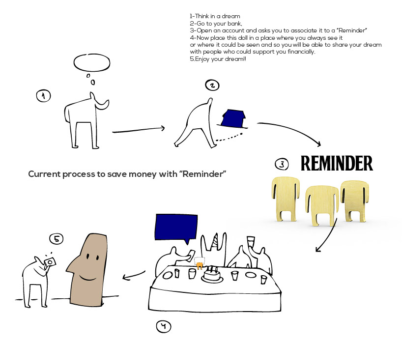
1 – think about a dream
2 – go to your bank, open an account and ask to associate it to a ‘REMINDER’ (a wooden dummy)
3 – now situate this doll in a place where you will always see it, or where it could easily be seen so you will be able to share your dream with people who could potentially support you financially.


what is a ‘REMINDER’?
a ‘REMINDER’ is a wooden dummy associated with an account via NFC card. the doll acts as a dock in which you can place a picture of your dream, so that every time you or someone else may close the mobile, an amount of money could be donated to the account, helping you reach your goal.


how ‘the reminders’ works
video courtesy of thinkers co.


third prize winner
‘GRUP’ by joanny causse, guillaume faure, rahman kalfane + alexis porhiel from france

grup deutsche bank designboom


designer’s own words:


‘what is GRUP?’


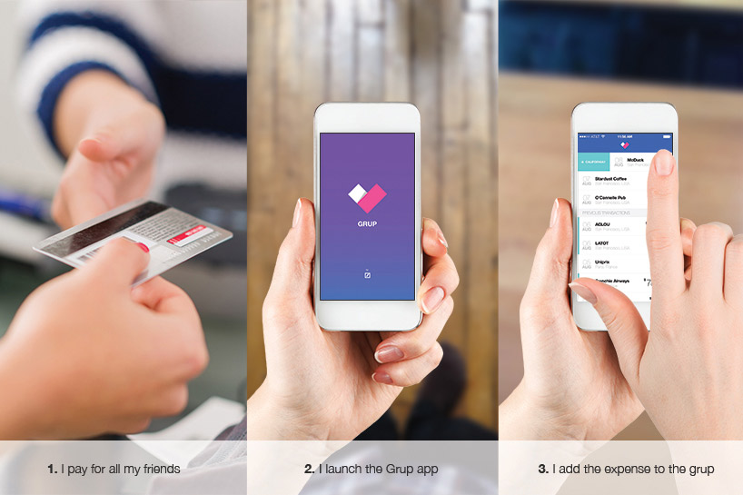
‘GRUP’ is the best way to handle shared expenses. it’s a simple app that allows you to do only one thing: add expenses into a group of people (family, friends, co-workers), or as we like to call it, a ‘GRUP’. once you have indicated your account number and password, you just have to select the expense you want to add to the ‘GRUP’ and the app will do the rest. when you wish to get your money back, just hit the « pay me » button and your ‘GRUP’ members will receive a summary and a link to transfer money directly to your account. don’t worry about asking for your payment, ‘GRUP’ will do it for you until you have been repaid.


the ‘GRUP’ app offers solutions to three major problems:


1. it removes the tension of sharing the bill because you deal with expenses after paying them, with only one payment made for the GRUP.
2. it keeps record of all expenses and does the math for you. everything is saved and divided equally between all members of the GRUP.
3. you never have to deal with bank account details, as everything is done online and already pre-registered for you.


how the ‘GRUP’ app works
video courtesy of guillaum faure


see the entire shortlist of winners of the DESIGNBOOM x DEUTSCHE BANK future banking competition here.