DESIGN AS IT IS. at singaplural presented at IFFS 2014
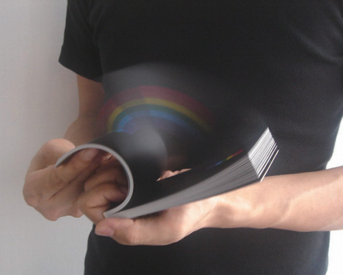
‘rainbow in your hand’ flipbook by PARTY (masashi kawamura) pictured above
photo by PARTY
nosigner has curated ‘DESIGN AS IT IS.‘, an exhibition that addresses our relationship with design. offering new perceptions of how we understand the objects around us, the pieces being displayed have each been conceived as a response to the environment around us, and not simply as a result of an exercise in form. the international showcase of creative works speak to various aspects of our daily lives, and is being presented under the singaplural program of the larger IFFS international furniture fair singapore, from march 13th – 16th, 2014. ‘DESIGN AS IT IS.’ recognizes the value of design and its ability to solve social issues, serving up a visual and contemplative display of projects by seven studios that each merge form and function, proving that these considerations are equally integral to their existence.
‘rainbow in your hand’ flipbook by PARTY (masashi kawamura) brings emotional value to its user, whereby instead of projecting a moving animation on its pages, it alternatively creates a 3D rainbow between them.
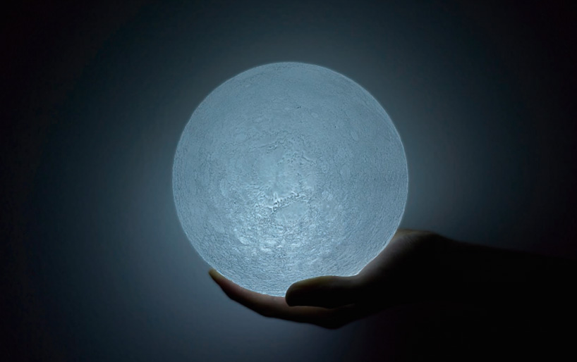
‘the moon’ light by nosigner (eisuke tachikawa)
photo by nosigner
nosigner has developed ‘the moon’ for K’S design lab, a lamp which draws its influences from one of our earth’s most fundamental sources of light. the design has been conceived to reproduce the moon in its entirety, based on topographically accurate 3D data retrieved from the JAXA satellite ‘kaguya’.
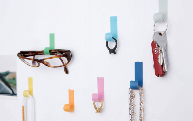
‘tapehook’ by torafu architects (koichi suzuno and shinya kamuro)
photo by fuminori yoshitsugu / hideki ookura
torafu architects created the ‘tapehook’ after exploring the potential tools that could be made from processed paper. curling the tip like a piece of tape, the resulting form is then soaked and dried through a process that makes it strong enough to support small accessories or keys. the design, produced by kami no kousakujo creates a visual illusion and sense of wonder.
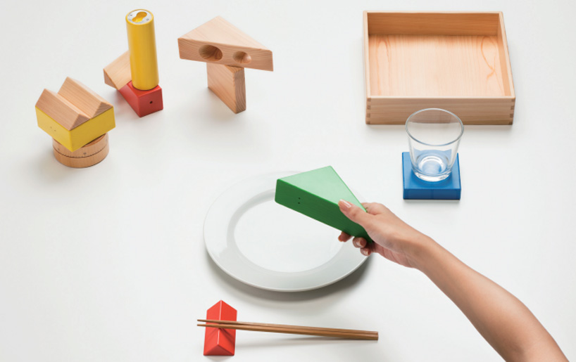
‘kitchen blocks’ by torafu architects (koichi suzuno and shinya kamuro)
photo by takumi ota
‘kitchen blocks’ are kitchen tools by torafu architects which have been created to resemble the popular children’s toy, wood blocks. produced by hida sangyo, the geometric forms are transformed into a salt and pepper shaker, toothpick holder, bottle opener, chopstick stand, coaster and spaghetti measure, creating a fun landscape across the dining table.
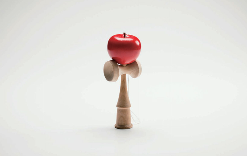
‘apple kendama’ by yasuhior suzuki
photo by takumi ota
yasuhiro suzuki references the famous story of sir isaac newton watching an apple falling from a tree – from which he defined the universal law of gravitation – as the basis of creating ‘apple kendama’. the popular game sees the red paint of the apple peeling off with time, as the surface starts to reveal itself much like a real rind off the tree-grown fruit would appear.
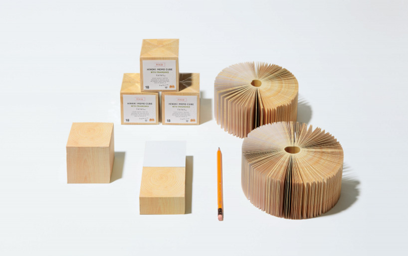
‘hinoki memo cube’ by mr_design (kenjiro sano)
photo by mr_designer
the ‘hinoki memo cube’ by mr_design resembles a block of wood on first glance. however, to heighten one’s senses when using the notepad, the scent of natural wood can be experienced as a sheet of paper is removed.
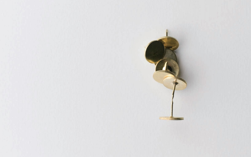
‘magnet tack’ by kosho tsuboi design (kosho tsuboi)
photo by nozomu matsunaga
kosho tsuboi design‘s (kosho tsuboi) ‘magnet tack’ is more than just your average pushpin. within each, there is a powerful magnet, allowing you to explore a number of possible uses for the generic office supply.

‘light bulb’ lamp by kosho tsuboi design
photo by nozomu matsunaga
playing with the idea of seeing a light bulb from angles that are different than usually expected, the ‘light bulb’ lamp by (kosho tsuboi) creates a warm ambiance, using the element that is normally hidden behind a shade, as its focal point. with an additional screw base fixed to the illuminating object itself, so it seems not as it appears.
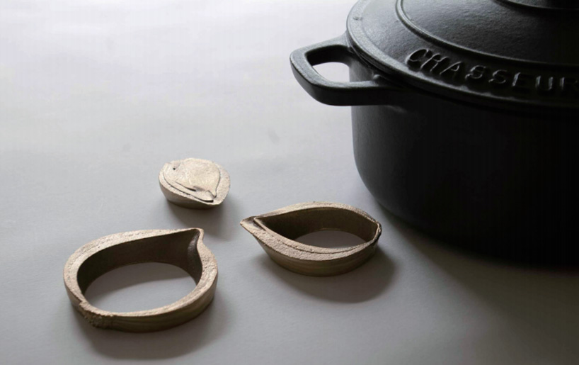
‘onion’ versatile trivets by graf
photo by yukitoshi toda
‘onion’ by graf studio (yusuke komatsu, kurasuhito kurasutokoro and yukitoshi toda) is a series of brass trivets that borrow their formal elements from that of cut fruits and vegetables. apple wedges become book weights, onion rings function as versatile trivets for any pot or pan, onion slices become chopstick holdrs, and fruit stems become skewers, creating a harmony between food and the table setting.

‘awaglass’ hourglass bauble by studio note (norihiko terayama)
photo by studio not
‘awaglass’ hourglass by studio note has been designed as an object in which to enjoy time, rather than measure it. within the vessel, water drains, creating a dense collection of bubbles within the lower portion of the piece. watch as bubbles are made, multiplied and eliminated.
