— the following is an example of a lesson from the upcoming food course: play with your food
 by jimmy zhang
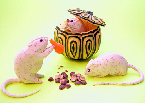
for hygiene reasons we are taught not to play with our food when we eat – but that’s not to say that we can’t prepare meals in more creative ways. as colorful and hand-made communication exploded in the early 2000s we have seen food as an art resource used more and more.
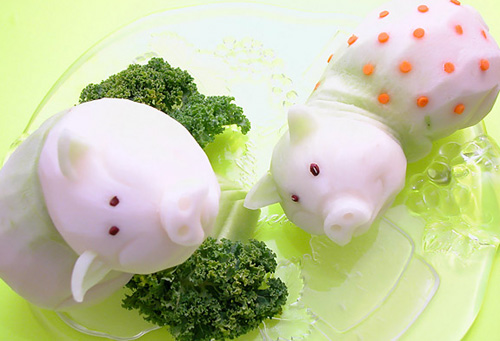 by jimmy zhang
sculpture it might be enjoying cool status currently but food art is nothing new. people have long been carving fruit and veg to resemble objects, especially in asia. in some instances chefs are taught the basics of food carving during their training and others pick it up as a form of stress relief.
the art of food carving is now recognized with international competitions and those who excel at it can make a good living from exhibition pieces and teaching.
while there are specialist food carving tool kits to be bought artists or hobbyists usually find a combination of art blades and reliable kitchen utensils sufficient – but the most fun resource in this field is of course the food itself.
fruit and vegetables are popular because of their strange forms and bold colors but there’s also plenty of examples of powders, pastas and other food types being used to make sculptures and images. so what has made food art so popular all of a sudden?
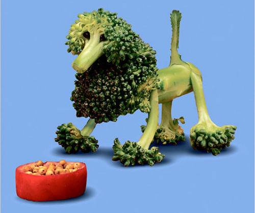 by saxton freymann
child’s play some culinary trend watchers have stated that artist saxton freymann might have something to do with it. his children’s books which he began work on in 1997 are illustrated with cute, minimal food sculptures. penguins made out of a chinese- eggplant and a baby hippos made out of peppers. there’s a banana dog and garlic kitten along with a turnip that becomes a baby duck and cauliflower sheep.
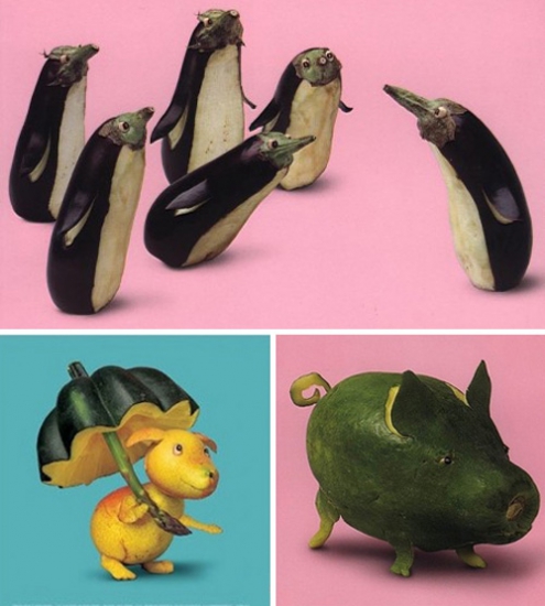 by saxton freymann
it’s not as though he invented the idea of making characters from food, but certainly his style of presentation seems to have had an influence on advertising and other communication in recent years.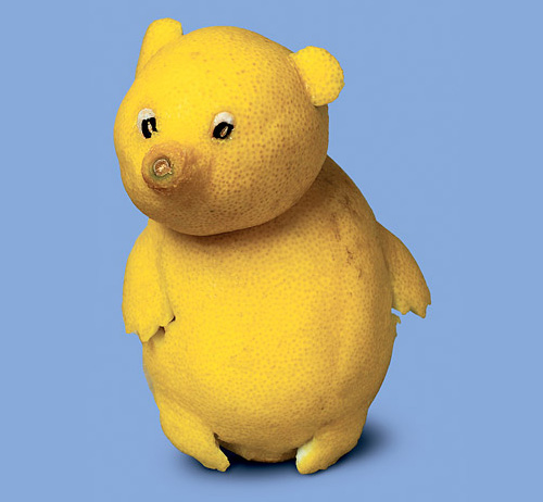 by saxton freymann
while he states that he never spent a great deal of time playing with his food as a child the new york based artist / writer has certainly made up for lost time. with a series of books now on the market, which are illustrated with his humorous food creations.
‘I do not have a favorite food. I like them all, both for eating and for making things. when I am working with them, different shapes are useful in different ways. I love the expressive faces you can find in a pepper. I love the different animals that can emerge from a banana. mushrooms, with their round bodies and long thick stalks, can be used to make tables, chairs, cars, people, almost anything.’
‘I hope kids and parents enjoy sharing my books with one another and that the books encourage everyone to look twice at the familiar. the world around us, particularly the organic world – is so full of possibilities and beautiful surprises. unfortunately, it is easy to stop looking for these. when you think you know what something looks like, sometimes you stop seeing it.’ – saxton freymann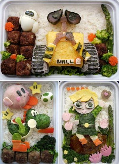 bento by anna the red
kyaraben / character bento packed lunches in japan have long been put together with great care and attention to detail. bento, usually consists of rice, fish or meat, and one or more pickled or cooked vegetables. as a way to get children more interested in eating new types of food parents began to make characters and scenes with ingredients. character bento or ‘kyaraben’ as it is known in japan has become so popular that there are contests held and some brands have even began to employ the approach. in this lesson you can see how some have taken on pop culture themes and present interesting ways of how food might be used in commercial environments in the future.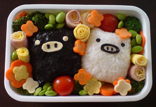 see how this bento was made
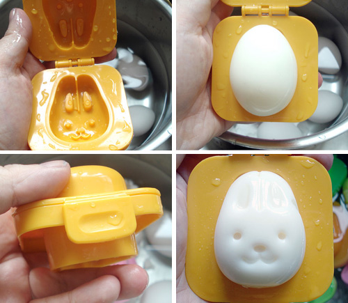 bento has reached a level of popularity now where companies have begun to produce tools to aid enthusiasts in their designs – read more
creative futures? whether it’s the intricate carving of food for display or the playful approach demonstrated by freymann and character bento food new approaches to food seem to be creeping into the consciousness of the creative industries. perhaps the rise in the natural and craft aesthetic is a response to the digital lifestyles we now find ourselves so wrapped-up in?
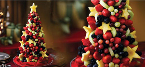 fruit xmas tree – more
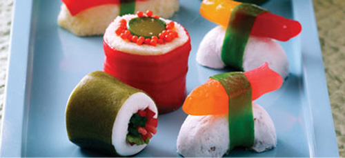 sushi candy –more
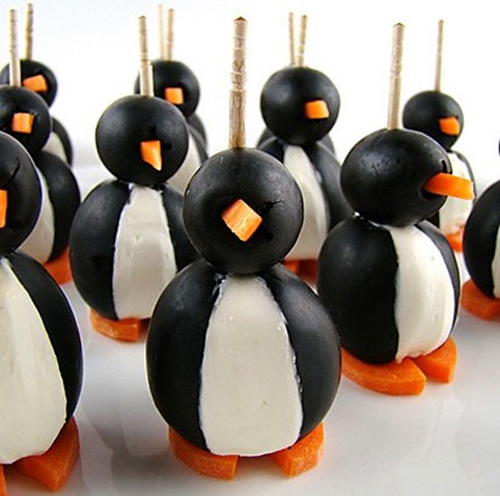 olive penguins –more
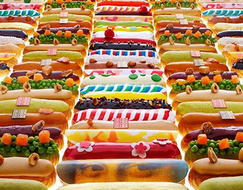 fauchon’s printed éclairs coated with, not your typical glazed-over chocolate, but the mona lisa and patterns
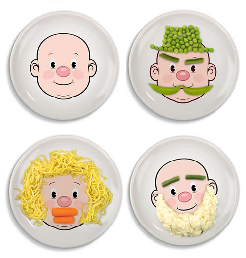 if you don’t find dinner time enjoyable, maybe this will help make meals fun – more
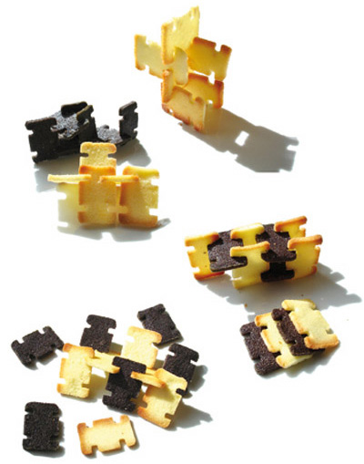 ‘carte a manger’ by julie hhh
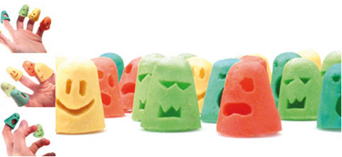 ‘patagdoigts’ by julie hhh
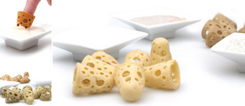 more finger dippers from julie hhh
maybe food and especially healthy foods are going to have to become more complex in their appearance to attract younger generations so influenced by artificially colored creations that stimulate their interest. the presentation of food can not only attract newcomers it can also give older audiences a reason to consume foods they might not have had in a while and also help them re-evaluate their eating habits.
— part 2 – marti guixe
having had enough of designing products spanish designer marti guixe began ‘food designing’ in 1997. a former droog collaborator who also had his own studio in barcelona – proclaimed to ‘hate objects’ and remedied this by turning his attention to gastronomy. ‘I will buy perhaps two chairs in my lifetime, but I buy food three times a day’.
thus he became what he describes as an ‘ex-designer’ who is dedicated to inventing ‘brilliantly simple ideas of a curious seriousness’. ‘I eat the same food as always… food needs a design revolution like furniture went through in the 80s’.
his view is that for many years food has no longer been a necessity but a consumer product and therefore it is able to be designed. drawing comparisons between the food and design industries guixe views chefs are the craftsmen – the makers, using tools and traditional techniques to make authentic goods. highly industrialized food developed by engineers and marketers imitates traditional food. he likes to draw on the similarities of food made in a humble way to furniture built for necessity and celebrative cuisine like that of mass produced products.
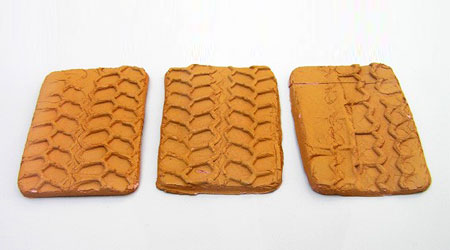 ‘autobahn cakes’: cookies for eating while drivng, with tyre print relief on them, 1997
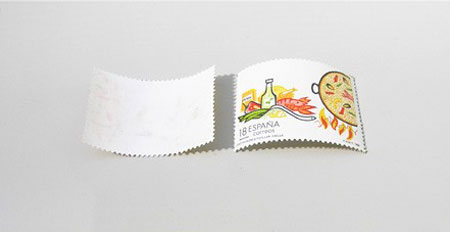 flavored stamps, 1997
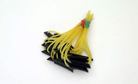 ‘tapas-pasta’: asystem to cook pasta that allows you to eat it like tapas. it improves the idea of eating a dish of pasta with several persons, and also allows to eat a dish of pasta trying different kinds of sauce, 1997
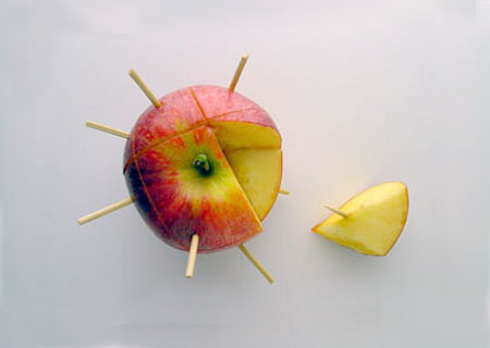 ‘3D-snack’: pre-cut fruit that allows you to verify that you get the whole fruit, 1997
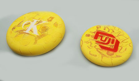 ‘sponsored food’: the idea of creating a network of sponsored food to eat for free, 1997
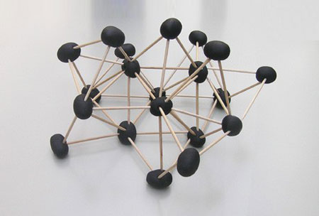 ‘olive atomic snack’: three-dimensional tapas, in the shape of atomic models, 2000
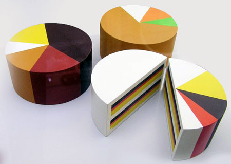 ‘I-cakes’. the pie graphic indicates the ingredients of the cake in percentages. decoration becomes information. prototypes 2001
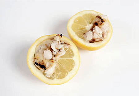 fish and lemon – with one hand, you squeeze then eat, 2001
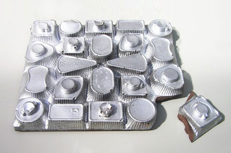 edible element that steals (mimicks) the shape of its container to eliminate it, 2001
food products and systems guixe began with a performance called spamt+ at the H2O gallery in barcelona where he and four people of different cultures investigated new ways to eat the catalan snack ‘és pà amb tomàquet’ (hollowed tomatoes filled with bread and olive oil) which is abbreviated to ‘spamt’.
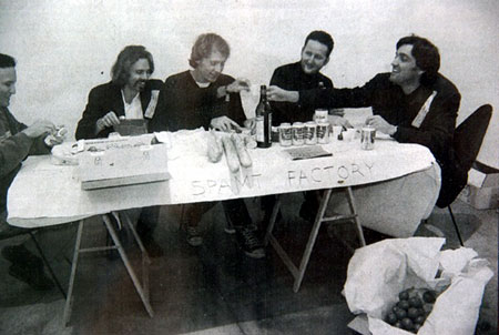 ‘spamt+’ at H20 gallery, barcelona, 1997
a japanese man (a symbol of sushi and fine sliced food) had the job of cutting the tomato using the spamt tool (a circular utensil that puts holes in the vegetable, while a swede (representative of ’empty, minimal design’) cleaned out the central part. a frenchman (symbol of the baguette) put a piece of bread in the hole, and an italian (symbol of olive oil) doused it in salt and oil, lastly martí guixé closed the tomato once again, as the co-ordinator of the whole process. one hundred people tried the product and many stated that it was better and more practical than regular pà amb tomàquet. at the same show guixe also presented a number of food products: flattened cookies that were decorated by tyre print and pre-sliced fruit that ensured each piece was the same size. flavoured stamps – that had food images on one side and the flavour of that food on the other. edible corks for drinks bottles and tapas-pasta, a system to cook pasta that allows you to eat it like tapas – challenging the idea of eating pasta with one sauce at a time and instead dipping bundles of the food into various sauces.
for guixe the show was a personal success in that he was able to show food as an edible, designed product by removing association and tradition. however most people weren’t sure what they had just seen…‘in early 1997 the design scene at that time did not take me seriously’.
nevertheless guixe continued with the project building ergonomic, functional, communicative, interactive, food products that are ‘contemporary and timeless’ in their nature.
given the nature of the project you might think that guixe is a food fanatic – but he says that he’s not: ‘I’m not interested in gastronomy, eating, or food in general, and I cannot cook. I am interested in food, as I consider it is a mass consumption product and I like the fact that it is a product that disappears – by ingestion – and is transformed into energy’ I am interested in systems’.
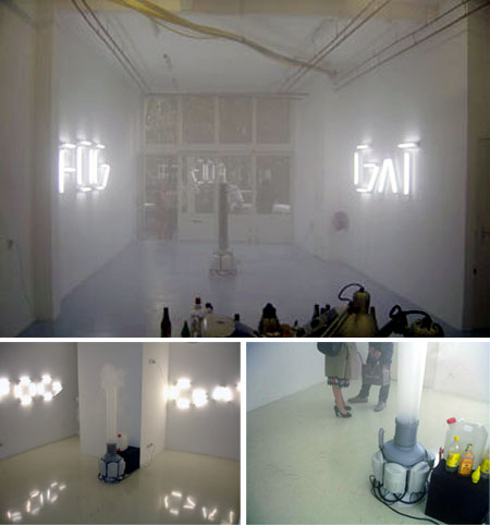 ‘gin and tonic fog’, utrech, 2004
some of those systems include sponsored food, where pizza or tortilla bear the name of non-food brands made from edible ingredients. there’s also food karaoke where visitors to guixe’s exhibitions are asked to follow the video projection with their hands and prepare a spamt snack. another equally playful installation was the GAT FOG party, first shown in 2004 where artificial fog is made from the constant mixing of gin and tonic. then there’s the somewhat conceptual ‘pharama food’, 1999 a proposed nourishment system whereby people could obtain any nourishment they need by simply walking into a room filled with vitamins, amino acids and minerals an just breathing in.
restuarants and eatery concepts guixe has also examined the surroundings in which we dine and how we function in those places, both commercially and within an art context.
one the earliest food spaces that guixe designed was ‘camper foodball’. described by guixe as a health food store, a restaurant, a bar, a fast food restaurant, a take-away, and possibly a point of encounter or a reference point in the context of a neighbourhood.
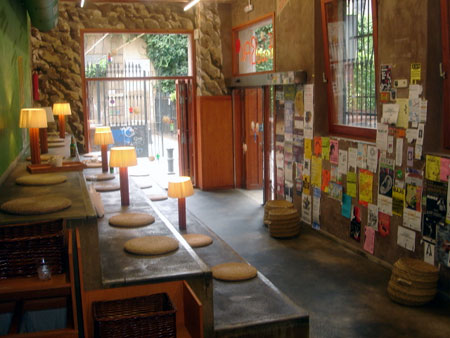 ‘camper foodball’, 2004
the foodball serves up guixe’s food concoctions in ball form (much like the spamt). by making the space as informal as possible, foodball is open to interpretation – being different things to different people. the lack of a predefined food type being served enhances this experience, and promotes a casual way of eating.
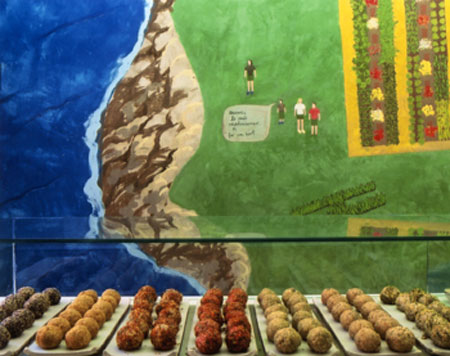 ‘camper foodball’ – foodballs, 2004
the space is divided into three parts: the entrance with the counter; the kitchen; and the area to consume the food, a series of wide steps laid out like a grandstand – were you can sit and eat as if on the steps of a building or the curbside. these three spaces have the goal to be lacking external references: ‘they seek to be informal for contemporary people’. the decor of the space also plays an important role – the wall facing the seating area is covered entirely by naive graphics that are intended to bring the busy feel of the street indoors, and enhance the non-conventional feel of foodball.
another of his food spaces was the ‘candy restaurant’ tokyo, 2007. with this project guixe sought to formalize the informal act of eating candy to see how the setting can alter our perception of food types. the restaurant featured a preparation area where the ‘candy chef’ organizes dishes of candy and a dinning room with a round table and seats for eating candies formally. four set candy meals were served to customers with instructions on how to eat them.
next came his internet-inspired ‘food facility’ an eating space that sources its food from nine nearby restaurants, working in very much the same way as a search engine. set up for a few weeks at mediamatic in amsterdam, 2005, guests sat inside the food facility and chose what they would like to eat from a take out menu, (they could select from a number of different food types, chinese, italian etc.) and then the food is brought to them via scooter delivery.
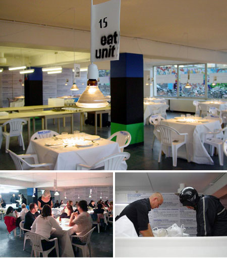 ‘food facility’, amsterdam, 2005
the FF model requires more interaction and a more active approach from the customers, providing them with very little atmospheric structure. ‘you have to choose a food typology, which is difficult in the neutral environment’. in fast food style the food facility asks that people pay upfront for the food.
‘food facility proposes a very complex mechanism that allows you to consume a very specific meal, without having the circumstance of an specific context and time. In this way it is meta-territorial but at the same time it refers to territory by importing the basics, in this case the food, from takeaways that basically rely upon selling the romanticism of an idealized geographic location like japan, morocco or italy. food facility breaks the limits of time and territory and is meta-territorial and extends and controls the moment as a contextual influence.’
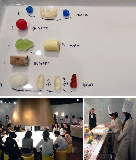 ‘candy restaurant’, tokyo, 2007
the future of food designing guixe’s food designing has slowly gathered a decent following from the design and art worlds and ten years of the project were celebrated at the 2007 milan design week along with a print publication. however guixe is still surprised that no established or emerging food brands have really latched onto his ideas and that the food designing is largely limited to non-commercial outlets.
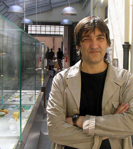 marti guixe – portrait © designboom
in theory the ex-designer makes quite a reasonable point: not only are their very few innovations in the foods which we buy regularly but also in the way that we eat them. could it be that when it comes to buying food most of us are extremely conservative, are we too loyal to brands we know and dishes we are sure of? why not prepare meals in new ways or investigate new foods?
guixe’s food project allows us to become more aware of just how mainstream choices and tradition affect our own decisions. why people stick to what they know and why somethings take many years to change.
by thinking of foods purely as products we might be able to disconnect some links between what certain foods mean to us and how we eat them but ultimately – even if foods are products – they might well be the most important ones we buy. after all they have a huge impact on our health and well-being, and it’s very difficult to get people to change tried and tested ways with things that have such an affect on our daily lives.
related links: http://www.food-designing.com http://www.guixe.com
part 3 – marije vogelzang
for many people the idea of designing food is largely about its appearance but for marije vogelzang it’s also about the story behind the food and how it is interacted with. her interest is in not limited to design or food but rather the verb ‘to eat’.
‘I think of an eating designer as someone who is sewing the food, harvesting the food, taking it out of the ground, cooking it, sharing it, serving it, putting it on the table and then putting it in the mouth and then eventually going to the toilet – that’s also a part of the design process.’
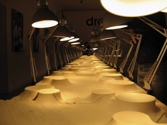 connection dinner – the angle poise lamps ‘cook’ the tablecloth made of dough for a night before the dinner. bowls are set up underneath.
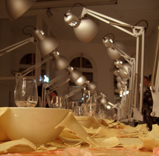 the meals served were hot and soggy things like soup and stew that cook the dough trough and make it soft and edible again…
proef vogelzang graduated from the design academy in eindhoven in 2000. after working with a handful of dutch designers she opened ‘proef’ in rotterdam in 2004 and later expanded it to amsterdam in 2006. the word ‘proef’ means both ‘taste’ and ‘test’ in dutch – making it the perfect description for vogelzang’s spaces which embody the design studio, workshop, restaurant, kitchen, vegetable patch and farmyard. in the proef spaces vogelzang and her team experiment with new ideas, grow ingredients.
they also cook and serve food for corporate dinners and curious individuals looking for a new eating experience. ‘I’m happy that I’m not creating another chair or plate – my designs are temporary but even more intimate because there is no material coming so close to human beings as food.’ vogelzang’s work crosses numerous themes within the world of food resulting in unexpected outcomes. these include: cooking root vegetables in sculpted clay vessels, cuddly toys made with sausage meat, edible jewellery, tattooed vegetables and sugar – sculptures. while each project is completed in a considered aesthetic manner all explore and expose vogelzang’s observations of how we eat. by presenting those who eat / participate in her projects with unexpected scenarios the designer heightens and abstracts their experience. leading them to ask questions about food and eating and the acts which surround them.
this constant questioning of our eating habits has seen vogelzang serve people according to their earth sign (fire signs served spicy and hot foods, earth signs served root vegetables, water signs liquids and air signs light foods.). she has served meals on tables covered in dough, made edible cutlery and served meals on segmented plates that force people to share food with each other.
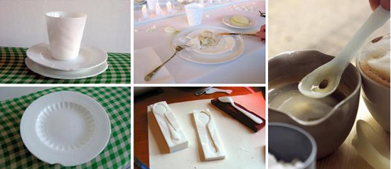 crockery made from sugar – can be used like ordinary crockery, but melts slowly. almost indistinguishable from porcelain crockery. we also made sugarspoons (of isomalt sugar) – this also melts really slowly so you can decide for yourself how sweet you want your tea or coffee to be.
 roots – exploring the shared culinary history of british and dutch root vegetables, I rediscovered clay cooking. clay cooking enables you to build sculptures, bake seasoned root vegetables and create a sensory landscape. in ancient times whole animals were baked in clay on an open fire, and after being removed from the hot coals, smashed open.
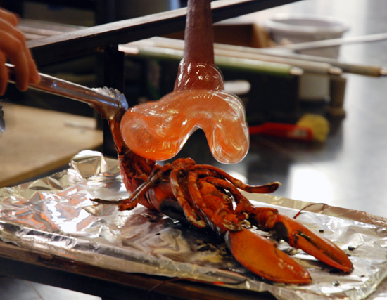 for the opening of the ‘glas’exhibition at designhuis, eindhoven, marije was invited to collaborate with norwegian artist tanja skaeter- experimenting with cooking food on hot, freshly blown glass. ‘it was great fun to experiment, and see the effects that food has in shaping the glass, not simply how it could be cooked.’
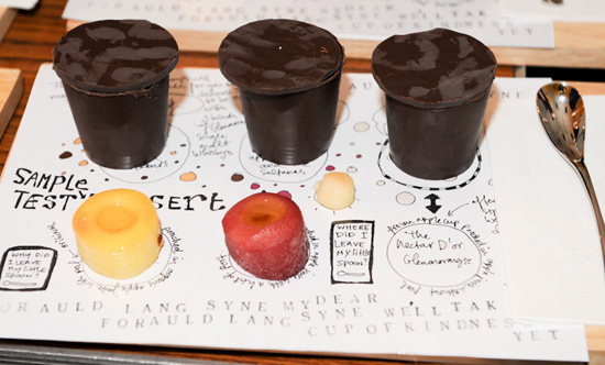 burns night – traditional scottish peasant food in a contemporary way.
8 points there’s not many aspects of eating that vogelzang hasn’t managed to investigate over the last ten years. she describes her projects as being informed by these eight core points:
1. senses smell, taste, see, sound, touch – how does the manipulation of these change our perception and experiences of food?
2. nature where do ingredients come from, seasons, eat the seeds, the sprouts, the leaves, the flowers, the fruits of the same plant and taste the differences.
3. culture etiquette, communication, history, rituals, preferences of particular regions, religious food laws, can food bring people together?
4. society mass production, sustainability, energy use for production, and food-miles, hygiene laws, politics, world hunger and starvation, excess production and farming, genetically modified foods.
5. technique bake, steam, grill, smoke, fry, pressurize, de-hydrate, drill, sew, cut, print, knit, micro-cuisine, macro-cuisine, workshop-cuisine
6. psychology memory through eating, aphrodisiacs, food as a healer, rewarding with food.
7. science dietary science, cocking-processes, physical and emotional reactions, vitamins.
8. action feeding someone, sharing, surroundings, body-position, tools, preparation.
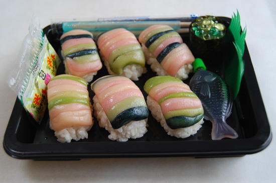 faked meat – a project that started as a reaction to the meat substitutes that supermarkets have had on their shelves for a long time already, sometimes even amidst the ‘real’ meat products. tofu, for example, can be made in the form of cutlets that, with the addition of spices, are hardly distinguishable from the meat versions.
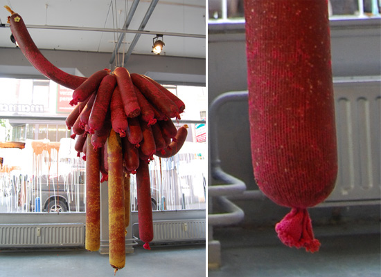 cuddly sausage – when I look round I hardly see any animals. I might see some pets but rarely I see the animals that I eat and I never saw them being slaughtered. when my daughter looks around she sees mostly cuddly animals. when she watches TV she sees them in cartoons wearing clothes and doing a little dance. this 200 kg cuddly sausage is mostly made of meat from animals that can live freely in the wild. by pulling the string, the knitting will unravel and reveal the elegantly flavoured sausage inside.
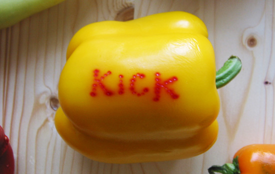 for a press-conference by hella jongerius at jongeriuslab. peppers stuffed with different ingredients each with specific qualities: brain-bombs, sex-bombs, energy-bombs.
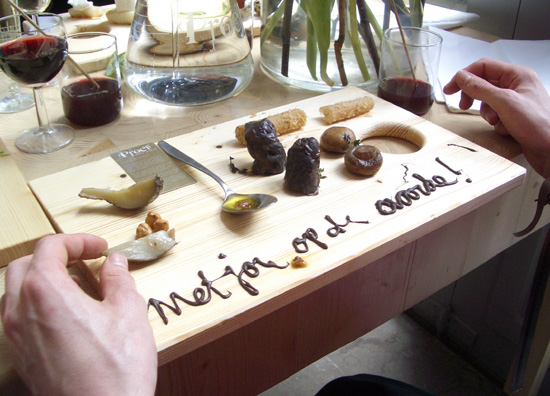 when entering proef rotterdam guests were asked for their date of birth. according to this information we could learn their astrological element; water, fire, earth of air. we served each person his or her own element-specific food.
DB: how closely do you follow what contemporaries (chefs or designers) are doing?MV: I hardly see what others are doing. I find my inspiration in other fields.
what would you say influences you the most?nature, humans, psychology, culture and daily life.
which sense appeals to you the most? and why? the senses are always connected to the brain and I think the brain is very interesting when it comes to food. the most important for me is to make the right balance between communicating through design and the taste and choice of the food, one is no more important than the other if the balance is right I can engage with the guests eating my food. they are very important too in the design, the design doesn’t end on the table. it ends in the bellies but also in the brains of the guests, food has a very strong psychological effect.
which is your favourite mealtime and why? I like appetizers
how important is the aesthetic of your presentation? aesthetics is a tool. I want to communicate a story to the person eating my food. If you want people to listen to your story you have to tell a attractive story.
many of your projects have a sense of spontaneity about them – could you describe your design process from conceiving the core idea of a project to the final presentation / outcome? the eaters of my work are a part of the design. they form a part of the outcome. usually once i have an idea I start with a sketch and the story that I want to tell. the story is inspired by the question the client asks. usually they have enough trust to let me do what I want and I communicate with pictures, sketches and words. food design and business goes well together only if people are interested in new ideas, fortunately I have open minded clients!
what tool / product could you not work without?my laptop.
which of your projects has been the most valuable for you? the white funeral dinner, the sharing dinner with the tablecloths up in the air. the colourfood for obese children for a hospital in NY. also the the world war 2 snacks that I did for the historical museum in rotterdam, we made snacks using original world war 2 recipes for guests who survived the war, it was an emotional day.
do you think any of your projects could lead to a commercial product? yes that could be very possible, but it hasn’t been my intention. if I were to get an assignment like that I would be open for it, or maybe I will start a commercial collection myself.
how can you see food design or eating design developing in the future? food design is a relatively new concept in society and designers are asking what to do with it. people say politicians should solve problems in society but I think designers should also be thinking about what they can do with regard to mass production, sustainability, hygiene levels, the empty fishing of the sea, world starvation, the over-production of food, children who don’t know where food comes from. designer can inform people and make them ask questions about these matters through their work.
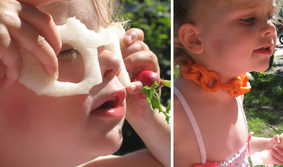 veggie bling-bling – while making the bling-bling, lots of chewing and nibbling is going on. it is a bit corny, but kids will eat the healthy snacks this way.
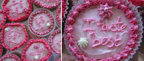 cupcakes with a lack of attention – every time we make these cupcakes I experience the psychological effect of people decidedly want to choose a certain message over another while all cupcakes taste the same. still most people will answer that they are not very sensitive for seduction other than flavour.
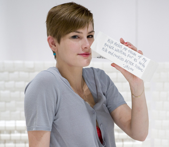 marije vogelzang
exercise you guessed it – we want you to play with your food! create either an artistic sculpture or image with ordinary food. think about form, color and the unexpected. once you have created your masterpiece we’d like you to photograph it and post it in the discussion area / blog.
—

« BACK TO THE DESIGN-AEROBICS HOMEPAGE
happening now! thomas haarmann expands the curatio space at maison&objet 2026, presenting a unique showcase of collectible design.

