various projects by turner duckworth 
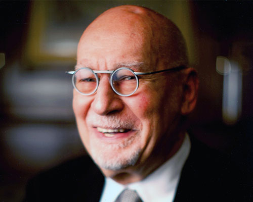
david turner of turner duckworth tells designboom his thoughts on contemporary packaging design, branding and more…
DB: could you tell us briefly about the evolution of turner duckworth? DT: it was founded in 1992 in london by myself and bruce duckworth who I met while working in london at minale tattersfield.
I’m based in san francisco and bruce is based in london, all together we have around 55 staff, which are evenly distributed between the two studios.
please could you tell us a bit about your design process? brand identity and packaging projects are approached in a similar way. a core team leads the project, while initial creative is explored by a wider group of designers. the principle of ‘competitive collaboration’ encourages designers to work together within a studio and between studios, but also acknowledges the idea of a ‘winning concept’ and celebrates the authors of those concepts.
if a designer is successful and their concept is selected they typically get to see the design through to completion. visual identity projects tend to be less finite and involve larger teams working over extended periods. each brand has a core team who know it and the client well; that includes account, planning and design directors, and a lead designer. we rotate other designers in and out of the team to keep the ideas fresh.
we use a process we call ‘distant crit’. creative teams or individuals in the sister office review work in progress and provide input. because they do not know who has done what work, and are able to assess the work without the pressures of impending deadlines, client preferences, budget issues etc. their input is highly objective and focuses entirely on the quality of the creative. they also provide a different cultural perspective. we have used this process for twenty years and believe it is a key reason for the consistently high creative quality turner duckworth has achieved.
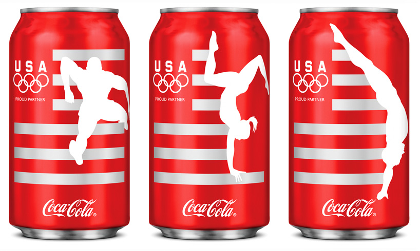
team USA coca-cola cans, 2012
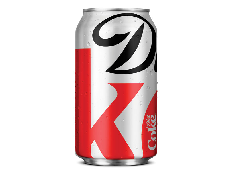 diet coke fall 2011 can, 2011
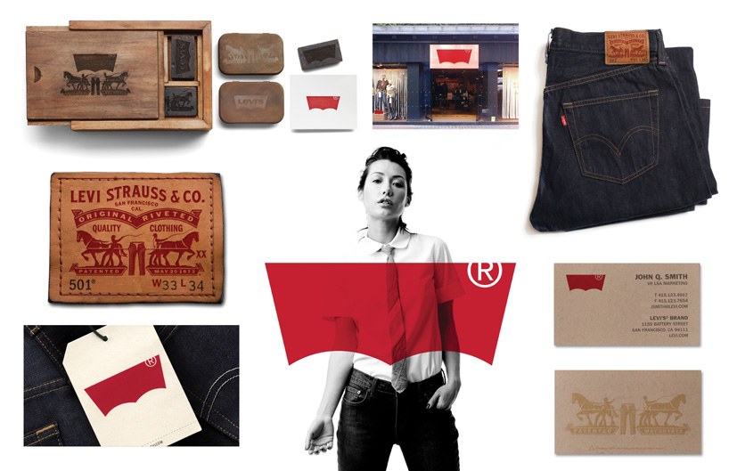 levis brand update and applications of the new logo, 2011
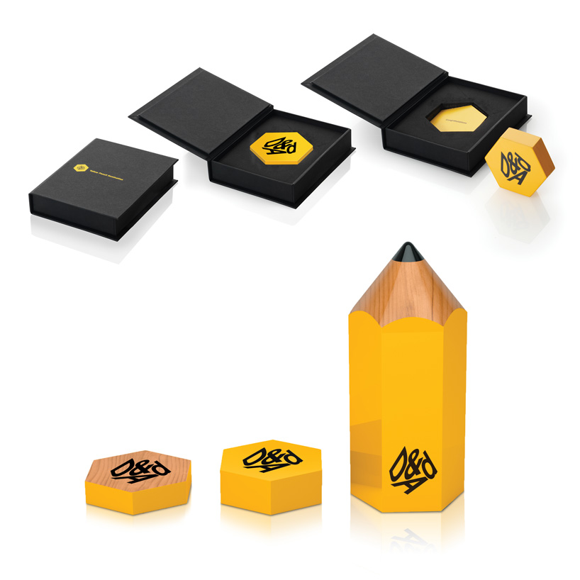 D&AD award, 2011 ‘in book’ projects receive the smallest slice of pencil, ‘nominated’ projects a slightly larger slice and winners receive the longstanding yellow pencil trophy.
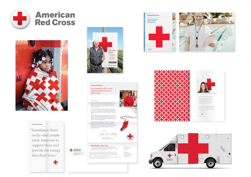 american red cross brand identity, 2012
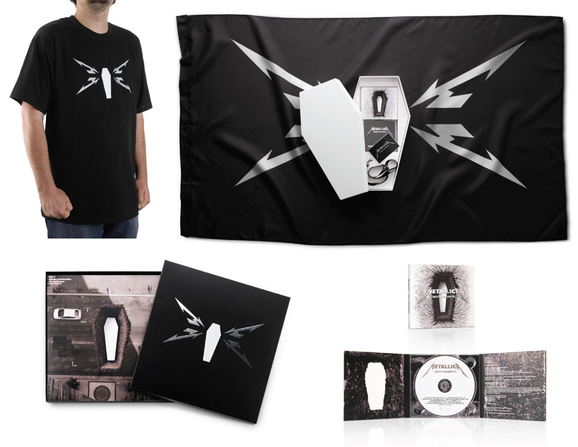 brand identity and packaging for metallica’s death magnetic album, 2008
are there any noticeable differences between the output of each studio? clients come to us based on our portfolio and expect the same approach whichever studio they engage with. we have always sought to create the same standard and type of work in both studios. we have built teams that value the same things and have the same goals in design.
we have a program where designers swap jobs with a counterpart in the other studio, our planners and account staff regularly collaborate and ultimately bruce and I have always seen eye-to-eye on what makes great design and so the results are always of the same quality.
there is a lot of great packaging in your portfolio, do you consider yourselves a specialist studio? before we started turner duckworth, bruce and I had both worked extensively in packaging and many of our early projects were exclusively packaging. over the years our work has extended out to designing complete visual identities for brands and working on brands that have no packaging or for whom packaging is insignificant.
we believe that packaging is one of the most demanding design disciplines because so much is expected of a package. it has to do everything from physically protecting a product during transportation to making a consumer fall in love with a brand, and all in a very limited space, a highly competitive environment and a rigorously controlled manufacturing budget. we believe that the discipline we apply to packaging has influenced our approach to visual identities in that we try to use the minimum number of visual components to achieve the maximum effect. we have also found that there are many packaging design studios, and many brand identity design studios, but few who do both well. if we have a specialism, that would be it.
do you think it’s a good idea for a graphic designer to specialize or generalize? when I moved to america, my old boss told me that I would be bored because the market is so huge that everyone has to specialize to differentiate themselves. he had designed everything from furniture to posters and loved the diversity. to a certain extent he was right (about the specialization not the boredom!). there is no doubt that if you carve out a unique niche, you have a very clear offering to clients and limited competitors.
but I believe young designers should stay open minded and as diversified as possible until they find something they really love. then put all their eggs in that basket and try to become the best in the world. that doesn’t mean becoming disconnected from other disciplines. no design discipline exists in isolation, and all disciplines evolve, so remaining engaged in other areas keeps your skill set relevant.
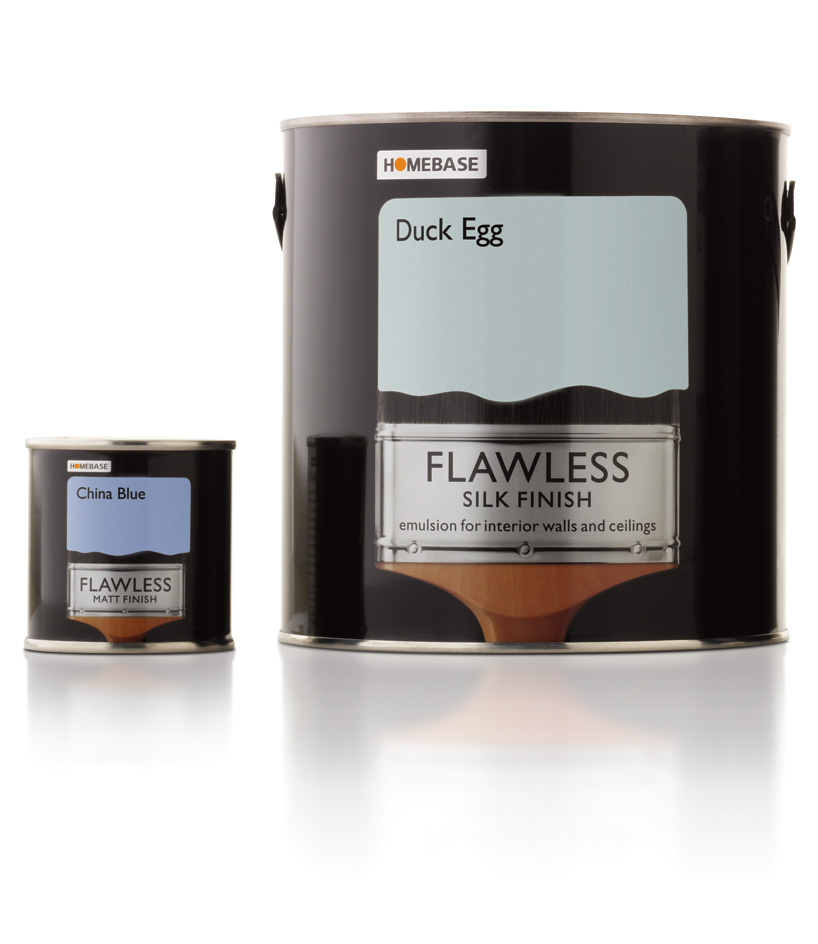 homebase paint packaging, 2007
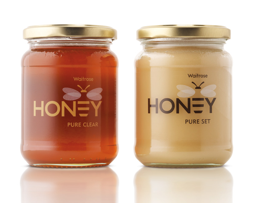 waitrose honey packaging, 2006
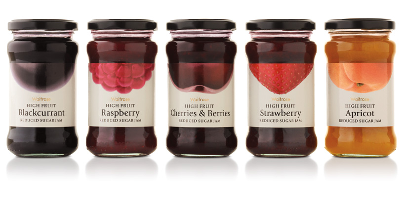 waitrose jam packaging, 2006
 amazon identity, 2000
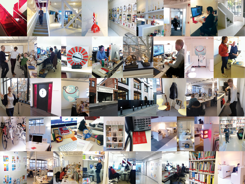 turner duckworth, san francisco office portrait
in recent years there seems to have been a rise in the popularity of packaging design, or at least the documentation of it, why do you think that is? there’s something very real about packaging. it is marketing, but it also physically contains the product. in these days of virtual experiences, there’s a yearning for reality. the physical seems to have more value. it’s also the one communication that’s guaranteed to actually be experienced by people buying your product. since media has become so fragmented, it’s the best way to reach an audience.
do you think the popularity of online design resources has heightened or lowered the quality of design being produced today? most graphic design innovation is driven by technological innovation. from the printing press to the latest version of photoshop, technology has created the opportunities that are exploited by designers. so from my point of view, bring it on!
the faster the technology moves, the more opportunities there are for creativity. my guess is that the ratio of good design to bad design remains pretty constant, but I would argue that there’s a lot more design going on now than twenty years ago.
to a certain extent, everyone’s a designer now. depending on which way you view your half a glass of water, we’re either getting more bad design, or more good design. as for reference points, now everyone has everything as a reference point, which means it’s not about being, ‘in the know’ its all about what you do with the knowledge. I think this encourages originality, which makes it harder to achieve. again, a good thing.
what are the most important points to consider when designing a piece of packaging? answer the brief. make sure it works functionally. make it as beautiful as possible.
besides design what do you have a passion for (and why)? I’ve spent the last five years working with mark jensen and the team at jensen architects to design and build my house. I haven’t moved in yet, and until I do that takes up all my spare time! I’ve learned a huge amount from that process by being on the other side of the client/creative relationship.
what piece of advice should every designer remember? quality is always in demand.
what piece of advice should every designer ignore? the above.

