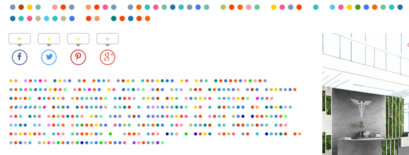
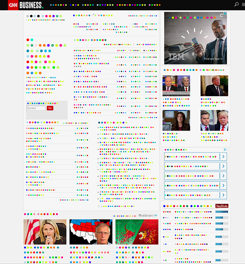
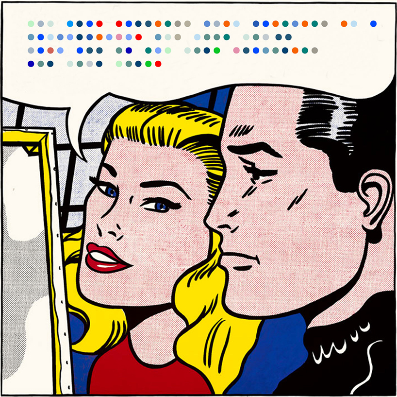
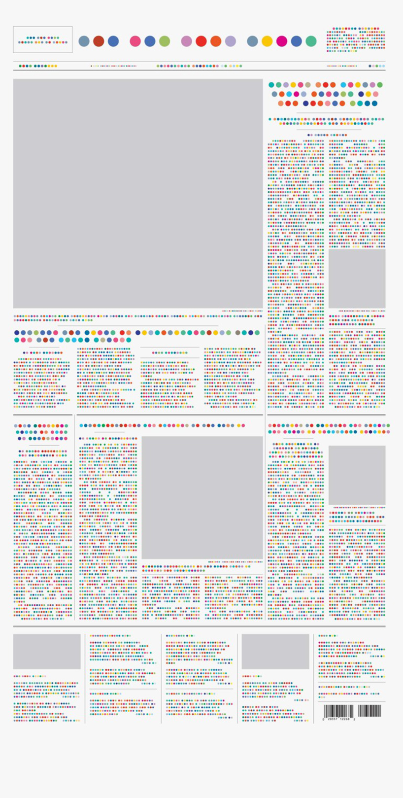
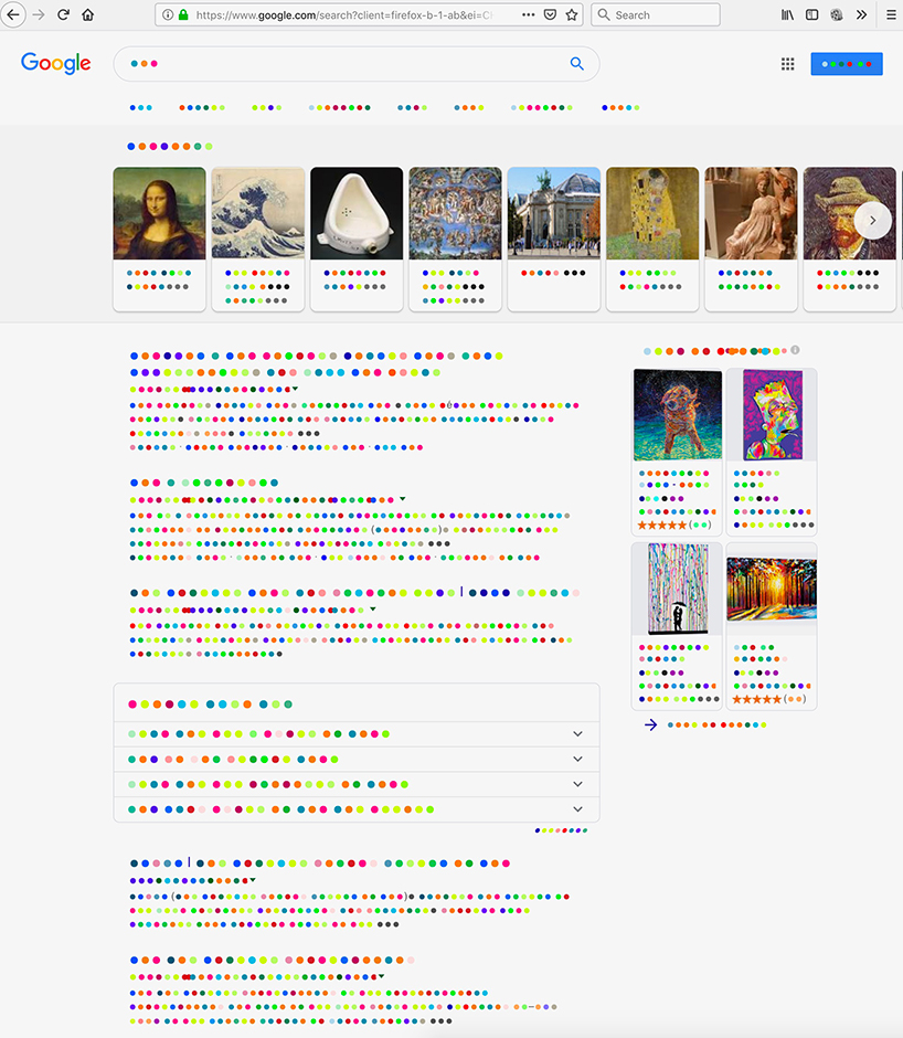
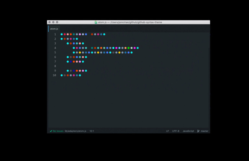
if you’d like to read this article in its colored-dot translation, you’re in luck. the guy who created the twitter logo, martin grasser, along with his design studio, ‘and repeat,’ have created such a typeface. in a couple of clicks you can download it, set the extension to your web browser, pull up your favorite news source and watch as thoughts and opinions and stories — good and bad — boil down to a batch of polka pink-red-blue-green (dots).
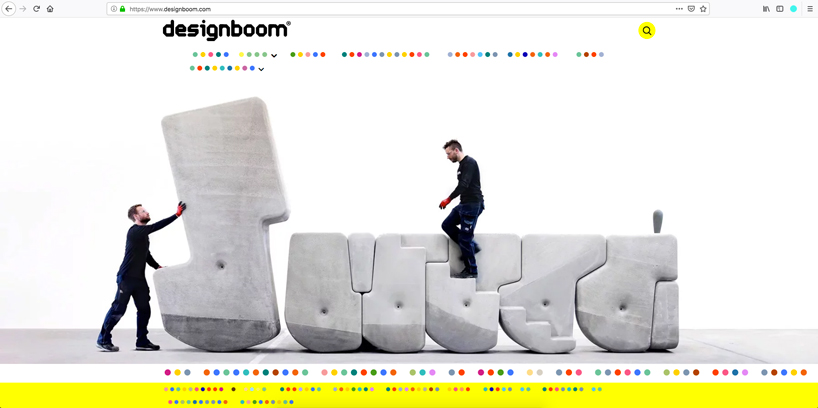
the colored dot font is composed entirely of colored circles, a simple idea that implodes the subjective building blocks of communication we’re used to. according to and repeat, ‘by replacing latin characters with dots, the color dot font frees the reader from the burden of linguistic interpretation, heightening their awareness of the structures in which language operates.’ if only we communicated this way, passive aggressive emails would be reduced to a rainbow of round thoughts. ‘death’ would be five colorful circles and ‘life’ would be four. below, we’ve screenshotted the first paragraph of this article in grasser’s colored dots. to further investigate language, download the typeface and extension on and repeat’s website, here.
