KEEP UP WITH OUR DAILY AND WEEKLY NEWSLETTERS
happening now! thomas haarmann expands the curatio space at maison&objet 2026, presenting a unique showcase of collectible design.
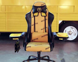
each chair reflects an individual child’s input and imagination.
connections: +910
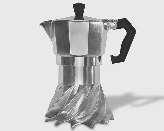
the spiral structure follows principles of fluid dynamics and thermodynamics to optimize heat distribution.
connections: 94
from 3D printed coral reefs to eggshell composite butterfly nests, designboom looks back at the top 10 social impact stories that defined 2025.
connections: 23
amid the rush of a hyper-accelerated world, the hue stands in for a blank canvas.
connections: 45
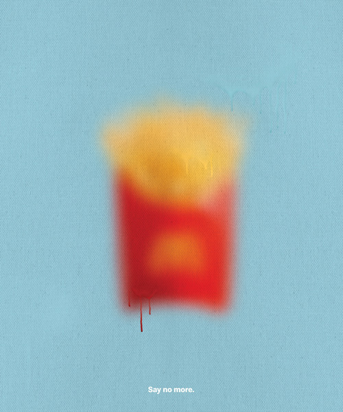
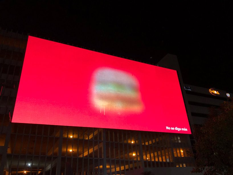 all images courtesy of TBWA\ san juan
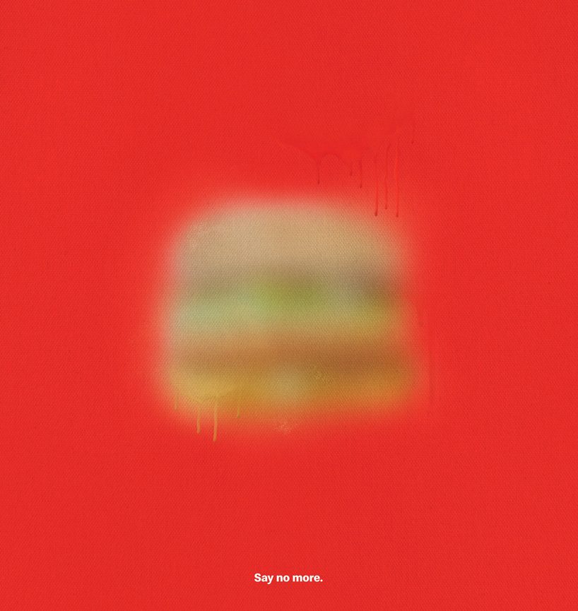 the mcdonald’s big mac appears spray-painted on a red canvas
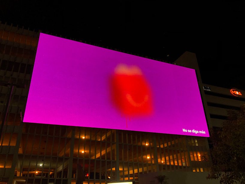 the happy meal on a street billboard
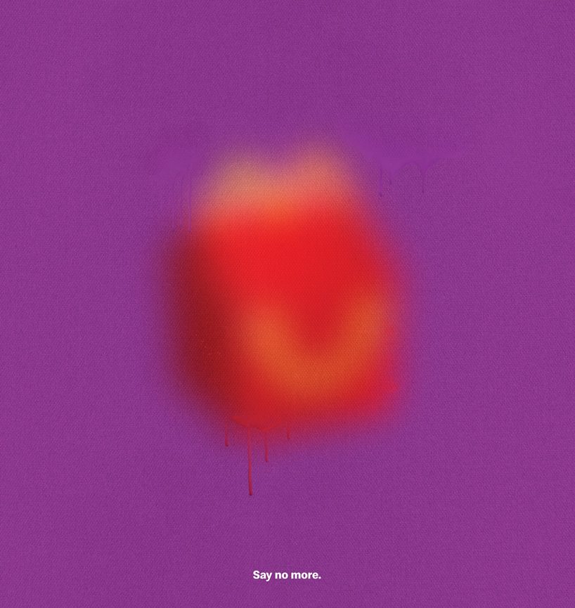 set against a purple backdrop, the item is instantly recognizable from its faded shape and color
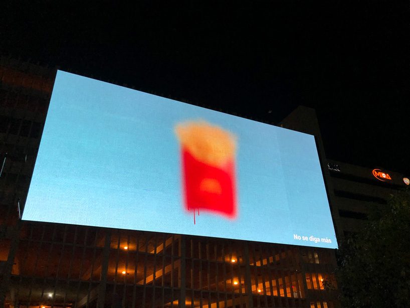 the mcfries are printed on a bright blue background
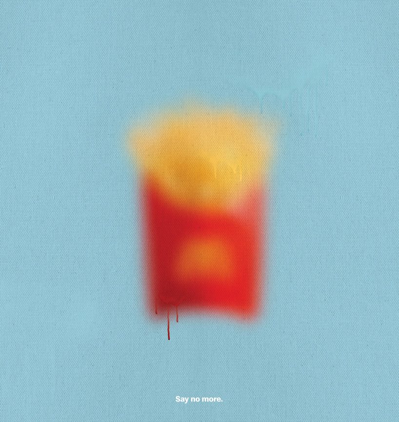 the campaign’s copy reads ‘say no more’, stating the items’ instant recognizability