powered by 2,700 journalists across 120 countries, bloomberg quicktake — the global streaming and social news network focused on business, technology, politics, and culture — is quickly disrupting the traditional broadcast TV news model. quicktake offers 24/7 content in a variety of compelling formats, including documentary-style original series, anchor-led news shows, data visualizations, motion graphics, on-the-ground stories and live events. ‘bloomberg quicktake is human, which is core to being a video medium,’ dylan greif, creative director for bloomberg quicktake shares with designboom in an exclusive interview. ‘we tell stories through the people and experts who live them.’ launched as a streaming news network in november 2020, quicktake’s identity and storytelling sensibility has built on its relationship with its audience — ‘our viewers are actually ‘users’ on a journey through interactive environments,’ greif continues. ‘our content is world-class, but it doesn’t live behind a dusty theater curtain. it’s a part of our viewers’ everyday, fast-paced spatial and digital user journeys.’
bloomberg quicktake recently expanded its ambitious offerings with new original programming featuring a roster of diverse creative talent across the design, food, travel, sports, and entertainment industries with ‘upfront’ — the vision for the ‘network for a new era’. dylan greif shares his insight with designboom on developing the quicktake identity, the design of its user experience and engagement, and the next big evolution in news media.
designboom (DB): in today’s saturated news media landscape, what’s different about bloomberg quicktake? what does it offer that other outlets don’t?
dylan greif (DG): we just launched bloomberg quicktake as a streaming news network in november 2020, but it initially started in december 2017, as the first ever 24/7 video news network exclusively for twitter. while other online news services used social media to compel users to click through to their website, we wanted to meet users where they were. the vision was to deliver global news coverage, business insights, and data-driven storytelling to them there directly — without sacrificing analytic depth. we then expanded to other social media platforms like youtube and instagram, and designed video storytelling formats that adapted users’ needs there specifically.
as news consumption patterns rapidly change, some media platforms are struggling with how to get audiences through the door. remaining committed to that ‘meet them where they are’ mission, we launched the streaming channel in november, adding a 24 hour live stream news feed to the already popular short, bite sized clips for social. so we now reach viewers on streaming platforms like apple TV, roku and amazon fire, which reflects a broader ambition to reimagine what it means to be a ‘news network’ in today’s complex, cross-platform digital landscape. you’ll notice from the new shows we announced at our upfront presentation this week, that we’re focused on documentary-style business storytelling to complement live news. creating a new network for a new era is the main idea.
from a brand perspective, this all means reimagining the relationship we build with our audience and developing an identity that’s defined less by how it remains the same and more by the way it adapts.

DB: what is the global reach of quicktake? and on which platform is it most popular? instagram? youtube?
DG: from december 2020 through february 2021, quicktake reached 7.4 million average monthly viewers on the streaming channel and 56 million average monthly viewers of on-demand videos across the social platforms. with the new shows, stars (NBA star, chris paul and business of fashion’s imran amed and others) and distributors (lyft, amazon news, vizio) we’ve just announced, the team is confident that will continue to grow.
in addition to those new outlets, quicktake is available through the bloomberg app on apple TV, roku, android TV, samsung smart TV and amazon fire TV, as well as on samsung TV plus, the roku channel, rakuten TV, tubi, haystack news, local now, distroTV, stirr, news player plus. people can also follow on twitter, instagram, facebook and subscribe on youtube on quicktake and quicktake: now.
DB: what image, look, or feel do you want bloomberg quicktake to convey to users?
DG: our rebrand strategy was inspired by a core principle: our system is not static; it moves. it moves because video moves. but more importantly, it moves because our users do. they digitally scroll and shift devices, and they physically stroll and shift environments. bloomberg quicktake has to be a brand that moves with them.
DG (continued): this is one reason, leading up to launch, we decided on a new name: bloomberg quicktake. ‘quicktake’ became an opportunity to instill the brand with part of the bloomberg media DNA — speed. we want to move in-step with fast paced news consumers, ready to provide an insightful take.
so, we knew the new logo not only had to convey that sense of movement, it had to move itself. we executed the graphic design and the motion design at the same exact time, so that the one naturally stemmed from the other.
if our logo could move on screen, it could just as easily move off. we felt this was a good thing. why? the reality is that our moments with quick-moving users are often ephemeral, especially on social. in these brief moments, first and foremost, we wanted to deliver stories they value and reinforce our identity without visual branding getting in the way or stealing the show. so, we made it a tenet that our new logo’s visual form be abstractable — a building block that could implicitly reinforce our brand when serving our graphic storytelling needs. those building blocks were a line and a circle – basic shapes that are embedded in our original ‘bloomberg’ logo, and that, in a fresh new way, form our title-case Q.
DG (continued): three values drove how this abstracted brand language could move and behave: 1) bloomberg quicktake is global 2) it’s data-driven 3) it’s human.
our coverage is global, with one of the largest newsrooms in the world — a window to diverse perspectives that help make sense of the news of today. we explored ‘windows’ and ‘portals’ as graphic tropes in our brand vocabulary.
DG (continued): our coverage is also data-driven, with origins in the bloomberg terminal — the world’s leading financial news and data-analysis software. we explored ‘processing’ as a graphic trope, and a palette that uses the concept of ‘light’ to convey illumination and insight.
DG (continued): finally, bloomberg quicktake is human, which is core to being a video medium. we tell stories through the people and experts who live them. we explored ways our motion graphics could convey not only a computer’s ‘processing’ but also, a human’s ‘thinking,’ and we countered our ‘light’ colors with deeper backdrop tones that help the people on screen shine.
DB: what do you think of the term doomscrolling? and do you think people’s appetite for rolling news coverage will eventually dissipate because of it?
DG: the term captures a sad state of affairs in the patterns of news consumption today. it articulates some of the industry’s tendency to engage users by capitalizing on anxieties and feeding them dramatized, inconsequential content. when a prevalent tactic is to distract people with one fleeting story after another, we believe our audience – the modern leader – wants something different. they’re hungry to build a better future. they want to keep up with the dramatic shifts in technology and business, to understand what impacts our tomorrow and learn the tools to navigate it. they want to connect the dots between where we are and where we have the potential to be.
but also, it’s important to say that the bloomberg quicktake experience isn’t designed to be about endless scrolling. our ambition is to meet users where they are. that means giving them options that encourage them to be intentional about how and when they consume their news via social, a connected television device, desktop web or youtube. you can find us where you want us.
DB: what do you see as the next big evolution in news media?
DG: I believe it’s moving toward a truer representation of the diverse identities, backgrounds, and cultures that make up our world. this requires a global reach, which our newsroom team has. it also requires a form of storytelling that captures the unique textures of people’s lives and enables them to express themselves more authentically. what better way of doing that than with video.
DB: what in your research about user experience and engagement led you to the design of the interface for bloomberg quicktake?
DG: I absolutely love that you ask about ‘user experience’ and ‘interface’ design of video. those terms are usually associated with interaction design — websites, digital products, architectural spaces. but our viewers are actually ‘users’ on a journey through interactive environments. our content is world-class, but it doesn’t live behind a dusty theater curtain. it’s a part of our viewers’ everyday, fast-paced spatial and digital user journeys. as I said, they move, and we move with them.
DG (continued): we craft videos drawing carefully on insights about what engages them across the platforms we serve. so, for example, on twitter, we A/B test what kind of title and footage are most effective in the first 3 seconds — and also what keeps viewers watching. on instagram, we track what types of topics lend themselves to a ‘like’ versus a share. we conduct user interviews to understand what kind of content they respond to in the day versus night, and how different kinds of user multitasking make a case for different functions for sound versus graphics. we can’t limit the creative direction of video to the video canvas – it’s critical we work with how that canvas is a component of its dynamic environment. we are not just creating a viewer experience. we’re creating a user experience.
DB: what teams were involved in the design and development of the platform, and what do these different voices contribute to the conversation?
DG: the answer is yes. like – all the teams! as I’ve said, we’re distributing on a variety of platforms, through the day, catering content to the context in which it is found. our bloomberg news team is vast and global, and we have different video editorial teams that focus on different format verticals – social, originals, news clips, live shows, data visuals, and more. in the same way the print journalism tradition encouraged its editors to be excellent writers, our company encourages video editors to be
excellent visual storytellers and designers.
design at bloomberg quicktake is living and breathing. the real task is identifying and communicating learnings across our team that help us all leverage each other’s learnings on what kind of video lends itself to good creative vision and design. beyond the editorial team, we work closely with our digital product team on the OTT (streaming) app and expression on bloomberg.com. we work with our bloomberg brand studio in partnership with external agencies to simultaneously steepen our brand in our DNA and stretch the potential of what our brand can be. we collaborate with the bloomberg media studio to craft custom content brand partnerships and closely with our bloomberg television operations and creative teams to leverage and reimagine live studio television as a key means of distribution.
we’re not only designing videos, we are designing an ecosystem, and that takes a lot of coordination and hard work among a giant team of very talented people that I feel lucky to call colleagues.
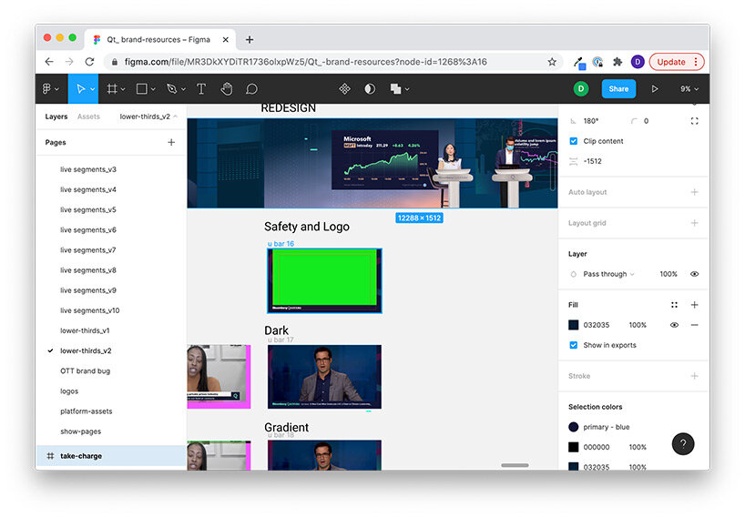
figma is one design tool we use to help us centralize the design of quicktake across a variety of platforms in coordination with our many teams
DB: what percentage of users navigate on mobile versus desktop, and what are the considerations in designing for both interfaces?
DG: the answer, again, is yes. and more: big screen televisions at home, and displays in public spaces. a given device is more than a preferred method of engagement. it is a time of day, a place, and context for engagement. today, we engage with news all the time, everywhere, across contexts – not just when we read the morning paper.
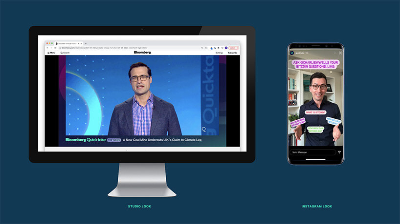
our goal is not to engage for one form of consumption, but develop a design ecosystem that follows you across them. what’s most important is the kind of news brief we deliver to a user on social during their lunch hour that gets them excited to learn the deeper story when they come home at day’s end to engage on television. how can the bloomberg quicktake experts and journalists across the globe, whom they may meet in a professional setting on the big screen, show their more personal, behind-the-scenes selves, when users check their tiktok or instagram stories in the morning? we facilitate these context shifts through design. decisions we make about staging, on-screen graphics – even wardrobe – not only signal to our audience different kinds of tone, but activate in our on-screen personalities different expressions of self.
PRODUCT LIBRARY
a diverse digital database that acts as a valuable guide in gaining insight and information about a product directly from the manufacturer, and serves as a rich reference point in developing a project or scheme.
