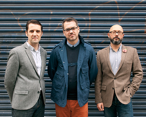
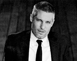
bibliothèque interview – top image: founding partners from left to right: tim beard, mason wells, jon jeffrey
designboom spoke to the founding partners of bibliothèque, tim beard, mason wells and jon jeffrey.
DB: how did you meet and why did you decide to form your own studio?
B: jon and mason studied together at college over twenty years ago. tim became friends with them both while working at small agencies in london in the early 1990’s. first and foremost it has always been about friendship for us. as young designers we had always had a similar design outlook and influences, and lots of shared time together encouraged us to think about ways we could make something happen with our shared expertise. many long evenings at a whole host of pubs in and around clerkenwell, formed the backdrop for us striking out together.
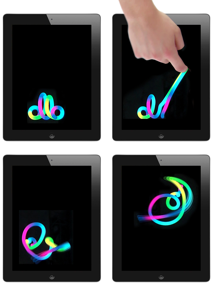
multi touch identity for ollo. high-speed internet access in emerging markets.
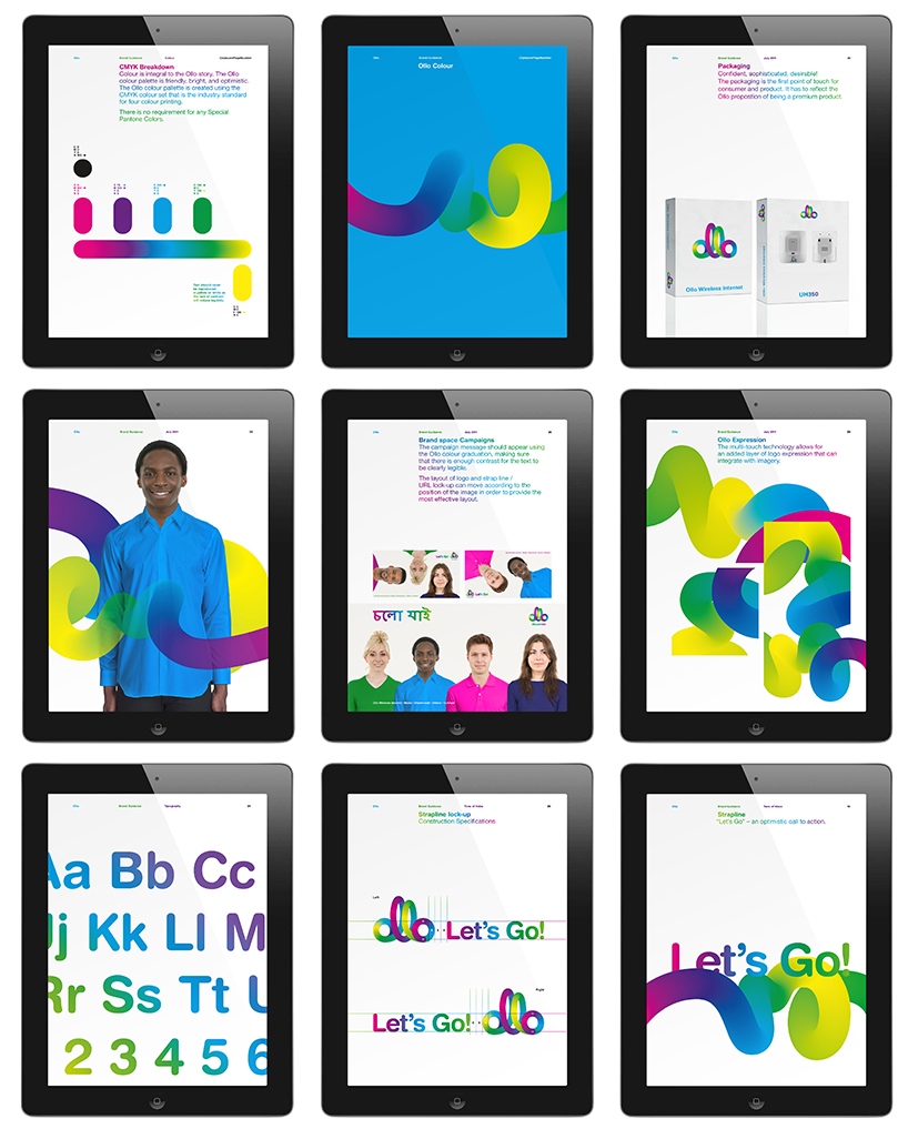
guidelines, strategy and positioning for ollo.
DB: please could you tell us briefly about the evolution of your work?
B: our work has been evolving ever since the first day that bibliothèque opened its doors. our work is always about problem solving with intelligent solutions. and it would be fair to say that we work along principles of modernity and reduction, but within these parameters we see every project as a place for exploration and evolution, of both our design methodology and execution. each project brings its own specific challenges and responses. and thus each project is an evolution of the previous one.
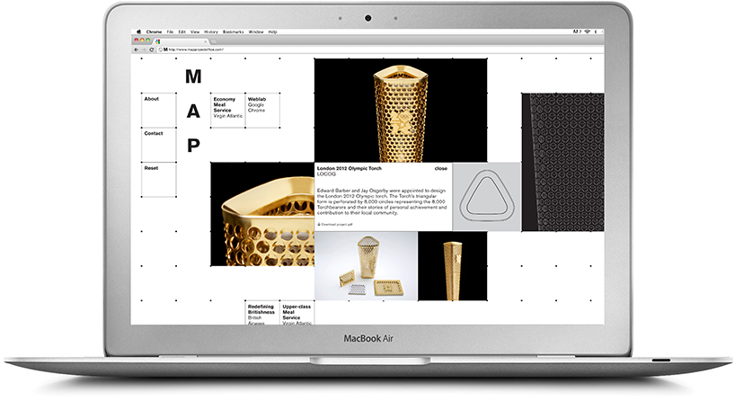
identity and website for map. strategy-led industrial design consultancy, set up by ed barber and jay osgerby.
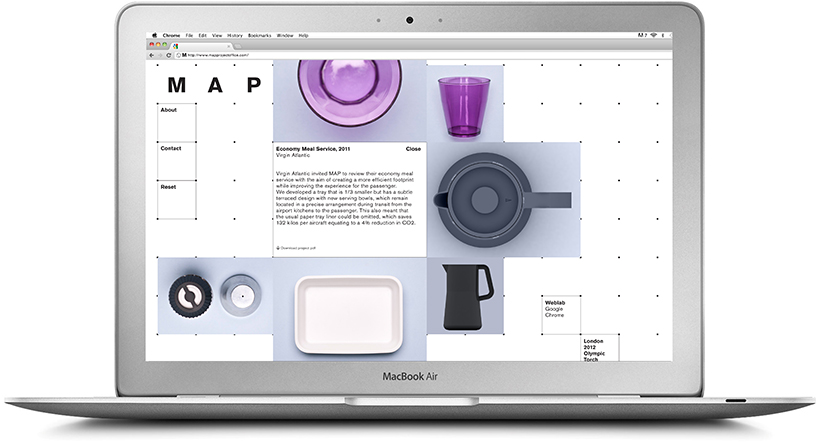
map identity and website. virgin economy meal service.
DB: how did you come to work on the type of projects you do now?
B: our specific areas of expertise are identity, spatial and digital design. traditionally designers have been segregated by small specific labels, identifying them with specific skill sets. however, we find that more and more of our projects cross over in to all of these areas. we talk about being media neutral, in that our solutions should be transferable to any platform. we see ourselves more as ‘designers’ than ‘graphic designers’, and that encourages us to explore any problem that is thrown at us. be it with a final delivery of identity, installation, digital experience, exhibition, marketing or publishing.
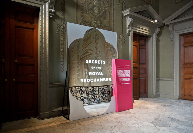
hampton court, secrets of the royal bedchamber. exhibition graphics by bibliothèque.
spatial design by universal design studio. entrance graphic configuration.
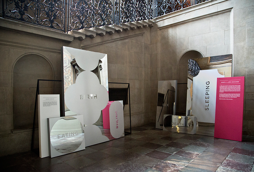
hampton court, secrets of the royal bedchamber. stair installation.
DB: how would you describe your work to someone who hasn’t seen it before?
B: we’d like to think of it as rich, intelligent, engaging, refined and strong. we always try to ground every project in a solid conceptual solution. something firm to hang the whole communication on. design is not just a styling exercise for us. an awful lot of soul searching and analysis goes into every piece of work, and we’d hope that rigour and reflection also comes through. massimo vignelli’s quote of wanting design to be ‘visually powerful, intellectually elegant, and above all timeless’, seams like a pretty good benchmark.
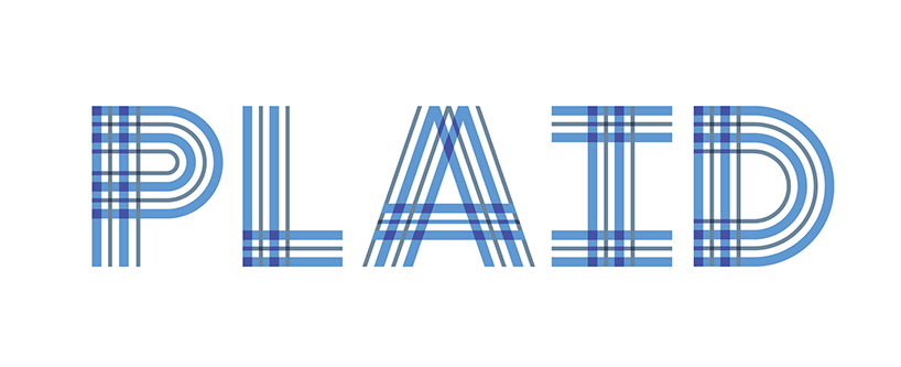
plaid. identity for a cross disciplinary studio specializing in immersive brand and museum environments.
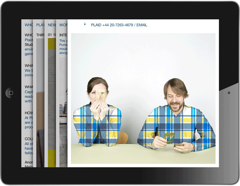
plaid website.
DB: how many people work at bibliothèque?
B: we have a core team of eight people, this then flexes with an extended group of freelancers and collaborators as and when projects dictate.
DB: how do you share your workload between studio members?
B: we have a fairly flat structure at bibliothèque, without clear definition of teams or sub-teams. everyone in the studio invariably gets involved with every project, at some stage. from the very first open briefing session, to studio critiques of the work on the walls that surround us. and any member of staff can comment or input at any time. each project is headed up by one or more of the three founding partners, and every client has designer contact at all stages, as we exist without specific project managers. we have a very talented team, with a range of specific design talents that are all called upon as and when projects dictate.
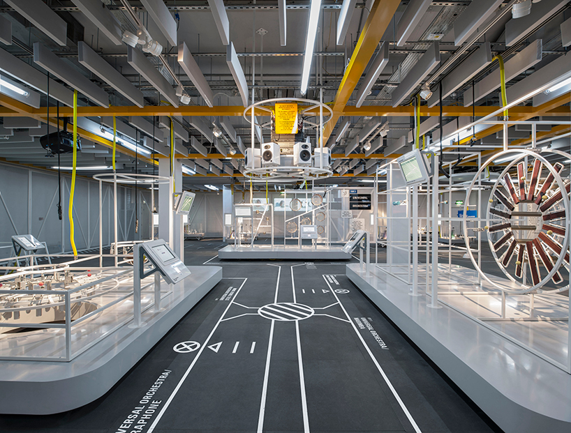
google web lab. bibliothèque delivering signage, graphics and way-finding as part of a bigger project delivery team.
DB: what is the attraction of designing identities for you?
B: identity, for us is exactly that – identity. its about more than just a logo or set of style guidelines, its about what a company actually is, how it performs and what it represents. the term ‘branding’ suggests a temporary surface change, and for us ‘identity’ goes much deeper. obviously the semantics of the terminology used are somewhat irrelevant in the bigger picture – be it ‘identity’, ‘branding’, ‘brand world’ or ‘corporate image’. but we get the most out of projects, and clients get the most out of us, when we are engaged at an early stage to fully focus on the longer term objectives, rather than short term sticking plaster solutions. in that way we can consider every single point of touch, with the level of detail and consideration required of really successful communications. from the ground up.
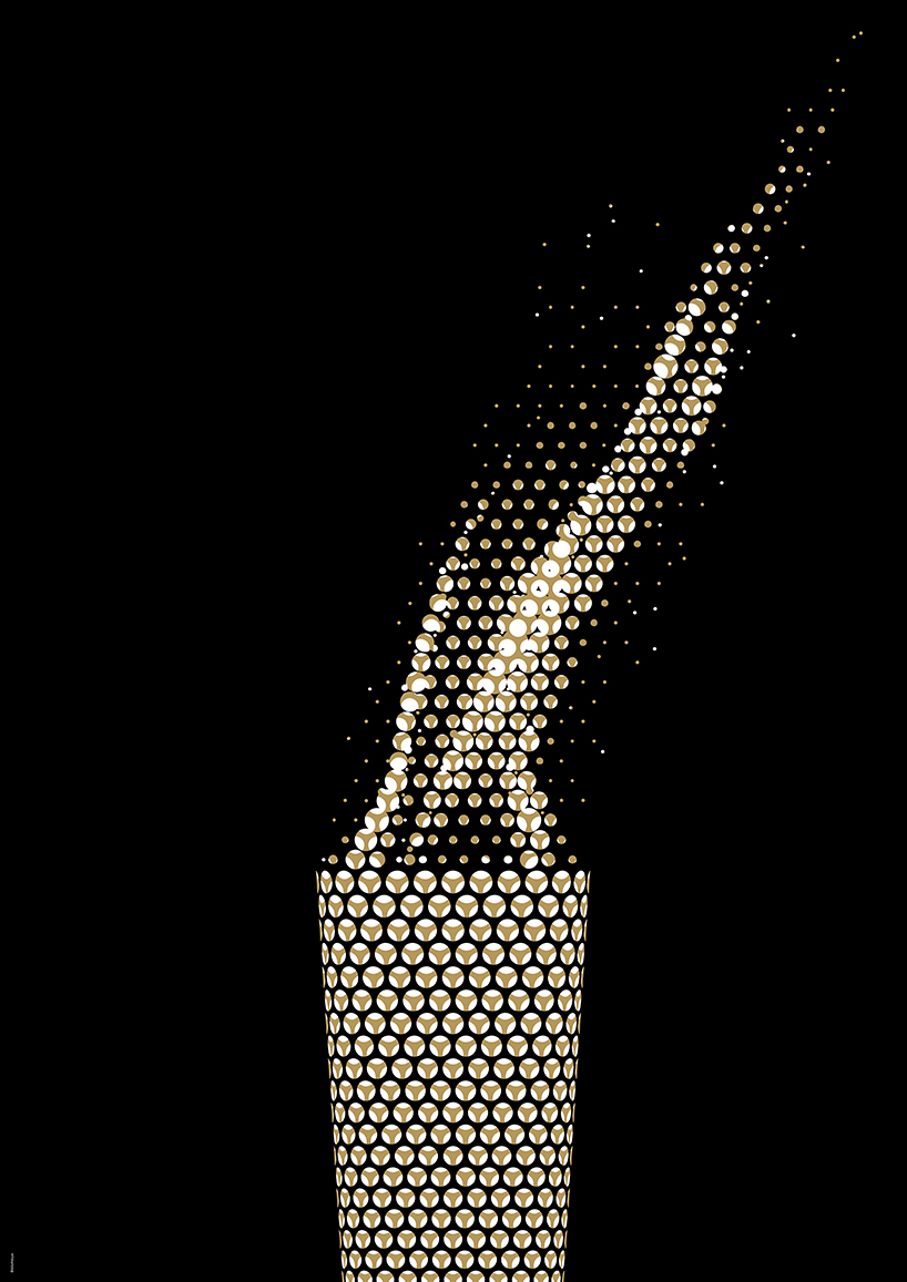
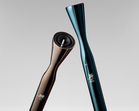
olympic torch poster.
DB: given your experience are you able to finalize projects much quicker than you used to?
B: technology has obviously sped up many of the working processes, that used to take many weeks of legwork. and digital production also means that many executions can now be achieved in time-frames that were unheard of, many years ago. (which brings its own problems as well as advantages). in terms of the conceptualization of successful design solutions, the same length of time is required to really interrogate ideas, to see what works best. there is no substitute for quality time. however the general perception is that all ‘design’ can these days be achieved more quickly, which is a real problem for design as a whole. do you want it good, or do you want it quick? you can’t have both.
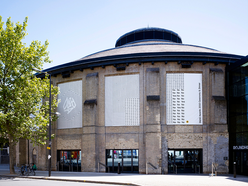
D&AD awards ceremony and dinner 2010. marketing, environmental, film and ambient graphics.
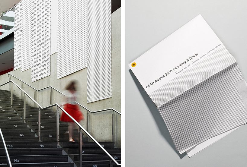
D&AD awards ceremony and dinner 2010.
DB: what mistakes or ‘traps’ should a young designer avoid when working on an identity system?
B: thinking that its just about sticking a logo on a business card. the logo obviously needs to be appropriate, and the business card executed with refinement, but it needs to offer more than that. think more deeply about the client and their ambitions, and how design can help them best achieve these. take ideas to them. think for them. understand the client, their customer and the marketplace. this will ensure that everything you deliver has grounding, and a reason to be. and challenge yourself, not just the client.
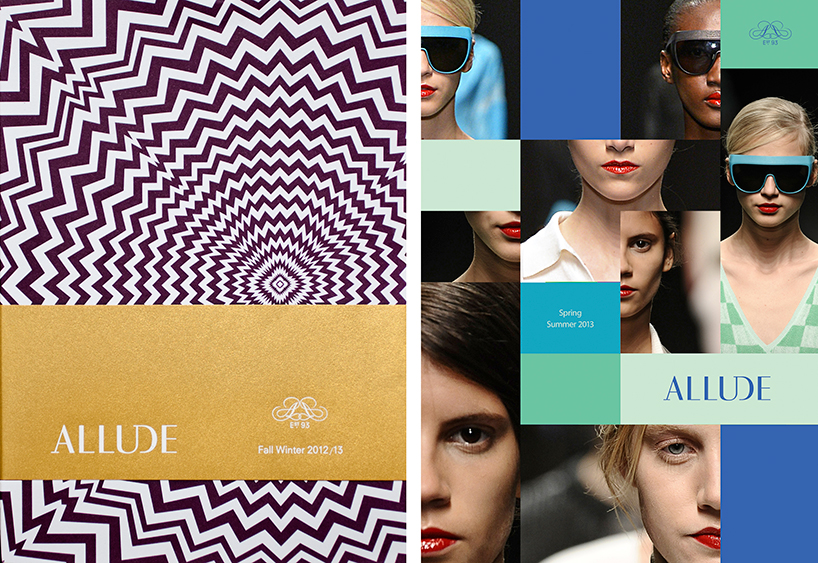
identity for allude, a leading fashion label based in munich. deliverables extend to packaging, print, look books, marketing and spatial concepts.
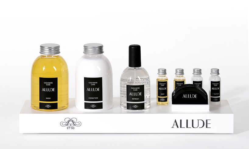
allude. cashmere care products and packaging.
DB: the work you produce is quite diverse, what are your thoughts on specialization vs generalization?
B: diversity is what makes for excitement as a designer. there is no point offering the same platform or execution for every project, as you can just fall into the same default thinking – which is no good for anyone. we see every project, as its own unique set of challenges, and hopefully this encourages a range of solutions and approaches. its not about being a specialist or a generalist, it’s about being an expert in how best to solve any given design problem, even if that means understanding a new field or creating a collaboration. and we see every project as an extension or expression, of a companies identity – regardless of if it’s a logo, campaign, installation, web site or part of a broader communication.
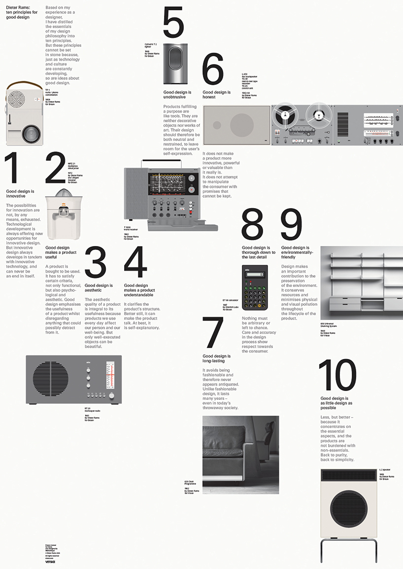
dieter rams 10 principles poster
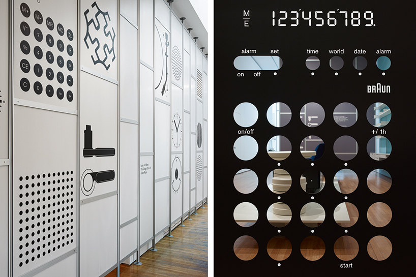
less and more: dieter rams. retrospective exhibition dedicated to one of the 20th century’s most influential industrial designers.
2D and 3D design by bibliothèque.
DB: do you think it’s important for a graphic designer to be able to draw?
B: with the new breed of younger graphic designer (more computer skills, less hand skills) drawing has become less important. you don’t have to be good at drawing, but you do have to be good at thinking.
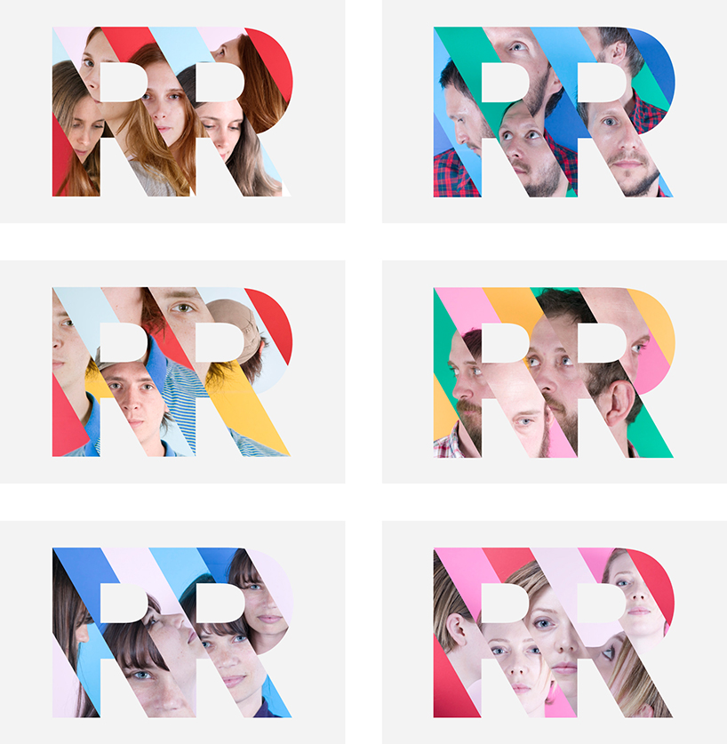
identity for rumpus room who create social entertainment across mobile, web and real world experiences.
DB: how do you think the popularity of online design resources have influenced the work being produced today?
B: it’s difficult not to be totally overwhelmed by the avalanche of visual content that swirls around us on a daily basis. being truly objective about design, is more and more difficult and any visual execution you can come up with, can usually be proved to have been ‘done’ before with the power of the internet. it’s about taking any reference and re interpreting it, in a new, different or better way. the main problem with online design resources, is that everything can be reduced to what we call ‘pixel deep’. any depth, explanation or meaning is eliminated, or a flicked away with a swoosh of the finger or mouse. attention spans are getting shorter and shorter. and we are as much the problem, as we are the solution – in that we are all guilty of it.
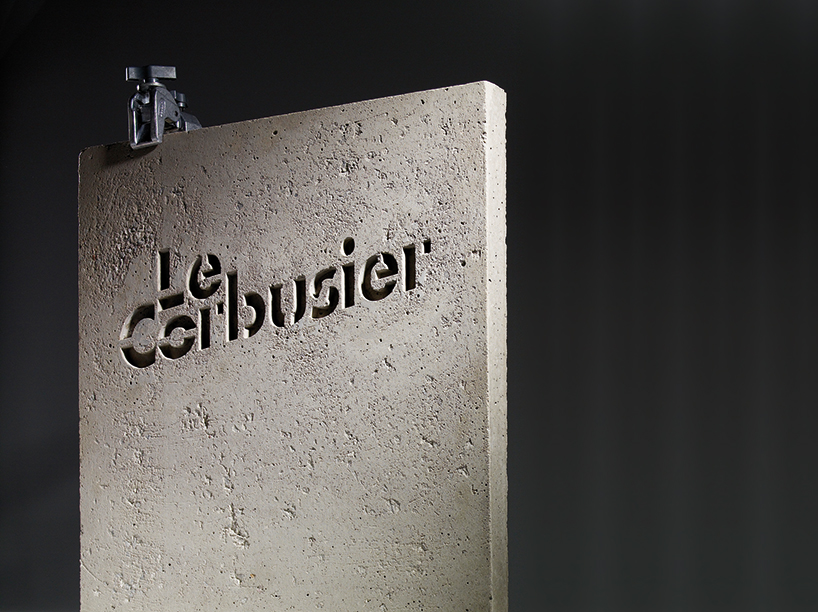
identity for retrospective lecorbusier exhibition at the barbican art gallery in london.
DB: besides design, what are you passionate about and why?
B: we do discuss design an awful lot. probably to an unhealthy degree. but besides that, in no particular order, other areas of intense studio discussion are: breaking bad, restaurants, bars, furniture, giles peterson, films, HBO, exercise, hackney, technology, architecture, music, fashion, shoes, watches, travel and cooking.
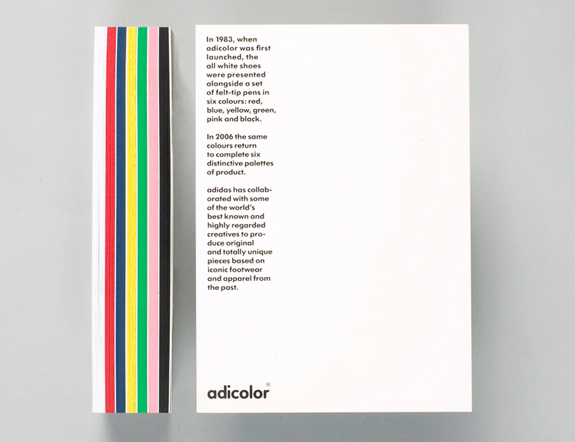
adicolor book. promotional item to celebrate the 20th anniversary of the adidas adicolor range.
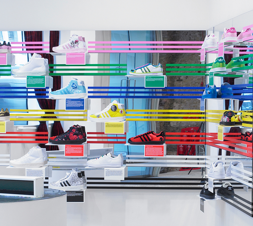
adicolor book. installation at dover street market.
DB: what is the best piece of advice you have ever been given?
B: could be one of many…
‘by doing good design, it leads to good design’ (sounds obvious, but its true).
‘set the business up on an equal footing’ (sound advice to build from).
‘less, but better’ (wise words from dieter rams).
‘don’t stand up in canoes’ (tried it once. it didn’t work. the point is: listen to those with more experience than you).
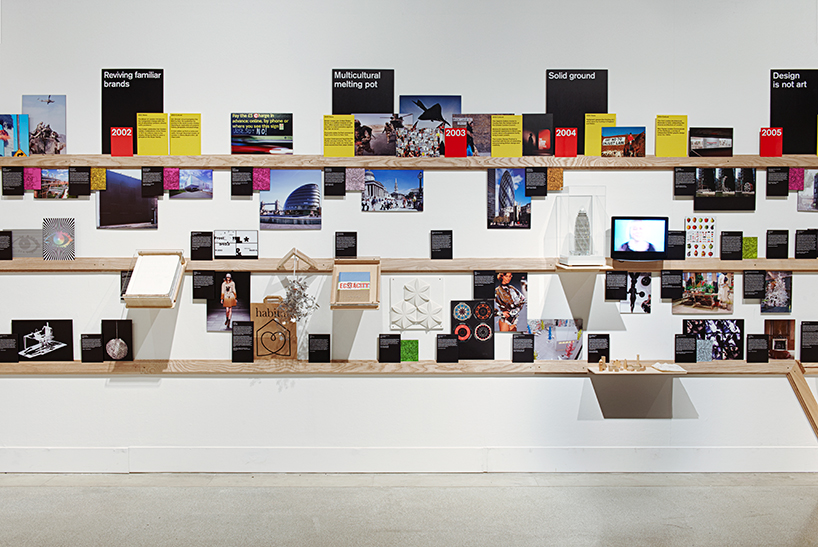
super contemporary. exhibition at the design museum in london.
DB: what is the worst piece of advice you have ever been given?
B: ‘the client hasn’t got much of a budget, but you can definitely do whatever you want, and it will be really straightforward.’
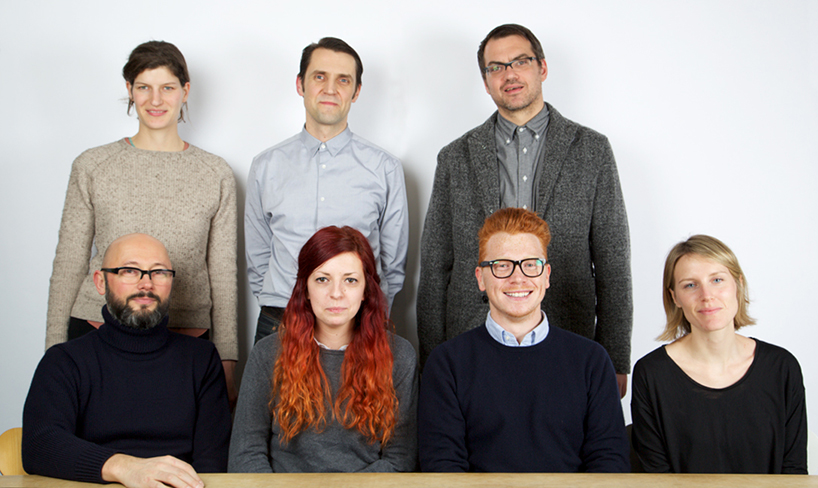
bibliothèque design team. back row left to right. laura breier, tim beard, mason wells.
front row left to right: jon jeffrey, kate goodridge, mike white, ella collinge.
