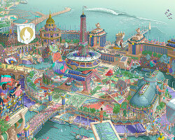
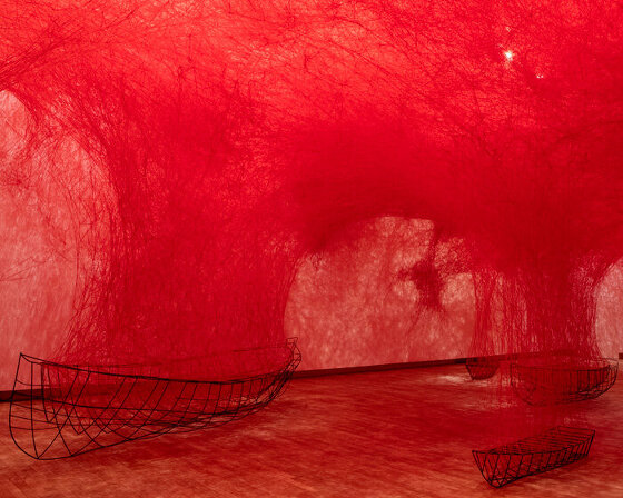
neon film posters present cult classics from the protagonists’ perspective
images courtesy of van orton design 


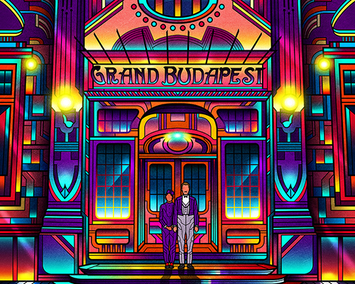
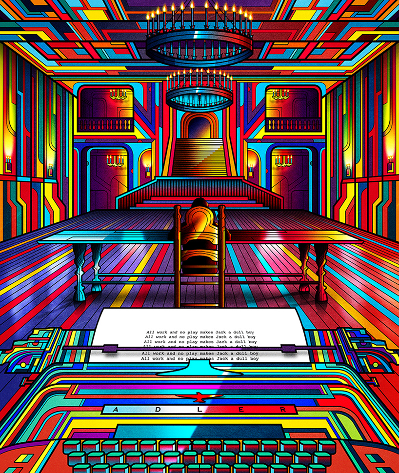
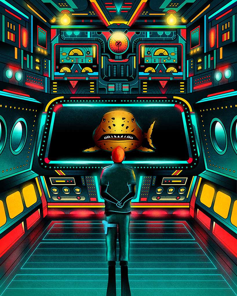
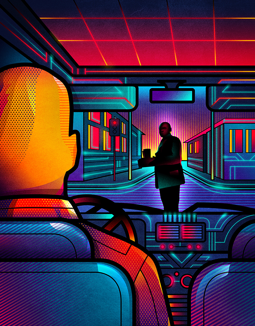
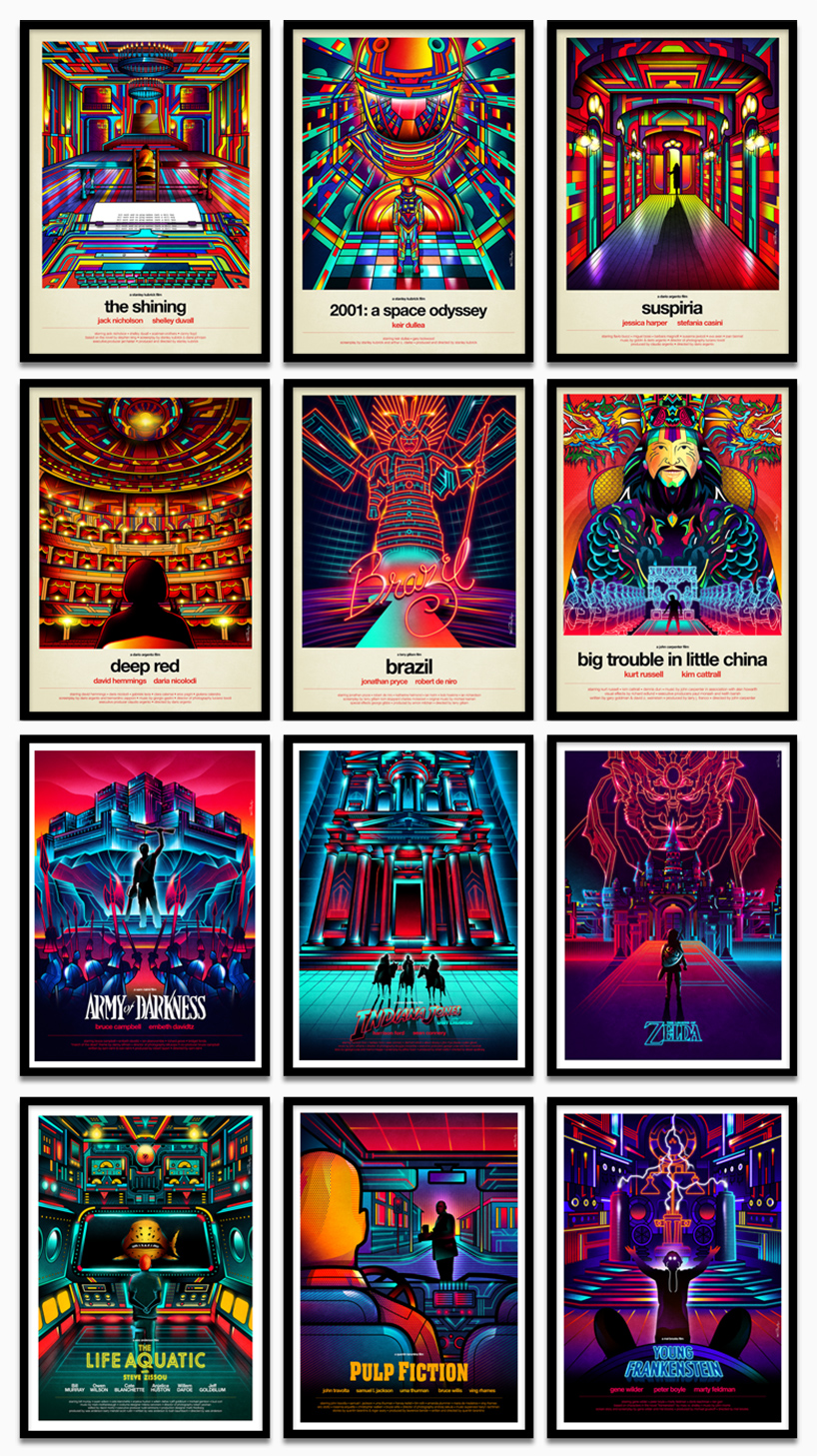
film posters typically intend to condense the essence of the feature in single frame, with chosen colors and photography reflecting the movie’s overall mood and message. in challenge of this norm, van orton design, the collaboration of twin brothers from turin, italy, has realized a series of alternative motion picture posters to some of the world’s most famous films.


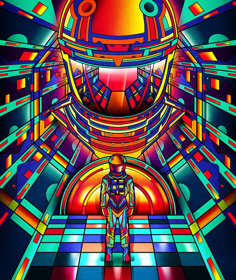
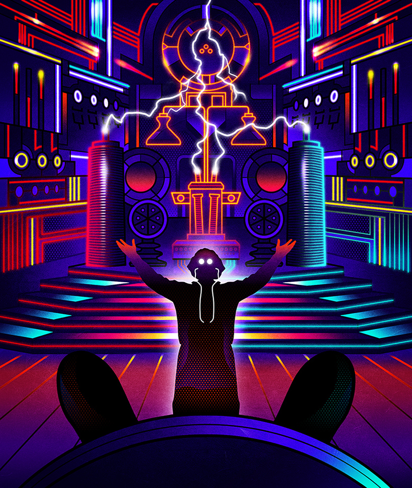
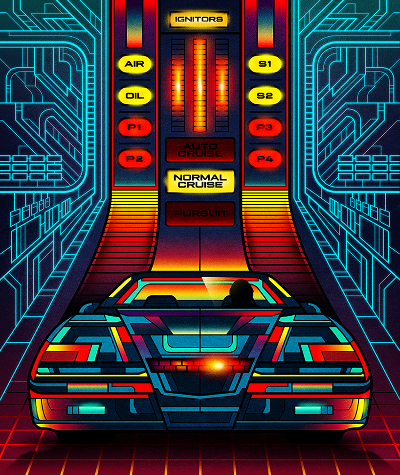
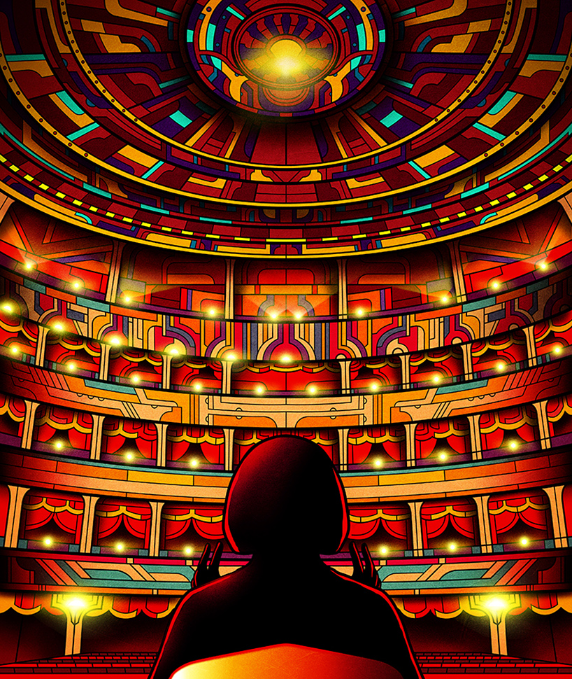
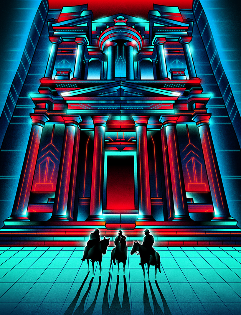
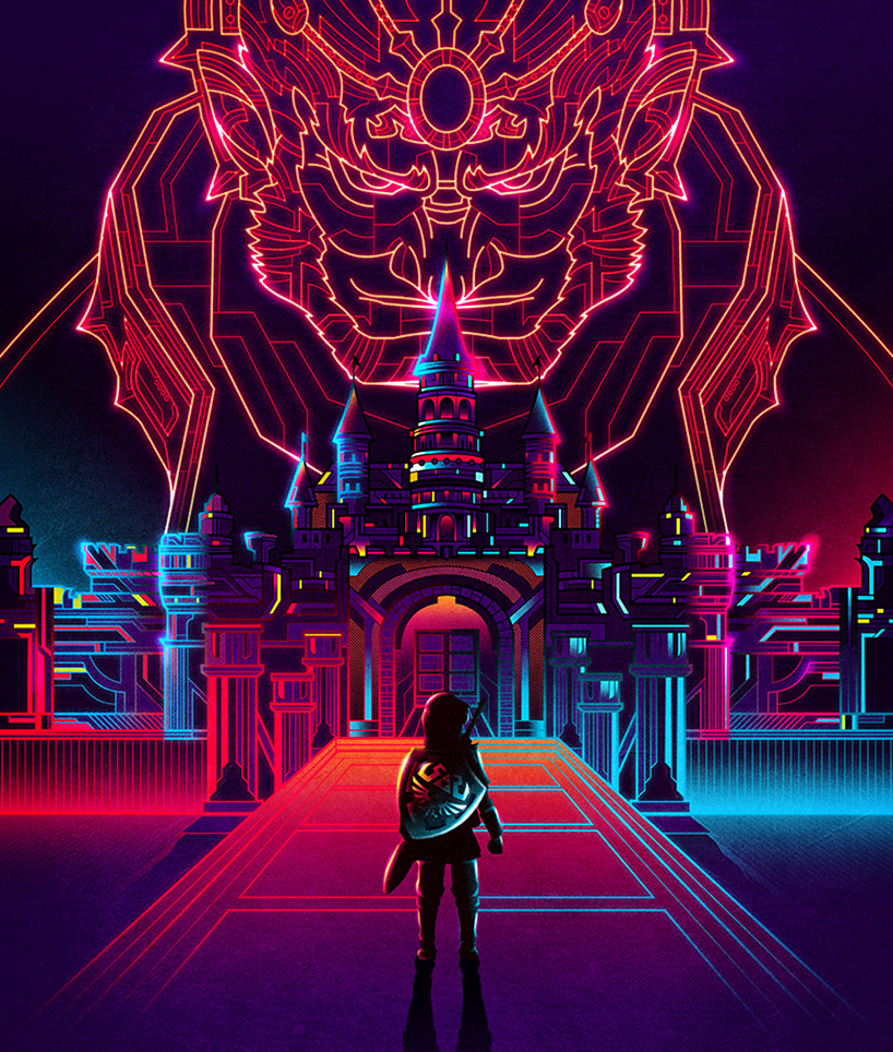
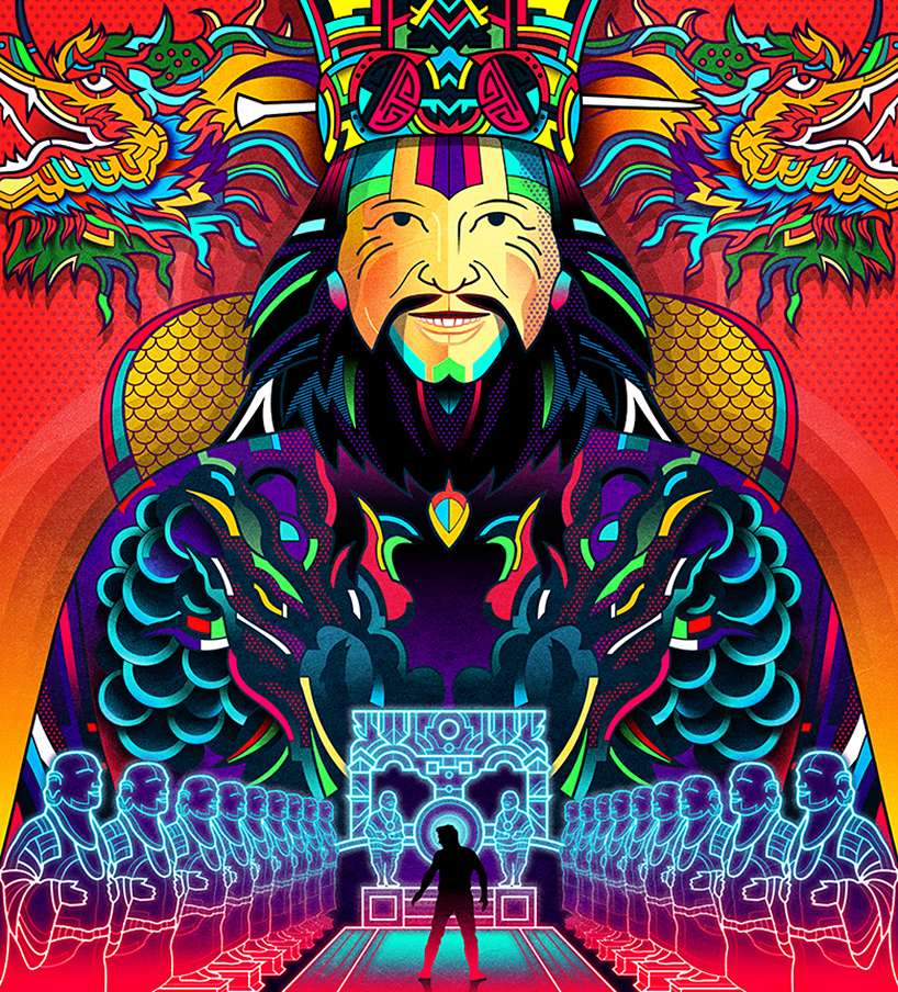
the collection of ‘one point perspective’ illustrations are drawn with a single vanishing point near the center of the frame, with all lines converging at this chosen spot. defined by vibrantly hued neon colors contained within thick black lines, the images offer completely new interpretations of movies like ‘the grand budapest hotel’ and ‘pulp fiction’, while still maintaining recognizability. 

van-orton-design-one-point-perspective-neon-film-posters-designboom-13
‘the shining’

van-orton-design-one-point-perspective-neon-film-posters-designboom-06
‘the life aquatic with steve zissou’

van-orton-design-one-point-perspective-neon-film-posters-designboom-02
‘pulp fiction’

van-orton-design-one-point-perspective-neon-film-posters-designboom-10
‘2001: a space odyssey’

van-orton-design-one-point-perspective-neon-film-posters-designboom-03
‘young frankenstein’

van-orton-design-one-point-perspective-neon-film-posters-designboom-08
‘knight rider’

van-orton-design-one-point-perspective-neon-film-posters-designboom-11
‘deep red’ 

van-orton-design-one-point-perspective-neon-film-posters-designboom-12
‘indiana jones and the last crusade’

van-orton-design-one-point-perspective-neon-film-posters-designboom-14
‘the legend of zelda’

van-orton-design-one-point-perspective-neon-film-posters-designboom-01
‘big trouble in little china’

van-orton-design-one-point-perspective-neon-film-posters-designboom-15
the set of posters