filip hodas — illustrator, computer animator, visual effects artist, pop culture connoisseur — wanted to learn how to use substance painter. specifically, he wanted to learn how to integrate substance painter with his texturing workflow. he just happened to get schwifty while doing so, with a little sequel to his past project. this is: pop culture dystopia part II.
all images courtesy of filip hodas
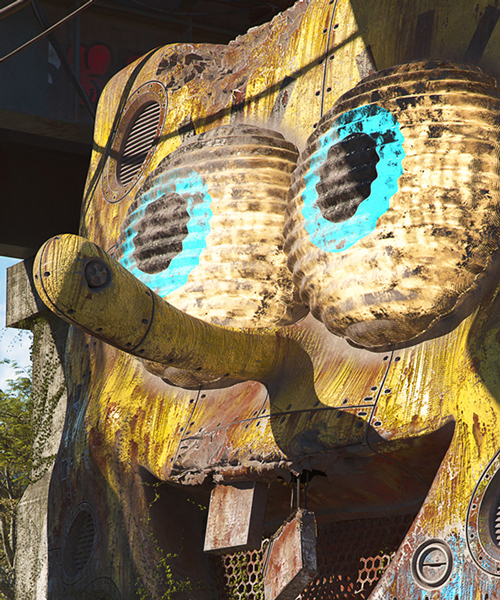
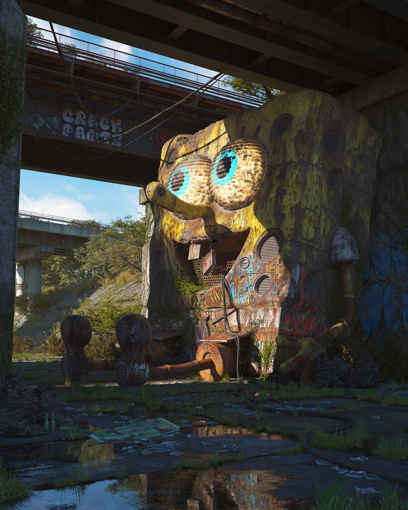
bikini bottom
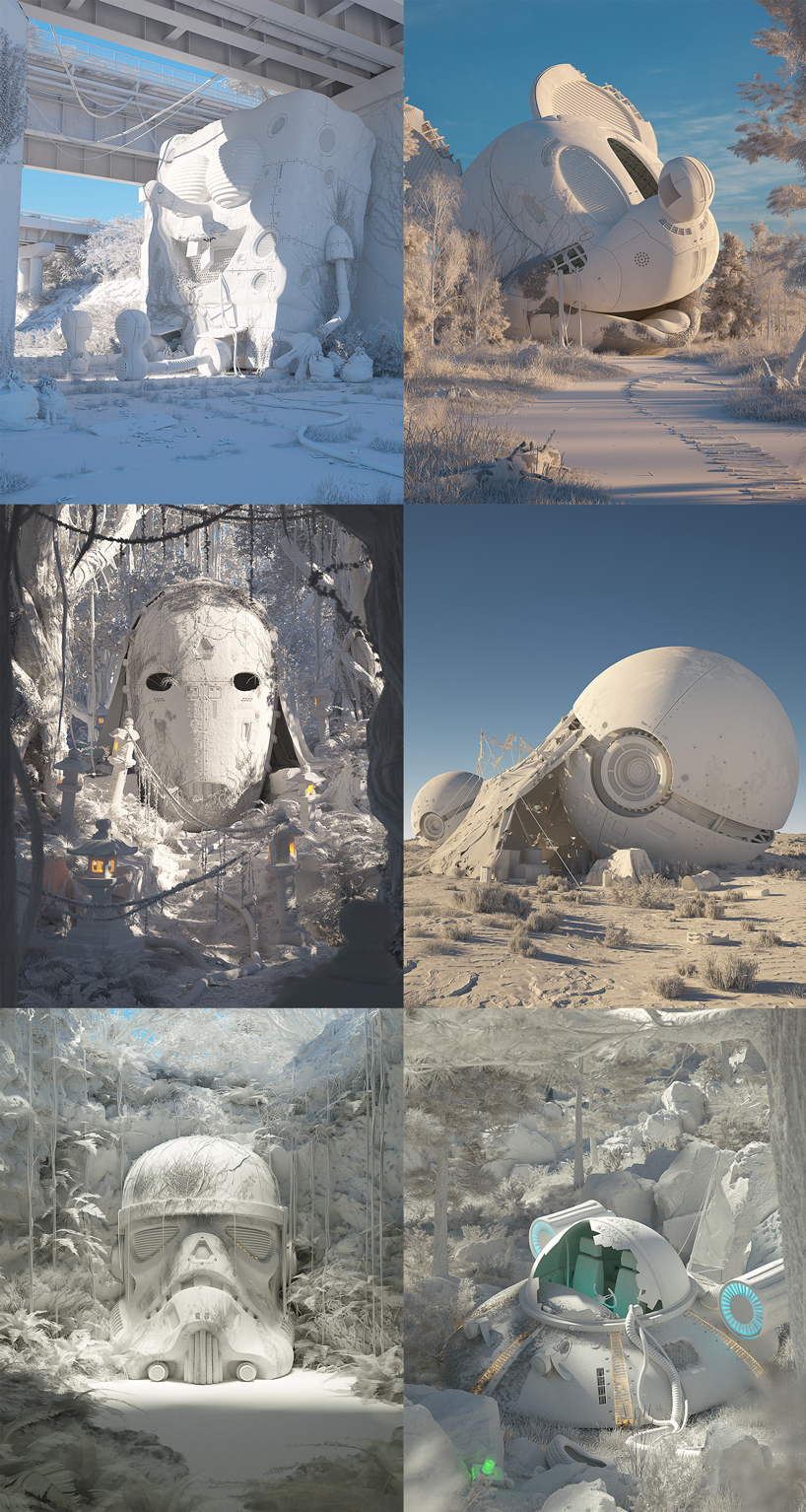
filip used cinema 4D, octane render, 3D coat, substance painter, substance designer, world machine, adobe photoshop, adobe illustrator, Zbrush, and agisoft photoscan to create this hyper-realistic mecha-spongebob, and his decayed mecha-friends. the prequel to this series (pop culture dystopia part I) didn’t utilize Zbrush, or agisoft photoscan.
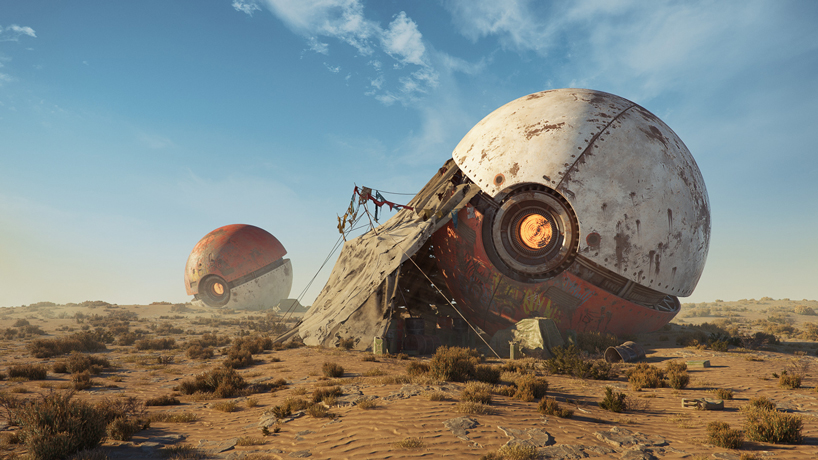
the monsutaboru colony
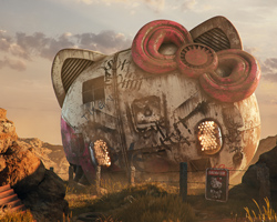
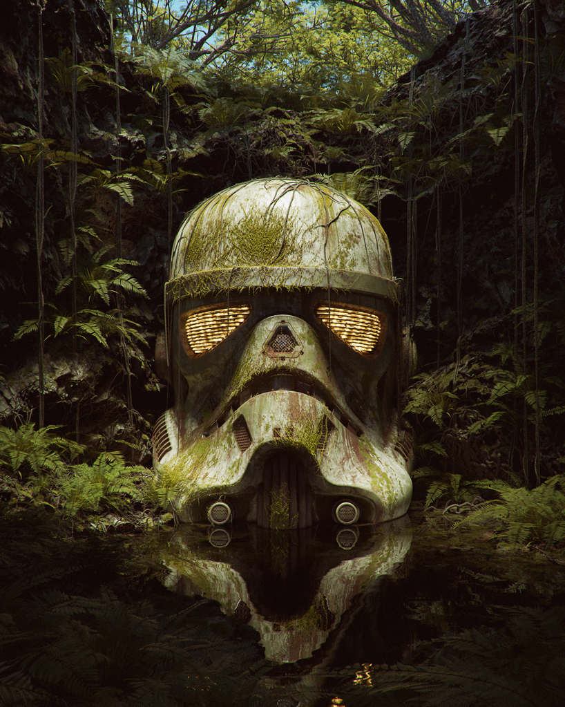
the growth between this series and the last is definitely found in the poorly lit eyes of the last storm trooper — the immense contrast of textures. part I was an amazing, catchy series: with futurama’s bender, pacman, hello kitty, a happy meal and more. the references were great, the colors were great, the contrast seemed perfect, too. but now, after seeing dystopia II, everything in part I looks softer, like a painting.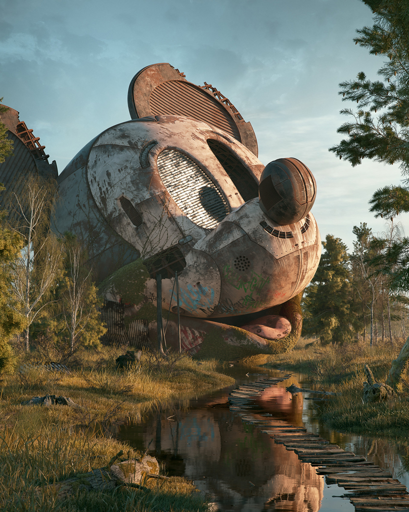
the old mouse
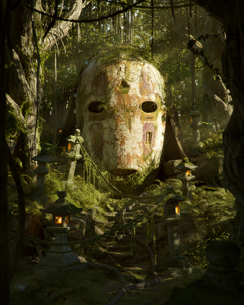
in pop culture dystopia part II, things are just realer. every piece of machinery on mickey’s dying face, ever lick of moss melting onto that storm trooper’s helmet — every texture is on a different end of a spectrum and it all makes perfect sense, as if it were real. the glass could cut you. the water could quench your thirst. the portal gun (thrown from rick sanchez’ ship) could take you to a dimension where you’re the star of cloud atlas.
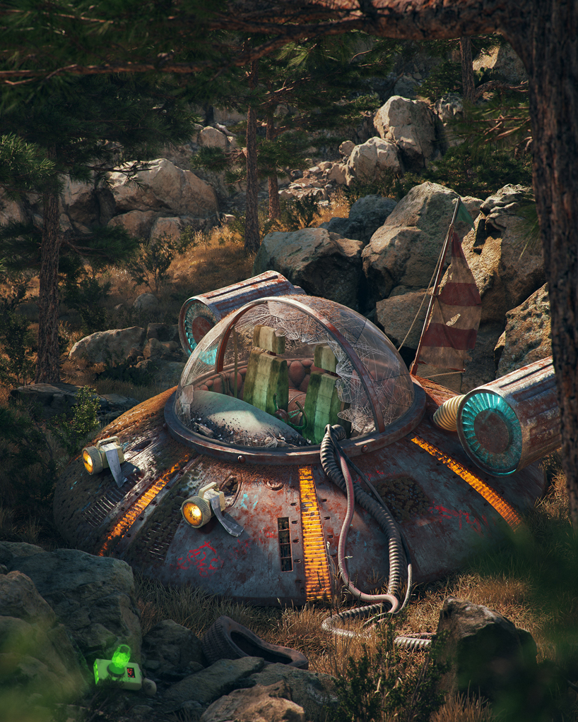
schwify saucer
the last trooper
konashi shrine
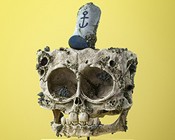
clay renders
