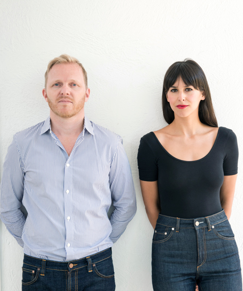
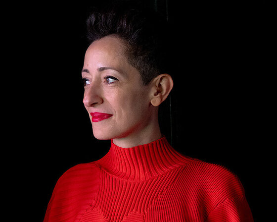
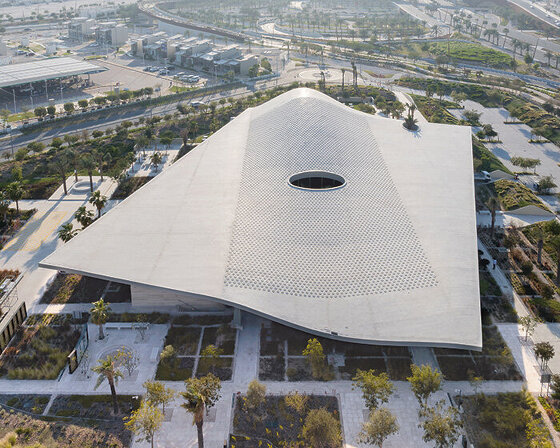
zeller & moye is an architectural studio with bases in mexico city and berlin. founded by christoph zeller and ingrid moye, the practice works between continents developing projects with an interdisciplinary approach. before setting up their own firm, christoph zeller and ingrid moye worked for SANAA and herzog & de meuron, leading the tate modern project and the 2012 serpentine pavilion, among others.
to understand more about zeller & moye’s work, we spoke with the duo who explained their contrasting backgrounds, what they enjoy most about mexico city, and the projects they are currently working on. read our in-depth interview below.
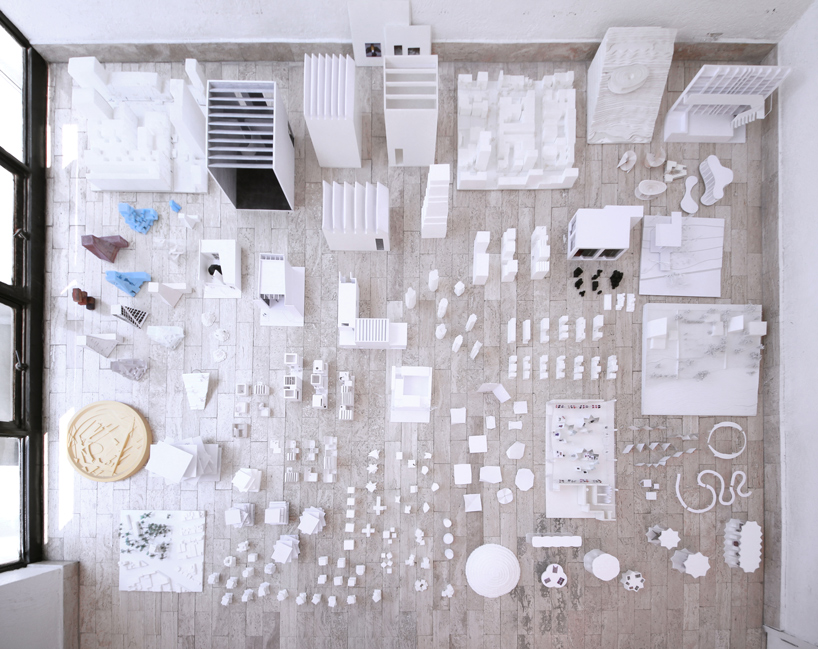
all images courtesy of zeller & moye
designboom (DB): can you start by talking about your backgrounds, and how you came to work together?
christoph zeller (CZ): coming from two very different worlds, berlin and mexico, our paths crossed in basel, switzerland where I was leading the tate modern project for herzog & de meuron at the time when ingrid joined the studio. she came straight from japan, having worked for SANAA for two years where she developed a tower for mexico. we discovered that oddly enough we sat on the very same desk in tokyo, since I also used to work at SANAA, but six years earlier.
more importantly though, and beyond the overlaps in our biographies, we discovered that we share an open approach to design and that we work well together as a team. after the completion of the construction set for the tate modern and the opening of the tate tanks we moved on to establish our own studio with bases in mexico city and berlin.
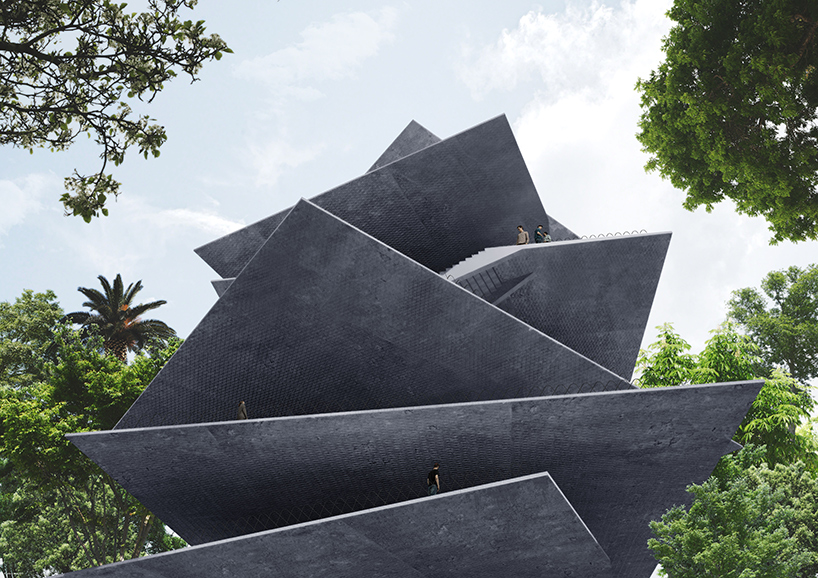
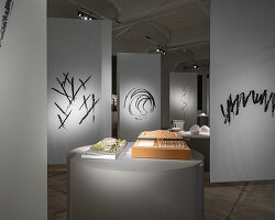
‘archivo’ is an open archive for a private design collection in mexico city
see more about the project on designboom here
DB: what particular aspects of your backgrounds and upbringings have shaped your design principles and philosophies?
ingrid moye (IM): when I grew up in mexico city I spent a lot of time at luis barragan’s park los bebederos, at the northern end of mexico city. it was a few blocks away from my grandmother’s house; I learned there how to ride the bicycle and to appreciate public space in a city dominated by cars. I was intrigued by the playfulness of barragan’s colorful architectural elements and how he managed to interweave them so beautifully with the nature.
later on, I had the chance to study and work in various countries including spain, japan, switzerland and great britain. this gave me the opportunity to satisfy a curiosity for architecture, art and landscape. plus it was a good escape from the juggernaut of mexico city. with the help of these experiences I developed my own design process. working on various projects, in and for different countries, gave me the sensibility for other contexts, and the flexibility of working together with different people, in different languages and in large teams.
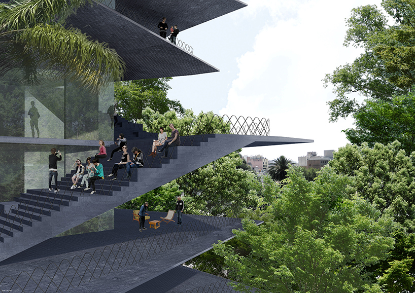
the project has been developed in collaboration with FR-EE
DB: what were the most important things you took away from working at SANAA and herzog & de meuron?
IM: from SANAA, I’ve taken the playful and experimental approach to design, to never jump at the first idea, but to try harder and to allow yourself to step into unknown territory. at herzog & de meuron I adopted to see architecture always as part of a wider contextual situation, and that a building is only relevant if it manages to respond well to the needs and requirements of the respective place.
DB: were there any pieces of advice that stood out?
IM: I remember nishizawa-san always stating ‘architecture must be beautiful’. I agree with that: if a building is well designed it has a better chance to get accepted and be used by the people it is made for.
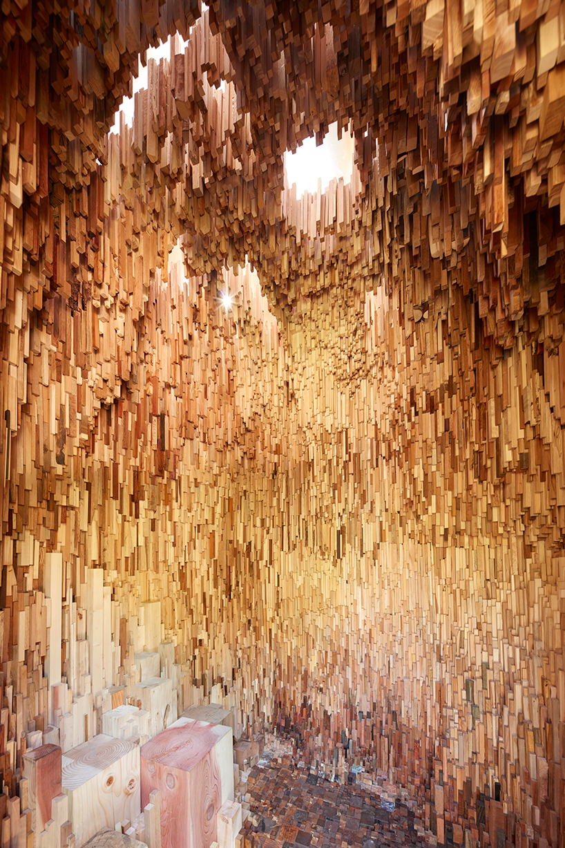
‘hollow’ is a public artwork designed in collaboration with katie paterson
see more about the project on designboom here
DB: as a team, what would you say is your strongest asset and how have you developed that skill over time?
CZ: each project comes with a set of constraints. for example, a protected tree in the middle of the plot, height restrictions or a limited budget. we like that and even search for more of them. we accept constraints as catalysts that have the potential to make a project unique. odd factors can be turned around and become an effective stimulus of a project. it might mean that you have to plan your building around a given obstacle, or it forces you to research into affordable industrial materials.
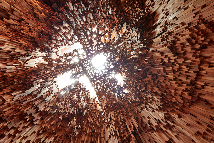
openings in the vaulted top let in natural light through the otherwise dense structure
CZ (continued): for example, we have used solid black rubber straight from the factory as flooring for a fashion shop to meet the budget. it is an unusual material that people normally start to appreciate when walking across its slightly soft surface. especially with your first projects you are not necessarily given the perfect plot or unlimited finances. we had to be creative to convert what seemed at first unprofitable or ordinary projects into something special through exploring the possibilities around these obstacles. I believe we are quite good at that by now.
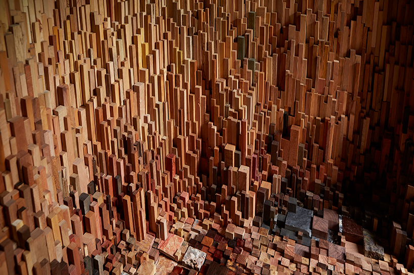
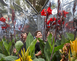
the miniature forest brings together over 10,000 unique tree species
DB: working across different continents, how do you approach diverse localities from project to project?
CZ: we established zeller & moye with the attempt to work for and in different places. as a result, we operate from two bases, mexico city and berlin. our current projects are both in latin america and europe alike, even two in asia. we are used to the fact that the work base is not necessarily also the place where a project is located. that works for us because on one hand architecture is an international language, i.e. a drawing of a concrete wall is understood all over the world. on the other hand, there are of course distinct cultural identities and that is where it gets interesting. to design for a house for mexico differs in almost all aspects from the process of designing one for germany. our team is a mix of many nationalities and experiences from different contexts. depending on the project, we compose our teams from these backgrounds.
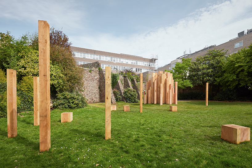
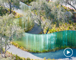
the sculpture was installed at the royal fort gardens in bristol, UK
CZ (continued): more importantly, and apart from local requirements and technicalities, we treat every project with the same importance regardless of its size and location. we carefully look into a place and analyze its context before we draw first conclusions. coming from the outside makes us sometimes see clearer than a local designer that might do a building the way everyone is used to doing it in that specific place.
last but not least, thanks to the technology of today we can have video calls and exchange information within seconds. we guide small cameras through scale models to illustrate spatial qualities to the client on the other end of the line; or we hold phone conferences with our engineers in london, and the client in berlin, whereas we are in mexico. all that is daily business.
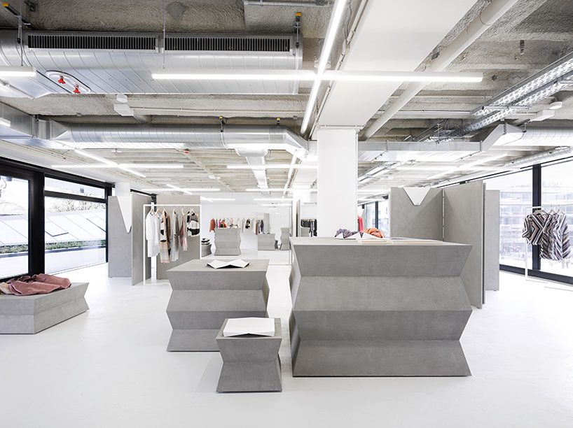
zeller & moye has also completed the berlin store of fashion brand ODEEH
DB: how do you assess mexico city’s current design scene? what is your relationship with the city?
IM: right now mexico city has a vibrant, multicultural scene of art, design and architecture. it is a good time to be here. we approach the city as pedestrians. we refuse to own a car and avoid using it as much as we can. by doing so, we see the city from a different perspective and have a more enjoyable experience than the car users that spend several hours every day in traffic jams contributing to the high pollution in the city. I enjoy using public transport, parks, markets and discovering new places.
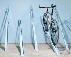
the best thing about mexico city is that you can always discover new things. one of my favorite activities is walking the streets as a flaneur, without destination, just letting myself be part of the city and getting surprised by it. based on our experiences when strolling mexico city’s sidewalks, we began a project where temporary objects are inserted into the city where we felt something wasn’t quite working or something was missing. these inserts, we call them implants, re-program faulty or even hazardous situations that we’ve found as passers-by, into positive and usable niches for public life.
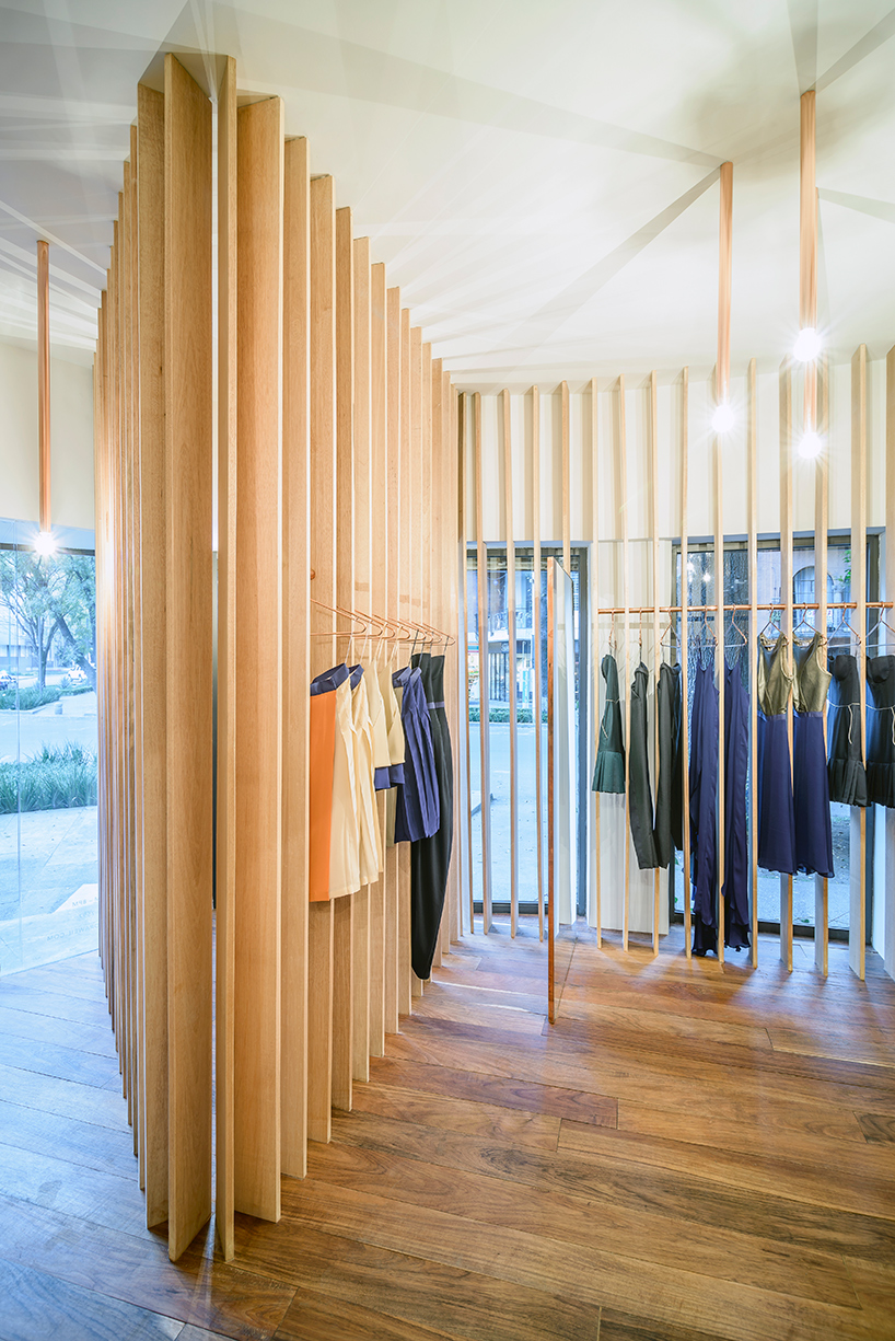
in meixco city, the duo designed a store for sandra weil
see more about the project on designboom here
DB: you worked with ai weiwei on the 2012 serpentine pavilion. how do other creative fields influence your architectural work?
CZ: from the beginning of our careers we worked along the intersection of architecture and art and often form teams with artists to develop projects. I studied at the university of arts berlin, where I was able to work across disciplines and learn equally from architects such as g. zamp kelp from haus-rucker-co, but also artists like lothar baumgarten. we like conceptual art and often find inspiration in an art piece rather than a building from architecture history. we are close to the way artists think: sideways and in associations; therefore any collaboration is easy for us to realize.
with each project we play around with various ideas before we settle on a direction. this is often a long process of trial and error, of conceptual thinking and discussions. as architects, we are used to developing a project in phases, to plan it starting at a large scale, gradually adding more detail, coordinating structure and services until we arrive at a very complex set of information with hundreds of construction details, schedules and descriptions. we like how artists ignore such planning structure by focusing their attention on what most people might consider unimportant detail like the smell of a wooden panel or the tactile qualities of a handrail. we try to adopt that perspective in our daily work life aiming to bring out the potential of what otherwise might be an ordinary detail.
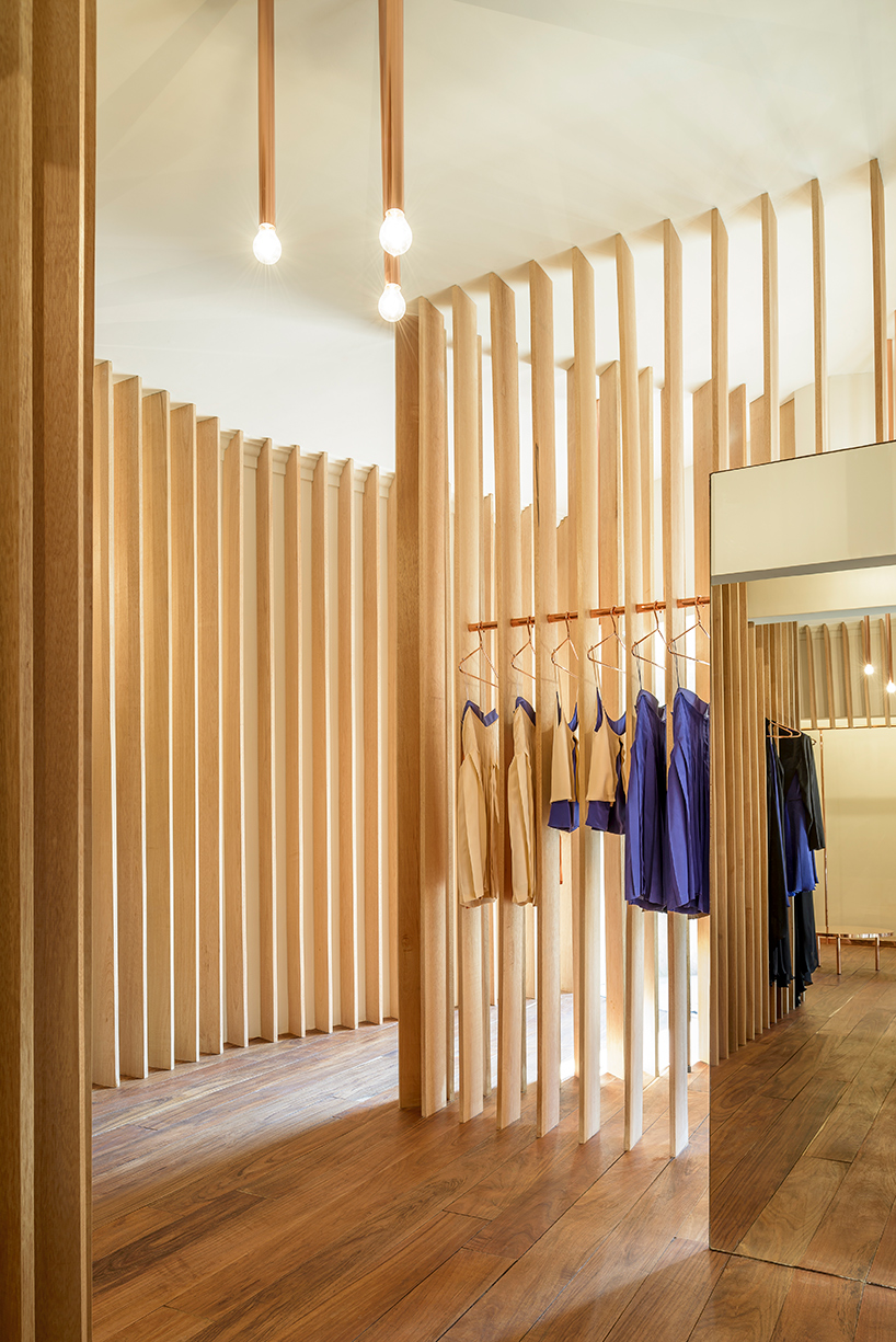
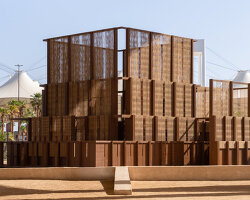
semi-permeable walls are made of local tropical wood
DB: which architects or designers working today do you most admire?
IM: although we do follow the work of many contemporary architects and designers, our inspiration comes mainly from art, film, music, philosophy or literature. we like to link between disciplines.
CZ: I guess the fact that we have collaborated with SANAA and herzog & de meuron in the past says something about our appreciation of intelligent concepts and poetic solutions.
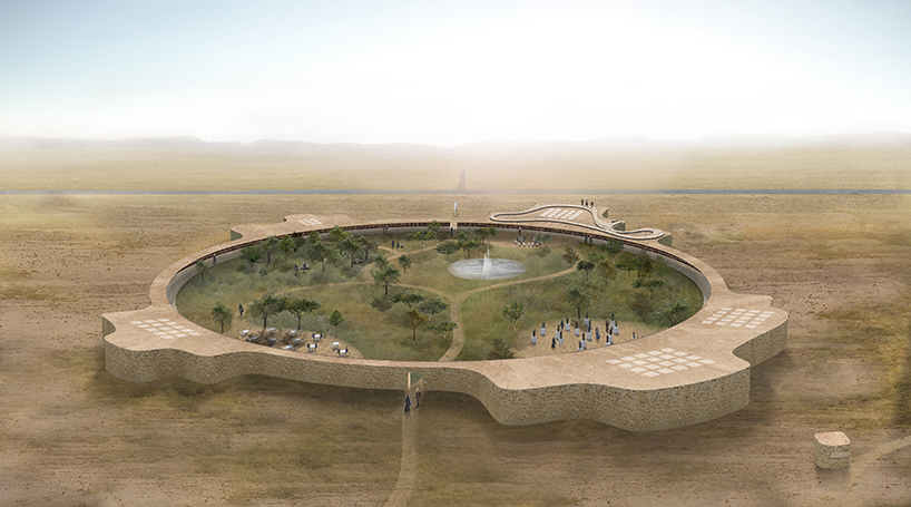
the anfal memorial is a museum and community center planned for kurdistan
DB: is there one specific project that you have worked on that has given you particular satisfaction?
IM: we were invited to design a memorial to commemorate the genocide on the kurds in kurdistan, iraq. further to the memorial function we designed a central public park, like an oasis in the desert, for people to gather, mourn, and to come together as a community. rizgary, the town where the memorial is located, grew out of a refugee camp and is therefore still lacking decent public spaces or places of identity. the central green inside the memorial building is designed around a photographic artwork depicting portraits of the survivors with an artifact of the lost family member.
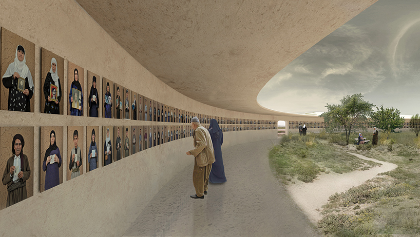
the memorial is designed around 1,500 photographs portraying local survivors
IM (continued): open archives and communal spaces provide room for commemoration, but we felt it was important to offer also a positive outlook into the future: what is simply a circular void in the center symbolizes the devastating event but will eventually be filled with new life in the form of a green park. as a bottom-up project, initiated by the community of survivors and with the help of an NGO, it is now also supported by the german foreign office and the local kurdish government.
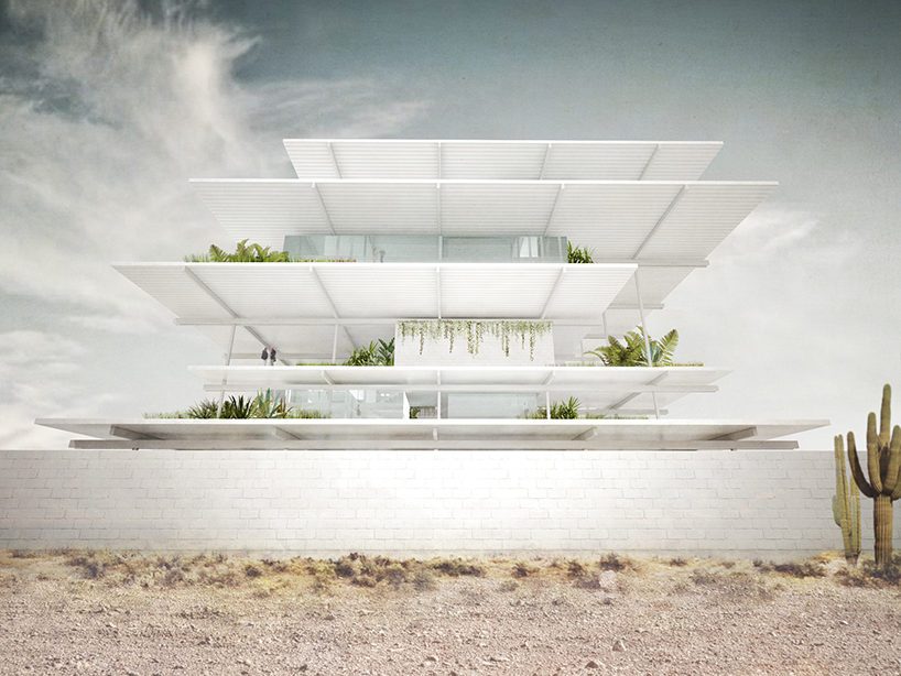
mexamerik’s new HQ comprises a trailer terminal with adjacent workshops
DB: can you tell us about any projects currently in development that you are especially excited about?
CZ: we are currently developing headquarters for a logistics company in querétaro, mexico, who work exclusively with large freight vehicles. the project is located in an extremely dry and hot landscape. although a pretty ordinary task to plan functional spaces such as workshops, garages and office spaces; we saw the potential to develop a fully sustainable project that was at the same time considering the client’s wish to be recognized from the highway nearby. by stacking several floors to a small tower we created a raw steel structure that primarily provides shadow to all areas but is at the same time clearly visible as a landmark from far away.
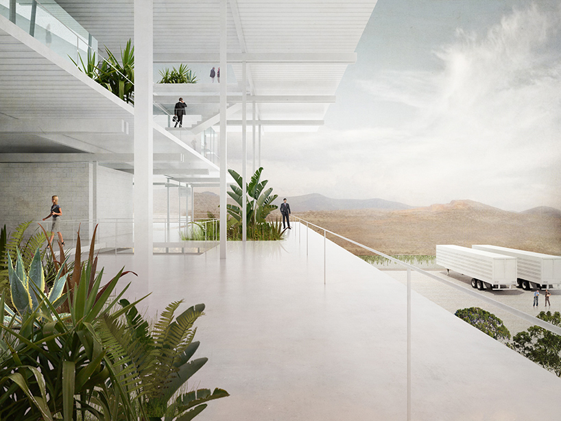
spaces are positioned within the steel framework as free-standing compartments
CZ (continued): as a second step we introduced free standing and naturally ventilated rooms recessed from the façade, so that they would avoid the direct sunlight and cannot overheat. all finishes are kept white to reflect the sun. a mix of indoor and outdoor spaces comprises the offices, and employees are encouraged to use them all during their working day. meetings can take place in shaded open terraces with natural cross ventilation. additionally, we embedded vegetation on all floors to improve the work environment and to benefit from the micro-climate that the plants provide. in a situation where the commercial approach is for an air-conditioned office block, we managed to introduce an architecturally ambitious and environmentally friendly structure that will provide high quality work conditions.
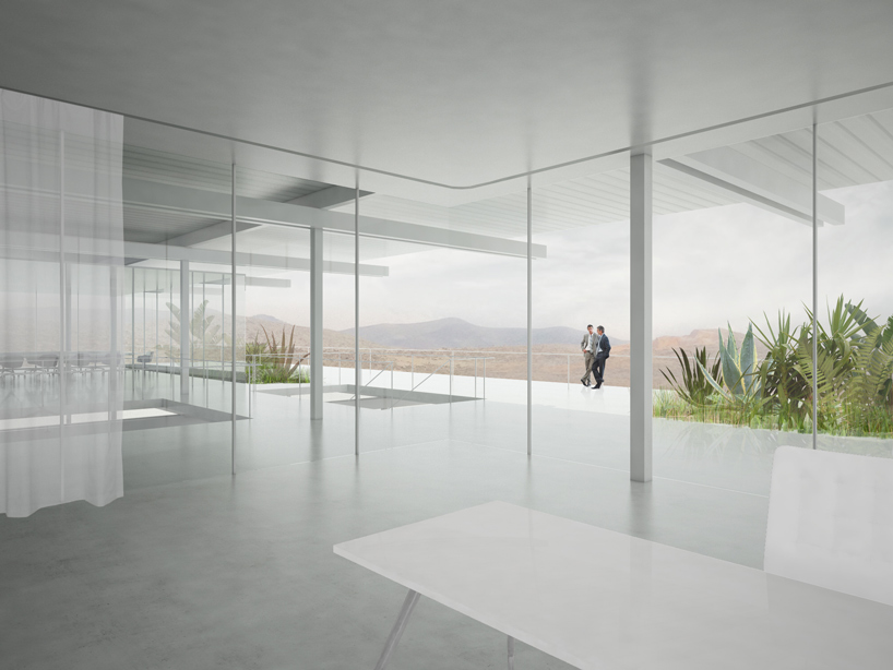
roofed outdoor areas around the enclosed rooms serve as informal meeting and hot-desk zones
Save
Save
Save
Save
Save
Save
Save
Save
Save
Save
Save
Save
Save
Save
Save
Save
Save
Save
Save
Save
Save
Save
Save
Save
