KEEP UP WITH OUR DAILY AND WEEKLY NEWSLETTERS
PRODUCT LIBRARY
do you have a vision for adaptive reuse that stands apart from the rest? enter the Revive on Fiverr competition and showcase your innovative design skills by january 13.
we continue our yearly roundup with our top 10 picks of public spaces, including diverse projects submitted by our readers.
frida escobedo designs the museum's new wing with a limestone facade and a 'celosía' latticework opening onto central park.
in an interview with designboom, the italian architect discusses the redesigned spaces in the building.
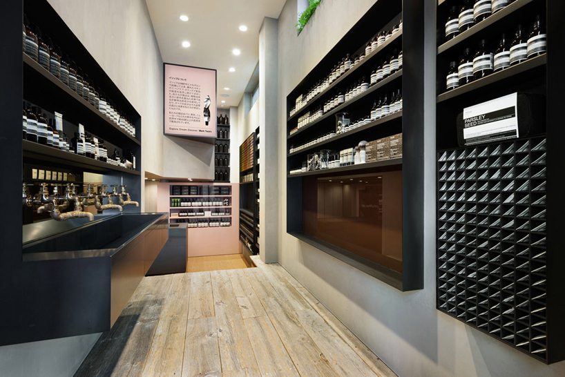
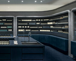
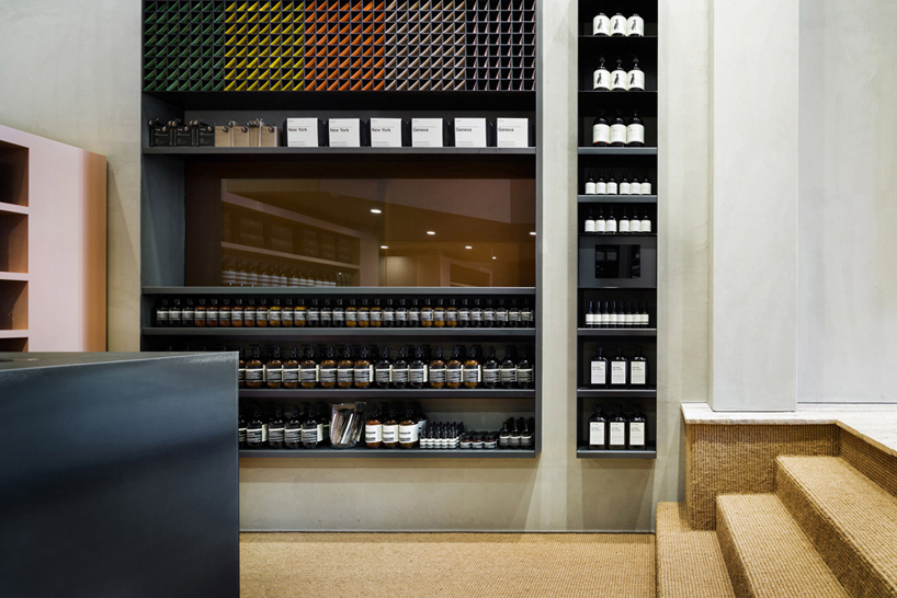 blackened steel is used for the counter and storage piecesphoto: takumi ota
 the basin – a signature feature of all aesop shopsphoto: takumi ota
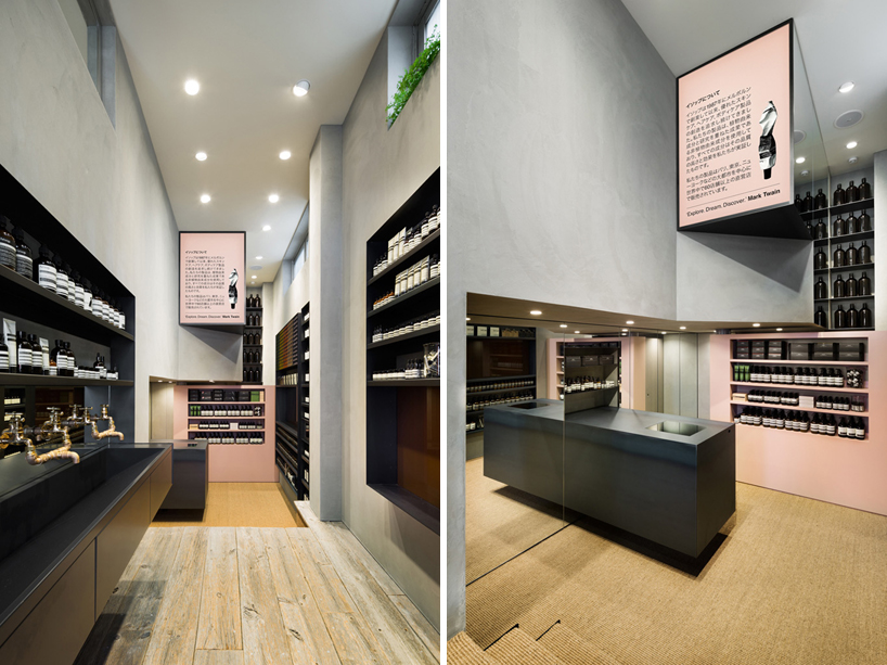 views of the transition of floor coverings, from weathered wood to sisal carpetingphotos: takumi ota
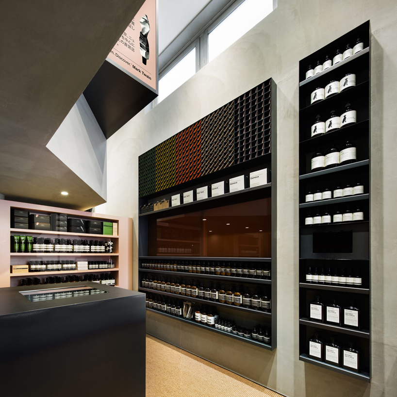 the back end of the store is lit by natural light which floods through from windows situated along the edge of the wall and ceilingphoto: takumi ota
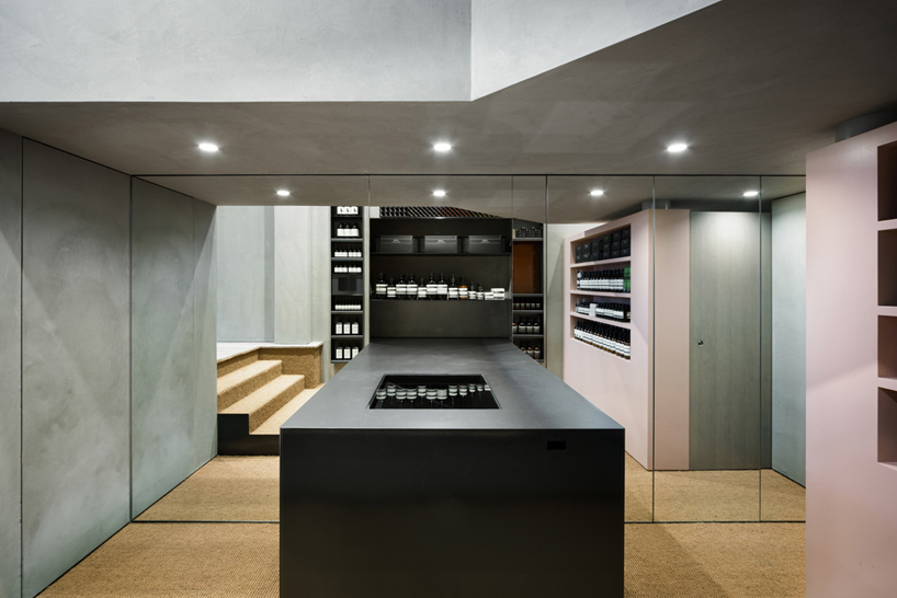 at the shop’s rear, there is a recessed area where there is a large work surface extending from a mirrored wall which visually expands the spacephoto: takumi ota
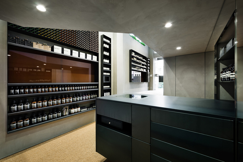 view into the shop from the backphoto: takumi ota
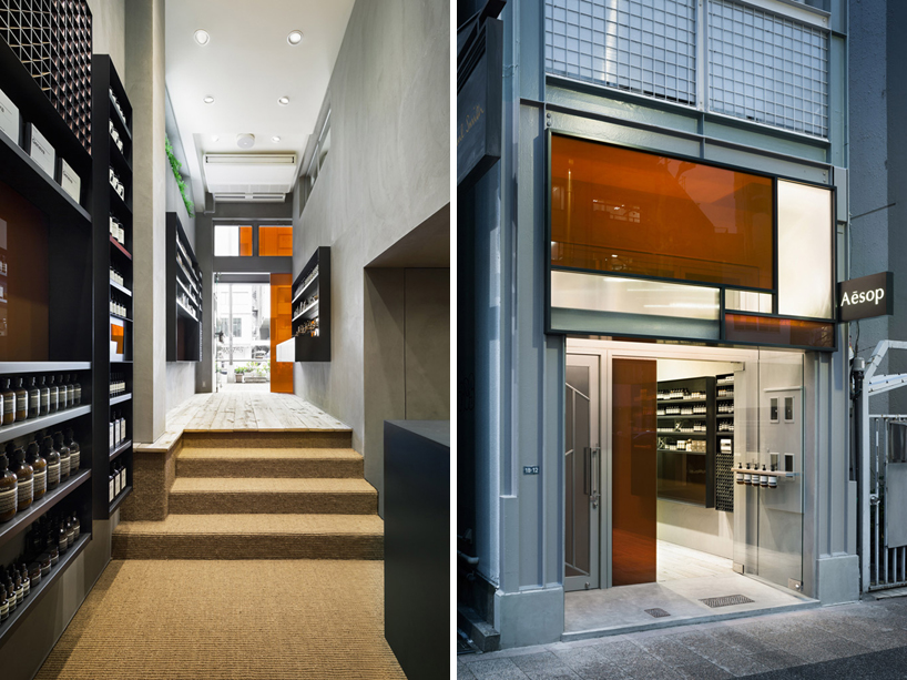 left: a look down the narrow retail spaceright: the glass geometric patchwork façadephotos: takumi ota