TOP 10 temporary structures of 2015


the past year has seen an array of pavilions and temporary structures realized for events, festivals and various occasions all around the world. tasked with a smaller budget, scale and a refined brief; architects, designers and artists alike are challenged to craft their proposal with more detail, focusing on engineering methods to engage with people’s senses. this culmination of art and architecture continues our annual review of the year’s BIG stories, as we take a look at the diverse array of temporary structures that caught our eye in 2015.


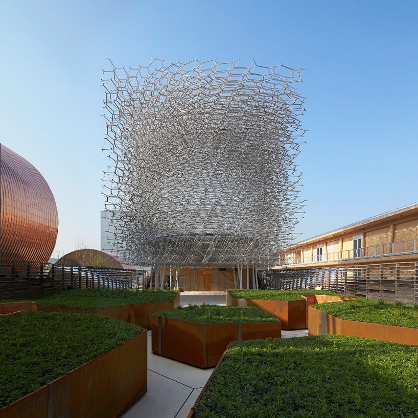
UK pavilion at expo milan 2015 by wolfgang buttress

UK-pavilion-expo-milan-2015-wolfgang-buttress-designboom-01-818x818
the english-influenced meadow leading to the pavilion changed with the seasons
image © hufton+crow 


led by UK trade & investment (UKTI), the pavilion representing the UK at this year’s expo milan was designed by nottingham-based artist wolfgang buttress, with stage onevisitors entering the site pass through a vegetated meadow landscape beneath the buzzing and illuminated framework to get a preview of the spectacle above. after passing up a staircase, one accesses the structure’s internal sphere from behind, to experience aspects of a live beehive through the architecture’s sensorial qualities. 


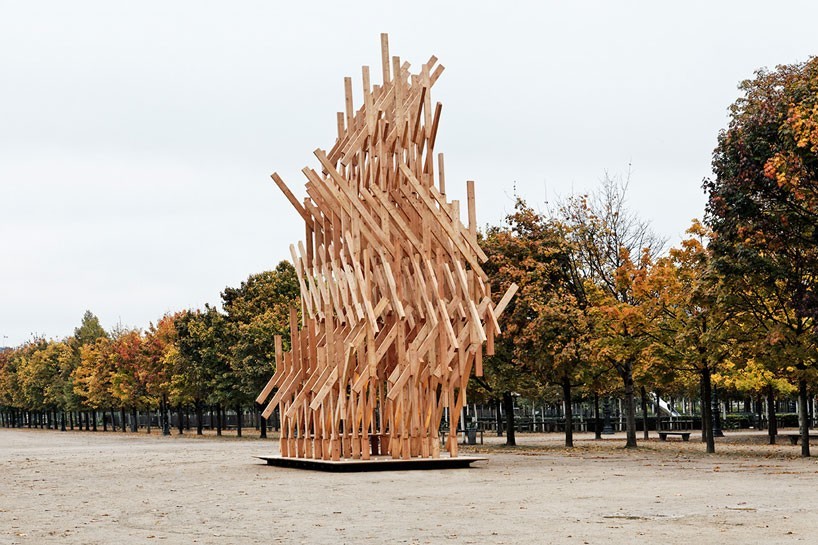
yure pavilion by kengo kuma

kengo-kuma-yure-jardin-des-tuileries-pavilion-paris-designboom-01-818x545
philippe gravier’s ‘small nomad houses project’ was created with the ambition to bring art and architecture together
image © antoine baralhe / courtesy of galerie philippe gravier


rising at a height of 12 meters, japanese architect kengo kuma‘s timber pavilion was unveiled in the tuileries gardens during the occasion of this year’s FIAC festival. kuma’s poetic response features a criss-crossing pattern of timber pieces which have been carefully assembled, stacked and twisted using traditional japanese techniques.


‘yure, is a japanese expression for a nomadic shelter slowly moving in the wind. it undulates like trees that gently swing slowly their branches and leaves, the organic geometry by a geometric composition of elements of wood.’ – kengo kuma


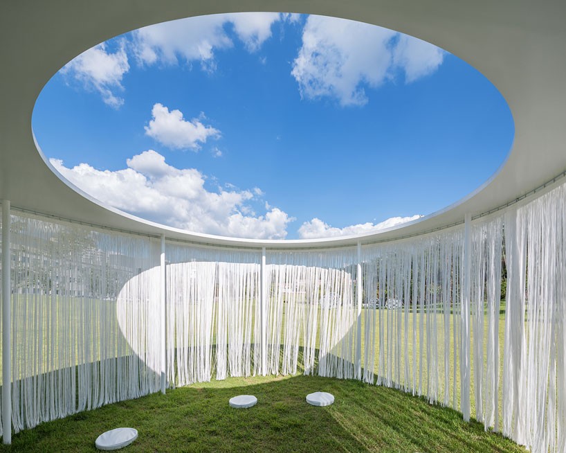
the oasis pavilion by OBBA

OBBA-architects-oasis-pavilion-amore-pacific-r-d-korea-designboom-07
a curtain of white thread runs around the perimeter of the structure, moving gently against the breeze
image © kyung roh


hosted on the grounds of the amorepacific museum of art, south korea, OBBA architects explored fluid architecture that crosses the boundary of space within their pavilion. circular openings were cut from the roof, framing perfect circles of the sky above, meanwhile a curtain of white thread ran the length of the pavilion’s perimeter. reminiscent of willow leaves, the curtain moved along with the breeze – blurring the boundary between the inside and outside 


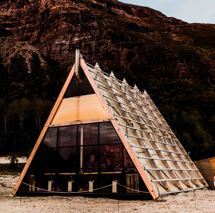
world’s largest sauna at SALT festival, norway

worlds-largest-sauna-agora-salt-festival-norway-designboom-02-1
based on the beach, the A-frame references norwegian fish racks
image © martin losvik


during the arts festival SALT, the world’s largest sauna was set within a timber A-frame, providing visitors with warmth, a place for social exchange and complemented with an ambient background soundtrack. referencing traditional norwegian fish racks, the rising, stepped amphitheater seating can accommodate over 100 people at once and simultaneously, overlooks the white sand beach while framing the mountains and clear waters.


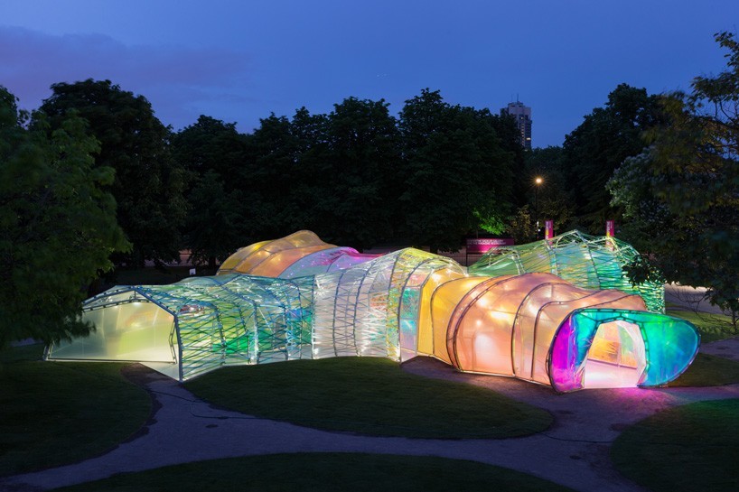
serpentine pavilion by selgascano

serpentine-pavilion-2015-selgascano-london-designboom-01-818x545
the sculptural wooden element was realized using computer technology
images © iwan baan


this year’s serpentine pavilion in london was designed by spanish studio selgascano. featuring an amorphous, double-skinned, polygonal structure clad in of panels of a translucent, multicolored fluorine-based polymer (ETFE). visitors are able to enter the pavilion at a number of different points, with a secret corridor connecting the inner and outer layer of the scheme.


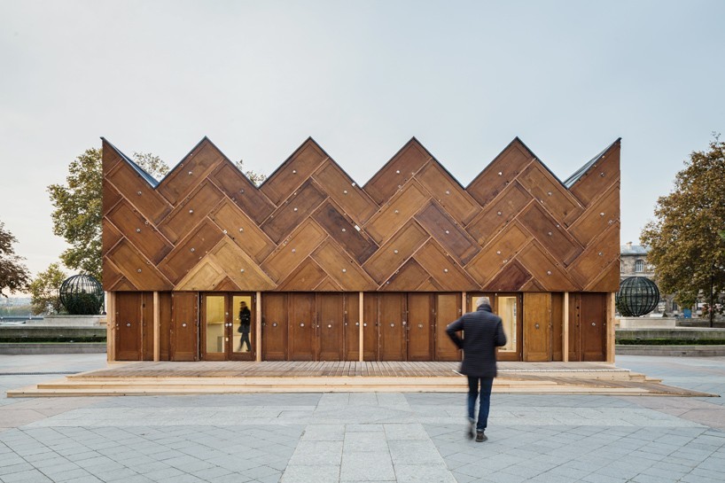
circular pavilion by encore heureux

encore-heureux-circular-pavilion-paris-designboom-01-818x545
the experimental project uses reused materials
image © cyrus cornut


designed by encore heureux architects, this temporary structure in paris is an experimental project built using reused materials. the name ‘circular pavilion’ refers not to the building’s shape, but rather to a design process that involves using recycled components. building materials have been taken from construction sites, erroneous orders, and unused stock, with the façade comprising a total of 180 wooden doors.


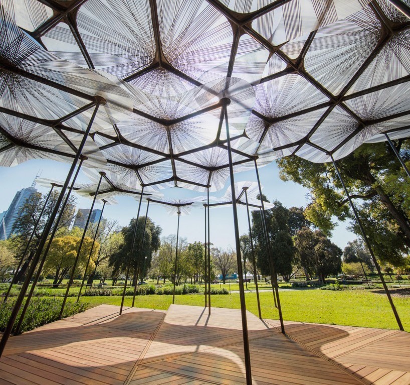
Mpavilion by AL_A

MPavilion-amanda-levete-melbourne-queen-victoria-gardens-designboom-04-818x1023
a canopy of translucent petals is supported by slender columns
image © john gollings


designed by AL_A led by british architect amanda levete, the 2015 MPavilion opened to the public in melbourne, australia. commissioned by the naomi milgrom foundation, the temporary structure employs materials and technologies developed for the aerospace industry to create a canopy of translucent ‘petals’ elevated four meters above ground.


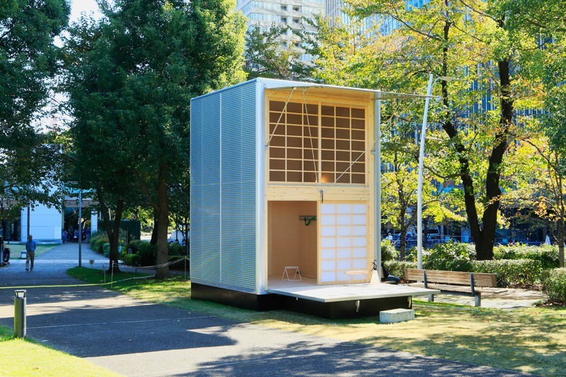
muji hut by konstantin grcic

muji-hut-tokyo-design-week-designboom-03-818x545
the rigid nature of the structure ensures that it can be placed in a variety of terrains
image © muji


german designer konstantin grcic developed an aluminum hut for japanese company muji, which was presented at the design touch 2015 event in midtown garden during tokyo design week 2015. grcic worked around japanese building regulations and the enclosed space is small enough to be built without the need for local planning permission. measuring just 3×3.3×4.5 meters, the hut uses the same lightweight technology and fabrication system as delivery trucks, with similar joining methods and corner detailing.


UNBUILT pavilion by harvard GSD

harvard-GSD-design-miami-unbuilt-pavilion-designboom-02
the pavilion is design miami/’s first to be led and developed by a student team
image © designboom


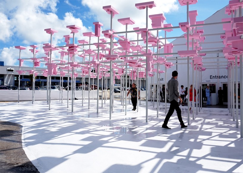
situated at the entrance of this year’s design miami/ event, the UNBUILT pavilion was conceived by a team of five architecture students — joanne cheung, jenny shen, steven meyer, doug harsevoort, and yiliu shen-burke from harvard GSD. a metal frame supported a series of 200 unique work models; the pink color providing a vibrant contrast against the blue miami sky. the project inherently captured the meticulous, behind-the-scenes stages of the developmental process that every design student experiences, bringing to life the unseen, and celebrating it as a dynamic public installation.


rising canes pavilion by penda

rising-canes-pavilion-penda-beijing-design-week-designboom-01-818x545
the design of the pavilion uses no nails or screws and made completely from recycled materials
image © xia zhi


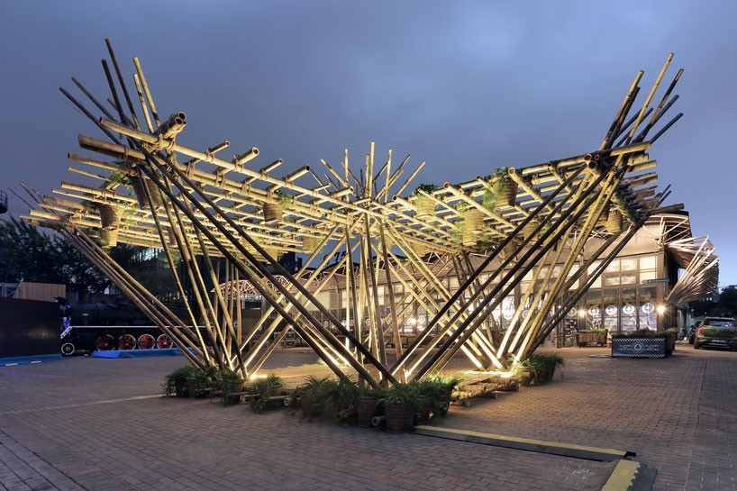
over the past year, architecture studio penda has been developing a structural system made entirely out of bamboo and ropes. named ‘rising canes’, the design left the bamboo canes unharmed in order for the material to be reused after the installation. during design week, visitors were encouraged to seed plants into baskets that are connected to the pavilion.