steven holl discusses the sifang art museum in nanjing
image courtesy of steven holl architects
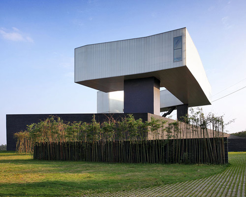
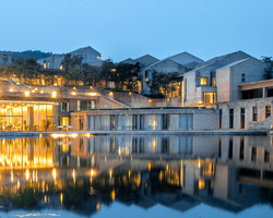
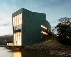
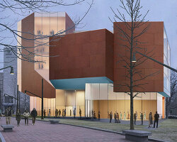
steven holl architects, collaborating with video specialists spirit of space, has released two short films documenting the ‘sifang art museum‘ which opened in november 2013 in nanjing, china. developed with li hu, principal of OPEN architecture, holl’s museum design references the alternating spatial mysteries of chinese paintings, exploring constantly shifting viewpoints and layered space. formed by a field of parallel perspective volumes, the gallery’s ground level passages gradually turn into the winding structure of the gallery above. elevated, the upper exhibition hall unwinds through a clockwise turning circle before framing views of the distant city. this visual axis establishes a relationship with the great ming dynasty capital.
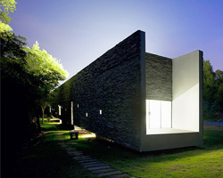
paved in recycled hutong bricks, the courtyard limits the monochrome colors of the museum, reinforcing the link with chinese paintings and providing a blank canvas for commissioned artworks to be presented. bamboo, previously growing on the site, has been used in the bamboo-formed concrete, with a black penetrating stain. from an environmental standpoint, the museum is heated and cooled by geothermal wells, and features a storm water recycling system.
see designboom’s previous coverage of the ‘sifang art museum’ in nanjing here.
sifang art museum: a conversation with steven holl
video courtesy of steven holl architects
the film, ‘a conversation with steven holl’, shows the renowned architect on-site, as he explains the design concept for the museum. holl describes the courtyard’s parallel planes and how they can influence the occupant’s movement through them.
‘you can see the way the landscape is organized in these parallel perspective walls, creating conditions where there’s not really a sense of a vanishing point but there’s a sense of warping the space. this is all about the body’s movement through space. so its very important that the bamboo is a horizontal texture, because that’s giving more emphasis on the condition of the walls and different conditions of space.’
indicating his vision for the museum’s interior, holl explained, ‘the condition of space isn’t exactly box-like but it is more or less orthogonal – that gives good background for the art. in this building we tilted everything that continues the parallel perspective condition of the courtyard into the building itself, in a way that connects the above and the below in a continuous feeling of spatial flow.’
a walk through sifang art museum in nanjing, china
video courtesy of steven holl architects
the second video in the series studies the charging perspectives presented to visitors as they move through the building. the spatial sequence takes guests from china’s lush green landscape, through the museum’s entry courtyard and lower gallery, before leading to the floating upper gallery.
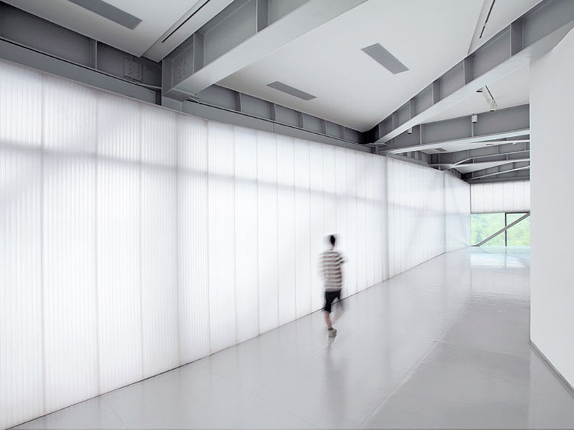
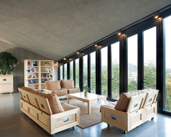
the upper gallery frames views towards the city center
image courtesy of steven holl architects
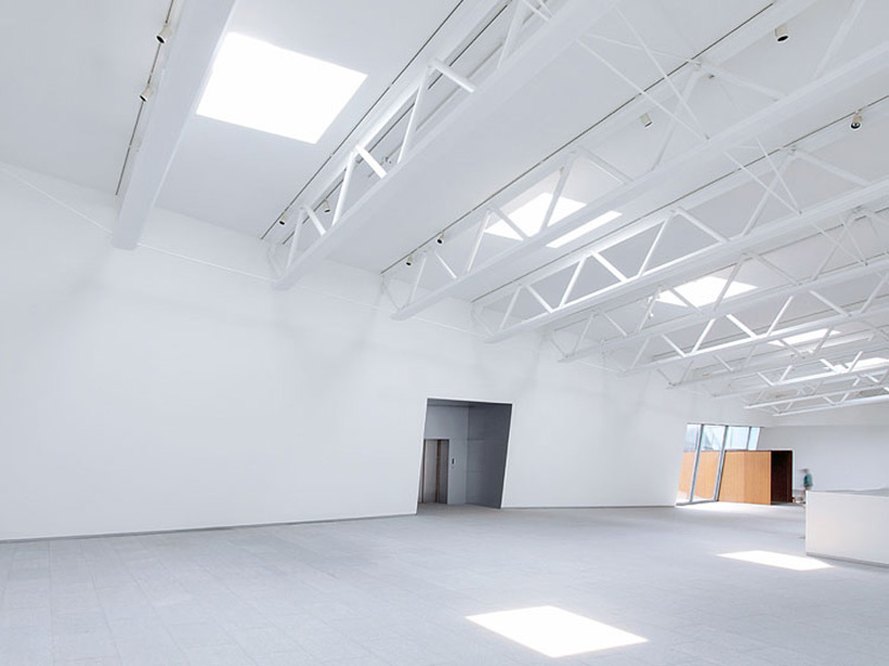
the entrance and lobby of the art museum
image courtesy of steven holl architects
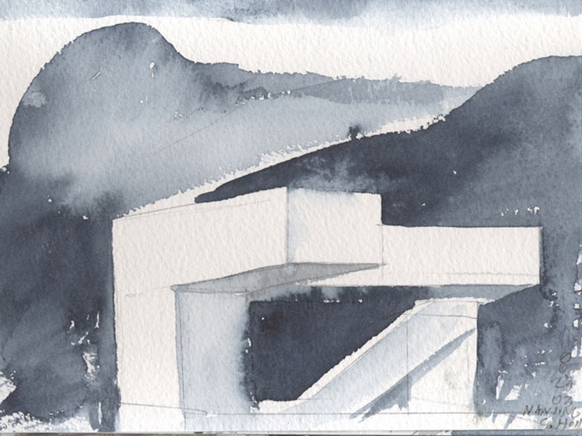
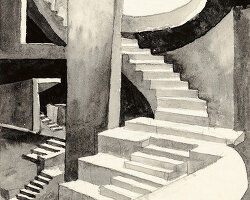
watercolor sketch by steven holl
image courtesy of steven holl architects
