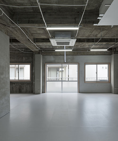
in creating its design for an office space in shibuya-ku, tokyo, architectural studio 2001’s main concern was producing a location capable of adapting to a diverse range of work styles and business models. in response to the abundance of office rental websites — each equipped with a comparative review facility — the studio’s plan is designed to appeal to as many prospective renters as possible by reducing the 50 year old concrete apartment building to its raw, unfinished state.
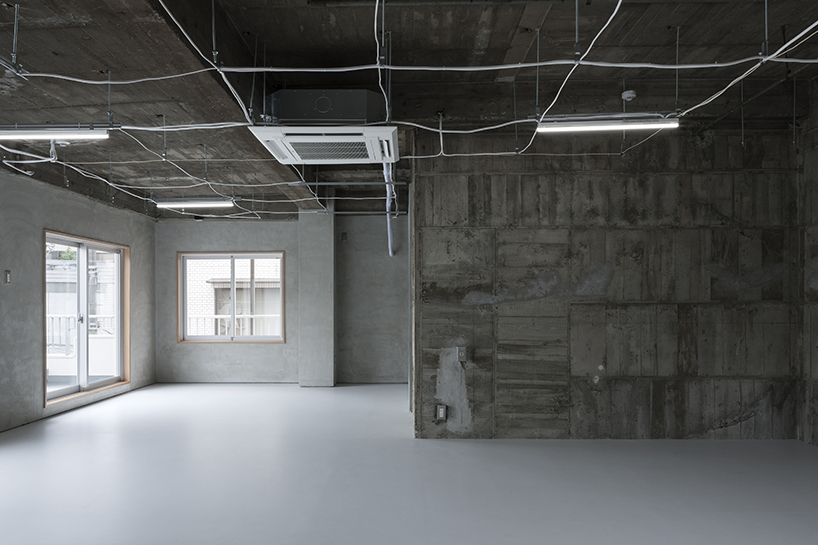
the different textures of existing concrete walls and the repair mortar created a variety of walls.
all images by shimizu ken
to achieve this, studio 2001 set about stripping the space down as much as possible, what the team democratically call, ‘dismantling the existing dwelling positively’. by reducing the walls back to their constructive, skeletal state, 2001 create a space that is characterized by its variety of contrasting walls and textures, while simultaneously retaining a single homogenous style. the subdued palette of the exposed wall is continued onto the floor of the office with the use of grey vinyl tiles, an adaptive material for an adaptive space. repairs with mortar took place only in areas where deterioration specifically required it, tonally matching the floor and adding a contemporary feel to the industrial frame.
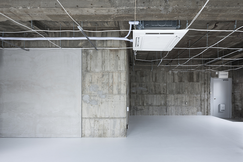
the functional facilities — such as air-conditioners and outlets — are incorporated into the grid of vinyl cable.
in what is probably the space’s most noteworthy feature, a ‘hypothetical ceiling’ has been conceived at the top of the space by means of an interconnected grid of vinyl cables. these cables are in turn supported by constructs traditionally used in a suspended ceiling, such as threaded rods and ceiling joints. in this way, the grid is capable of performing all the functions of a traditional ceiling without cramping the space. the thin, weaving wires also add to the overall ‘stripped back’ aesthetic of the office, enhancing the utilitarian character of the office. elsewhere, the toilet is concealed within a white box that descends from the ceiling, a structure whose exterior also incorporates the kitchen unit. with this alignment the studio was keen to keep the kitchen small and unobtrusive, discouraging the conflation of work and living space.
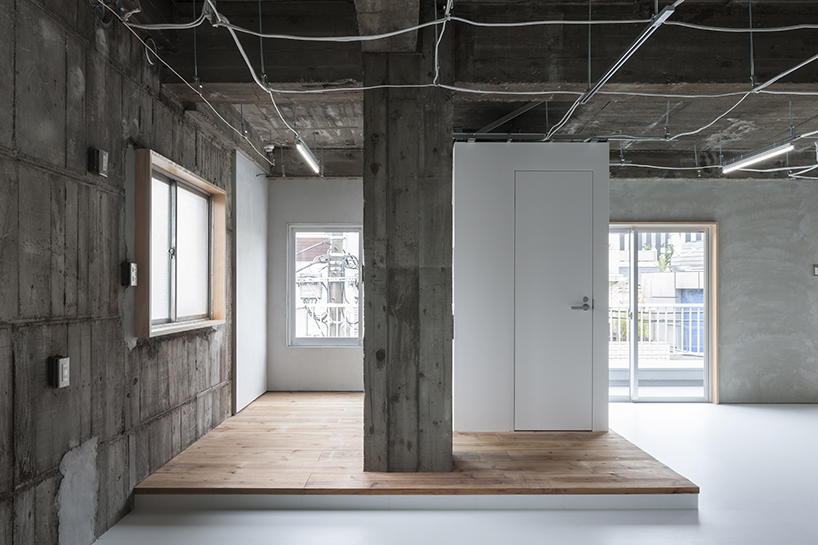
the team revealed what they call the ‘skeleton’ of the building, and incorporated it into their design
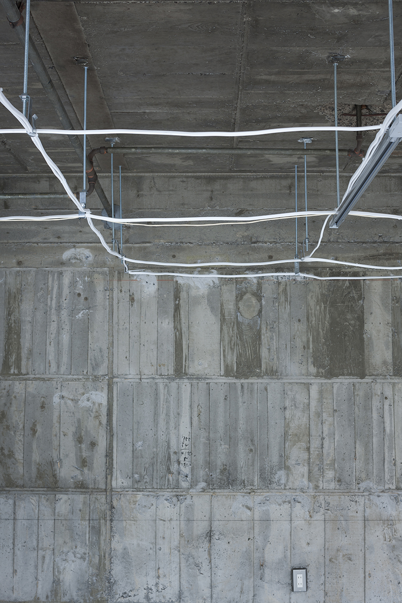
in order to make the ‘hypothetical ceiling’, 2001 scultped vinyl cable into a grid form with ceiling threaded rods
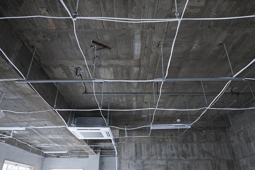
the grid is capable of suspending air conditioners, lighting fixtures, and other technical facilities
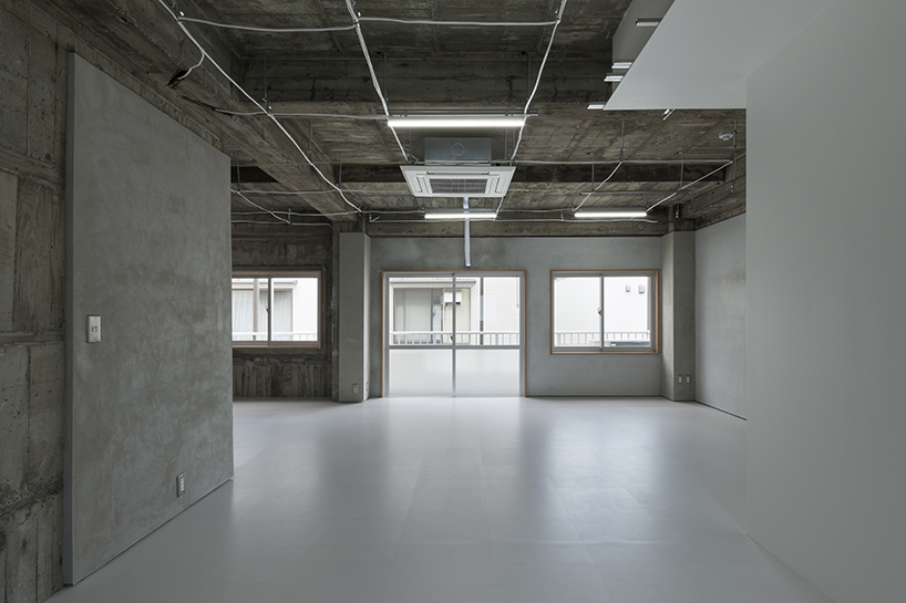
the floor is created using vinyl tiles
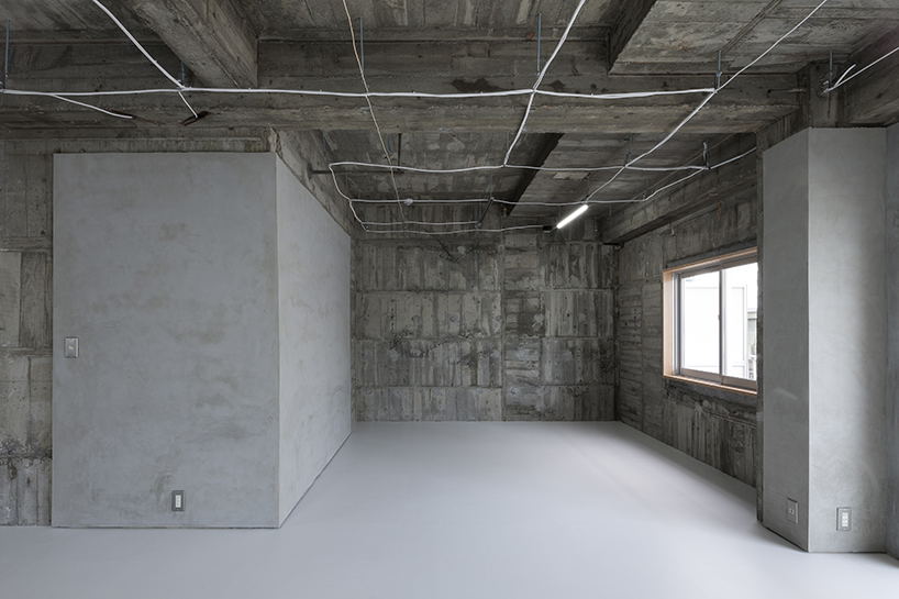
the wall was repaired with mortar only where deterioration required it
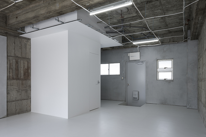
the bathroom is concealed in a white box that descends from the ceiling
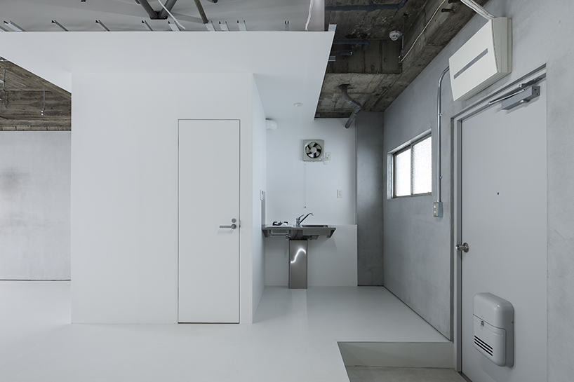
the kitchen area is reduced and concealed
![]()
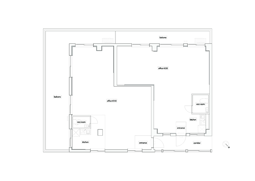
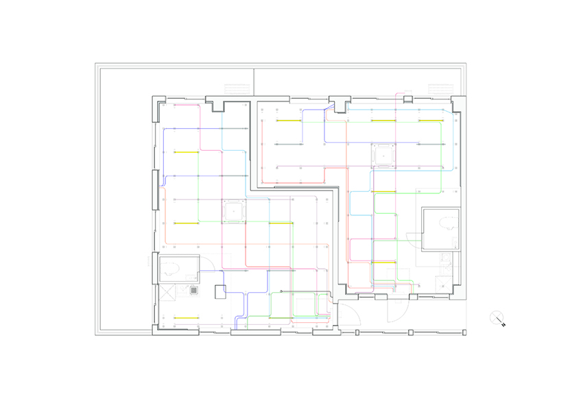
project info:
title: office in sendagaya
architects: yoshi kishida / 2001
location: shibuya-ku, tokyo, japan
construction: ROOVICE
total floor area: 90.90 sqm (#310 : 47.00 sqm + #320 : 43.90 sqm)
project year: 2015
photographs: shimizu ken
designboom has received this project from our ‘DIY submissions‘ feature, where we welcome our readers to submit their own work for publication. see more project submissions from our readers here.
edited by: peter corboy | designboom
Save
