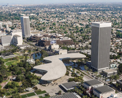
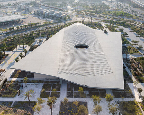
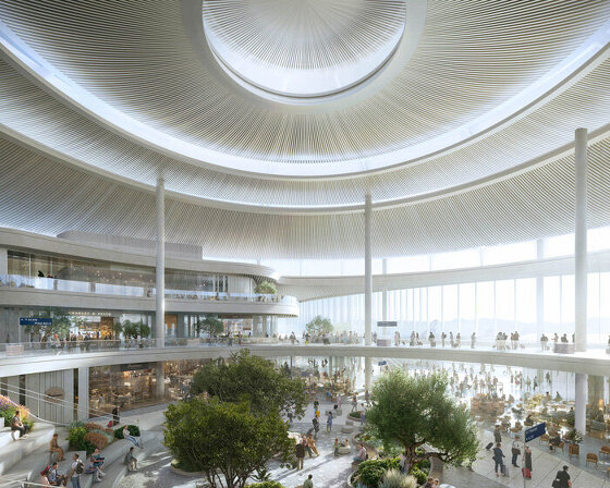
in opposition to peter zumthor’s scheme for a new los angeles county museum of art (LACMA), the citizens’ brigade launched a protest design competition to find alternative solutions. the current plans intend to demolish the four existing buildings on the east campus, and be replaced by one new building. in a ‘corrective’ competition, the citizens’ brigade invited architects from around the world to submit their alternative proposals that would expand gallery space rather than shrink it, and use less rather than more land.
the competition proposals have been whittled down to three from each of the two categories, ‘existing buildings’ and ‘ground up’, and you can vote for your favorite here until may 15th, 2020. ‘we are not proposing that any one of them be built as is, but simply suggesting that the public, the museum board, and the county board of supervisors view them as possible starting points for developing alternatives that truly capture people’s eyes, hearts, and minds, and showcase LACMA’s collections in a practical and architecturally stimulating environment.’ – the citizens’ brigade.
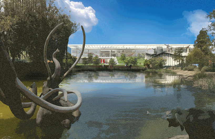
‘unified campus’ by paul murdoch architects
category: from the ground up
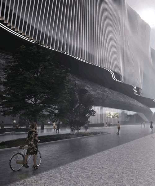
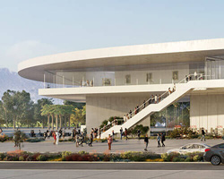
to create greater institutional cohesion, paul murdoch architects took a holistic approach to the entire LACMA campus and its relationship to the cultural institutions flanking it. the architects describe the design as ‘expressive of LA in its openness, multiplicity of urban, natural, and cultural connections, and abundant use of controlled natural light.’ the jury noted how this horizontal skyscraper – an on-axis version of the neighboring tower across wilshire – corresponds to the urbanism of the area. ‘it restores the continuity of the wilshire boulevard streetfront with a respectful attitude by placing the narrow part of the building facing the street and the broad side framing the park.’
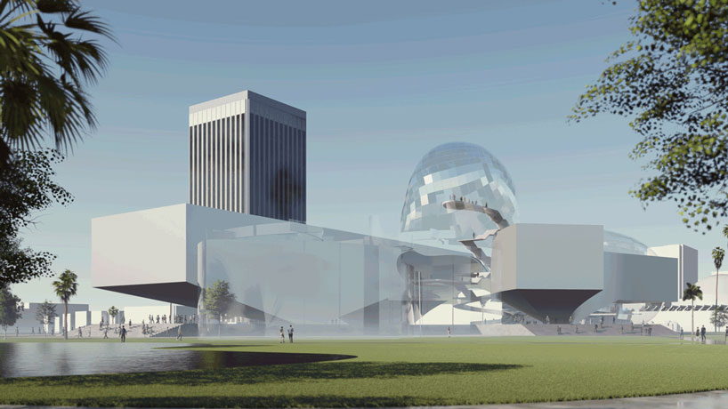
‘LACMA wing’ by coop himmelb(l)au
category: from the ground up
emphasizing ‘an architecture that combines functionality with aspiration,’ coop himmelb(l)au designed three main elements: a landscape plinth and two, three-level ‘floating’ gallery wings. public circulation on ramps connecting the volumes would be encased by expressive amorphous forms whose openness to the outside refreshes the museum visiting experience. the jury appreciated the curatorial flexibility of generous gallery spaces, with 22-foot floor-to-ceiling heights, the possibility of mezzanines and intimate galleries, and open floor plates. ‘this entry combines issues of great efficiency with moments of drama,’ noted the jury. ‘the ‘bubbles’ offer exciting spaces that celebrate the public realm while connecting to straightforward, practical, functional galleries in the wings.’
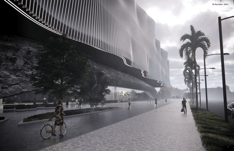 ‘hillacma’ by theeae (the evolved architectural eclectic)
category: from the ground up
theeae (the evolved architectural eclectic) considers los angeles’ diversity when proposing the museum as ‘a new cultural platform that connects people from different walks of life,’ by simultaneously offering enclosed cultural spaces and an open, sculpted, outdoor landscape. the tall building (five levels plus garden roof) combines an undulating façade along wilshire boulevard to the south with ‘hill’ element sloping into the park on the property’s north side. ‘the wilshire façade becomes a kinetic wall, imparting a strong urban experience that changes as you drive by, which is how most angelenos experience the city,’ noted the jury. ‘the back façade, a built hillside, is a landscape event that adds a surprising new participatory dimension to hancock park. this will be a hill you want to climb.’
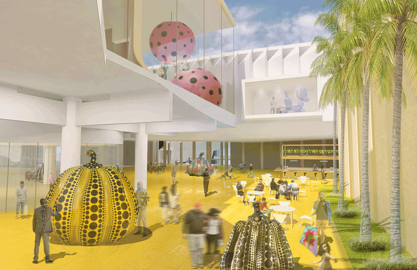
‘re(in)novating LACMA’ by reiser + umemoto
category: working with the existing buildings
reiser + umemoto’s aim was ‘to create a coherent, retroactive masterplan that builds off the campus’ prior successes and seeks to engage and reinvigorate the full breadth of LACMA’s collection.’ the three-pronged approach includes adding new elements in and around the original 1965 buildings, binding them into a new whole. the cone sits within and atop the ahmanson; the bar, an elevated gallery building, transects the campus from north to south, offering an appropriately scaled wilshire entrance and new gallery space; the cluster replaces the 1986 building with a series of interior pod-shaped galleries, as well as exterior exhibition space on a reimagined plaza level. ‘the architects found a way to make the plaza into a connective tissue and strategically make the existing buildings work as an ensemble,’ said the jury.
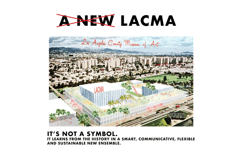
‘tabula LACMA’ by barkow leibinger with lillian montalvo landscape design
category: working with the existing buildings
this ‘reconstitution’ is an unusual hybrid of old and new, as it maintains the scale and context of the original LACMA buildings by reconstructing them with modern, sustainable materials, then interconnecting them with a new plinth form punctured by courtyards. barkow leibinger – working with landscape designer lillian montalvo – stresses this would ‘provide spaces for art, delight, and public encounter.’ the jury thought this flexible, spacious design addressed the changing role of museums by including a good amount of shopping, cafés, and event venues that urbanize the spaces and engender a lively environment. ‘there’s a powerful idea of using the area around the pavilions to create a whole new programmed space,’ according to the jurors. they enjoyed the rediscovery of the inner plaza and could ‘imagine these would be great spaces to be in, as well as fun to discover.’
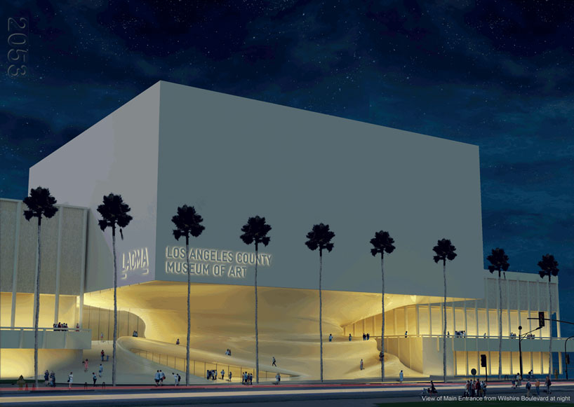
‘reimagining/restructuring’ by saffet kaya
category: working with the existing buildings
replacing the 1986 building, saffet kaya proposes ‘to preserve the best elements of the past while creating a more contemporary, multi-use alternative space.’ an elevated volume that respects the scale of the existing structures has solid walls on three sides for curatorial flexibility, then opens to the north with an all-glass façade. circulation into the entrance is through a gentle ramp/walkway leading into the lobby that directs visitors to the other buildings on other floors – the ramps equalizing the importance of all adjacent floors. the new structure is reserved for exhibition space on six above-grade levels, including the interior of the spiral element. ‘this design achieves a considerable service to the campus, making the east campus more coherent than it’s ever been,’ said the jury. ‘the biological form of the spiral – as ancient as seashells and hurricanes – gives value to the floors it connects.’
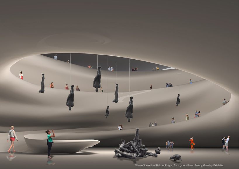
‘reimagining/restructuring’ by saffet kaya
category: working with the existing buildings
competition info:
competition name: LACMA not lackMA
designs by: barkow leibinger, berlin; coop himmelb(l)au, vienna; kaya design, london; paul murdoch architects, los angeles; reiser + umemoto, new york city; and theeae (the evolved architectural eclectic), hong kong
