rotterdam-based architecture practice — or, as the team calls itself, ‘label’ — namelok presents its first, yet very professional project ‘house 1’, located at the edge of rotterdam. the young architects derive their approach which uses simplicity combined with functionality from the works of renowned architects, such as lina bo bardi and aldo van eyck — these references can be traced through the color selection and very gentle and exact use of materials.  

simple and functional house 1 by namelok refers to mid-century architecture
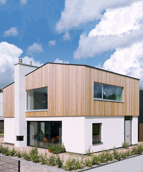
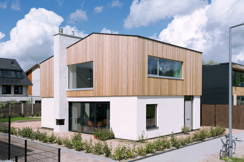
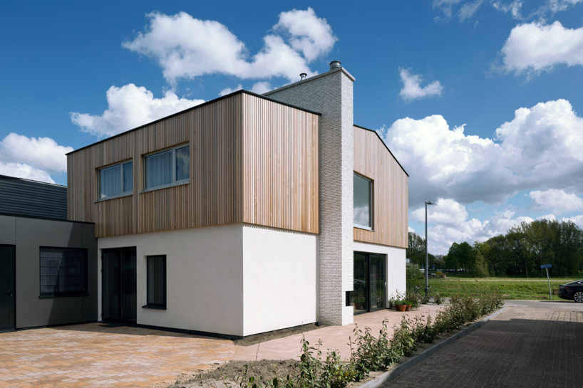
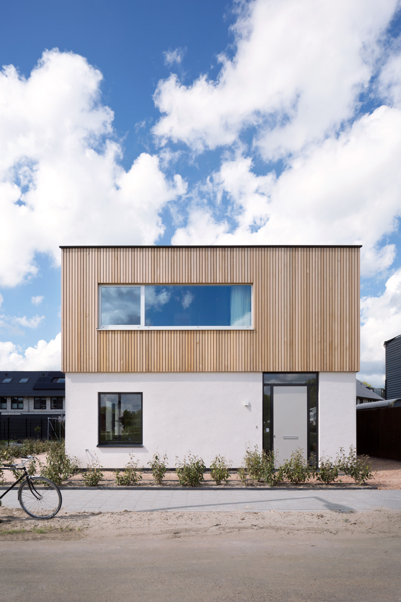
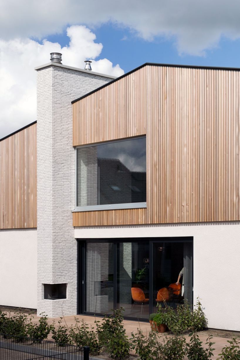
three main materials were used in the exterior: western red cedar, plaster, and brick


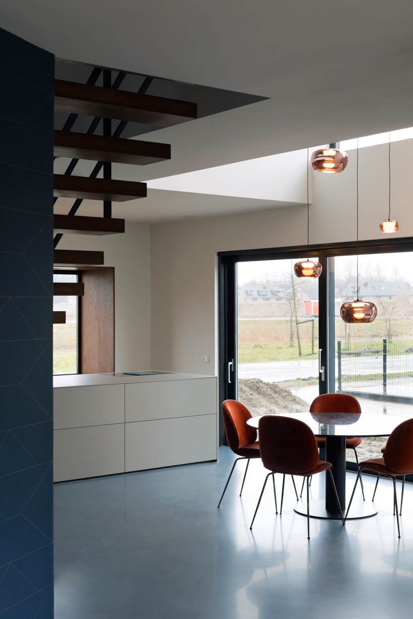
the design of house 1 serves as a perfect base for a young and modern family where three design principles are to start with: the kitchen is the central core, horizontal and vertical connections are open and visible constructions work together with tangible textures.

simple and functional house 1 by namelok refers to mid-century architecture
the heavy, stone base is topped with a wooden construction


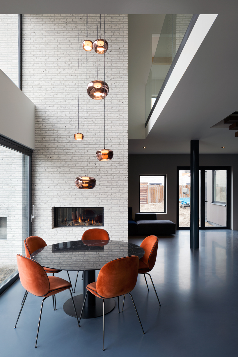
the landscape and the beautiful view can be seen from the spacious and naturally exposed kitchen which extends all the way up to the roof. however, the living room is completely different: the dimly lighted room is meant for quiet and intimate moments with the family. the chimney separates the rooms and functions as a natural backbone throughout the house, it connects the garden to the living area with its in- and outside fireplace. these important features all revolve around the concept of maximizing human potential, which both lina bo bardi and aldo van eyck used in their architectural concepts.

simple and functional house 1 by namelok refers to mid-century architecture
the tangible materials give the house a feeling of old-fashioned craftsmanship, inspired by the mid-century architecture


the separation of the living areas by functional and natural features creates a different purpose for all rooms in the house. ‘we tried to create the home in such a way that all of the rooms have a different atmosphere for varying tendencies,’ explains namelok team. ‘it takes the experience of famous architects to adhere a different character to every space in the house as to make the family feel at home during any time of the day.’

simple and functional house 1 by namelok refers to mid-century architecture
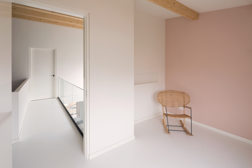
the difference in lightness between the two levels is also shown by the color of the window frames


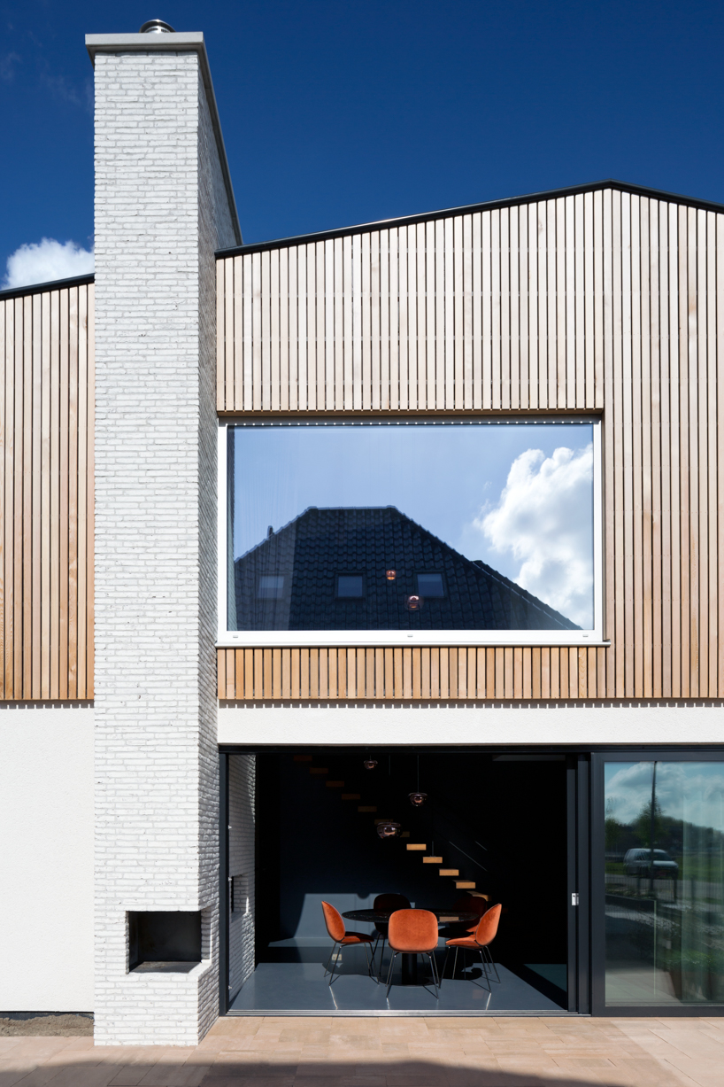
the used materials go together to form a minimalistic, yet warm feeling for the design. the coarse plaster and frost grey bricks have a simple design but add tangible textures to the inside and outside of the house and chimney — the vertical western red cedar slats add warmth and define and unite the parts of the house because of the difference in color and texture.

simple and functional house 1 by namelok refers to mid-century architecture
the massive chimney is equipped with an open fireplace outside and a gas fireplace inside


simple and functional house 1 by namelok refers to mid-century architecture
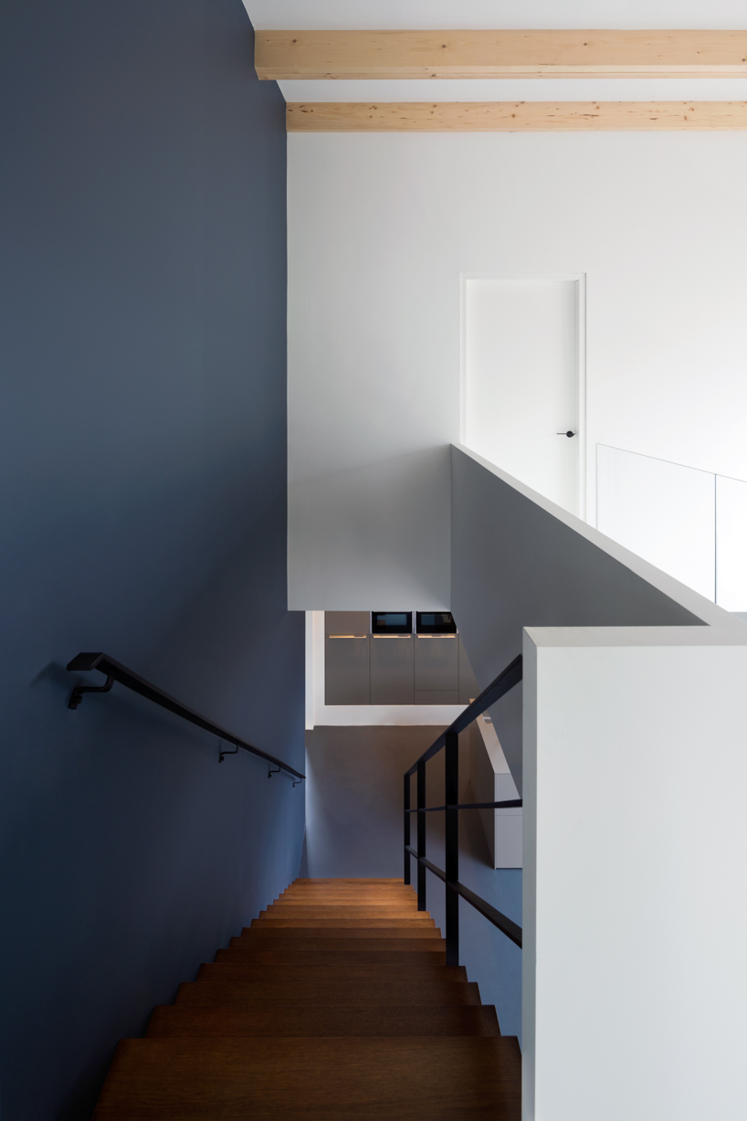
view from the second-floor bridge down the stairs


simple and functional house 1 by namelok refers to mid-century architecture
the light grey brick chimney connects every space: outside, inside, downstairs and upstairs


simple and functional house 1 by namelok refers to mid-century architecture
large glass sliding doors open to the garden and the outside dining area


simple and functional house 1 by namelok refers to mid-century architecture
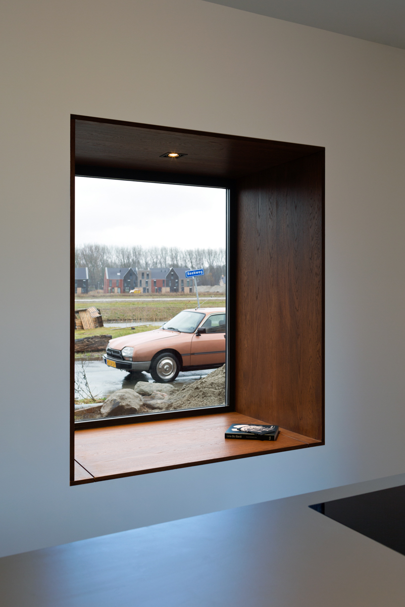
the beautiful window seat is an ideal spot for relaxation in the kitchen area


simple and functional house 1 by namelok refers to mid-century architecture
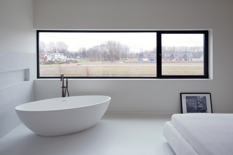
the en-suite bedroom provides the best view over the dutch polder landscape


simple and functional house 1 by namelok refers to mid-century architecture
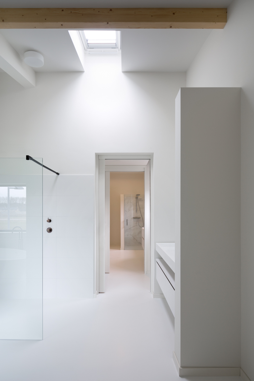
the upstairs lavatory is accessible from the en-suite bathroom as well as the children’s bathroom through two sliding doors


simple and functional house 1 by namelok refers to mid-century architecture
the minimalist glass parapet ensures a visible connection between the levels


project info:


location: rotterdam, the netherlands

year: 2016 – 2018

status: completed

size: 230 sqm

design: namelok, rotterdam

execution: damsteegt, nieuw-lekkerland

construction management: ibz, albergen

photography: christian van der kooy


designboom has received this project from our ‘DIY submissions‘ feature, where we welcome our readers to submit their own work for publication. see more project submissions from our readers here.


edited by: maria erman | designboom