SIGNTERIOR = SIGNAGE + INTERIOR
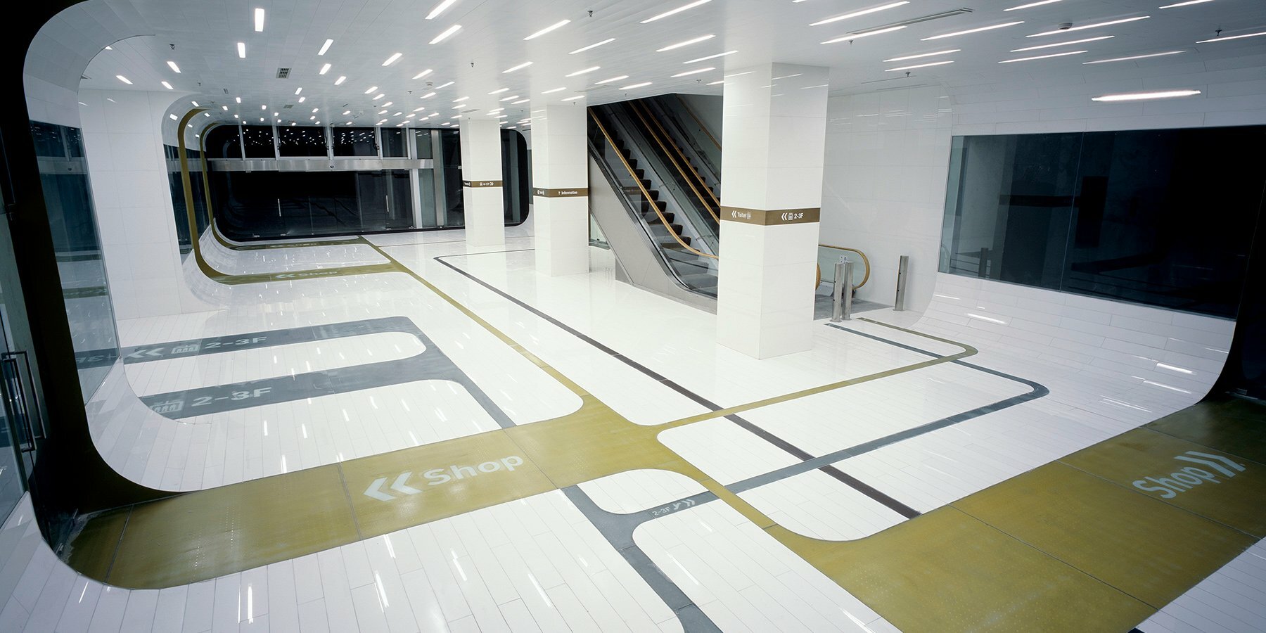
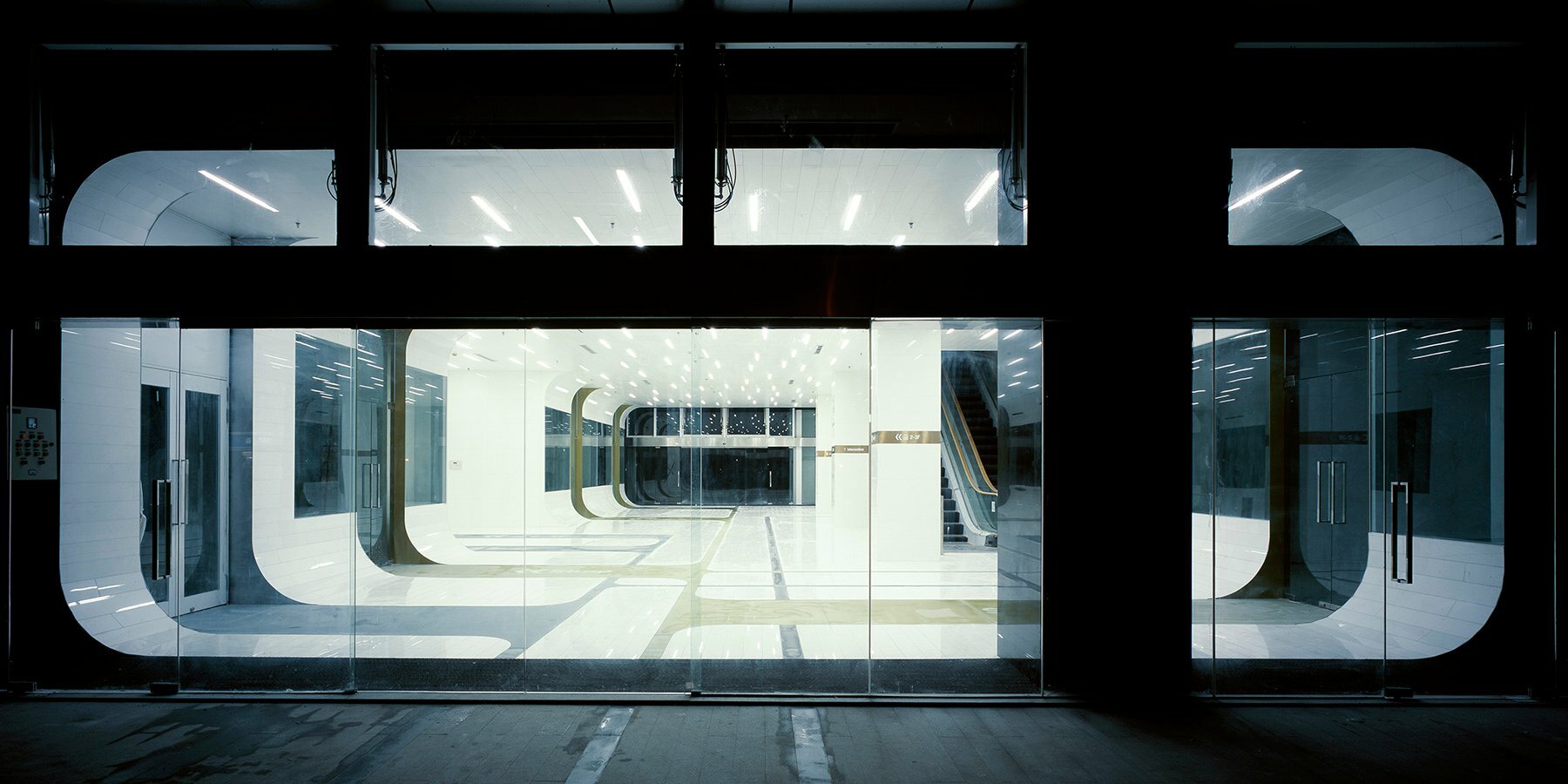
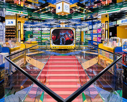
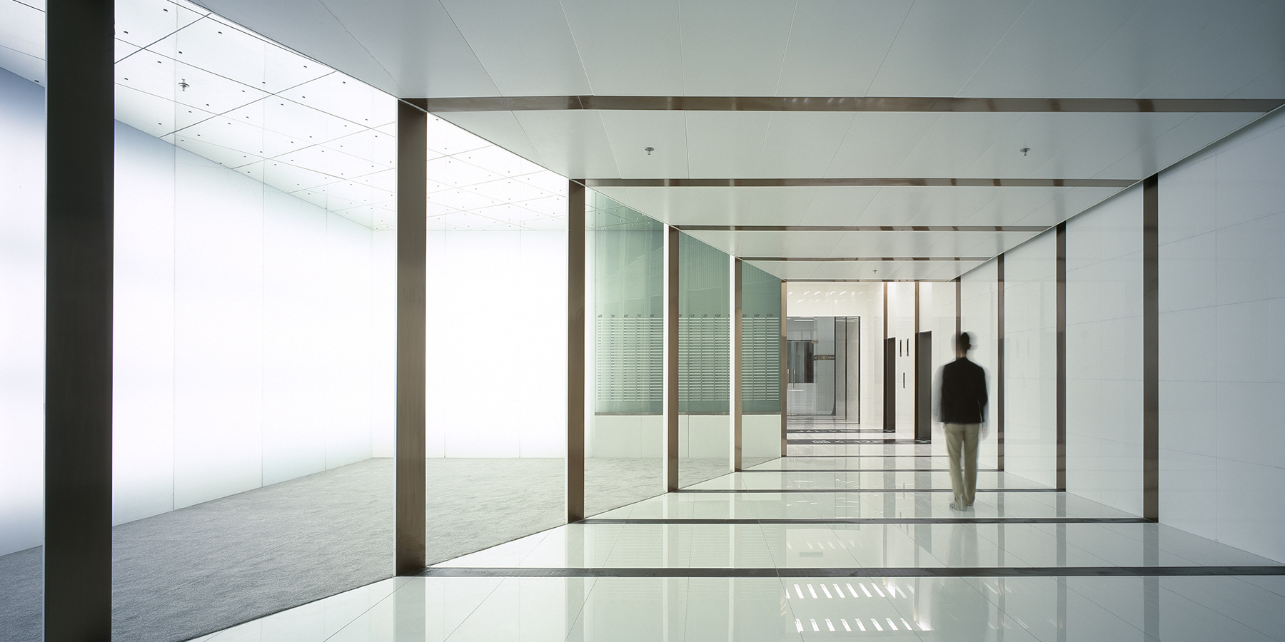
japan and china-based design practice A-asterisk has completed ‘signterior’ (named after the combination of signage + interior), an interior project in shanghai, marked by distinctive signage to guide people through various commercial areas. the space houses three different functions —a retail center, a soho area, and an office complex— as well as multiple entrances and elevators that facilitate circulation. black, silver and golden lines run across the all-white background to mark the proposed routes, while a series of linear fixtures generate a brightly lit environment.

all images courtesy of A-asterisk
colored signage and luminous elements facilitate navigation
the complex building features multiple floors with different uses, including shopping spaces, a soho area, and offices. it is quite easy to get lost in a building like this, so the team at A-asterisk (find more here) created a signage system to guide people efficiently through the vast interior. different colors like black and gold are used to signify different directions, while large lettering, numbers, and arrows help visitors navigate their way through the space.
both horizontal and vertical graphic elements accentuate the sense of direction in the project, encouraging the visitors to follow the designated paths. luminous signage and linear light strips are dynamically installed throughout the interior, providing the environment with abundant light and catching the attention of the visitors. in some parts of the structure, the walls adopt a curve volumetry to further accentuate the sense of direction.