designer: DOME&ASSOCIATES

gemdale up view 1


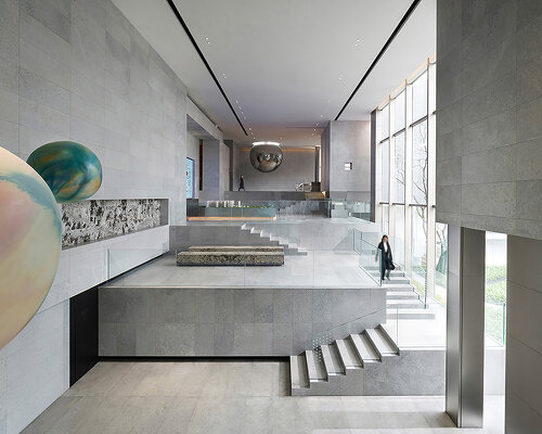
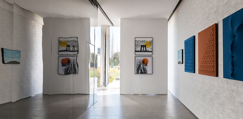
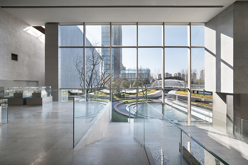
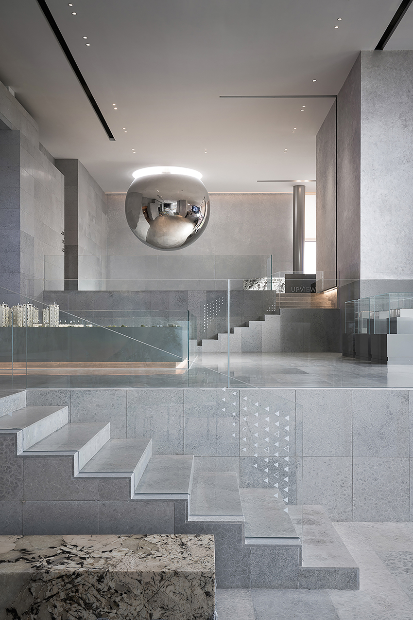
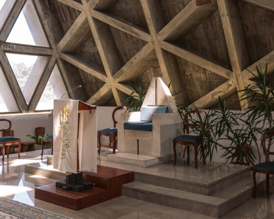
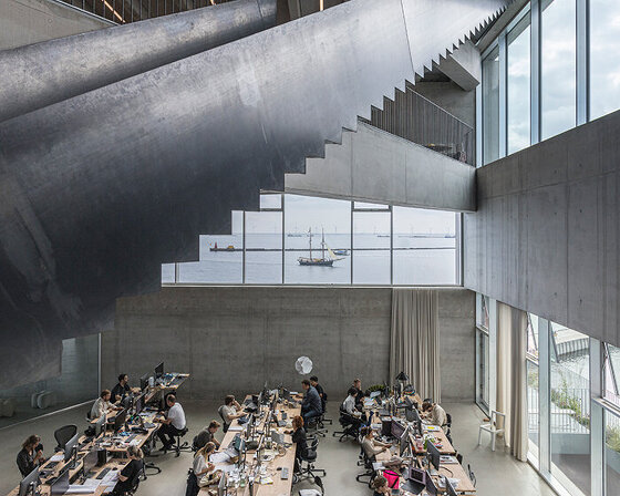
The area where the project is located in has a high degree of urbanization. The purpose of this design is to explore the unique Genius loci in the urban environment, and realize the combined design by considering the three architectural elements of modulus, details and place, so as to elevate the design to the height of living art. Create Stairs Based on the environmental constraints (openness), the initial spatial strategy is developed with depth and height – using a folding traffic flow to build creative stairs to organize the space. The exhibition hall consists of two rectangular volumes that are offset vertically from each other. The large scale entrance space allows the view to be controlled within the rectangular space. Simple, block-like geometries are interlaced in a 10-meter-high space. The volume retreating from top to bottom forms the main interface facing the street. This leads to the sculptural expression of cantilever. “The giant, solid cubic sandstone faceted stone extends to the top through three successive overlaid steps. Its total length is 5 meters, and each step shows a section of one of the three gallery floors.” These receding volumes guide visitors to enter the back yard from the street. Meanwhile, as excellent exhibition spaces, each of them gradually elongates and extends as they rise. The steps form a traffic flow for display and movement, and raise the height of sighting line. In addition, they also create a kind of centered feeling for the ball-shaped art installation in the second floor. As the steps rise, the ball becomes a focal point. Natural Light On the second floor, the central wall is designed to allow light from a skylight above the “one character” shaped staircase. We design an “abnormally shaped italic notch” on the wall and add mirror material on the vertical surface of the skylight. This arrangement allows people to see the sky from certain angles in the negotiation area. The staircase leading to the first floor extends the view. Concise line design and scattered form echo each other. The vertical shared space, the holes in the wall and the introduction of natural light on the top surface enable people and space to achieve mutual integration and dialogue. Materials and Techniques 设计师将墙面、顶面、门洞及其他各种元素组合在一起,并试图减少材料类别的方式,来实现的。 The designers integrate walls, top plane, door openings and various other elements, and try to reduce material categories. The craftsmanship of the material restores many of the delicate features of the raw material, and the wall stones are polished in a low-gloss manner. This approach reduces the brightness of the stone and is imperceptible in appearance, allowing different color tones and textures of the stone to come out. In this way, a large amount of marble forms a visual base for the front yard, allowing people to focus their attention on the material. The grey space is empty and neutral, where precious stones are inlaid in different corners. Project name: GEMDALE UP VIEW Client: Gemdale East China Regional Co. Ltd Location: Shanghai Completed time: 2021 Area: 1500 m² Interior Design: DOME&ASSOCIATES Architectural Design: Lacime architects Landscape design: Shanghai Wubei Landscape Design Co., Ltd Client team: Xia Yinghua, Wang Zhenyu, Yao Yu, Wu Meiyue, Wang Dan Design team: Su Jun, Zhao Yuqing, Zhong Xuechun, Xiao Cong, Sun Guoqi Design guide : Dong Wenpeng, Shao Qing Art curators : NothingGallery Photography: Aguang, Zhuji images

gemdale up view 2


gemdale up view 3


gemdale up view 4


gemdale up view 5


gemdale up view 6


gemdale up view 7


gemdale up view 8


gemdale up view 9


project info:

designer: DOME&ASSOCIATES