gabriel gomera studio uses color and light to motivate gym-goers at R3
all images © laura villaplana
a simple, sight specific plan was created for the ‘R3’ active therapy center in manresa, spain. addressing basic requirements like dressing rooms, service areas, lighting, and storage, gabriel gomera studio was able to provide a unique establishment for recovery, maintenance and improvement of physical fitness. in addition to the minimalistic philosophy behind the plan, the studio took full advantage of existing elements. air, light and color are used in abundance throughout, and considered an essential element and consideration in the final design.
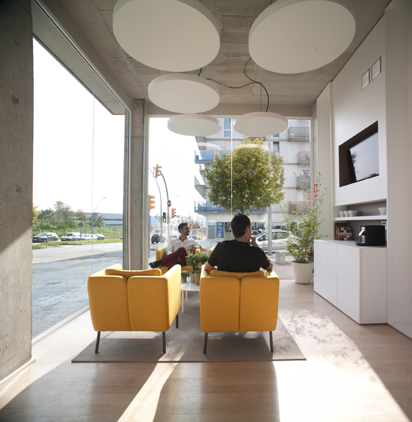
materiality of light grows and varies throughout the day
sunshine and fresh air are inseparable associations to outdoor sports and activities. when participating in the natural environment, its hard not to feel free and happy, however the bliss is easily lost when forced inside a stuffy, dark gym. ‘R3’ aims to recapture the feeling of the great outdoors. large glass windows and mirrors work as filters, playing with shadows and reflections while minimizing the sense of enclosure. maximum light circulation invites users to move freely throughout, managing to feel open, flexible, and transparent, but without sacrificing the benefits of a climate-controlled habitat.
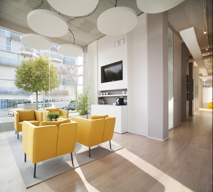
colors and textures change the feeling and requirements of the space
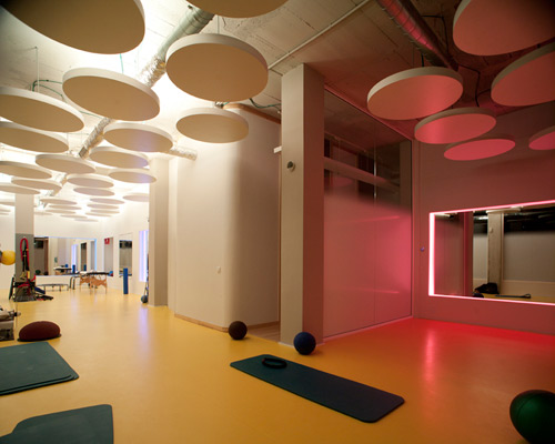
natural light is constantly changing from dawn until dusk. windows invite natural luminescence to bounce and accent colors and materials. as sunshine floods the interior it traces invisible, suggestive lines, emphasizing shapes and shadows, giving character to each room. large, circular ‘saucers’ house all artificial lighting. their shape and technology provide indirect illumination that lengthens the day and smoothly transitions into the night, and also allows non-aesthetically pleasing facilities to hid within them.
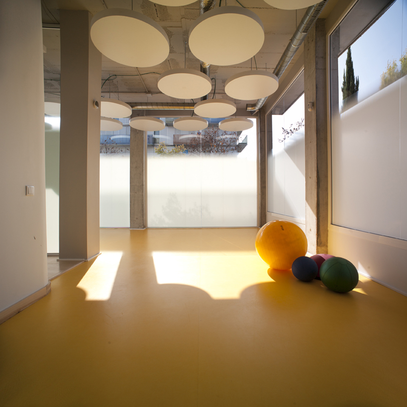
large glass windows act as filters, playing with shadow and reflections
materials and colors are an essential design component that provides a sensory experience alongside physical activity. yellow linoleum and warm wood compose floors where the body has direct contact, their softness and flexibility creating a slight padding. glazed ceramics and other woods are used in enclosed spaces to soften the view, and white walls in common areas act as neutral canvases for light to interact with.
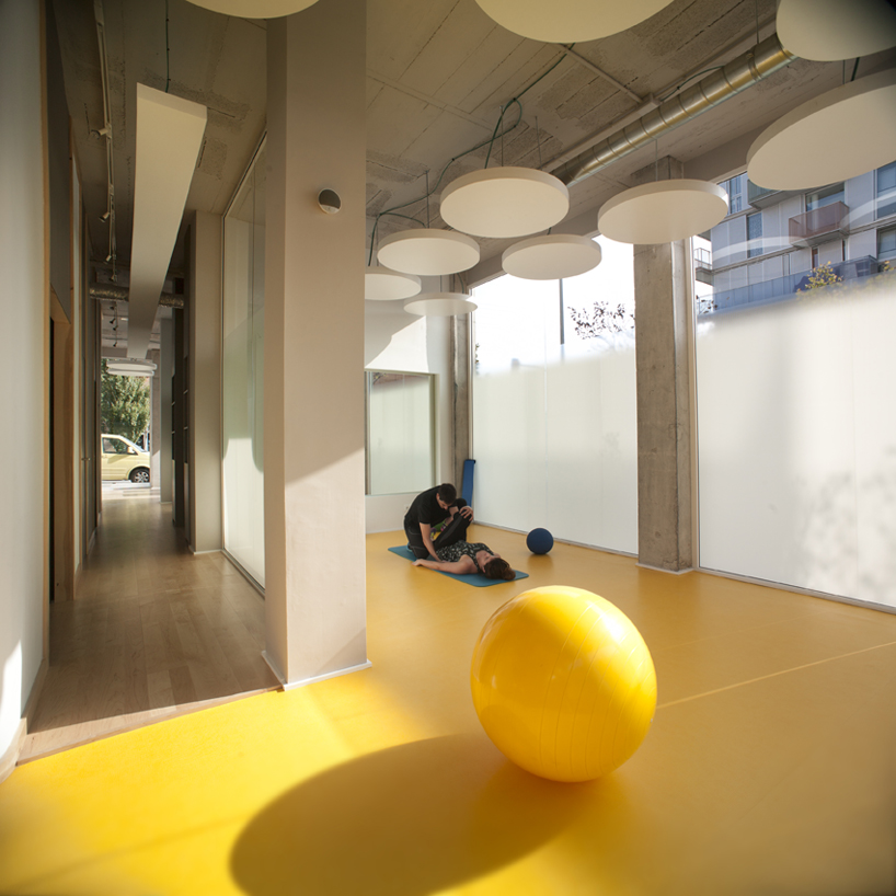
color and materials are an essential element, providing a sensory experience for physical activities
more than decoration, various colors function collectively as an expressive tool with psychological intentions. different rooms provide encouragement, support, energization, or a calm setting to recover. whether to relax or activate, the innate stimulation of senses works on an emotional level to bolster the physical activities of the ‘R3 center’.
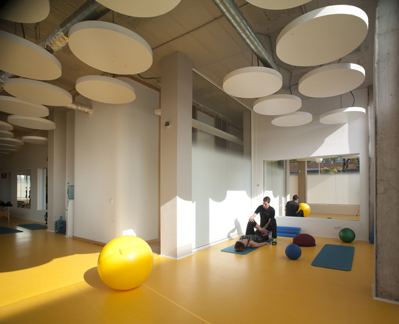
the floor is made of yellow linoleum, allowing flexibility for direct body contact
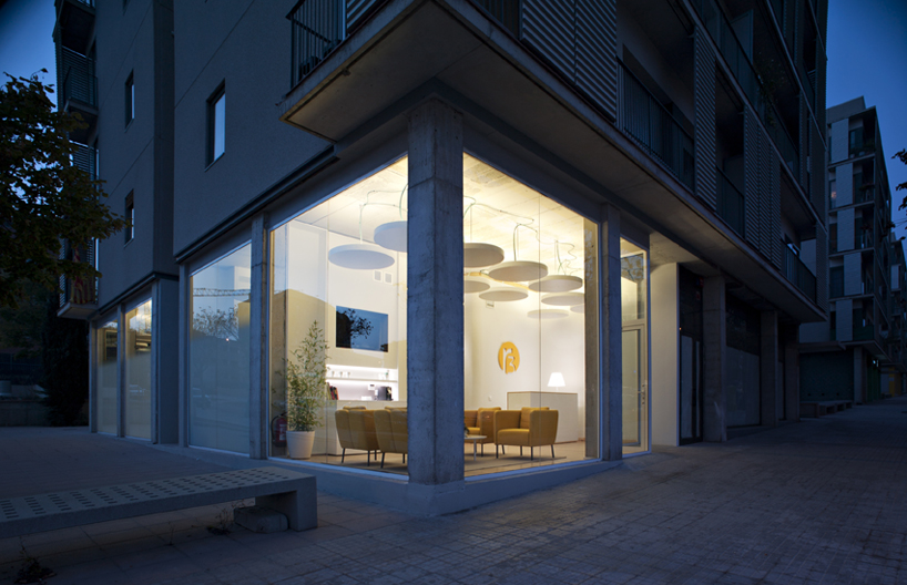
exterior façade
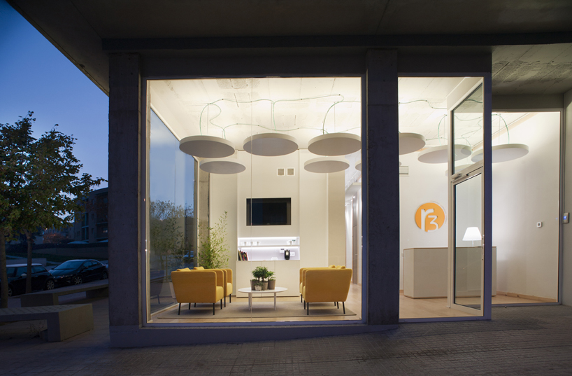
artificial light radiates from ceiling-bound ‘saucers’ that also hide various components
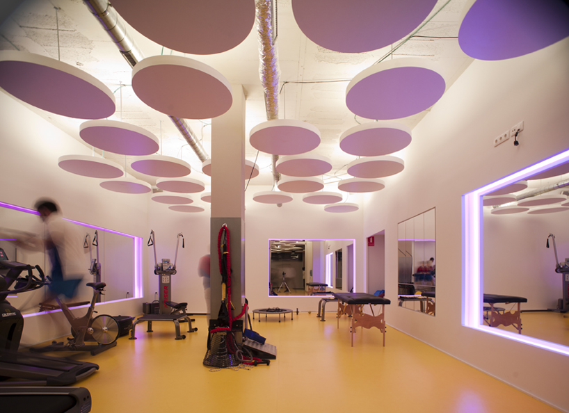
color and light are an expressive instrument with a psychological intent
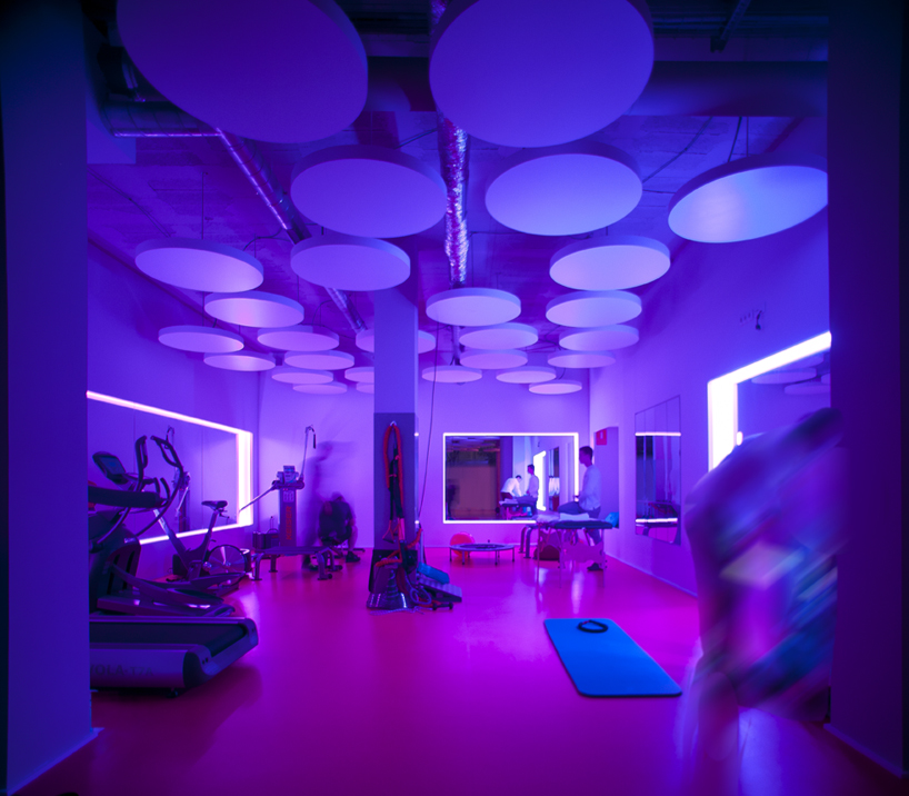
vibrations of different colors form different dynamics to accompany activity and recovery
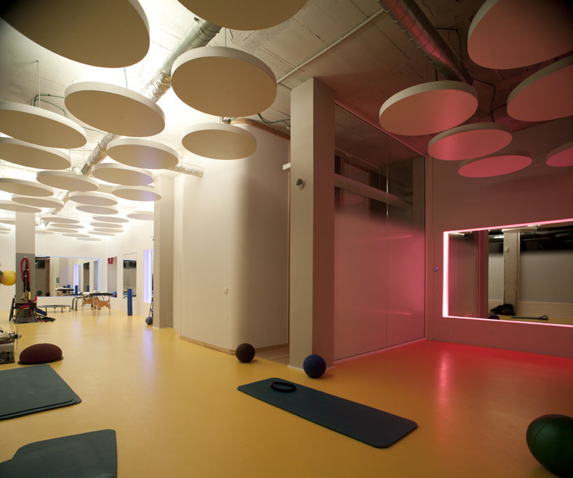
a space to relax or activate
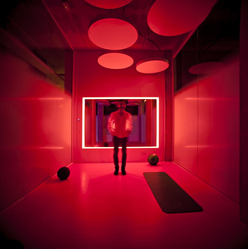
a sensory experience for physical activity
project info:
location: manresa, barcelona (spain)
design studio: gabriel gomera studio
project: active therapy center R3
designers: gabriel gomera (interior design) ruben paez (architect)
team: josep puchades (CAD) eva sanchez (graphic design)
photography: laura villaplana
construction: construbages SL
completed: september 2014
area: 230 m2
designboom has received this project through its ‘DIY submissions’ feature, which welcomes readers to submit their own work for publication. see more designboom readers submissions here.
