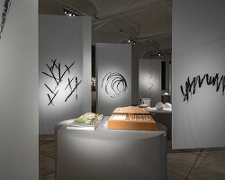
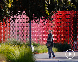
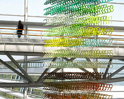
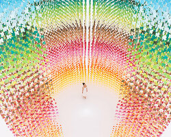
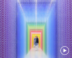
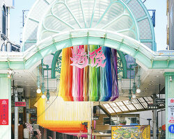
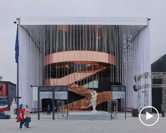
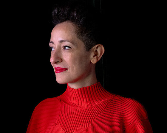
emmanuelle moureaux is a french architect who has lived in japan for the past 20 years. in 1996, moureaux relocated from france to tokyo where she later founded her own practice in 2003 — emmanuelle moureaux architecture + design. inspired by the city’s vibrant tones and hues, as well as traditional japanese spatial elements, moureaux’s work uses color as a three-dimensional element, rather than an applied finish.
while in japan, designboom caught up with emmanuelle moureaux at her office, where she gave us an insight into her creative practice and explained why she is so fascinated with color. read our interview in full below, and take a look around her tokyo workspace.
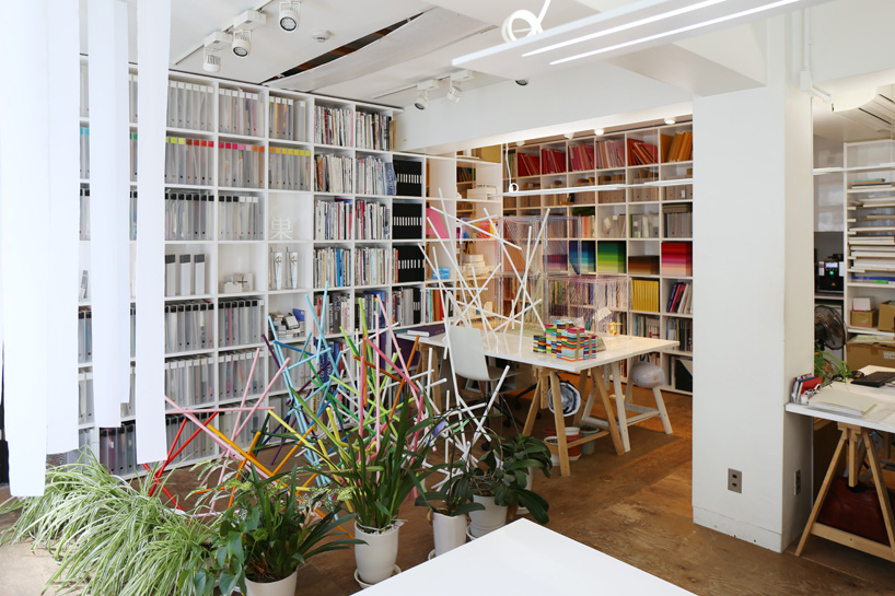
inside the studio of emmanuelle moureaux architecture + design
image © designboom
designboom (DB): can you explain why you originally decided to move to tokyo from france?
emmanuelle moureaux (EM): I have been living in tokyo for 20 years — I moved in 1996. I was very interested in japanese literature when I was in high school, so I discovered japan by book. of course, at this time there was no internet, so there was no way to know how contemporary tokyo would be. I was a student of architecture, and I decided to go to tokyo for one week by myself in 1995. it was a one week trip, but it changed my life.
when I got off the train, and when I walked for the first time in ikebukuro, I was so impressed by all the colors, which were floating in space. for me, it was the first time I saw color, and I felt a lot of emotions. these colors appeared not two-dimensional, but three-dimensional, like layers. it was beautiful, and in my first two hours in ikebukuro I decided to live in this city. I went back to france, I took my architecture license, and two months later I moved to tokyo.
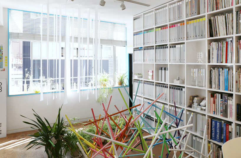
the brightly illuminated studio contains a wide range of models and prototypes
image © designboom
DB: color is a central theme in all your projects. how do you use it in your work?
EM: I say I discovered color with the city of tokyo. when I was in france, I was not conscious at all about color. tokyo gave me this passion. I think in europe, and in japan too, in the field of architecture or interior design, color is often considered as a minor element, like a finishing touch. usually architects decide colors at the end of the design process. for example, when the space is created they have to choose the colors of the walls and floor, so it is like a finish.
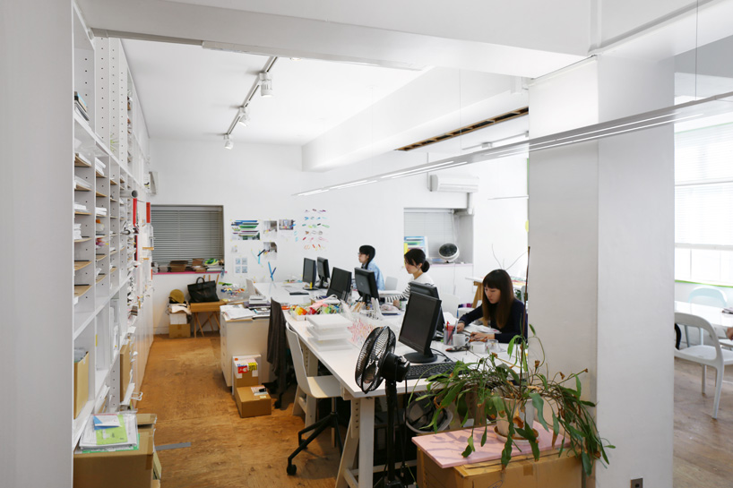
a small team works on the firm’s numerous projects
image © designboom
EM (continued): when I saw the cityscape of tokyo — because of the structure of the city, the size of buildings, the electric cables, and neon — the colors appear like floating three-dimensional layers — structuring and composing the space. that is totally different from the structure of european cities. for me, the floating layers of color in tokyo gave me the inspiration for my design concepts. I decided to use color not as finishing touch at the end of design process, but as structural elements — so it is three-dimensional.
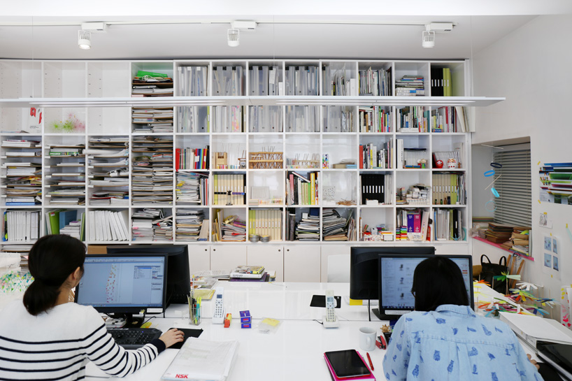
walls are lined with books, models, and other resources
image © designboom
DB: can you explain the concept of ‘shikiri’?
EM: ‘shikiri’ is japanese word which means partition or screen. for example, it is used to define the traditional japanese sliding paper screen. I was very interested in the traditional shikiri partition, because it is a very beautiful element in japanese architecture. it structures the space, but in a flexible way. unlike a wall, you can feel who or what is on the other side of shikiri. it is a very beautiful element.
when I moved to tokyo I realized that traditional japanese shikiri would disappear, because now japanese people prefer to live in occidental (western-style) apartments or mansions. when I realized that, I felt very sad because shikiri is so beautiful and so functional and adaptive to the japanese climate. so I decided to make something in order to keep and protect shikiri. of course by myself I cannot do big things, but I decided to extract the essence of shikiri, and express it in a more contemporary way. that was the start of my shikiri concept.
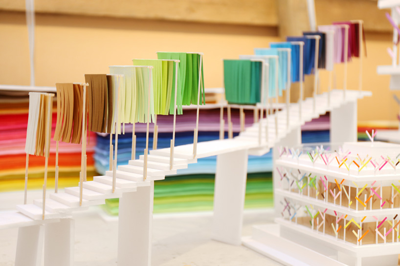
model of the ‘100 colors no.15’ installation
image © designboom
EM (continued): the pronunciation of my ‘shikiri’ concept is same as the japanese word for ‘partition’, but it is written with different japanese characters. so when japanese people read my ‘shikiri’ it reads not as normal ‘shikiri’, but as ‘partition with colors’. it means that the concept is inspired by both the traditional japanese partition, and by its colors, its layers, and the city of tokyo. it is a concept which means ‘to divide and create space with color’.
DB: what originally made you want to study architecture and become an architect?
EM: I decided to study architecture when I was in high school. architecture is a field between art and science, art and technique. I think it is the only field which has a relationship with other fields like art, culture, mathematics, science, sociology, history, geography. I was very interested in this. it is a very large field, which has lot of possibility and no limits.
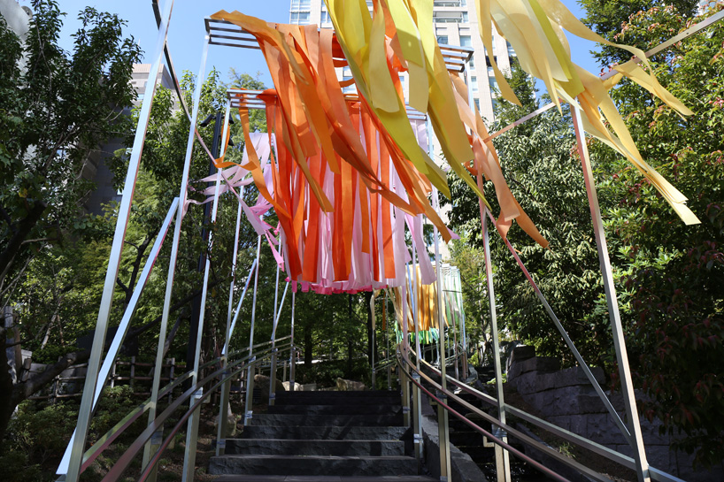
‘100 colors no.15’ within tokyo’s awaji park
image © designboom
DB: now that computer generated visualizations are so commonplace, do you still use physical scale models or sketch designs by hand?
EM: yes, for design studies or concept studies, I only use sketches or models. it is very important to use your hands to explain something, so studying through sketches and models is very important. we use computer graphics or renderings to put together presentations for clients, as most clients request those images.
DB: outside of architecture, what are you currently interested in and how is it influencing your designs?
EM: I am usually interested in and influenced by all the things except for architecture and design! I like to see environments, and I am very sensitive to the things I see — cities, or some details in the city, and nature too. a lot of my projects are inspired by natural elements, so both natural and city environments.
the concept behind the ‘sense of emotion’ installation is color mixing
image © designboom
DB: many of the recent pritzker laureates have been japanese. how do you assess the current state of japanese architecture?
EM: I think both japanese designers and architects have same quality, of course their works are very simple, very functional, and very beautiful. at the same time, japanese designers and architects are very monotone — they don’t use color. I decided to move to tokyo, because I was fascinated by all the colors in the cityscape, but when I started to live here I was so surprised because contemporary japanese designers do not use color at all. when I saw the city, it was so beautiful, like painting — I felt a lot of emotion. it was the first time I felt a feeling like this. as color is not usually used in japanese architecture and design, I decided to use color in my designs so that people can feel the emotions I felt when I saw the cityscape of tokyo.
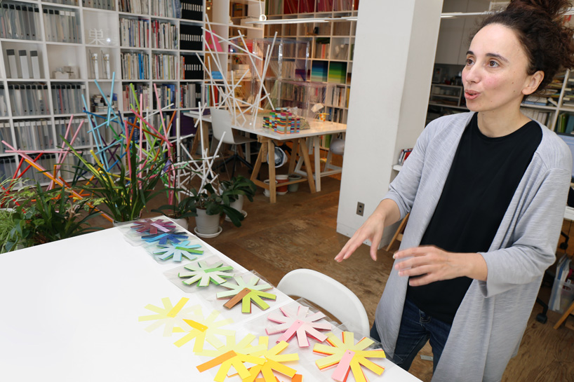
moureaux explains the colored paper models for the installation
image © designboom
DB: which architects or designers working today do you most admire?
EM: since I was a student, I was not interested in designers or architects. I am not so interested in people working in the same field as me, so I can not say one person.
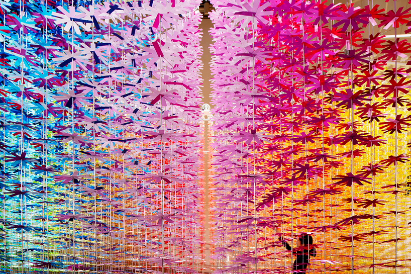
the realized work immerses visitors in a spiral of color / see more of the project on designboom here
image © daisuke shima
DB: can you tell us about any projects you are currently working on that you are especially excited about?
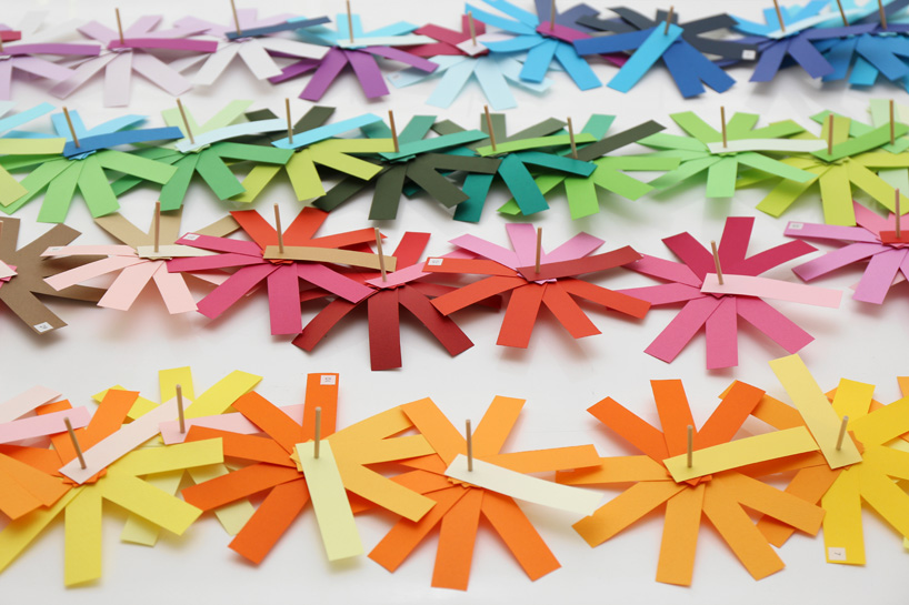
EM: there are two projects. the first is an installation in the ‘spiral’ building in omotesando. it is very interesting exhibition called ‘sense of emotion’. it celebrates the 100th anniversary of NSK, a japanese company which is famous for manufacturing bearings. the concept of my installation is color mixing. my past projects look like still colors, where the colors do not move at all. this time I work with colors that appear to move in the wind. it is the first time I used technical parts, such as bearings. so it was a very difficult and interesting challenge.
another is an architectural project. it is a kindergarten, which will open in next april (2017). it is in fukuoka, in the southern part of japan. it is my first kindergarten project.
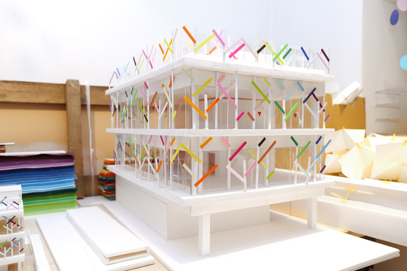
moureaux’s kindergarten in fukuoka will open in april 2017
image © designboom
DB: what is the best advice you have received, and what advice would you give to young architects and designers?
EM: I cannot remember the best advice I have received. instead my advice for the young, if I have to chose only one, is to look more around yourself and not only at the internet. I have been teaching at yamagata university for nine years, and students now are not conscious of their environment, they are always looking on their smartphone or computer. I think the important thing is to be more conscious of all things, like details of cities or the form of leaves.
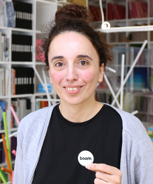
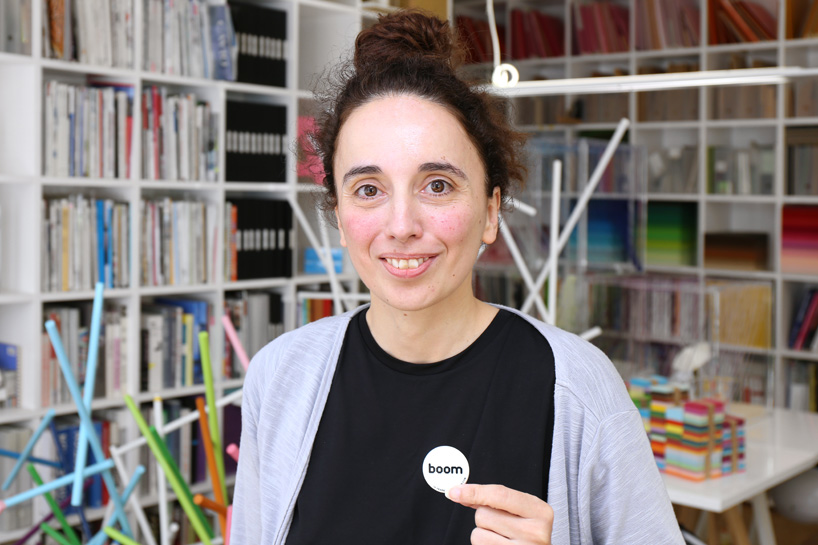 portrait of emmanuelle moureaux
image © designboom
DB: what is your personal motto?
EM: to have a colorful life.



Save
Save
Save
Save
Save
Save
Save
Save
Save
Save
Save
Save
Save
Save
