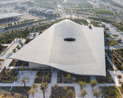
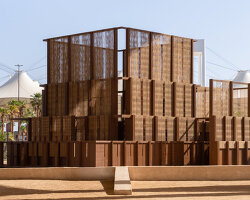
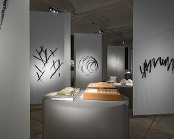
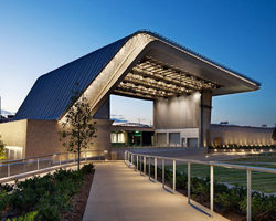
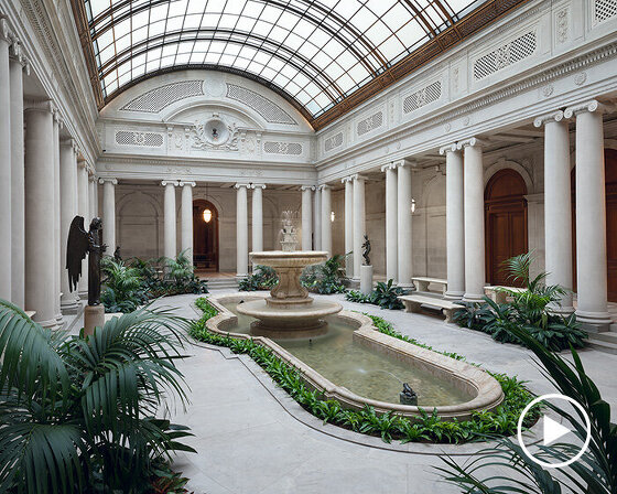
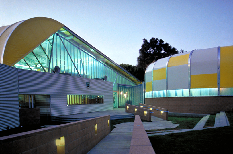
located in culver city, los angeles, hodgetts + fung, also known as HplusF, is an interdisciplinary design and architecture studio led and founded by principals craig hodgetts and hsinming (ming) fung since 1984. with backgrounds in urban design, architecture, and industrial design, the practice is most renowned for creating unique educational venues, cultural events, and civic centers, including the ‘wildbeast’ pavilion at the california institute of the arts, the new hollywood bowl, and the renovation of the egyptian theater, also in hollywood. the firm employs a multifaceted approach for each project, tailoring the designs to harmoniously facilitate technology, visitor experience, and communication in accordance to the client’s needs, all housed within bold, uncompromising architecture.
during a recent trip to LA, designboom went to visit HplusF’s studio in culver city, where we met with craig hodgetts. gaining an intriguing insight into the daily activities of the office, craig gave us an extensive tour of the workspace, delving into great detail about his design methodology and numerous projects currently in development. afterwards, we sat down with craig to discuss how he first got into architecture, his partnership with ming fung, and some of the studio’s most substantial projects to date.
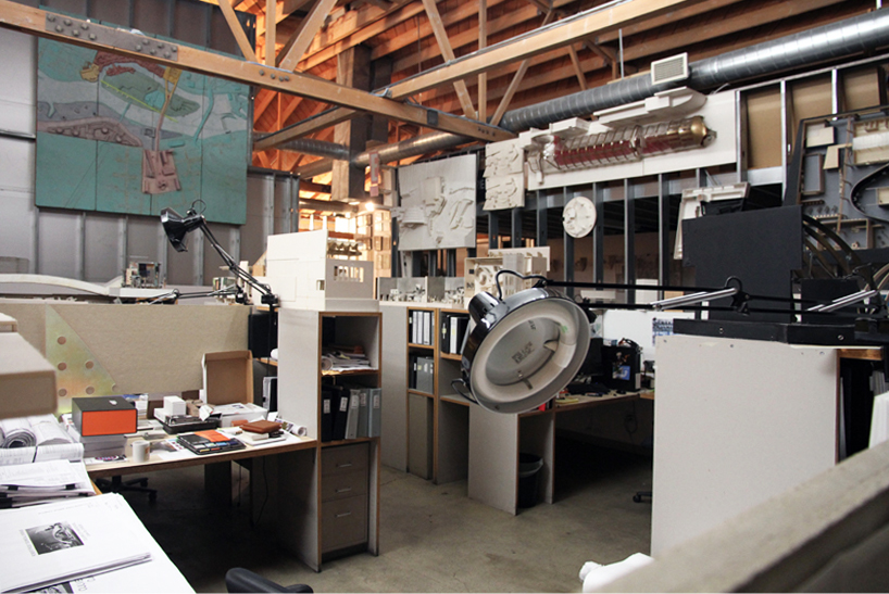
the studio is divided up into workspaces with large shelves
image © designboom
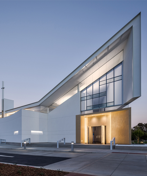
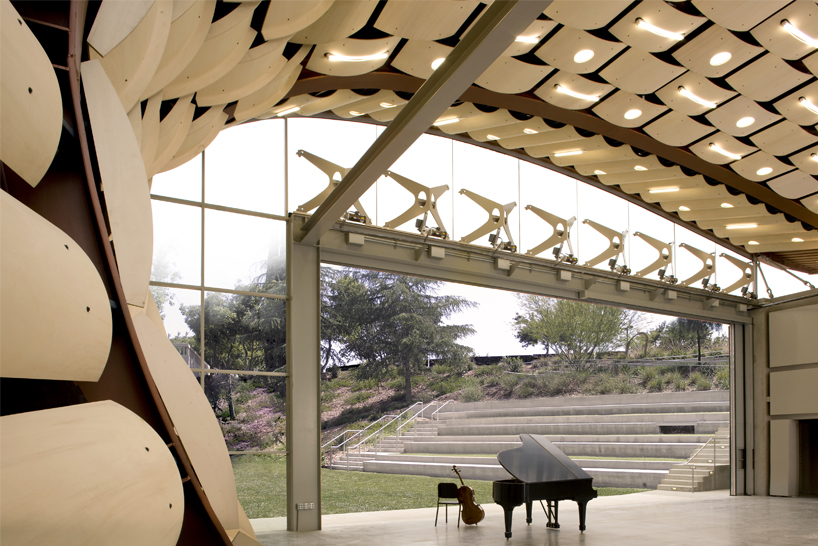
(main image: wildbeast pavilion, los angeles, 2009, image © tom bonner)
situated in a former chocolate and biscuit making factory, HplusF’s warehouse now facilitates an eclectic and energetic space for its 12 strong team. the large area accommodates and displays the practice’s many exploratory models, which, as craig proved, tell rich stories of past projects; their clients, their inspiration, and the final design. however, the extensive hoard of memorabilia is much more than just trophies of work, they depict a timeline of the practice’s history, the learning curves for each project, and the magnitude of care they take for every client. they, much like the designated spaces within the warehouse, also showcase the versatile nature of the studio’s work. pencil sketches and printed posters canvas walls alongside intricately scaled architectural models and even prototypical furniture designs.
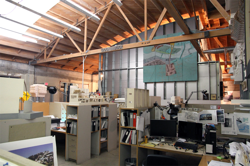
models adorn the walls, desks, and surrounding shelves
image © designboom
the majority of the studio space houses a large cluster of office-like cubicles whose dividing walls are four-foot high shelves full of files, books, and again, more models. this organized, almost cityscape layout ensures that their designers and architects are constantly surrounded and in reach of creativity, inspiration, and most importantly, knowledge. the rest of the office is separated into a conference room, kitchen, and most importantly a workspace area. this zone is where a lot of the studio’s creativity takes place as they manufacture small exploratory models up to large, impressive final prototypes.
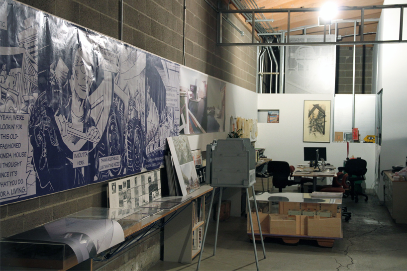
they create a lot of their models and prototypes in their studio
image © designboom
after touring the studio and learning more about the team’s design methodology, we conducted an interview with craig hodgetts to find out even more about HplusF.
designboom (DB): how did you first get involved in design?
craig hodgetts (CH): there were the general motors fisher body craftsman guild competitions, which were held in the 1950s, 60s and 70s. in 1955, I won first prize in the national competition. it was all about making a little model car — there were over 2,000 entries — and I made one and won it. from that moment, I thought that I would become a car designer rather than say a musician etc. I went off on an apprentice car program with this scholarship I had received, and I hated it. it was so corporate, so intensely focused on this one little factor, whereas I am a very collective person, so I abandoned that. I kind of stayed on course with design though, and went into theater production design, and then fell into architecture by accident. all those different roots are still around me somewhere. there has been a design thread throughout my life, and architecture has kind of been a component of this and it happens to be where, as a business proposition, the studio has the most leverage.
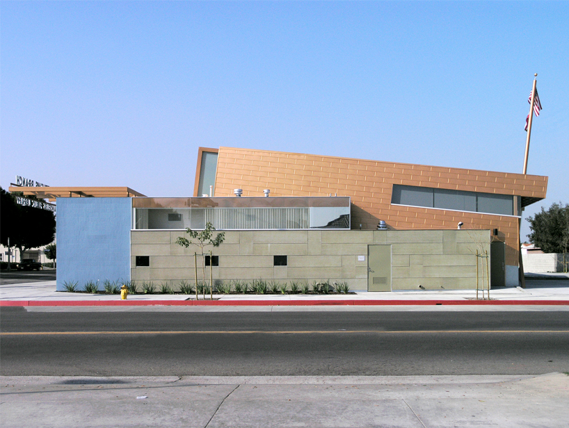
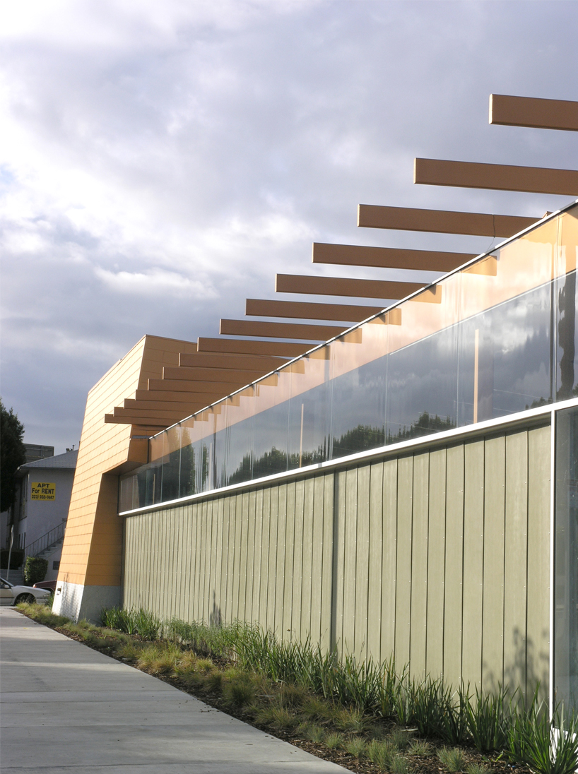
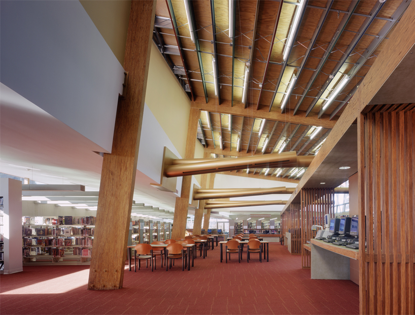
hyde park library, los angeles, 2004
DB: with a career which has spread of many different elements of design, how did you end up in architecture?
CH: well the short story is… I left GM. I went to oberlin which was a very liberal arts college, and I got very involved in theater there. I produced a couple of plays and musicals that I wrote, then went on to graduate school and theater. afterwards I ended up in san francisco working for an avant-garde theatre company. I had no money of course at that time, and someone directed me to an architect’s office to help them make a model for a competition. I realized then that I could make a living from doing this. I enrolled in architecture school, roughly at the age of 30, and wound up at yale with my idol, jim stirling. I was in berkeley studying, near san francisco, I opened up an issue of domus magazine and there was an image of stirling’s work and I was amazed. I took myself to yale, where he was then teaching, and that was really the start of it. it was an opportunity I could not refuse. jim and I became very close friends when I was there, so to be mentored by him and to meet people in new york city, was a great launching pad.
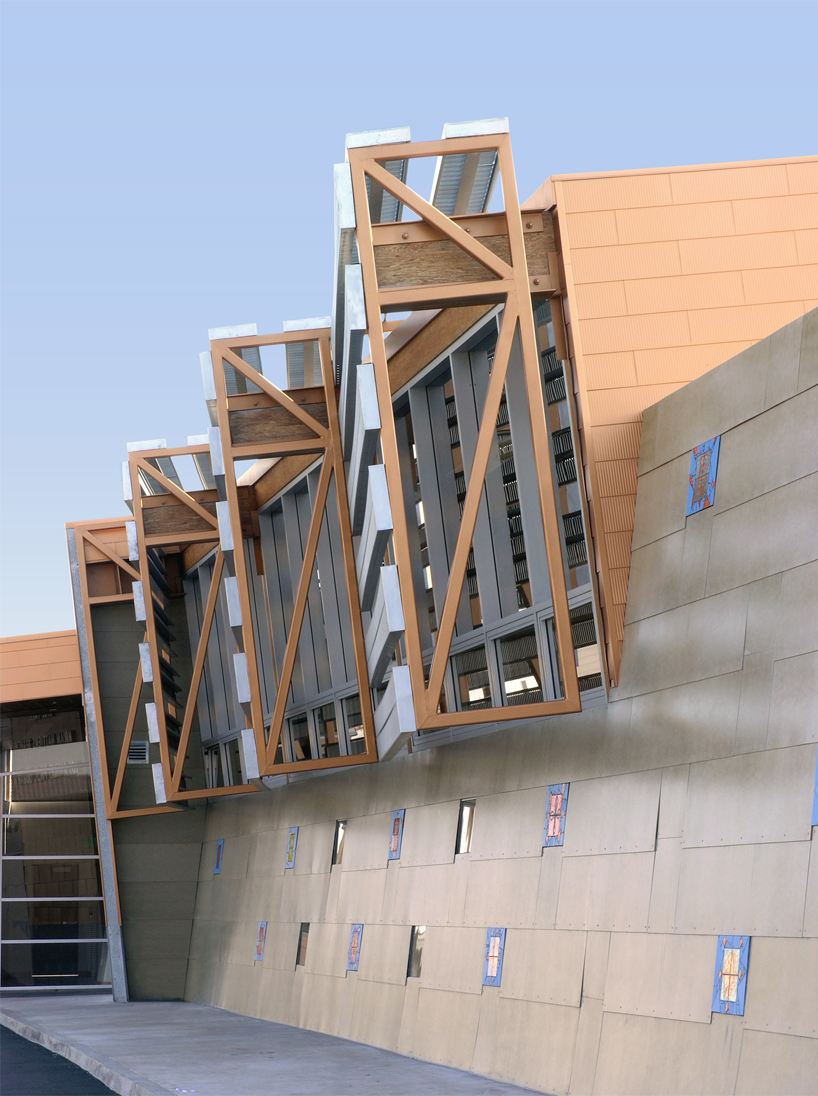
detail of the library’s copper-clad roof
DB: so you have not just worked in many different fields, but also in many different cities across the US. how did you end up working in los angeles?
CH: we had a very, very strong presence in new york after jim stirling left to go back to england, where lester walker and I inherited his space. we had an office set up and we knew some people in a couple of magazines like new york magazine, which was just starting up. they needed some material to publish, so we ended up doing this project called the ‘land-liner’, which is a transportation system that is now known as the ‘straddle bus’ in china. we had a cover story with that and got almost immediately very well known. at the same time, I was firing things off to peter cook who I had met quite a lot, and archigram was very much my inspiration back then. that visibility led to an offer from walt disney to come out to los angeles and start the california institute of the arts school. so they hired me to start the design component of that school, which is what brought me to los angeles to start with, and then things have just kept going.
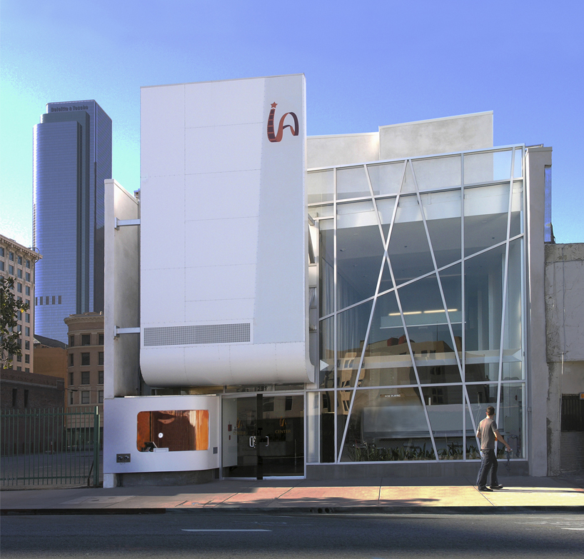
downtown independent theater, los angeles, 2008
DB: how did the partnership with ming fung begin?
CH: I had gotten kind of seduced into working on a couple of films, just because I was at CALarts and no architecture work had emerged, so I was just doing work in film and production design for commercials. at that time, ming was working for a commercial architect and we had met as they were entering a competition and needed someone to make some renderings for them. they hired me to do this, and that was how ming and I first got together. I then had another film job which we collaborated on, and led us to working together regularly, and that became our office. it emerged from making films — they were really awful ones as well. our work on feature films with roger corman led to being commissioned to build a house for him. that was our first architectural commission. our second one was from another television commercial producer that we had worked with, so our connections in the film industry were how it all started really.
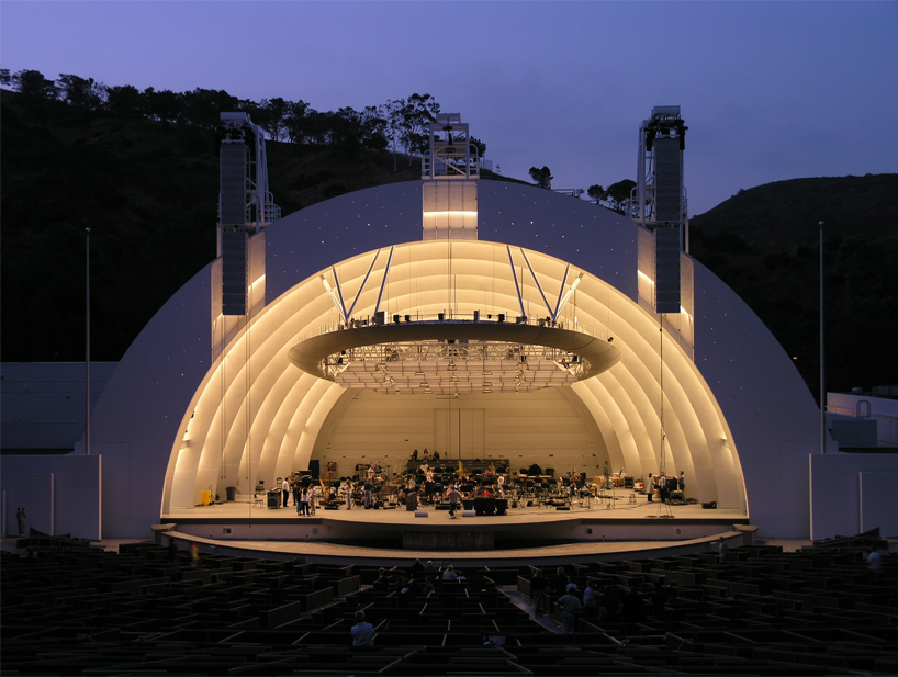
hollywood bowl, los angeles, 2004
DB: what are the founding principles and design philosophy of your architecture and the studio’s work?
CH: number one, ethics and honesty. that means from a creative point of view, being very forthright and not service orientated. that is not at all what we do, because we are very faithful in the searching for just the right solution. rather than super-imposing our precedent knowledge on something, we really search for what in that place, condition, and for that purpose, is the highest expression of these values. taking a couple of movie maker heroes of mine as an example, I love to think about how they switch from one project to another completely different film. that incredible flexibility and amazing attention to what is right for that certain project, is what really started everything we do here. from a creative point of view ming and I act more like a film director than like an architect with a particular set of predetermined aesthetics.
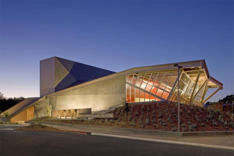
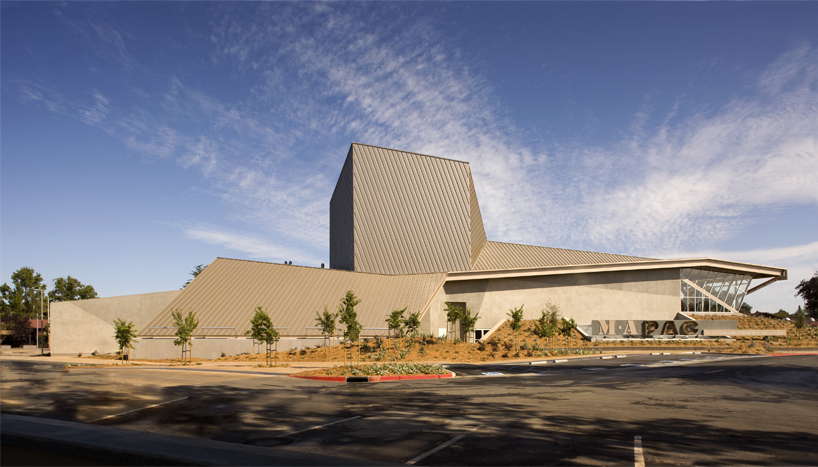
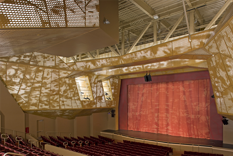
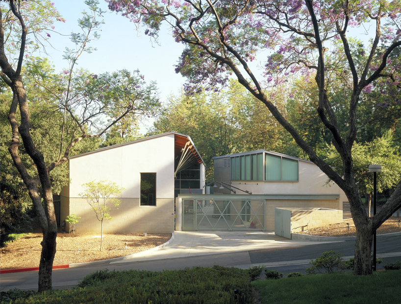
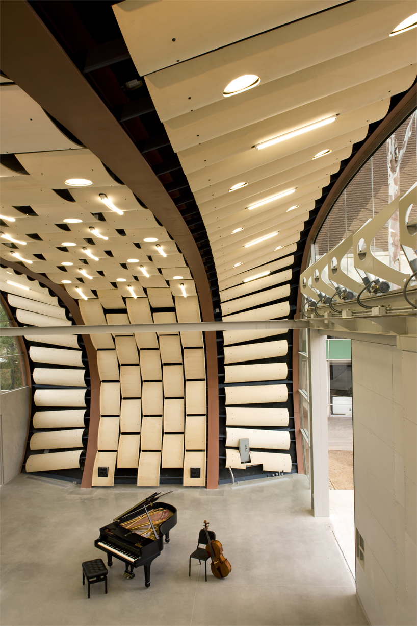
menlo-atherton performing arts center, los angeles, 2009
image © tom bonner
DB: would you say that creatives in the film industry have influenced your work more than architects and designers?
CH: the vibe I had with jim stirling is still very much alive in the sort of attitude to culture and to convention. I always feel a little disrupted as though the expectations are a little bit too corporate and right wing for what an architect is expected to do. there is a little bit too much affinity with corporate power and money. I feel that we do not want to live in that world so much, therefore our studio is a bit more abrasive and a little more edgy, but not edgy for the sake of it. I hate that idea, I really do. this comes from being rather unadorned, not being cautious about what people’s reception might be, not looking over one’s shoulder and wondering what is in fashion today, and doing what seems right by letting the chips fall as they may. I wouldn’t say we have a calculated design ethic, and this is a thing that is very motivational because as a studio, we don’t worry about whether it is original or credible, or any of those issues. we are worrying about putting the project together and how to make it work.
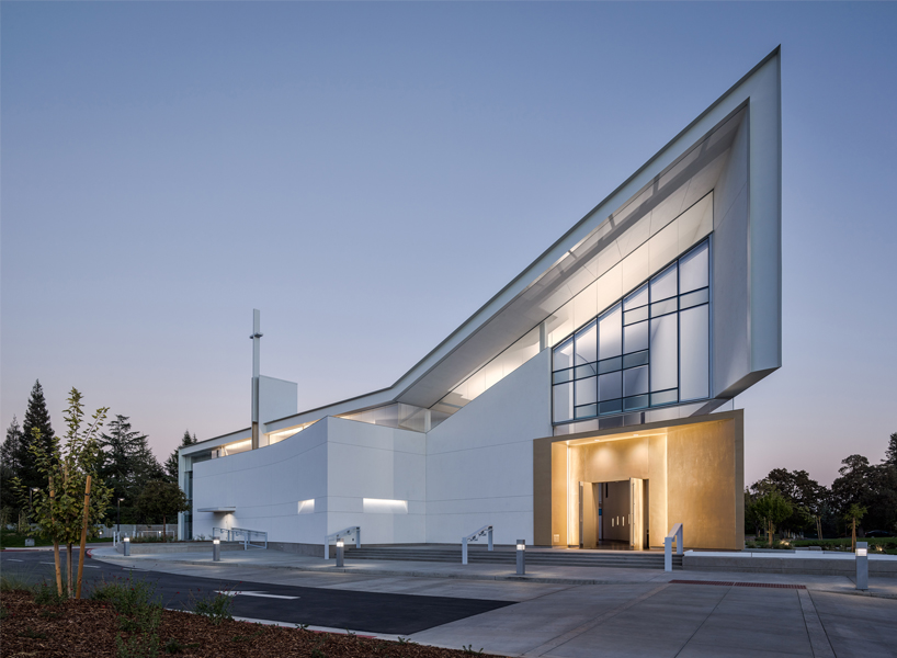
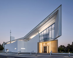
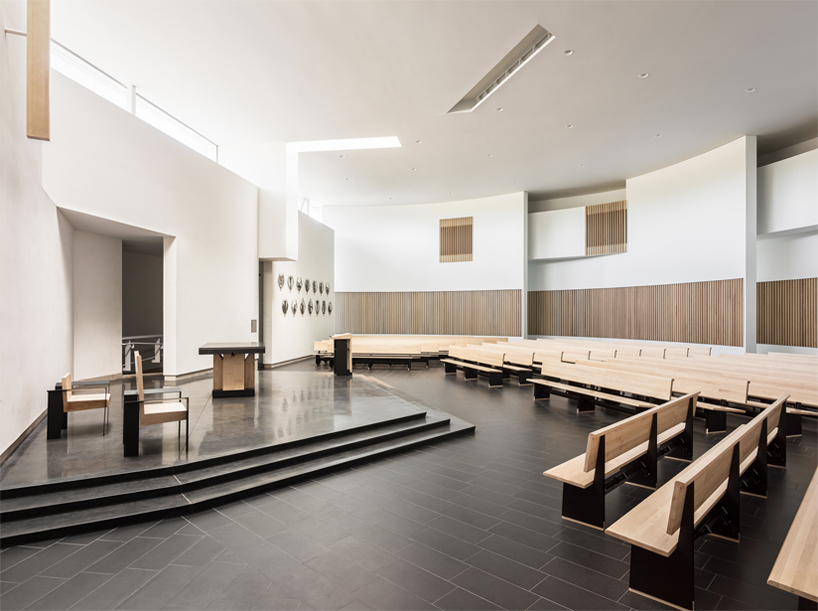
jesuit high school chapel, sacramento, 2014
image © joe fletcher
DB: taking a look around your studio, you have a lot of machinery. do you try and craft a lot of your models here?
CH: we craft a lot of stuff. we make models, fiddle around with them a bit, and very often come up with an effect that wouldn’t have been possible otherwise. when working with fabricators or technicians, you bond with them, and enhance your knowledge. we try and make proof of concept models here to see if we can get them to work the way we want them to. generally, that is very exciting to do, almost like a laboratory. the ‘jesuit high school chapel’ that we just finished, with all its colors and such, was very interesting in the way it evolved. neither of us are religious at all and here we have completed a project that jesuits are admiring. every time that we came up with a design motif, they, because of very sensitized imagery and what they mean, had really interesting interpretations of some of our ideas. that influenced a lot of the design. for example, the seismic bracing is on the outside. it was originally on the inside, so it became very much a tangle of steel. we didn’t know what to do with the wall behind it, it was very difficult because of the solar exposure issues etc.
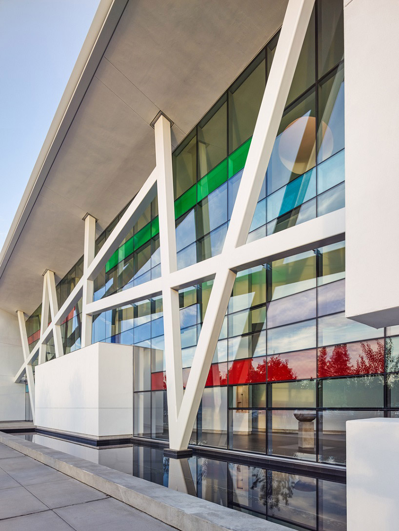
see more of the chapel on designboom here
image © joe fletcher
CH (continued): that is when we came up with the idea of some colored glass as a solar intervention. in came the glass in the colors of the four seasons, but you won’t be able to see the stained glass from the outside of the building because it doesn’t transmit as much light back as that goes through it. so we had to invent a way to do it and build a proof of concept model here. what we finally devised was a box with clear glass on the outside, which featured a colored dot pattern on it, and colored glass on the inside of the box. this meant that the light that is transmitted is colored and goes inside and hits the wall. the light which you see optically from outside, is bouncing off the colored dots, it has nothing to do with the colored glass. it had never been done before!
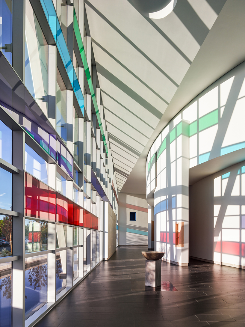
the effect of sunlight and dotted colored glass in the jesuit high school chapel
image © joe fletcher
CH (continued): through experimenting and experimenting and experimenting, we got there. it was so exciting and so great, and we had no idea then that it was going to do what it did to the interior. when it was installed, the contractor phoned us in amazement. he sent me a picture and I was blown away as well — it looked amazing. that process of experimenting is something that we have learned to trust. we trust the idea that if you launch off into some territory and you follow it very, very faithfully and you don’t give up, something good will happen. in terms of our design ethos, that is very close to the way we try and work. this practice goes all the way across our projects, all the way back to the towell library we did at UCLA, with the tensile structure which needed various investigations into developing technologies.
DB: what projects are you currently working on that our readers should be excited to see in the next few years?
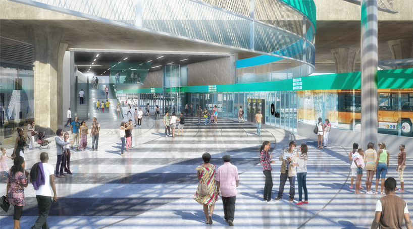
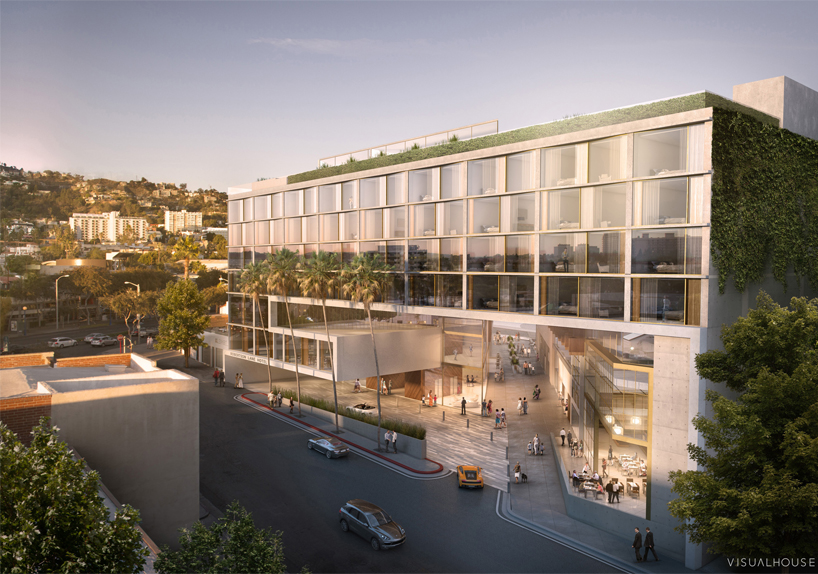
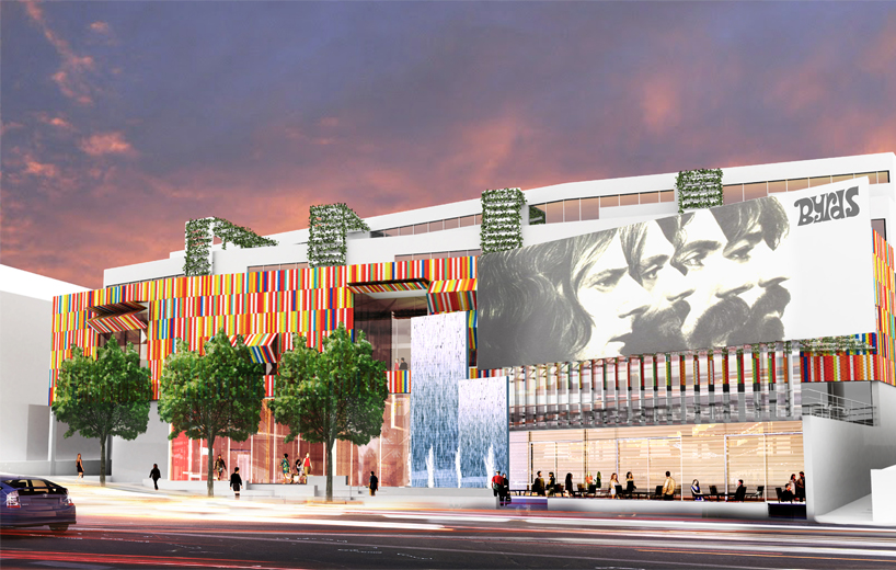
CH: it is very hard to explain the origins of our projects, but for some reasons they seem to come in clusters such as exhibit design projects, or libraries, or theatres. they always seem to come in small clusters. the present grouping is hotels and retail commercial developments, which we have never, ever had before. within the last year, we have been approached by three different developers for these mega-projects, which frankly are very important urban propositions. I have always wanted to do projects in these arenas, and all three of these projects have very exceptional conditions and sites as well.
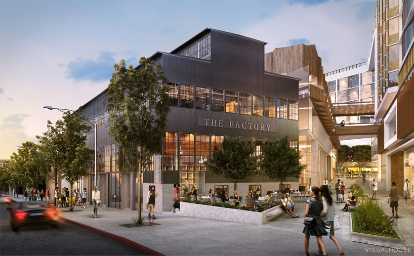
robertson lane, west hollywood
CH (continued): one is in west hollywood, where the santa monica boulevard runs at a diagonal to most of the surrounding streets, which are perpendicular to one another. it slices through all these grids in a diagonal. the site of our big hotel project touches the boulevard, and we have devised a way with the developer to involve a pedestrian way. it is just like those gallerias in london, I love how they cut through shopping streets. what we have is an open-area, not covered, galleria that is running parallel to the diagonal street. it is cutting diagonally through the site from street to street, from block to block. that is pretty neat from an urban mechanism point of view, because it will create a lot of pedestrian activity.
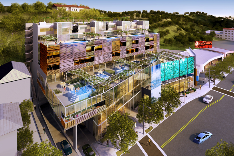
live on sunset, west hollywood
CH (continued): the next hotel is in downtown chinatown. it is a land-locked site, surrounded completely by low retail buildings, but it will end up being quite a big hotel. we have just really started on this project, but the imagery that we are looking for is one that resonates with chinese traditions. it is quite remarkable how that morphs into something that seems very contemporary. we have just started work on this, but it will become the core of chinatown’s renaissance.
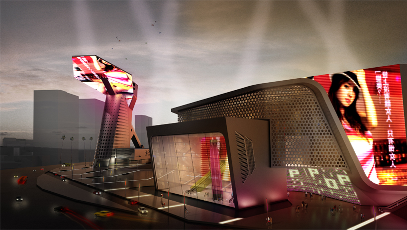
the third project is in combination with a gallerist who bought an old automobile dealership building and wants to turn it into a hotel. it is a fantastic building. it is one entire block long and has a ramp for cars to drive up to the roof. the site is vast and is right on ray avenue. we are beginning to design a hotel and retail complex that will complement the museum.
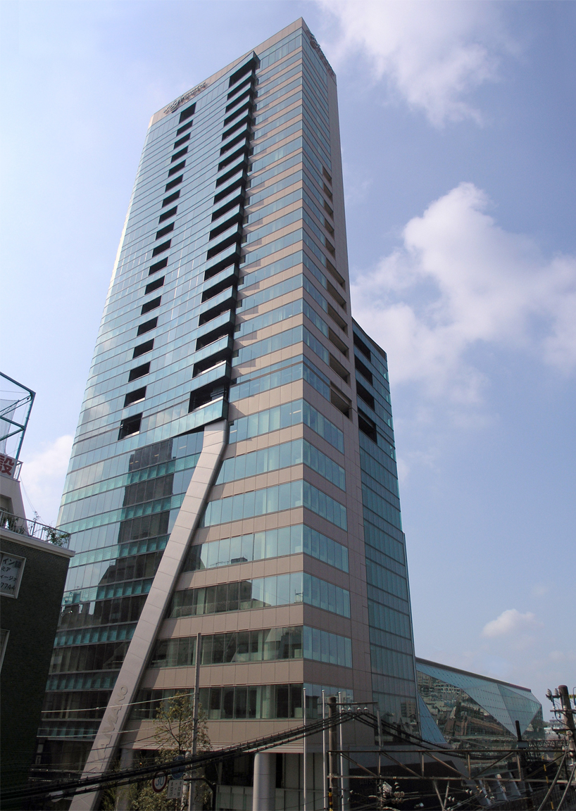
yamano gakuen tower complex, tokyo, japan, 2007
CH (continued): all these projects just fell into our laps. people just walked through the door and asked if we can do them. generally, that is how we operate and how our projects normally start. I don’t really know how or why this happens, but I know that we are very receptive to the people we work with. this allows us to make big and lasting impressions on our clients. I think that our antennas so to say, or senses are really tuned to the conditions and our clients.
I think we have been very, very fortunate to not have a brand in a certain way. if we were dead-set on building a business, then we wouldn’t be able to operate in this way. actually, at the moment, there is the matter of building more as business so that in the future some of our staff can carry the studio on. the types of jobs we do allows us to be quite flexible as a practice, and enables us to switch between certain projects. in the future, focusing on a certain type of project might be more fruitful rather than being more freestyle.
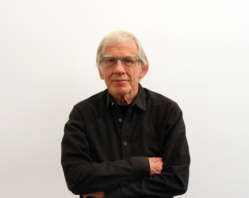
portrait of craig hodgetts
image © designboom
DB: you have worked with, or been taught by, many influential names in architecture, and you also teach at the UCLA. what has been the best advice that you have received and what advice would you give to young architects now?
CH: I would have to go all the way back to jim sterling when I was a student at yale. you may know the kind of reputation he had, but he was a very, very blunt character. he would come by my desk and look at what I was doing and say, ‘it needs something else’ and would just walk on. at one point, he told me not to do anything if I didn’t have three reasons for it, and that might be: ‘it looks good,’ ‘it is highly functional’, and ‘it is cheap’. this was to focus what you were doing with palpable criteria. it is actually quite eames-esque advice, like: if you are designing a chair, you don’t want to vomit when you see a hundred of them in one room. you can think of a lot of furnishings which would fall into this category nowadays. this isn’t quite ethical advice, but it is important.
for young architects, I would say that you should not be immodest, follow your heart and not the trend, be culturally aware, and don’t turn into donald trump. there is a certain amount of restraint, which is appropriate in the practice of architecture, and if you are confident in your ideas and that they are well-grounded, then you can go crazy with it. you have to have the ideas really securely anchored in the city context, the human spirit, and in feasible and practical terms.
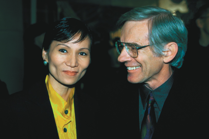
hsinming fung (left) and craig hodgetts (right)

Save
Save
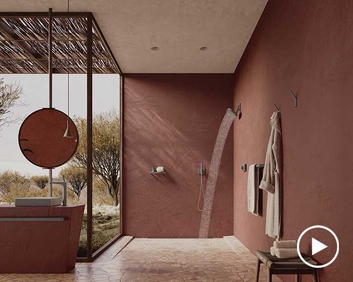
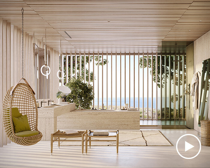
happening now! partnering with antonio citterio, AXOR presents three bathroom concepts that are not merely places of function, but destinations in themselves — sanctuaries of style, context, and personal expression.
