C+C architecture covers guggenheim helsinki entry with light-diffusing veil
all images courtesy of C+C architecture


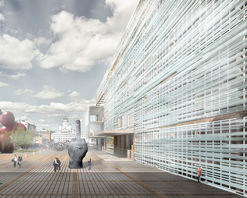
for the guggenheim helsinki design competition, C+C architecture has created a building that highlights both the museum’s collections inside and the unique landscape of the city outside. the concept of the ‘huntu’, the finnish word for ‘veil’ that expresses the essential nature of the location for experiencing art: a nexus in an urban context that allows for both intersection and, simultaneously, separation.

carchitecture guggenheim helsinki light-diffusing veil huntu
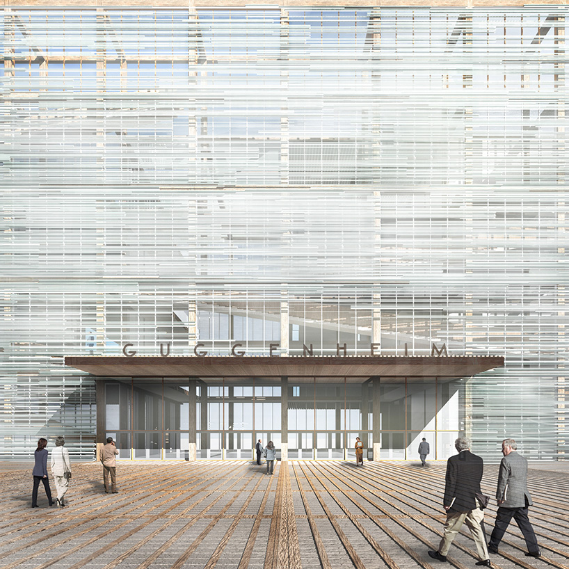
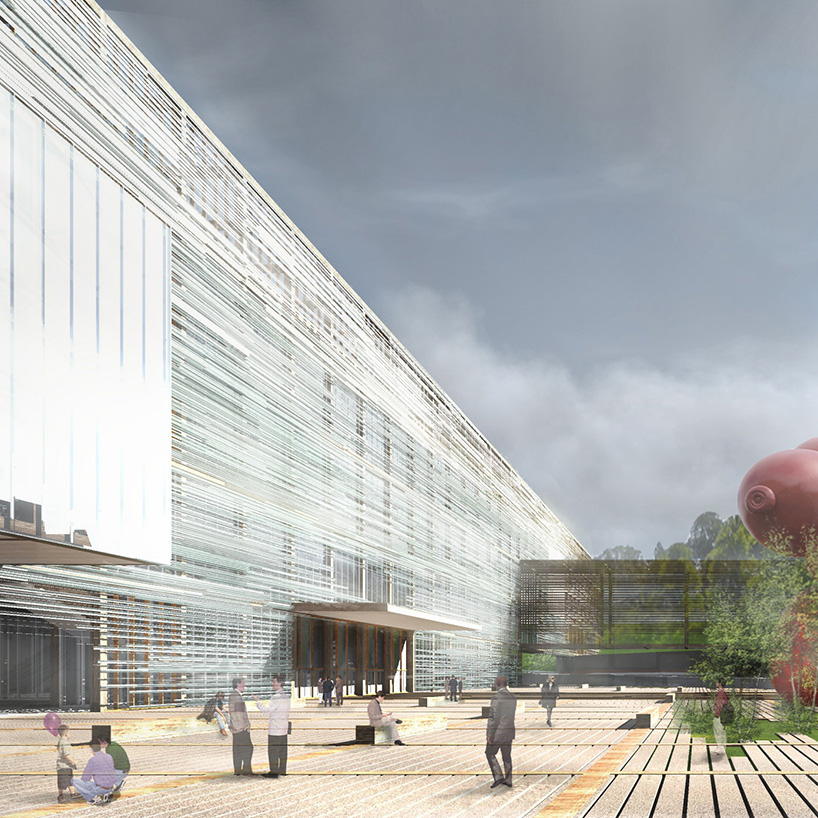
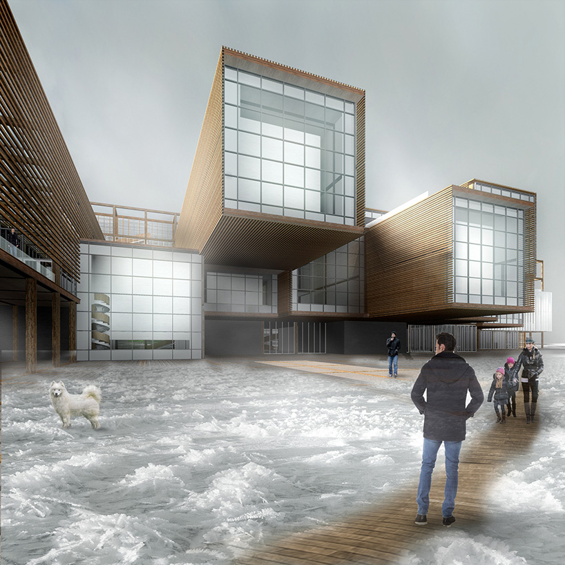
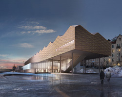
entry canopy protruding from the horizontal slat and glass façade system


the architects believe, ‘the defining moment of any building is when one passes through the skin of the facade to discover what lies within.’ this metaphor is formed by the collection of horizontal slats along the large expanses of glass that grant a limited amount of visual access, merely hinting at the interior qualities. a wood structural frame supports the veil and expands it into three dimensions. the moments that penetrate this boundary do so in recognition of their participation in the life of the metropolis.

carchitecture guggenheim helsinki light-diffusing veil huntu
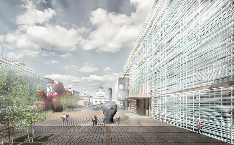
view of the plaza with other parts of the city in the background


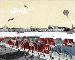
the building is organized in concert with the grid of the city, emphasizing its relationship to the helsinki cathedral and senate square. this can be seen through the various links placed between the intervention and the existing infrastructure. for instance, the bicycle route is incorporated into the plaza and a bridge connects to the tähtitorninvuoren puisto, the design museum and the museum of finnish architecture.

carchitecture guggenheim helsinki light-diffusing veil huntu
interior of the bridge


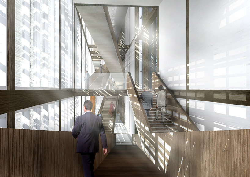
the plans are directed by a non-linear progression. ‘choosing one’s own experiencing of art, food, music, film, and more in an order that reflects one’s own desires and creates a more natural museum experience,’ says the studio. the box element that houses the circulation spine serves as a moment between the city and the sea, while at the same time focusing the occupant on the building’s interior. while the component is along one axis, the experience of it is anything but, with visitors entering and maneuvering at different levels to stress the vertical distortion. as they travel through galleries, the restaurant, and the theater space, they must regularly return to make a decision about where to go next, reinforcing an awareness within the facility and helsinki.

carchitecture guggenheim helsinki light-diffusing veil huntu
the linear box manipulates the vertical spatial experience with a series of staircases


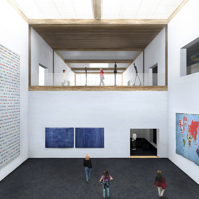
the museum is conceived as a set of four programmatic areas, each with its own purpose: the introspective, the social, the communal, and the functional. each may be experienced on its own, or in combination with the others.

our proposal fits in the continuum of the history of wood construction, but also celebrates the potential of modern construction technologies and techniques. Through the veil it reveals the elevation of the spirit of man as understood through our creation of art.

carchitecture guggenheim helsinki light-diffusing veil huntu
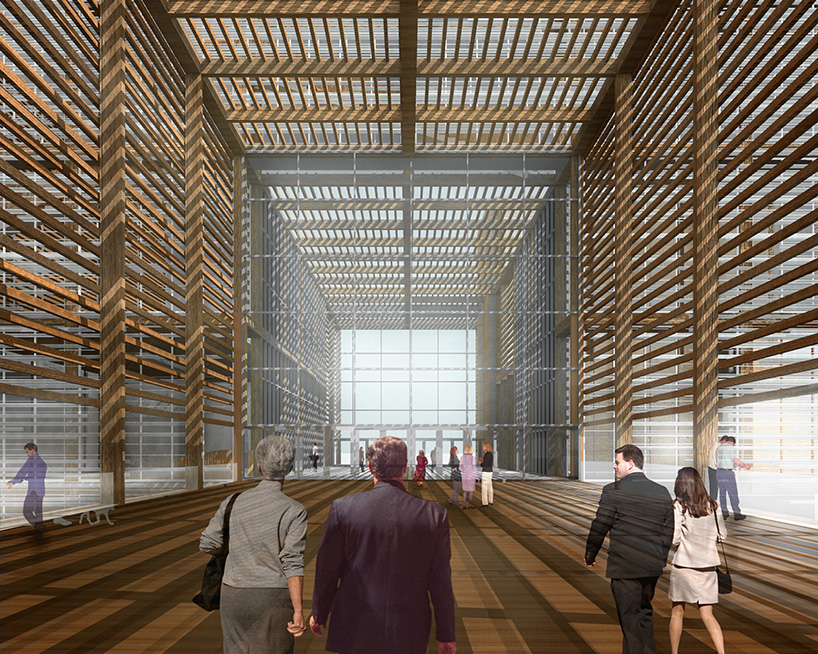
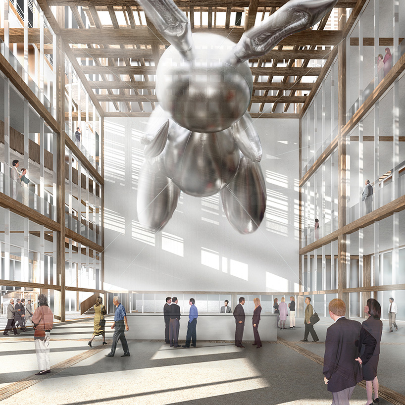
lobby

carchitecture guggenheim helsinki light-diffusing veil huntu
the structure is a combination of traditional wood construction and contemporary technological methods

carchitecture guggenheim helsinki light-diffusing veil huntu
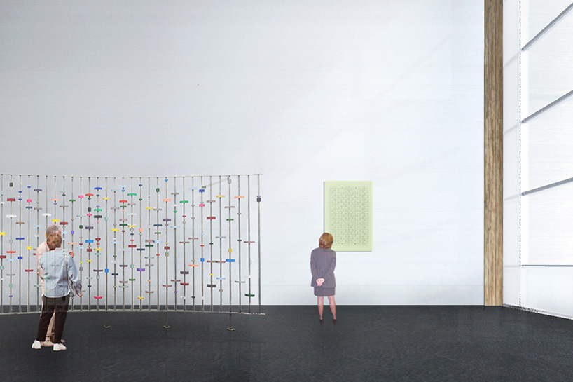
gallery

carchitecture guggenheim helsinki light-diffusing veil huntu
gallery

carchitecture guggenheim helsinki light-diffusing veil huntu
habor plaza


designboom has received this project from our ‘DIY submissions‘ feature, where we welcome our readers to submit their own work for publication. see more project submissions from our readers here.