folded brass ribbons envelope bureau de change’s london office design
all images © anna stathaki


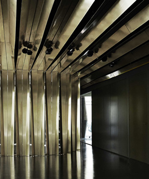
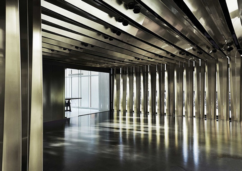
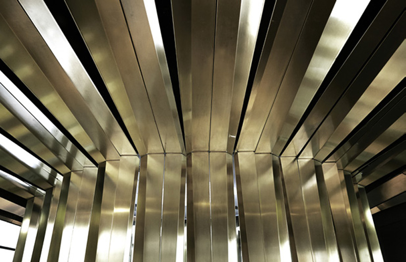
in chelsea, london, bureau de change architects have overhauled a office to give the company a strong identity and an adaptable scheme to cater to a variety of uses. a central elliptical ‘chamber’ defines main space formed by a cluster of twister 1mm brass ribbons. this sculptural feature spans and extends across the whole ceiling to create a permeable surface that folds and lands at the base of the outermost glazing.

bureau-de-change-brass-headquarters-office-london-designboom-02
the 332 bespoke made brass panels, cast dramatic shadows onto the polished floor


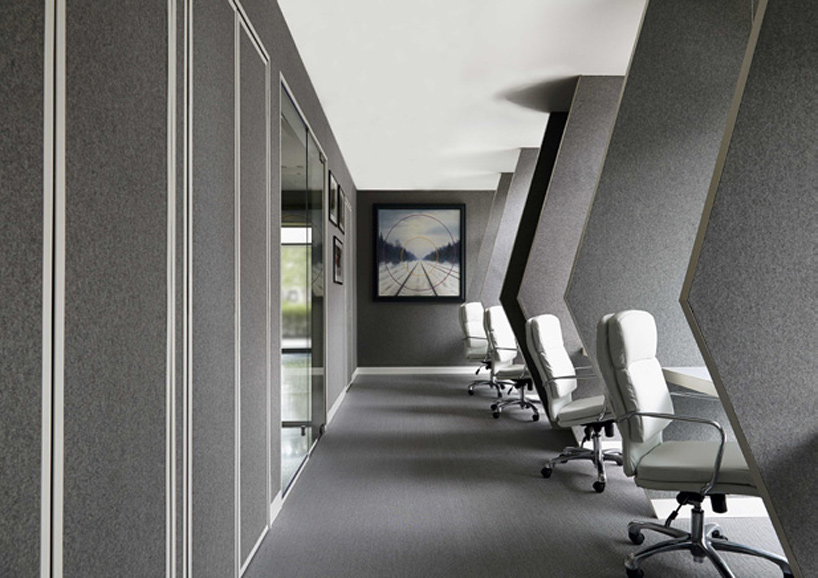
the overhead brass strips follow a radial geometry, echoing the composition of the central core and creating a rippled effect. the polished floors reflect the dramatic shadows caste by this feature, animating throughout the space and establishing a recognizable image. the design divides the site into two distinct programs: the sharp and reflective events area, and the warm monochromatic office space, workshop and meeting rooms. the threshold of the office has been clearly defined by movement by using a more modest materials palette. utilitarian white tiling and grey felt wall paneling create a hushed atmosphere – quietly opposing the liveliness of the brass cavern.

bureau-de-change-brass-headquarters-office-london-designboom-03
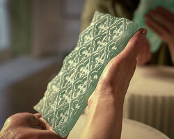
the ribbons were folded, before being edged and pressed to retain the consistency and depth of the profile


‘with views into the space from three sides, the site presented an interesting challenge, requiring that its visual treatment would function effectively both internally and externally. the result is a scheme that brings privacy to staff and visitors, whilst presenting a bold identity and first impression from the exterior.‘ – billy mavropoulos, co founder of b-de-c architects

bureau-de-change-brass-headquarters-office-london-designboom-03
utilitarian white tiling and grey felt wall paneling create a hushed atmosphere


‘we distilled the scheme down to key materials in order to create contrasting atmospheres, each with their own kind of drama. the unexpected combination of materials and environments establishes a visual brand for the company housed here. this process of editing also allowed us to invest in the bespoke fabrication methods the project demanded.’katerina dionysopoulou, co-founder 

bureau-de-change-brass-headquarters-office-london-designboom-03
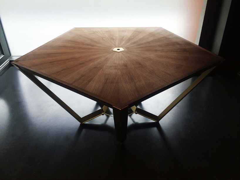
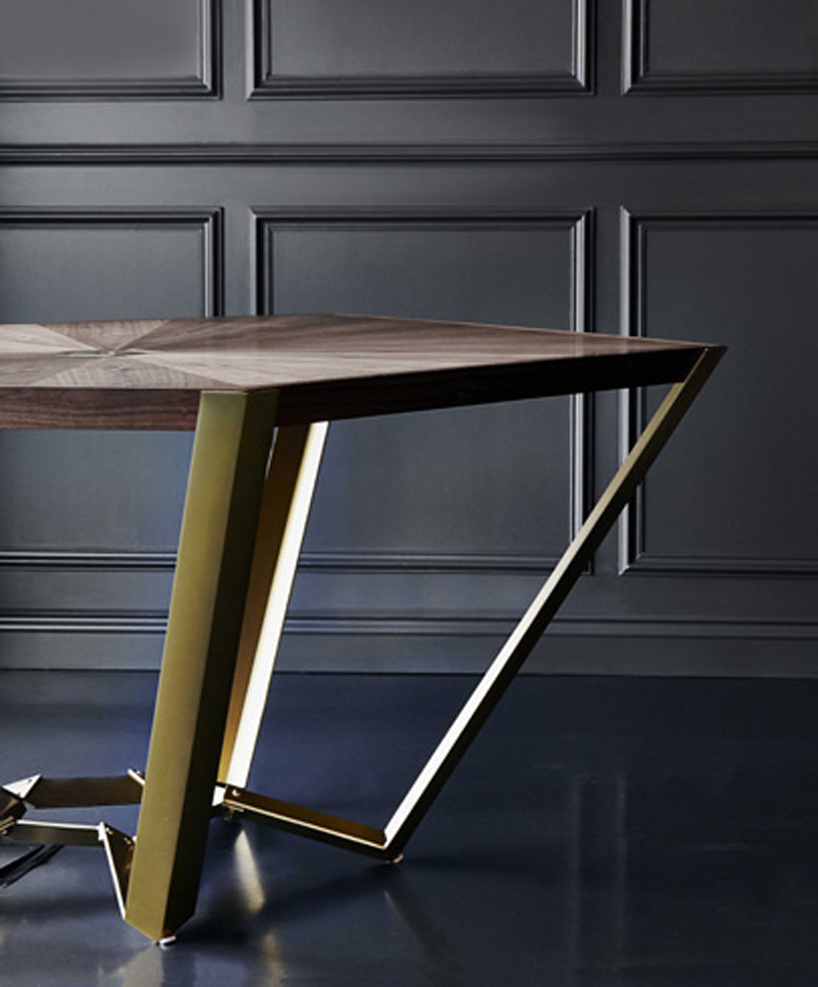
constructed from thick walnut veneer and brass, the slab-like table top appears to rest on fine 3mm thick brass legs


as well as the interior renovation, bureau de change also designed a small table for meetings up to five people. the top surface is composed of 20 individual segments to create a radiating geometric pattern.

bureau-de-change-brass-headquarters-office-london-designboom-03