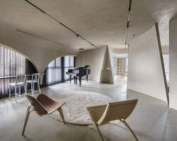
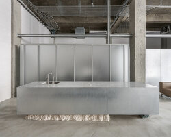
situated in a satellite city near taipei, taiwan, the ‘sharing space’ building by arcadian design is a public cultural domain for the local community. the site has an irregular shape, and the overall  layout strategy applies the concept of the ‘urban infill’ theory. after completing the requirements by the local building code, the plan was conformed to the existing terrain and was shaped as a polygon concrete volume with diverse angles. 

sharing space 1all images courtesy of arcadian design


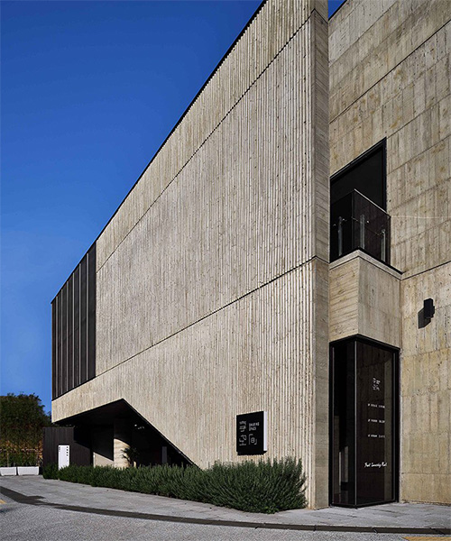
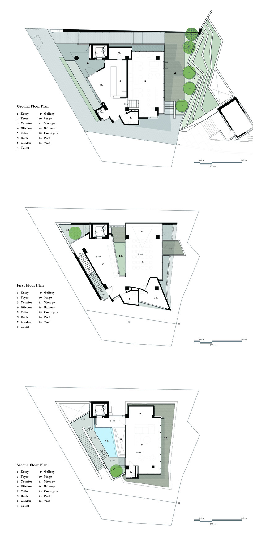
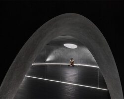
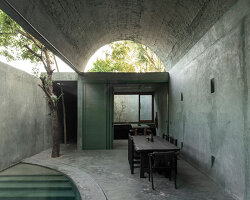
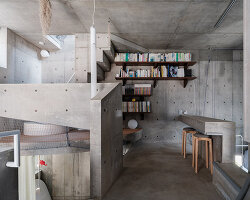
the three-floor ‘sharing space’ by arcadian design consists of a catering and recreation area on the ground floor, an artwork gallery on the first floor, and an exhibition area for life style on the second floor. the main facade is a solid thick wall with no openings, except for a low-profile entrance at the southwest corner where the volume was raised by a single column. sufficient lighting and ventilation are ensured by forming a trapezoid central courtyard which connects the first and the second floor. on the first floor, the courtyard is surrounded by the interior of the artwork gallery. the courtyard extends upwards to the outdoor space on the second floor, allowing the sunlight to enter from the top of the building.

sharing space 2


in front of the building, there is a busy main street, while at the back, there is a garden with abundant greenery. with this in mind, the architects followed a ‘solid front vs. void back’ approach in their design. in other words, they created a clean, solid wall at the front to maintain the continuity of the urban context, while by rising the height of interior space at the backside, they aimed to enhance the interaction with the rear garden. the integration of the vertical and horizontal circulations, as well as the relationship between first and second floors encourage visitors to encircle, cross, and interact with the interior and exterior spaces alternatively.

sharing space 3


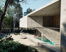
one can enter the building from the low-profile entrance and view the backside greenery through the high-ceiling lounge space. after walking up to the first floor, visitors can find the gallery with the courtyard in the middle, while by looking upwards, the water garden on the second floor is visible. via a sunny outdoor stairway, one can reach to the water courtyard then walk into another indoor exhibition room. during the entire walking process, one can fully experience multilayered spaces with various illumination, heights and scales in limited dimension.

sharing space 4


the main construction material of the building is architectural concrete with wooden texture, using indigenous bamboo as the construction template for the front facade. as a result, the particular concrete appearance with indented bamboo joint and undulated texture was achieved. this bamboo texture delicately intensifies the contrast of light and shadow on the facade. the masculine architectural concrete and the delicate metal meshes on the top of the entrance were integrated together to weave a contrary yet harmonic poetic architecture. 

sharing space 5


sharing space 6


sharing space 7


sharing space 8


sharing space 9


sharing space 10


sharing space 11


sharing space 12


project info:


name: sharing space

architecture office: arcadian design

principal in charge: alex yu

design team: yu-hsien lin, jerry chang, ping-jui chiang, man-wei ke, cheng-hui lu, yu-shan huang, kuan-chen lin, hau-yuan chiang, yu-han weng


designboom has received this project from our ‘DIY submissions‘ feature, where we welcome our readers to submit their own work for publication. see more project submissions from our readers here.


edited by: myrto katsikopoulou | designboom