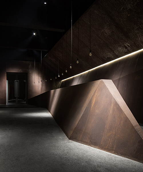
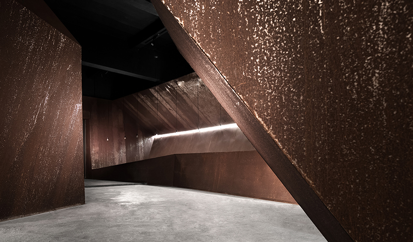
in order to pursue the sense of scale brought by a large space, AD ARCHITECTURE has abandoned excessive partitions and adornments in its office in shantou, china and has naturally extended the fusion of the original space and the new force through the composition of materials. the black paint finishes, cement floors and dark gray steel plates have strengthened the consciousness of the original space’s atmosphere. without adopting an unnecessary process and decoration, the additional built area is applied with industrialized steel and iron materials which corrode naturally as time passes by. it seems that they are showing the essence of strength and beauty. the integrity and uniqueness of each piece of material are respected and the structure is as simple and direct as possible. all of them are telling the concealing power of the space which intensifies its original temperament.

AD ARCHITECTURE's office in china adopts a sense of integrity using dark steel plates
AD architecture has abandoned excessive partitions and adornments in its office in shantou, china


apart from preserving the original structure and satisfying the functional needs in the office, chinese based firm AD ARCHITECTURE has also added some bold spaces where people can think quietly. taking the public working area as the core, the architects have created two functional areas to inject new vitality. the small attic created by space division enhances the sense of form and the originally tall space becomes very interesting through the intersection of different volumes. all volumes are seemingly connected without interfering each other and each space is provided with necessary functions. the whole area is open and comfortable and the focus is on the regained formal sense. the project team hopes this sense of form can enable designers to open their minds and take every step with courage and this is the spatial experience AD architecture wants to bring to every visitor.

AD ARCHITECTURE's office in china adopts a sense of integrity using dark steel plates
the black paint, cement floors and dark steel plates have strengthened the original space’s atmosphere


AD architecture has retained the original structure and has used a patio and some large windows to express the relationship between people and nature. the sunlight penetrates from the translucent patio and projects on the rusting models, which brings vitality to the interior. the concise large windows unintentionally allow the interior to talk with the exterior and people would feel pleasant in the space. through the refracted light and shadow, we can feel the power of nature. designers are pursuing their dreams and insisting on design here and this space frees their imaginations. they can enjoy a quiet moment in this place which no longer just shows its form. based on the patio’s lighting design, the architects have aimed to create a nearly perfect space. through the conversation between the patio and the outside, the spatial feeling is enriched and more experiences are provided.

AD ARCHITECTURE's office in china adopts a sense of integrity using dark steel plates
the public working area of the office has become its core


the project team has adhered to the principle of ‘less is more’ and has tried to create light without revealing the lamps. lighting strips have been mostly used in the front desk and office area. the light and shadow in the empty ceiling area refract on the model planes again which not only avoids deliberately decoration, but also creates a simple atmosphere and good lighting layout. this is exactly what AD architecture are following and will follow in design.

AD ARCHITECTURE's office in china adopts a sense of integrity using dark steel plates
AD extends the fusion of the original space and the new force through the composition of materials


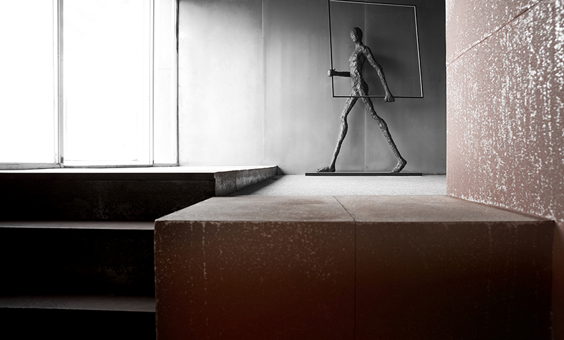
soft decoration is a symbol of design in space and a connection between design culture and life. AD architecture has selected simple materials as a response to the space, so that the decorations are connected and the individual character of the space is reflected. the small attic is a focal point in the space where people generate lots of inner ideas every day. at one side of the attic, a large person statue is looking at the door, as if implying the visitors that more things are waiting to be explored in this office. walking closely, you can see the ball which is made of iron wires is expressing art directly. the wires are interwoven with each other, just like designers’ infinite thoughts. what the project team has striven to do is to combine the artistic language to create a perceptual and powerful working space.

AD ARCHITECTURE's office in china adopts a sense of integrity using dark steel plates
AD architecture strives to combine the artistic language to create a powerful working space

AD ARCHITECTURE's office in china adopts a sense of integrity using dark steel plates
the industrialized steel and iron materials corrode naturally as time passes by

AD ARCHITECTURE's office in china adopts a sense of integrity using dark steel plates
a large person statue implies the visitors that more things are waiting to be explored in this office

AD ARCHITECTURE's office in china adopts a sense of integrity using dark steel plates
designers are provided a leisure area in the office to free their mind during working hours

AD ARCHITECTURE's office in china adopts a sense of integrity using dark steel plates
soft decoration is a symbol of design in space and a connection between design culture and life

AD ARCHITECTURE's office in china adopts a sense of integrity using dark steel plates
the project team has adhered to the principle of ‘less is more’


designboom has received this project from our ‘DIY submissions‘ feature, where we welcome our readers to submit their own work for publication. see more project submissions from our readers here.


edited by: apostolos costarangos | designboom