Herzog & de Meuron launches new website 


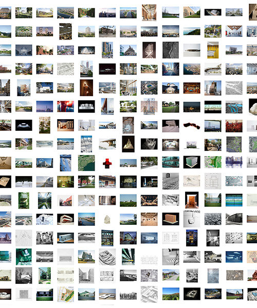
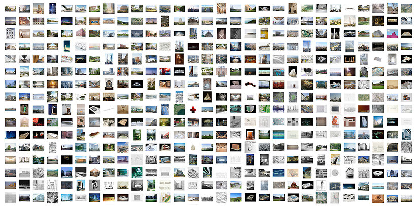
In the beginning of 2023, Herzog & de Meuron unveiled a new website. The renewed website herzogdemeuron.com, created as a collaborative project between the firm’s digital media team, developer Rasso Hilber, Fertig Design, various project teams, clients, and the Kabinett, presents a new layout that goes beyond the concept of a digital portfolio, showcasing the full spectrum of the office’s work and providing more a deep insight into the projects, working methods, design and construction process, as well as the people of Herzog & de Meuron.


To learn more about the new H&dM website, its new features and functions, and the way it communicates with users, designboom spoke with Simon Demeuse, partner at the Basel-based architecture practice and partner in charge of the new website project, who shared how the site allows one to intuitively navigate all facets of the practice. ‘In terms of content, there is an emphasis on process, on sharing working methods which lead to unique design solutions, across most project pages,’ mentions Demeuse. ‘In a way, the website is built upon the same principle of allowing a range of individual experiences, whether they be a deep dive into research or just a casual stroll through the homepage.’ Read the interview in full below. 

interview: herzog & de meuron launches new website allowing range of individual experiences


interview with Herzog & de Meuron


designboom (DB): Why did you decide to revamp the Herzog & de Meuron website?


Simon Demeuse (SD): To increase the transparency of H&dM’s practice — the new website was an opportunity to go beyond a typical project portfolio and address the oft-heard request for a finer-grained view of who we are and how we develop our projects. Herzog & de Meuron is a constantly evolving organization; over the course of the last forty years, the office has transformed in scale and in setup and it is important to share this with clients, collaborators, and to the architecture community at large.


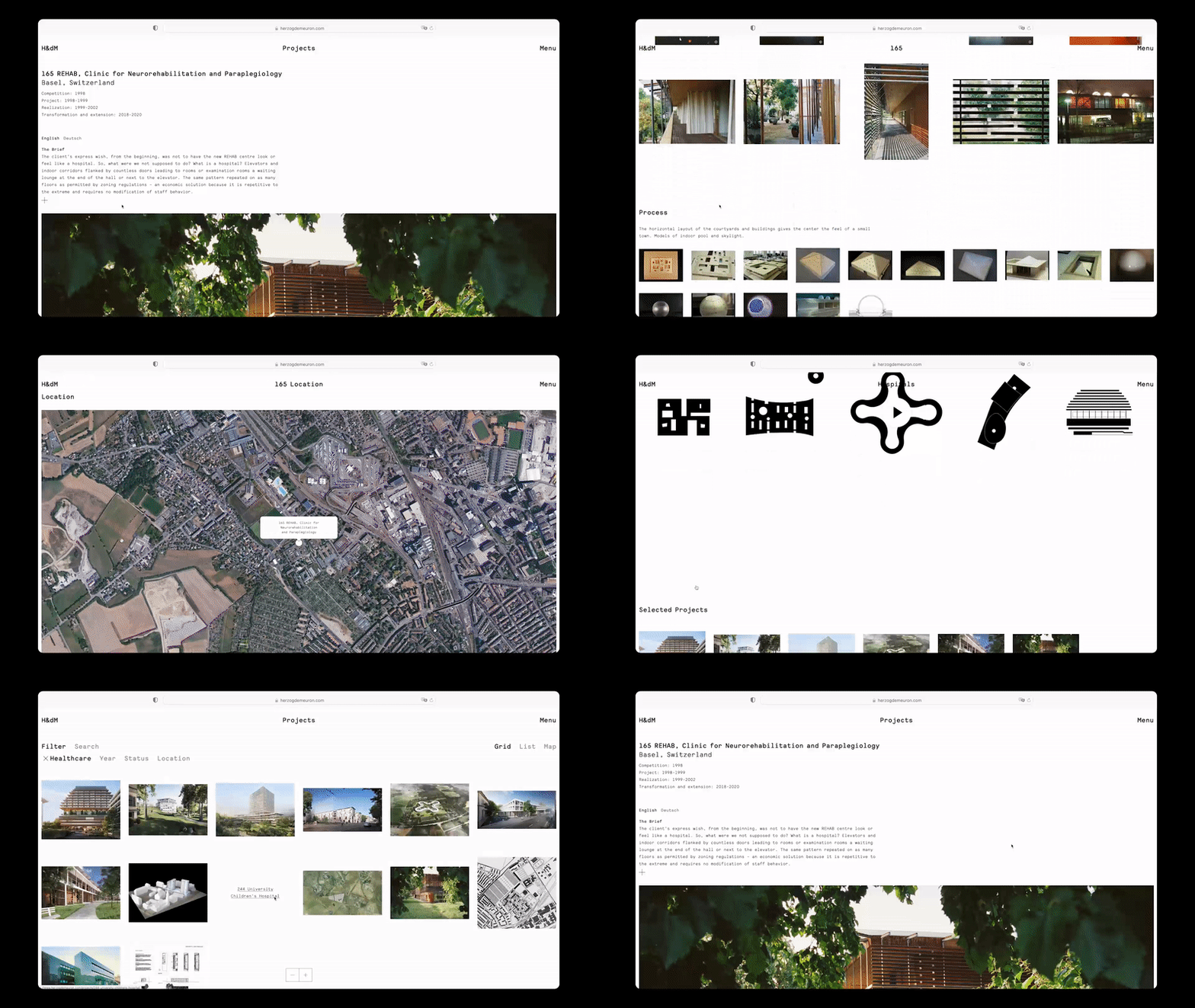
The website also allows us to better explain the full spectrum of our work. Healthcare, for instance, continues to be one of our major focuses. How design can improve life in a hospital is a topic explored early on with REHAB Basel and actively developed today through projects such as UCSF, New North Zealand Hospital, University Hospital Basel, and the Kinderpsital Zürich — all of which are now shared and connected with one another online.

interview: herzog & de meuron launches new website allowing range of individual experiences


DB: What were your main goals in redesigning the new website?


SD: We wanted to share more about H&dM’s practice and the process of how our buildings are made, and share more about our team and the people who make the work possible. The website, therefore, links a diverse group of individuals —from envelope experts to architects to BIM specialists— to projects, working methods, international offices, and core expertises within one platform.


Additionally, we wanted to make the website, and our practice, more accessible to a wider range of users. We had many in mind: collaborators, clients, other architects, academics, people curious about H&dM … the list goes on. Different groups use the website for their own purposes — browsers, who explore the website with no agenda; searchers, who look for information about a specific topic or project; and researchers, who might spend significant time combing through.


DB: How is the new website different in terms of communicating your work and character to users?


SD: The website is no longer a series of isolated chapters but rather a dynamic database within which all content is connected. Collaborating with Rasso Hilber and Fertig Design, we intended the interface and visual language to be straightforward and uncomplicated. The result is a quiet content machine that gives users the ability to intuitively navigate through all facets of H&dM’s practice, on their phones or computers.


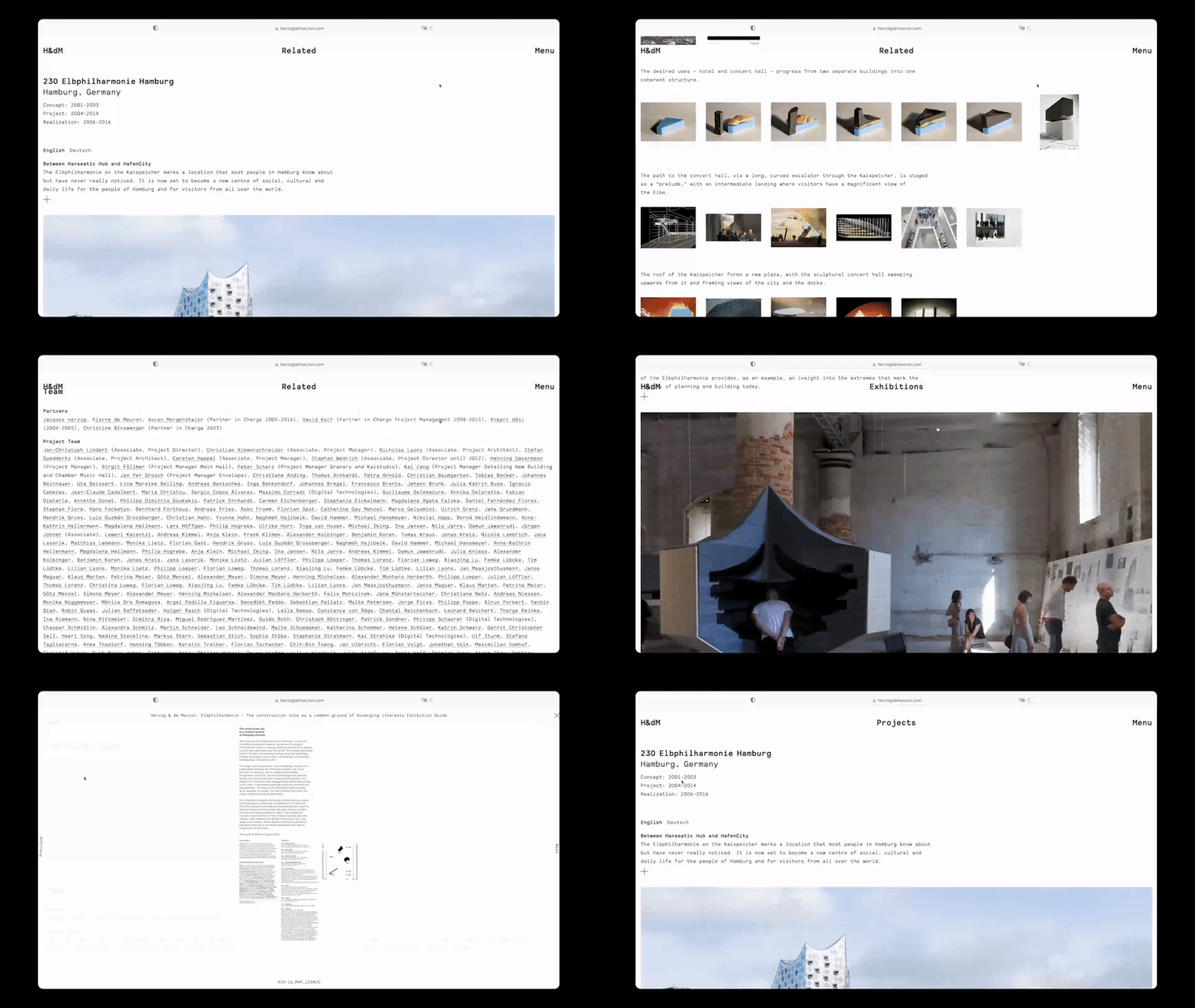
In terms of content, there is an emphasis on the process, on sharing working methods which lead to unique design solutions, across most project pages. This was inspired by the logic of our Complete Works monographs. On the page for the Elbphilharmonie Hamburg, for example, a user can trace the development of the project from concept studies to the final building, see construction and completion photography, and go to related posts such as the exhibition contribution to the Venice Biennale.


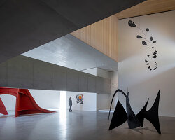
Many of our projects —the Turbine Hall at Tate Modern, for instance— demonstrate how architecture can be accessible and porous, open to its surroundings, and thereby offer the public choices of use. In a way, the website is built upon the same principle of allowing a range of individual experiences, whether they be a deep dive into research or just a casual stroll through the homepage.

interview: herzog & de meuron launches new website allowing range of individual experiences


DB: The new website has been developed together with many project teams, clients, and the Kabinett. Can you tell us a little about this collaboration?


SD: The first step was a fact-finding mission across all parts of the office involving project teams, partners, kitchen (the team working on exhibitions, publications, and special projects), the Kabinett, the business departments etc. We heard similar things from them: the website should make people and process more visible. 


Then there was the critical task of collecting, assembling, editing, and publishing; collaborating closely with all those groups to gather the right amount and type of content. This meant researching within the archives to consolidate and fact-check information, developing backend platforms to streamline the flow of content, and revisiting many projects to see how we could build upon the content previously shared. The effort continues — the website is a live and changing entity linked to a constant stream of new content.


DB: You’ve mentioned that ‘in addition to enriching projects with images, drawings, texts, and videos, the website reveals extensive and sometimes surprising connections within the world of the practice’. How is this achieved, and can you give us some examples?


SD: The website creates links between all aspects of the practice—features like the Related section on each project page and a robust global search function allow users to jump between strands that they might find interesting.


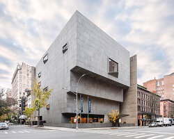
For example, starting from the project page of 56 Leonard St, a user can visit a specific team member’s profile page, continue by searching for H&dM’s office in NYC, from there discover a museum project in the United States that they might have never seen before, then find out more about our approach to cultural spaces in general and so forth. Each excursion through the content is therefore highly specific to a visitor’s individual interests, again relating back to the wide range of people who might use the H&dM website.

interview: herzog & de meuron launches new website allowing range of individual experiences


project info: 


name: herzogdemeuron.com
architects: Herzog de Meuron
developer: Rasso Hilber
in collaboration with: Fertig Design, the Kabinett