KEEP UP WITH OUR DAILY AND WEEKLY NEWSLETTERS
happening this week! holcim, global leader in innovative and sustainable building solutions, enables greener cities, smarter infrastructure and improving living standards around the world.
PRODUCT LIBRARY
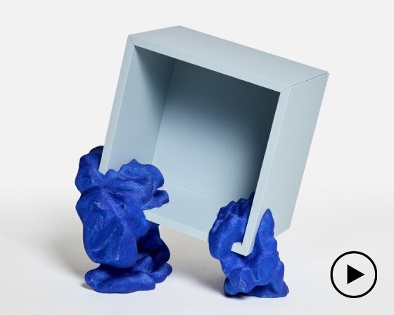
by upcycling mass-produced furniture, YET architecture and BDM architects blurs the lines between standardization and personalization.
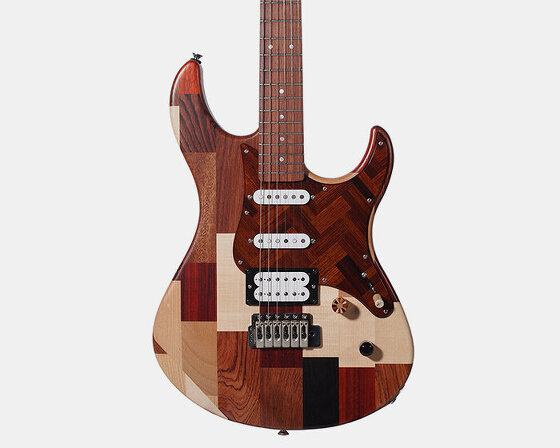
yamaha design laboratory's concept project upcycles rare woods originally intended for marimba tone bars and pianos.
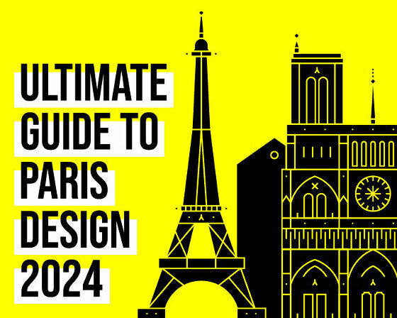
find out more about this year's maison&objet, as well as the must-see exhibitions, and cultural events in the run-up to paris design week 2024.
connections: 9
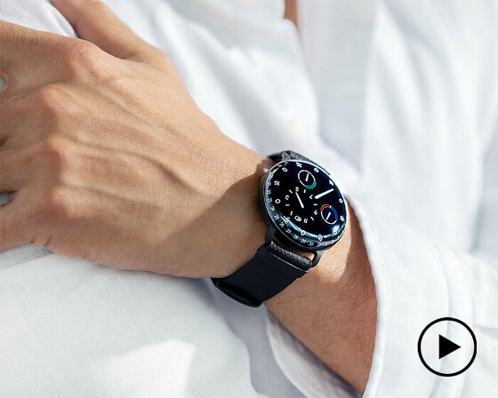
discover the magic behind ressence’s TYPE 3 BB2 watch - a mechanical marvel that looks like it is powered by LEDs but is purely crafted with hundreds of intricate pieces.
connections: +390
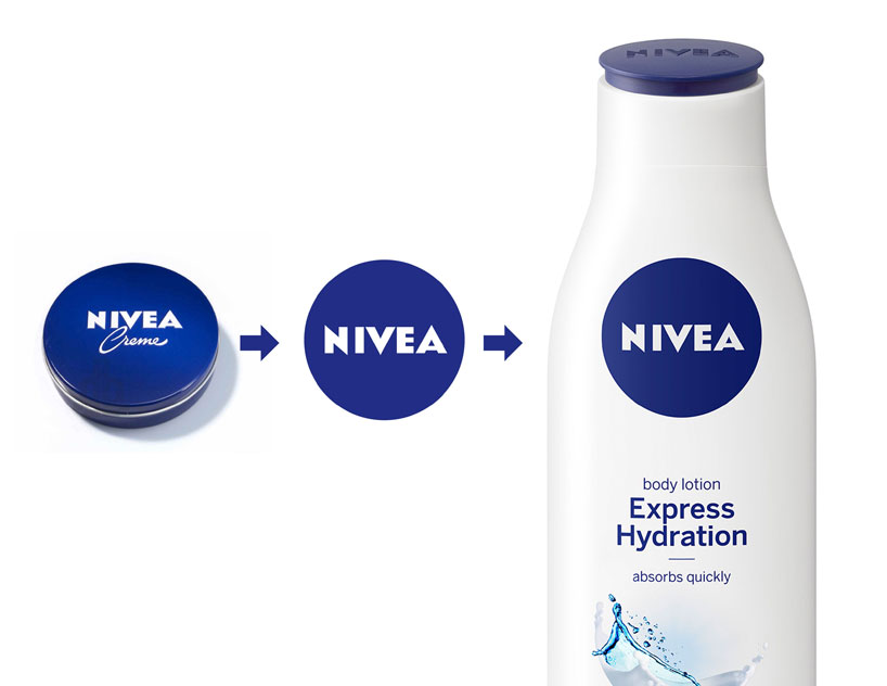
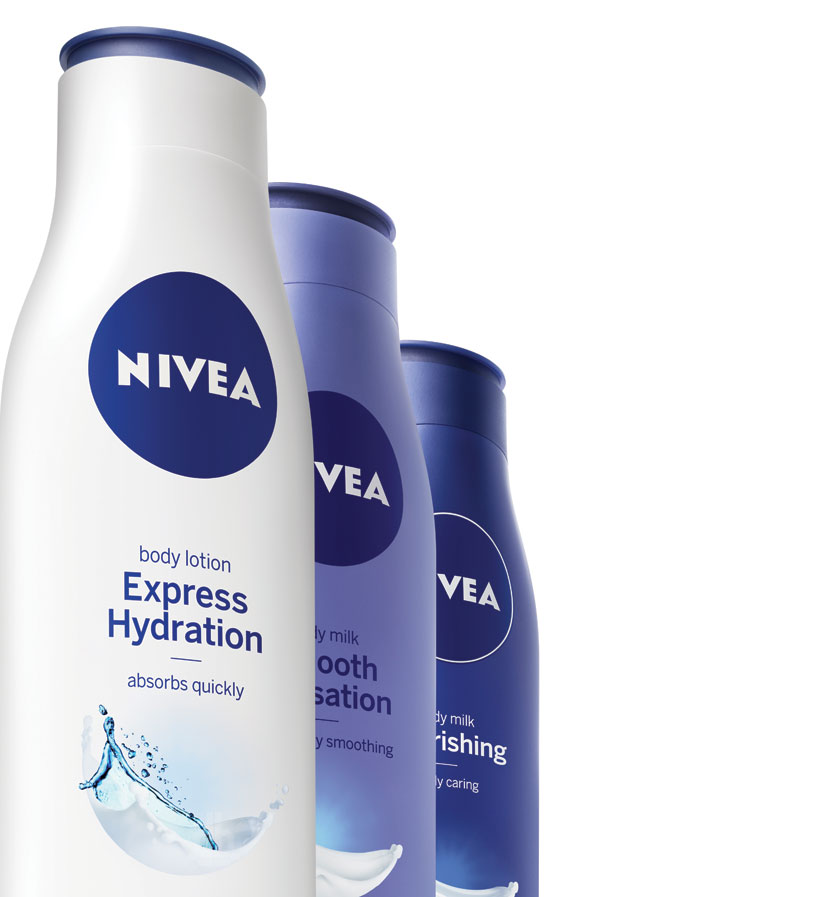 new packaging in reduced blue and white colors
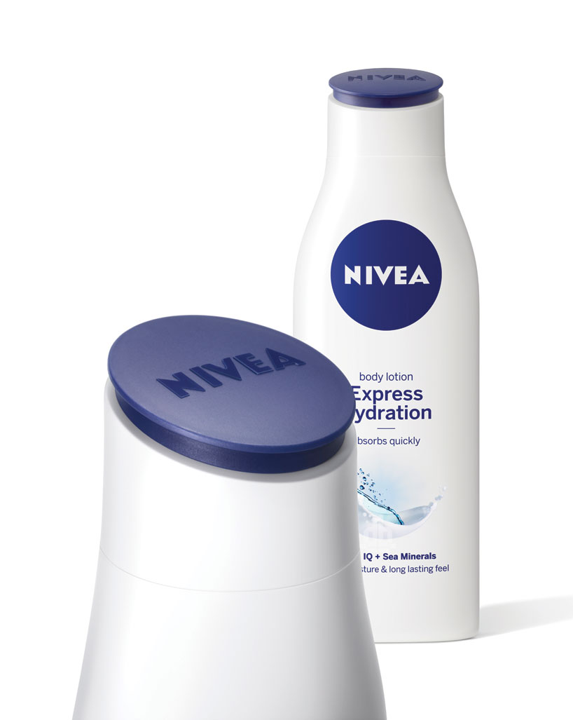 the rounded lids of the new bottles tilt towards customers and are embossed with the NIVEA logo
 NIVEA’s new global design by yves béhar / fuseproject
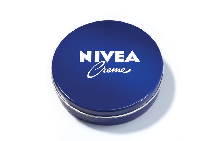 the skincare brand’s iconic blue tin was the basis of the updated design language
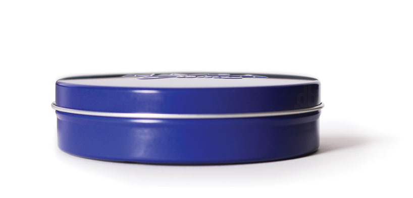 profile of NIVEA’s blue créme tin
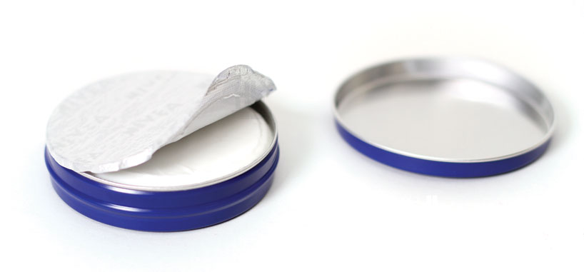 the tin has been a part of the company’s visual language since 1925
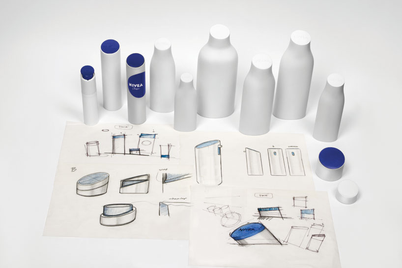 concept development of the new NIVEA global design
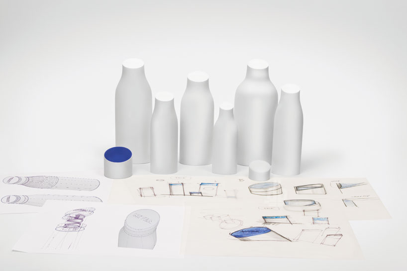 prototypes and concept sketches of the new packaging
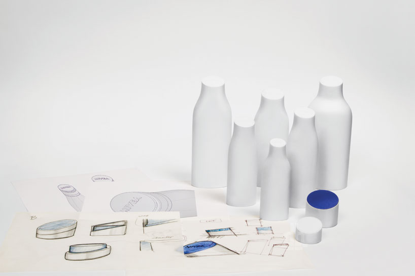 process documentation
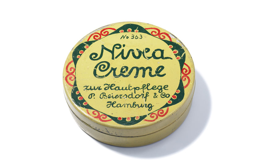 the original NIVEA creme tin packaing, 1911
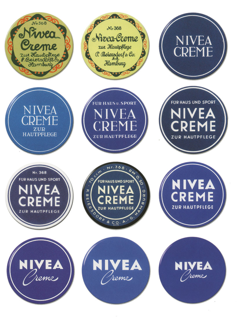 evolution of the NIVEA creme tin over time
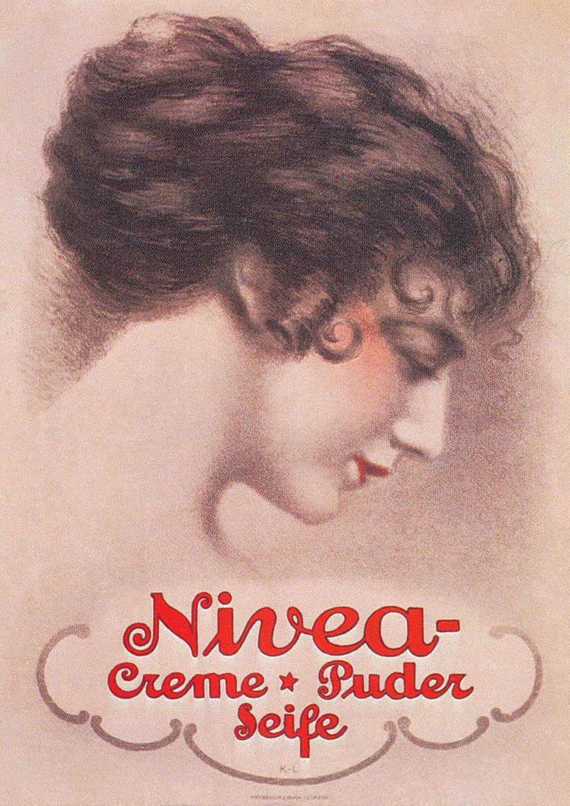 vintage NIVEA creme powdered soap advertising, germany 1924
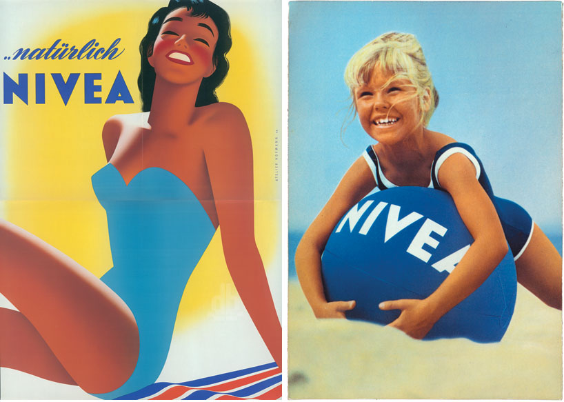 left: postwar advertising, germanyright: the NIVEA ‘fun in the sun’ advertising, germany, 1967
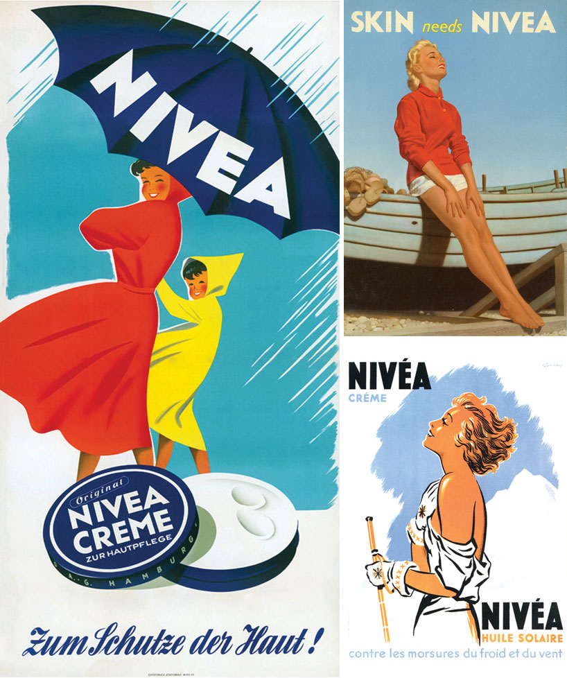 left: postwar advertising, ‘to protect the skin’, germanyright: NIVEA commerical, UK, 1958 (top); sun tanning oil advertisement, ‘against the biting cold and wind’, france (bottom)

