‘dentist with a view’, by shift architecture + urbanism, best, the netherlandsall images courtesy of shift architecture + urbanism


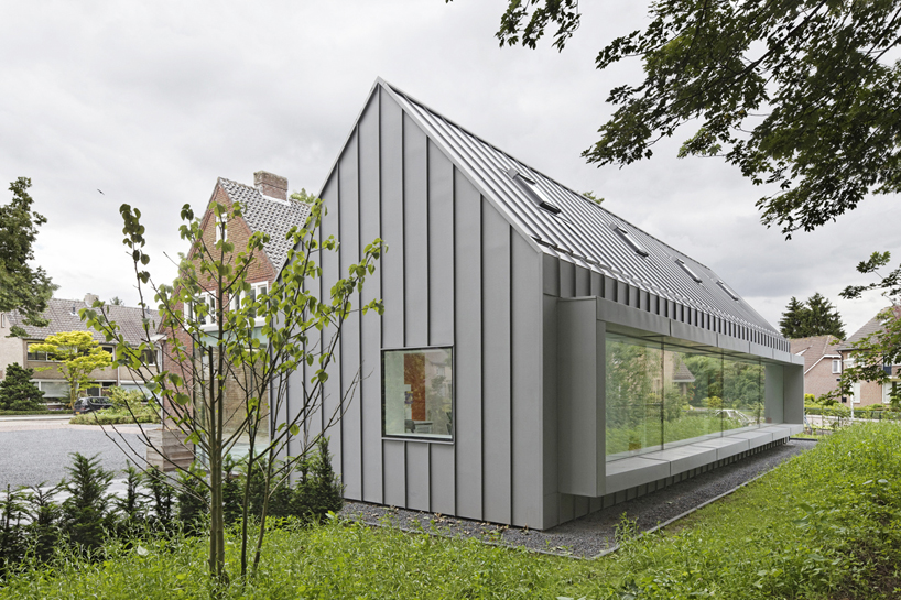
the task of ‘dentist with a view’ by dutch practice shift architecture + urbanism was to transform and extend a historical house in the centre of best, a village in the south of the netherlands, into a dental practice with four treatment rooms. the central question was how the extension responds to the existing architecture and how it profits from the green setting. the four new treatment rooms are situated in a volume that at the same time mimics and contrasts the existing house. its archetypical form is derived from the existing dwelling – it takes over the exact same inclination of the pitched roof – while it is being manifested in a very different material. both the roof and the facades of the extension are clad with zinc. this strengthens the iconic quality of the archetype and renders the new addition into a “contextual alien” that blends into the rural surroundings and at the same time creates a clear landmark that expresses its recently developed function.


shift architecture + urbanism: dentist with a viewlarge flower window with overhanging bench
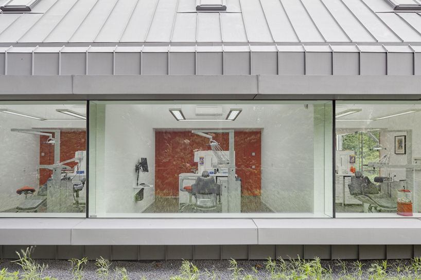


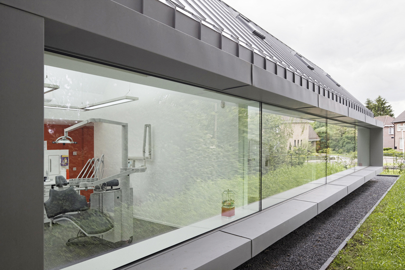
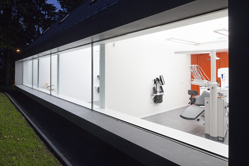
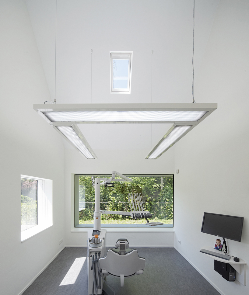
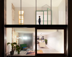
the addition provides each treatment room with the archetypical space of a miniature house. its high ridge and steep ceiling results in a verticalspace that connects to the perspective of a patient in the dentist chair. a roof light in each treatment room enables the patients to relate with the outside,even during treatment. a large ‘flower window’, that also serves as a bench, floods the rooms with daylight and provides both the staff and their patientswith a framed view of the surrounding green environment. all secondary functions of the dentist practice are positioned in the existing house withoutharming its structure and typical 1930’s details. the patient enters and waits in a homely and familiar atmosphere that, together with the experience ofthe surrounding garden from the extension, makes the necessary visit to the dentist a (slightly) more comforting experience.


shift architecture + urbanism: dentist with a viewpanoramic windows give each chair a full view of the garden
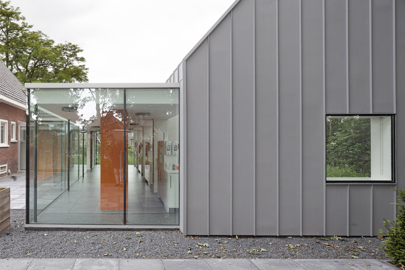


shift architecture + urbanism: dentist with a viewentrance to the new addition


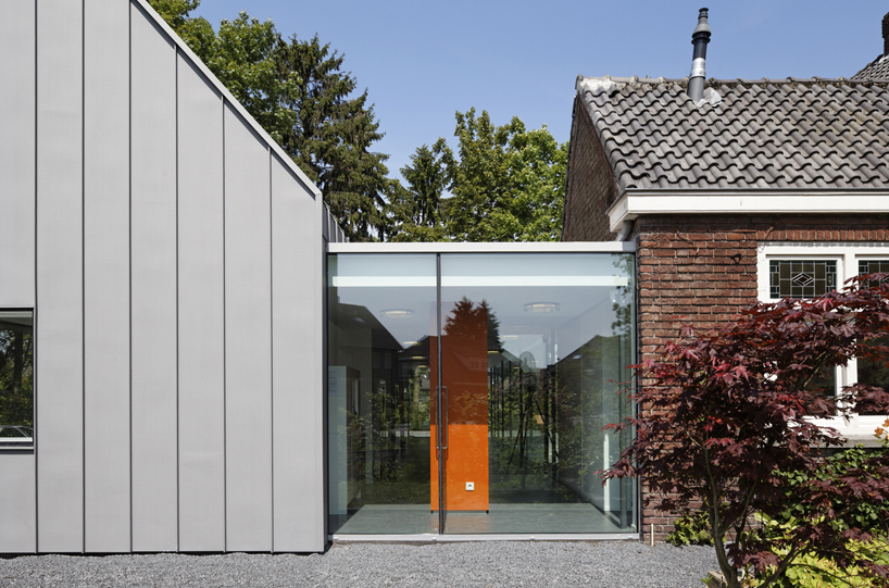
shift architecture + urbanism: dentist with a viewtransparent box connected the old and new
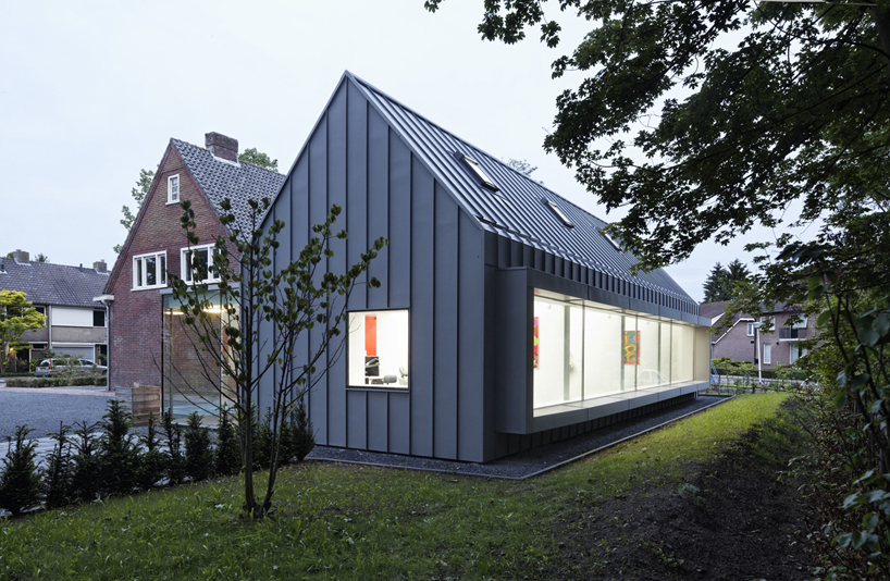


shift architecture + urbanism: dentist with a viewextension with four treatment rooms mirrors the overall form of the existing building, with different material
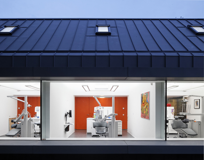


shift architecture + urbanism: dentist with a vieweach chair is provided a cozy private room
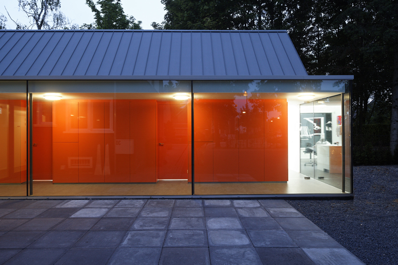


shift architecture + urbanism: dentist with a viewglazed corridor


shift architecture + urbanism: dentist with a view


shift architecture + urbanism: dentist with a viewinterior treatment room


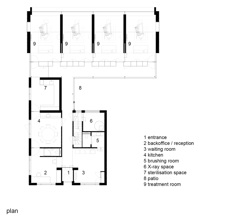
shift architecture + urbanism: dentist with a viewfloor plan / level 0


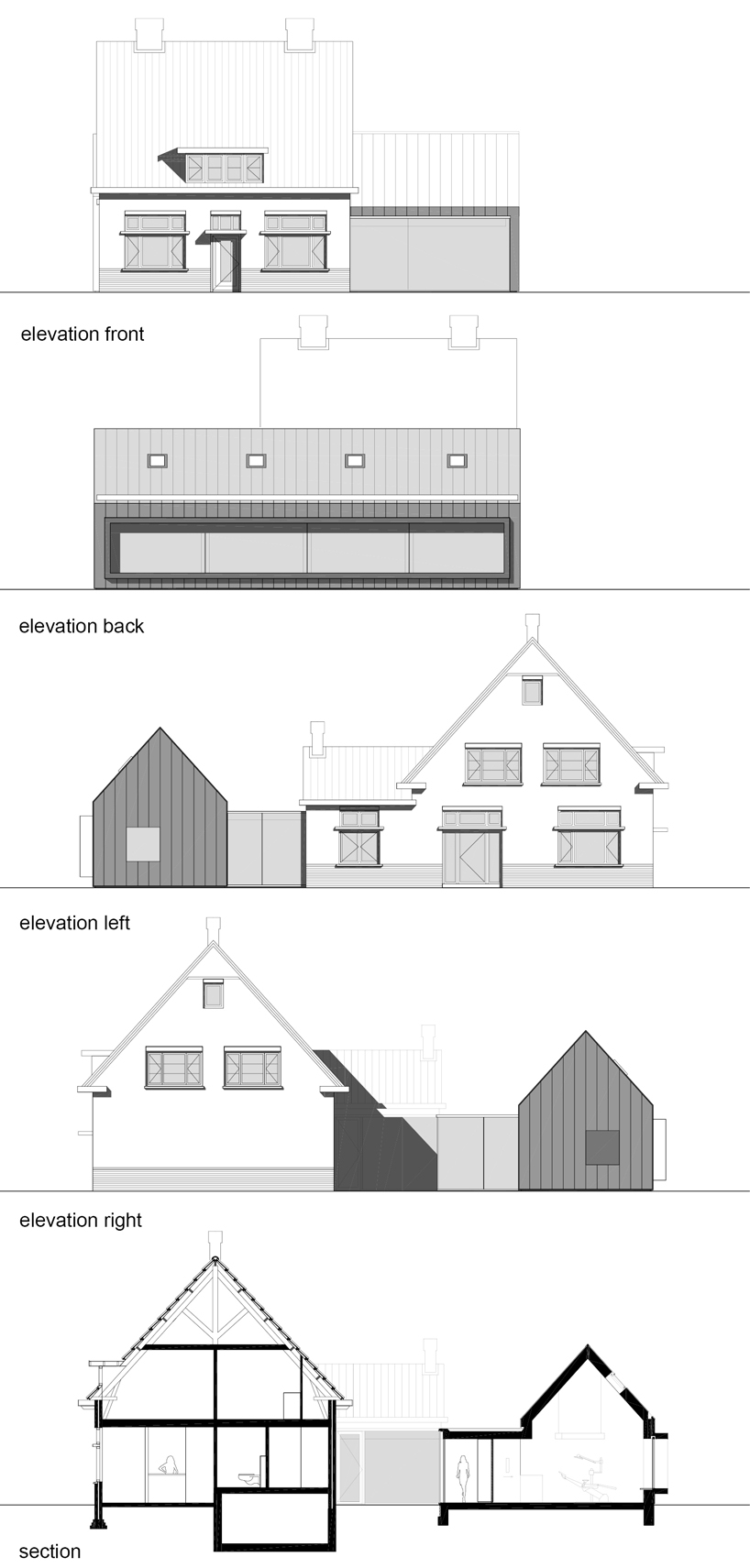
shift architecture + urbanism: dentist with a viewelevations and section


project info:


address: oranjestraat 55, 5682 ca bestclient: lisette van gils & ruben timmermansdesign: shift architecture urbanism, rotterdamproject architects: harm timmermans, pieter heymansadviser construction: b2co, richard fielt, edeadviser installations: van delft groep, nieuwkuijkcontractor: van der weegen bouwgroep,tilburgcontractor furniture: bots bouwgroep, deurnesub contractor zinc facade: bax koper en zinkspecialist, bergeijksub contractor frames: hoefnagels groep, tilburggross surface area: 292 m2delivery: august 2011building costs: € 340.000 excl. vat


designboom has received this project from our ‘DIY submissions‘ feature, where we welcome our readers to submit their own work for publication. see more project submissions from our readers here