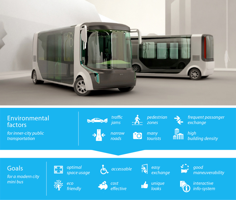
m8 city mini bus by laszlo peter molnar from hungary
designer's own words:
M8 is a city bus concept for inner city transportation.
When designing inner-city public transportation, many environmental factors should be taken into consideration. Traffic jams, narrow roads and sharp turns, high building density and pedestrian zones are present at the same time in the same place, while buses have to deal with frequent passanger exchange and tourists who don’t always know where and how they should go. It is also important for the buses not to compete with sights, not to act as an outsider visually.
To compensate these factors, inner city buses should use space as efficiently as possible, combined with full accessability, easy passanger exchange, good manouverability, and decent, still recognizable looks. For the locals, it is important that it has a small ecological footprint, is cost-effective to operate, and easy to repair. And all this should be adjustable for all the cities where it can be possibly used in.
To reach these goals, I made several changes to traditional bus design clichés. I placed the driver in front in the middle, so he/she can have a better sight. The front wheels are placed next to the driver’s seat, this extends the wheelbase and grants more space for the front wheel arches, thus the wheels can turn more, so the turning radius becomes smaller. The usual two-door layout is changed into a single wide-door layout with the same capacity.
The rear wheels are put closer to the end of the bus. The engine compartment is also placed here, which makes repairing easier. Rear wheels also turn, making the turning radius even less.
The exterior design is as low-key as possible, with maximized reflecting and transparent surfaces and minimal still sufficient paintable areas for communicating the operator’s identity.
Due to the extended wheelbase, the interior area is an almost flat, cubic space which means space usage can be easily maximized. The passanger area is split into two areas. The front(A) part is for short-term trips, with transformable seats. This area is suitable for up to 23 people standing, 9 sitting/leaning and 2 in a wheelchair, or 35 people standing. The rear(B) area is for long-term trips suitable for 9 seated passangers.
The interior design reflects to typical street environments with candalebras as central visual elements between buildings. Due to the large windscreens you feel like walking in the streets while on the bus. Interactive AR-screens can also be equipped into the bus. This way the passangers can see what happens in front of the bus, and they can get additional information about sights.
When designing inner-city public transportation, many environmental factors should be taken into consideration. Traffic jams, narrow roads and sharp turns, high building density and pedestrian zones are present at the same time in the same place, while buses have to deal with frequent passanger exchange and tourists who don’t always know where and how they should go. It is also important for the buses not to compete with sights, not to act as an outsider visually.
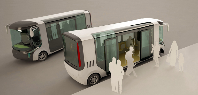 The exterior design is as low-key as possible, with maximized reflecting and transparent surfaces and minimal still sufficient paintable areas for communicating the operator’s identity.
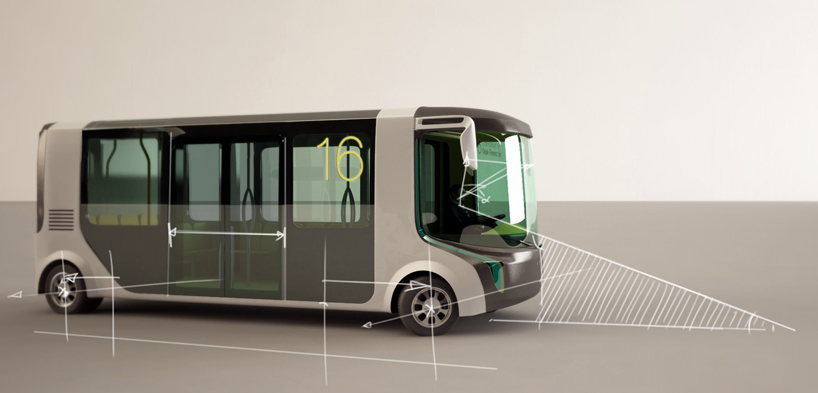 The rear wheels are put closer to the end of the bus. The engine compartment is also placed here, which makes repairing easier. Rear wheels also turn, making the turning radius even less.
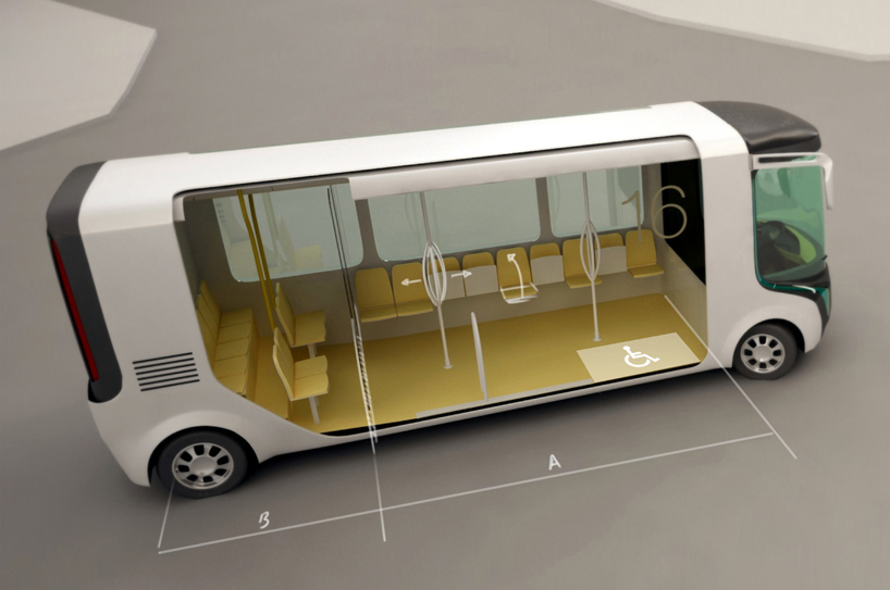 Due to the extended wheelbase, the interior area is an almost flat, cubic space which means space usage can be easily maximized. The passanger area is split into two areas. The front(A) part is for short-term trips, with transformable seats. This area is suitable for up to 23 people standing, 9 sitting/leaning and 2 in a wheelchair, or 35 people standing. The rear(B) area is for long-term trips suitable for 9 seated passangers.
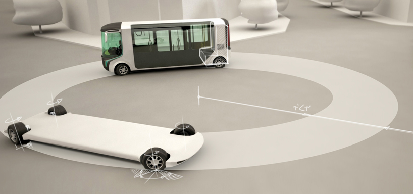 The rear wheels are put closer to the end of the bus. The engine compartment is also placed here, which makes repairing easier. Rear wheels also turn, making the turning radius even less.
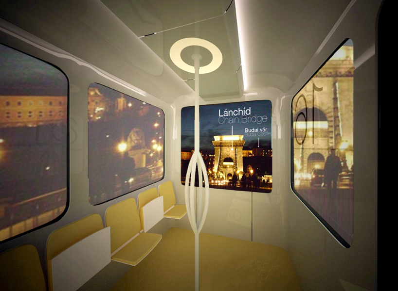 The interior design reflects to typical street environments with candalebras as central visual elements between buildings. Due to the large windscreens you feel like walking in the streets while on the bus. Interactive AR-screens can also be equipped into the bus. This way the passangers can see what happens in front of the bus, and they can get additional information about sights.