the winning design by kengo kuma
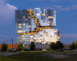
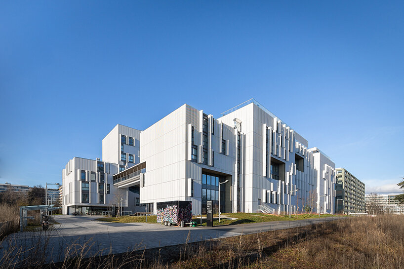
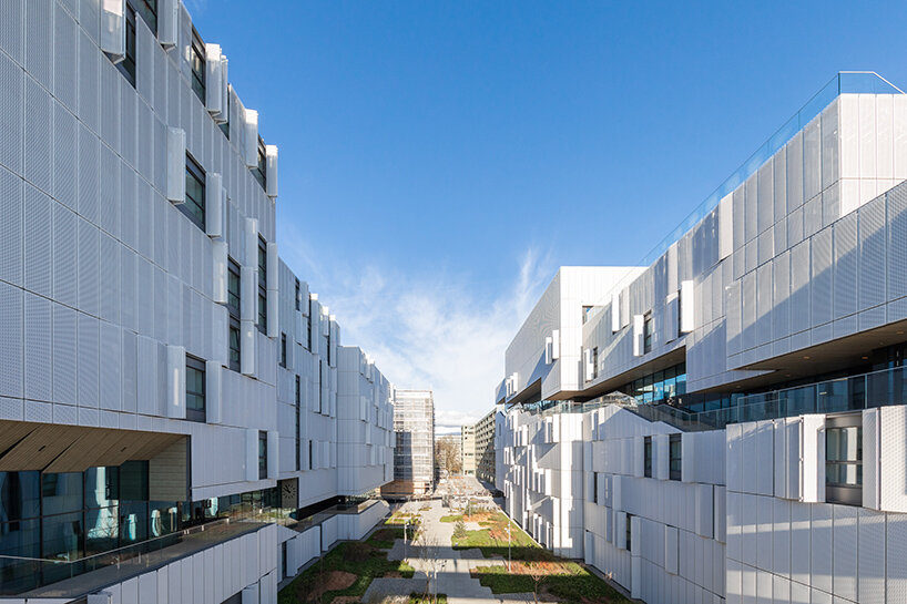
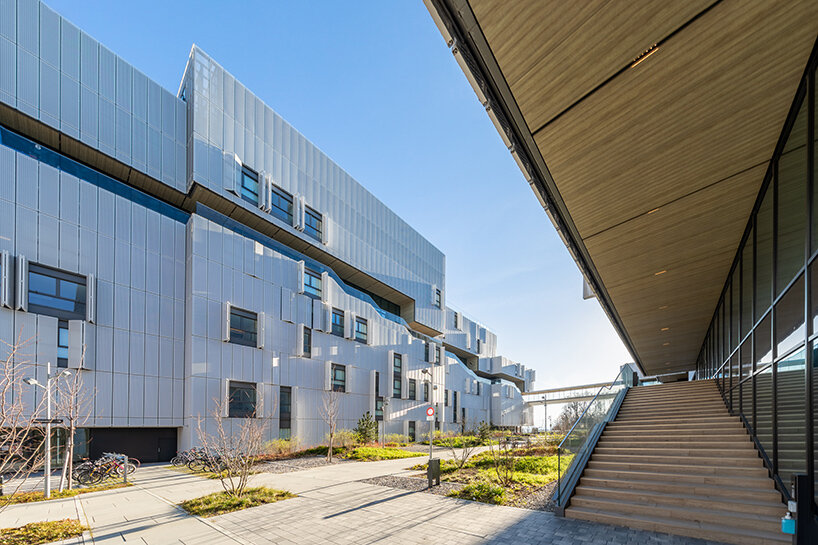
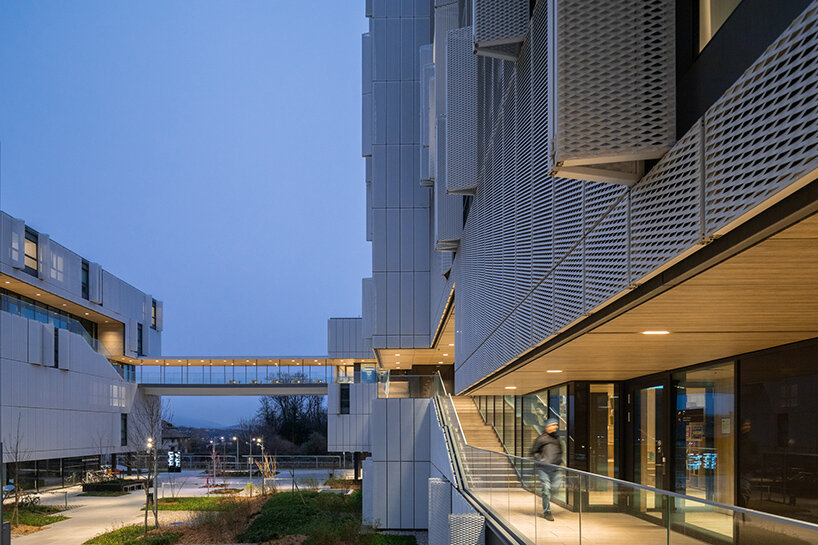
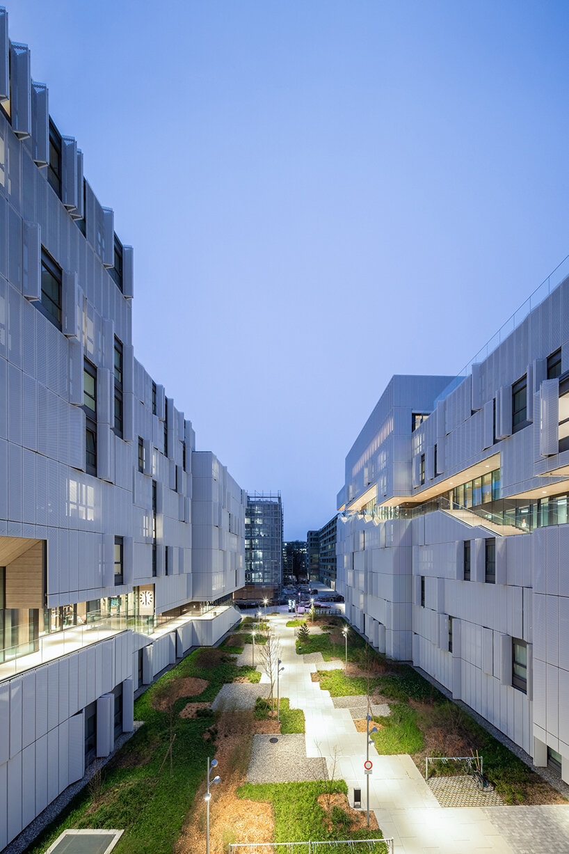
kengo kuma & associates have completed their grand morillon student dormitories, unveiling the design with photography by vincent hecht. the structure is the result of a winning competition entry announced in 2017, organized by the graduate institute of international and development studies (IHEID). located in geneva, switzerland, the light-filled project takes shape as a cluster of volumes which have been ‘carved’ away to reveal a continuous pedestrian promenade running throughout, and integrating shared community spaces along the way.
 images © vincent hecht | @vincenthecht.photography
natural community through architecture
kengo kuma & associates (see more) design the grand morillon student dormitories to emphasize the dialogue between community and moments of privacy. the project houses 700 beds for IHEID students. while offering these various apartment types for private times of retreat, the team understands the need for spontaneous interaction between students while traveling between the dorms and classes.
rather than connect the building with vertical circulation, relying purely on elevators, the carved-out ribbon of promenade ensures that students will have these points of meeting and engaging along their way. a natural community is thus promoted alongside the private apartments so that students are not isolated.
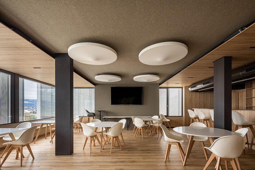
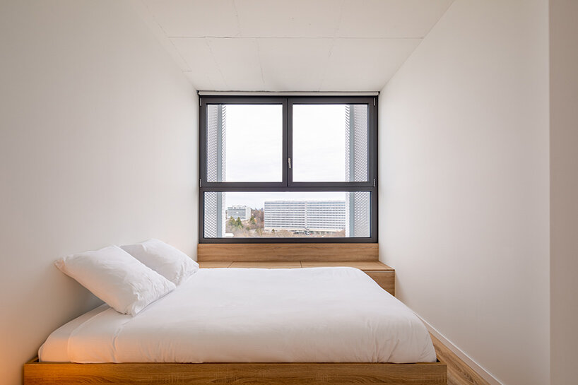
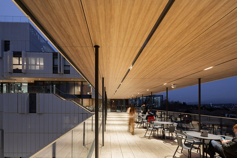
the kengo kuma-designed grand morillon dormitories thus incorporate common spaces across all levels. the design team rejected the typical organization which sees shared areas on the bottom levels with apartments designated to the upper levels. this may lead to a sense of seclusion as the community spaces are not passed through naturally. instead, the common areas — including communal kitchens, laundry rooms, sport facilities, library, study areas, cafeteria — are scattered across the buildings, linked directly to the carved pedestrian promenade. inside, the spaces are curated with warm wood to contrast the gray and white tones of the facade.
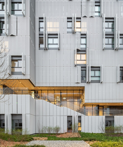
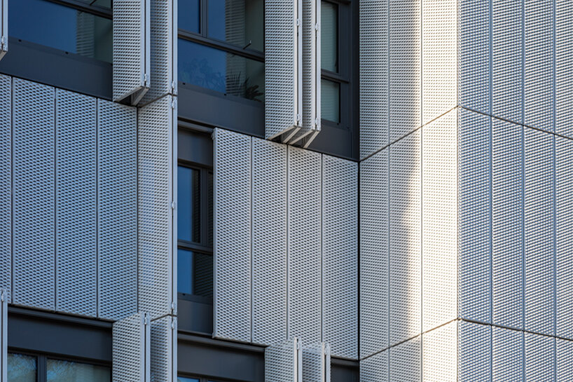
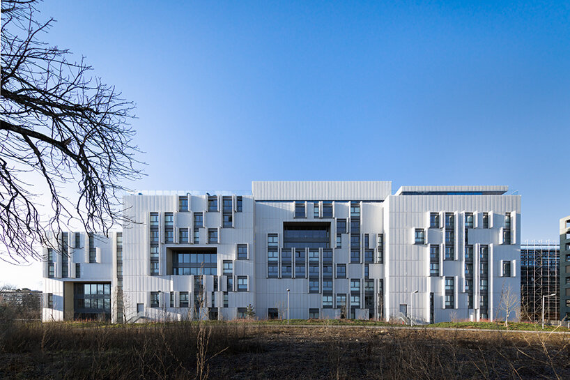 the metal facade opens outward with sliding shutters
interview with the team at kengo kuma & associates
designboom speaks with javier villar ruiz, partner-in-charge at kengo kuma & associates, to learn more about the spirit of the complex project. the architect begins by describing the project’s ambitions and challenges.
‘this project started as part of an international competition. our initial proposal was so ambitious that this project could perfectly have finished becoming one of those competition entries that are well appreciated for their surprising twists but finally not selected to go forward. the proposal was based on a series of solutions that were not, by far, part of the requirements. we were aware that, although we were giving to the client what they needed, it was not necessarily what they were asking for.
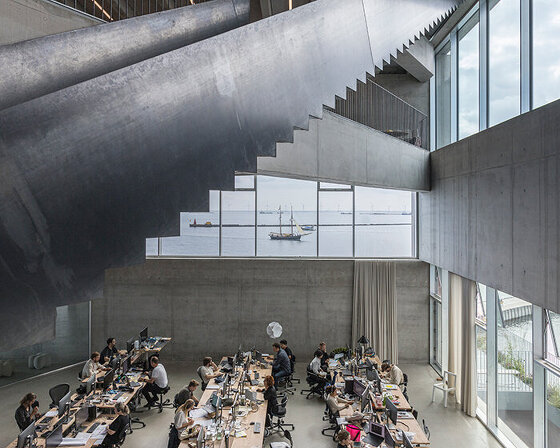
‘in this project we wanted to question the usual program segregation that places the public facilities on the ground floor and the residences units above; a typology that heavily relies on the use of elevators. instead, an ascending promenade, as a new kind of public space, would allow pedestrian access to all floors and activities, from the ground floor all the way up to the rooftops.
‘students going to their apartments or to the facilities, going down to the street or up to the rooftops, would use this public space as the main way to navigate and experience the building. all this to turn this project into a place that encourages a more walking-conscious lifestyle that provokes encounters between its inhabitants, offering a community-like experience to all these hundreds of students, all from very different origins, that will be cohabitating here for the years to come.’
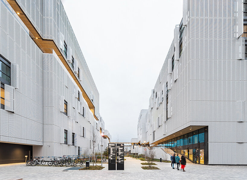
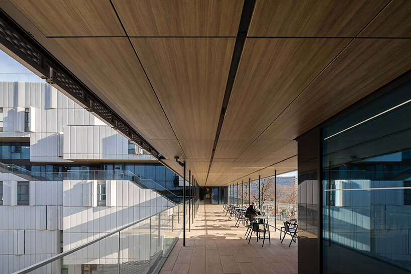
the warmth of the wood contrasts the light facade
a confident calligraphy stroke
‘we imagined this promenade carved into the architecture, as an essential part of its expression, not appearing as an afterthought. during its upwards travel, this linear and ever-changing void, as a confident calligraphy stroke, breaks into the rational organization of the apartment cells. but despite this organic disruption, the promenade articulates and brings sense to the whole. the apartment cells strictly follow a 2.8-meter grid.
‘each apartment module is enclosed by two openable windows that are protected by 4 foldable metal mesh screens. the 70-centimeter module of these screens wraps entirely the different volumes, defining their widths, heights, and interlocks. when the grid of the façade screens arrives to the void of the promenade, its lines meticulously continue in the divisions of its ceiling and floors that carry on into the interior spaces organizing its lighting layouts, wall finishes and built-in furniture.
‘it is a project that has been conceived to be coherent at all scales… from the structure grid down to the divisions of all interior arrangements. a design that implies the complexity of being both rational and organic, brutalist and detail driven, warm and cold.’
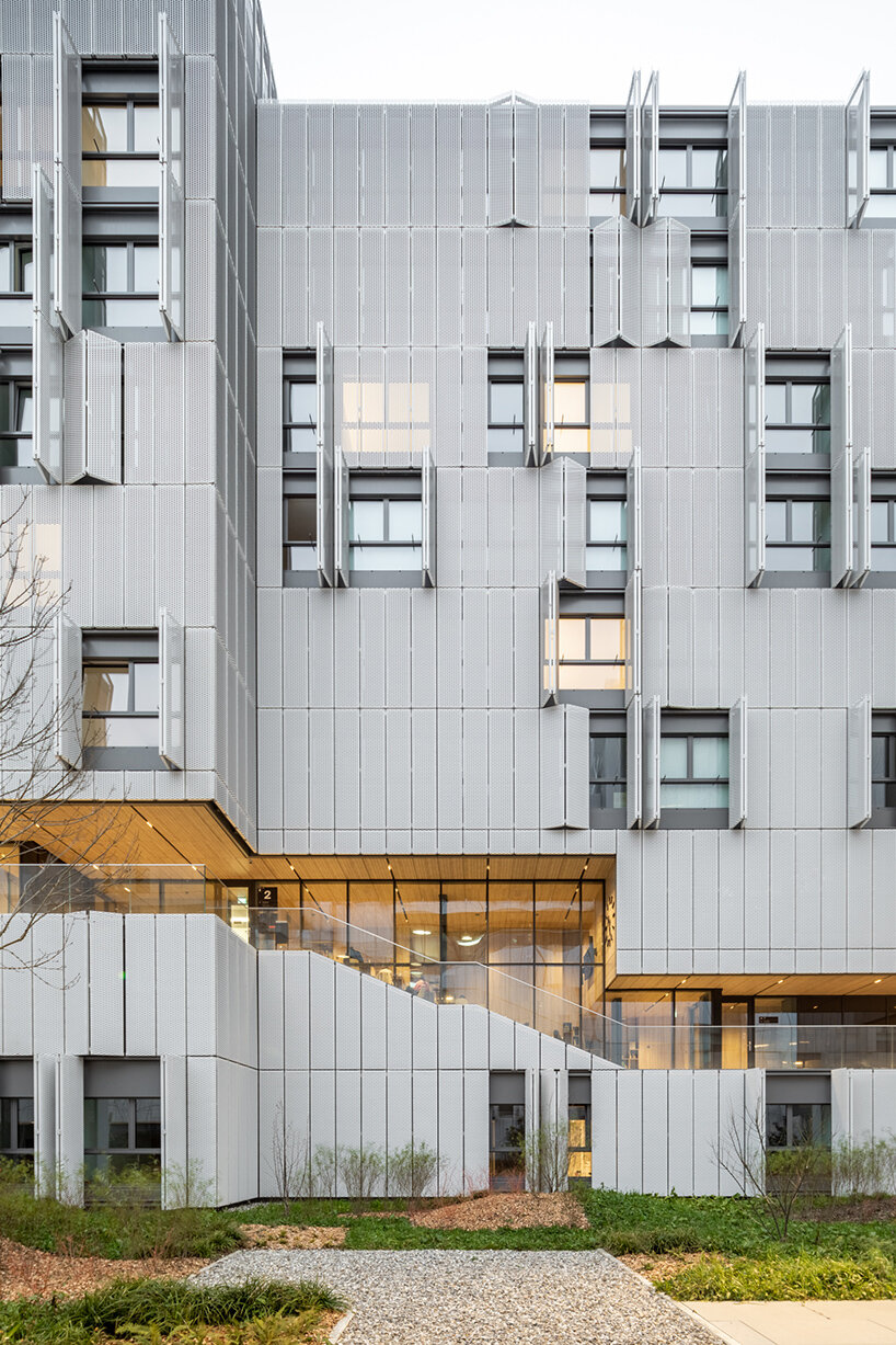
the carved-away promenade promotes a walking-conscious lifestyle
challenges arising from an ambitious design
‘ such ambitions and challenges raised many questions, both at the time of the competition and during the development of the project and its construction:
’would the client take the challenge of such new kind of operation where the public and the private realm are completely interweaved? would the engineers find reasonable ways to keep the promenade free of structural and mechanical elements, to be fully open to the exterior as we imagined?
would the construction company manage to erect such a complex building, caring for its principles at all its scales, from the daring super-structures down to the delicate millimetric coincidences in the finishes’ divisions? would the local team engage themselves in discussing with the authorities pushing forward solutions that are not shown in the books but necessary for such a particular architecture? and would all the involved parts be willing to make all this to happen in the best way possible in terms of quality, time, and budget?
‘ as in all projects, and especially in challenging ones, the whole process is not an easy path to go through. but in this case, it was particularly exciting, even surprising, to see how all these questions and uncertainties were cleared one by one, revealing the common ground of all parts involved. with no doubt, this is one of these projects that could not have been possible without the complicity, commitment and good-will of a big group of professionals, all believing in the good that this project will bring.’
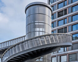
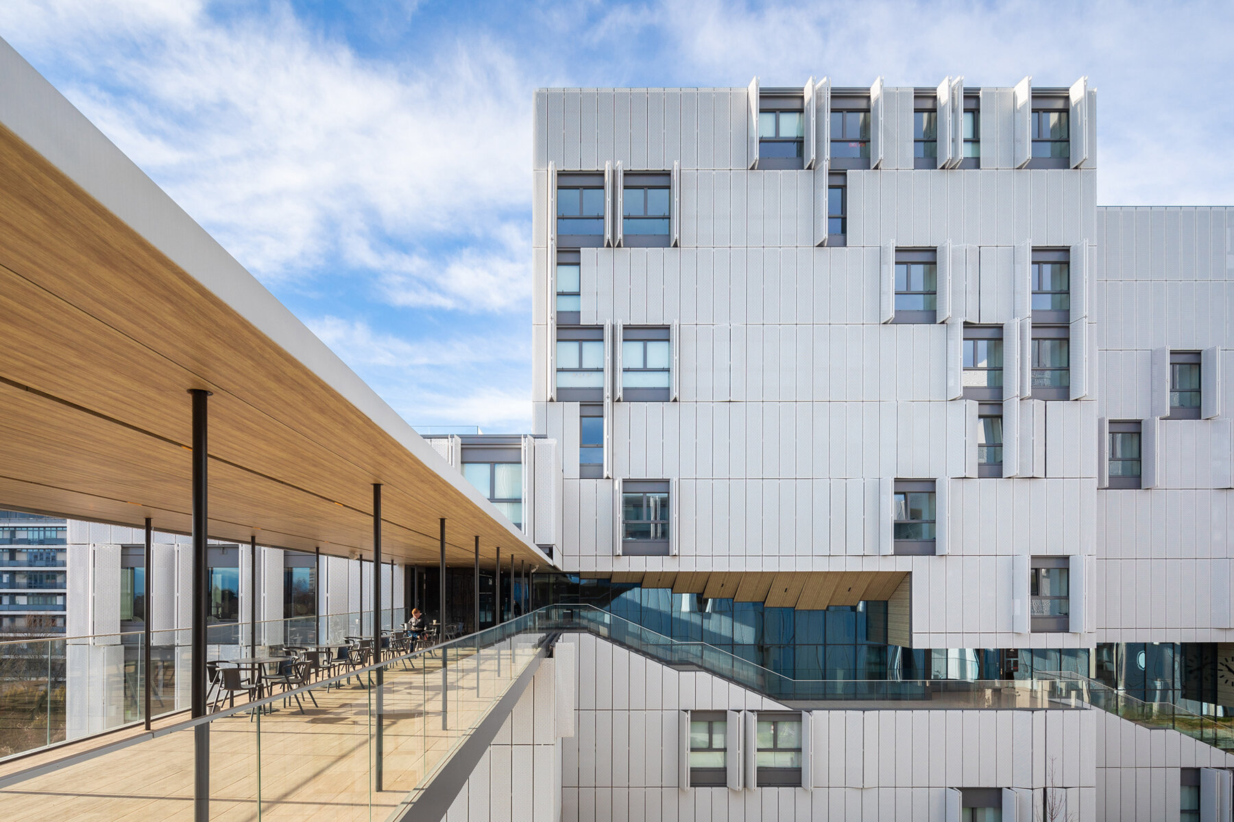
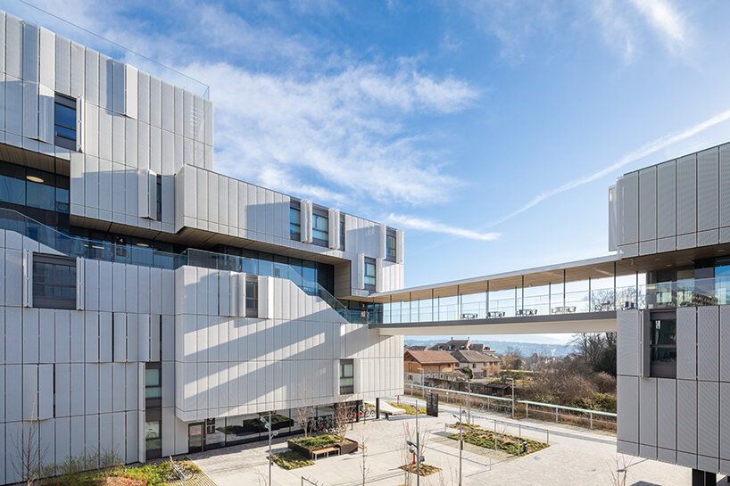
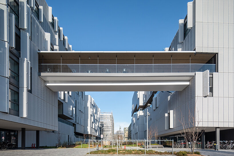
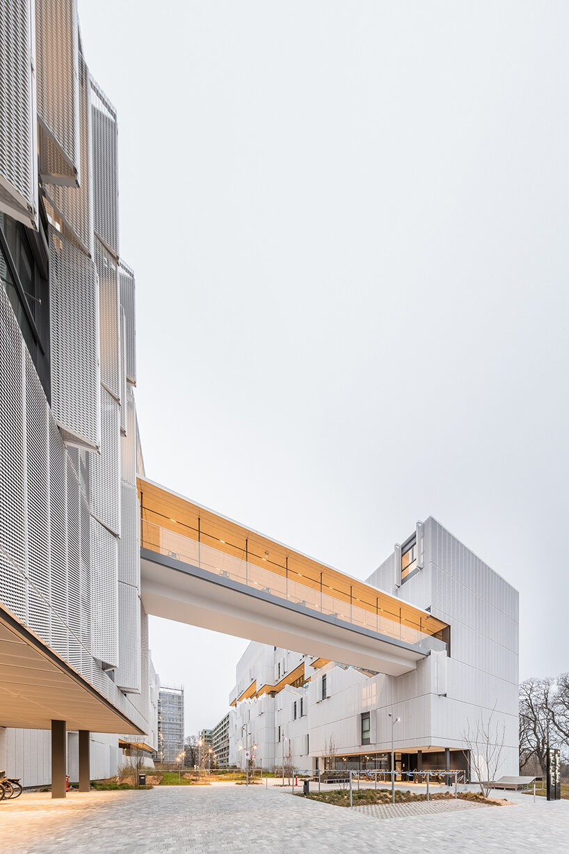 the cluster of buildings are connected by a footbridge, continuing the promenade
the four realms: creating a sense of community
javier villar ruiz explains how the four realms — the private, the collective, the common, and the public — are intensely interwoven, but not mixed.
‘most of the mass of this building is composed by the approx. 700 beds’ student studios and apartments forming a rational and modular-like volume that strictly follows a 2.8 meter grid. the expanded metal screen shutters allow to the students living within to adjust their privacy level at every moment –- as well as the amount of natural light and breeze. it is very exciting to see how the façade constantly changes according to the operability of these shutters throughout the different times of the day or seasons of the year.
despite the rationality of this part of the volume, its façade becomes an expression of the life of the students within. carved into this rational volume, the collective activities are placed along a public ascending promenade that goes from the ground level all the way up to the roof. anybody visiting the site is allowed to walk up to the roof to enjoy the fantastic panoramic views of the surrounding mountains and lake.
‘indeed, those activities and the promenade itself are conceived together, appearing as one negative space that fractions the mass of the volume in two.
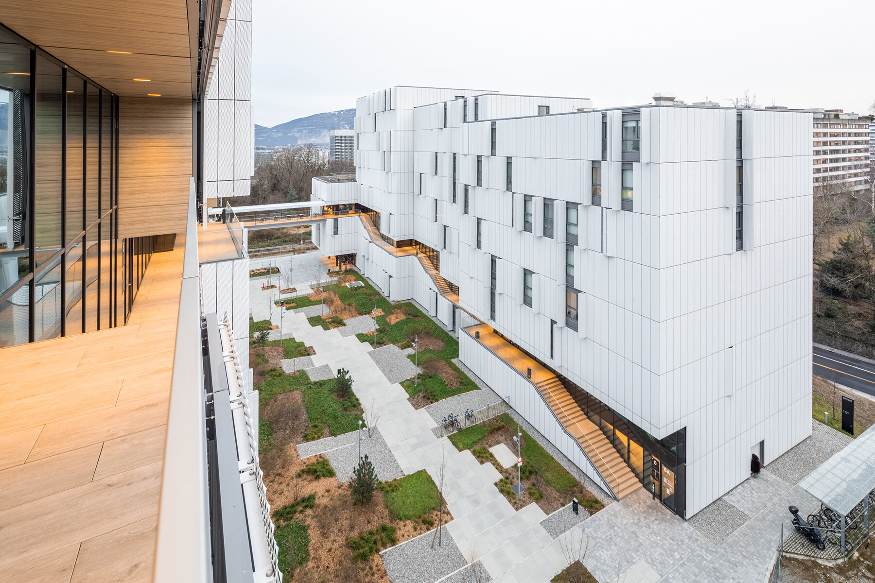
the interwoven experience
‘with this unusual arrangement, the intent was to invite the students to access or leave their private spaces always through this public ascending promenade, whether coming back or leaving for the university, the city center, or the collective activities within the building. this is not just to provide a more salutary walking-conscious alternative to the usual elevator-driven lifestyle in this kind of buildings.
‘but to provide, with this ascending promenade, a linear-like public space, that would always stand between the apartments and the street, in fact between the private and the public, so that students would be more likely to meet, socially interact and be aware of who else is leaving, working, or touring in this same building. at the end of the day, the aim is to promote a more community-oriented way of living in this building inhabited by hundreds of students, teachers and researchers from very different parts of the world.
‘the aim to make these collective activities and the public ascending promenade seamless, perceived and experienced as one same space, was at the beginning a big challenge. especially when several of those activities, being adjacent to the staired portions of the promenade, had to be designed in a stepped way.
‘the lecture hall naturally became comfortable with such principle, but the library and the recreation room required very unusual space arrangements that at the end, once solved, became unique exciting spaces. it is especially intriguing to see how the stepped library, due to its folded long study table, creates both a sense of being in a generous collective space, while also providing a sense of privacy and coziness.’
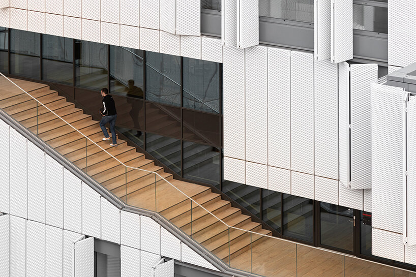 the circulation relies on a gradual footpath rather than elevators
‘ right in the middle point of this ascending sequence of collective activities, the bridge appears as an elevated public plaza that gives outside seating to the adjacent cafeteria where one can enjoy the views to the surrounding landscape. but the bridge did not appear in the project as an opportunity for a panoramic feature. it was indeed the direct consequence of establishing the continuity of this ascending promenade that starts in the grand floor of one volume and ends up in the roof of the other one.
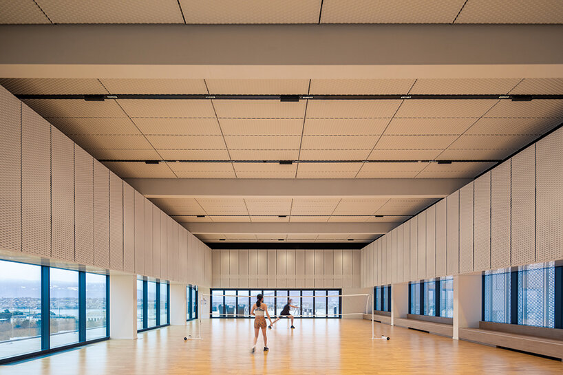
‘because of this continuity, the ascending promenade allows access to all the collective activities within the building : the PO-box & delivery room, a convenience shop, the stepped library, a lecture hall, the cafeteria with the panoramic bridge, a student association office, group study rooms, the recreation room, gym & fitness, general meeting room and, at the end of all this, a high-ceiling multipurpose room facing the roof plaza with its fantastic panoramic views.
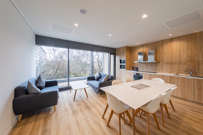
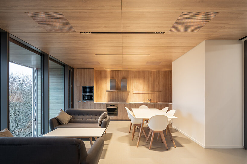
‘the only non-private spaces that are not located along this promenade are the common activities such as the group kitchens and the rooftop vegetable gardens that are used exclusively by the residents of the building. the group kitchen, that also allow for group dining, are located in most of the floors, are intentionally grouped in elevation so that they have a distinct presence in both outwards facades, so they participate as well in the appearance of the project.
‘ it is interesting to think that the appearance of this building is entirely a consequence of the presence of all these interweaved private, common, collective, and public realms : the private composing the rational volumetry, that is perforated outwards by the rotund voids of the common kitchens, and inwards by the organically carved public promenade and its adjacent sequence of collective activities.’







project info:
project title: grand morillon student dormitory
architecture: kengo kuma and associates
location: geneva, switzerland
completion: december 2020
opening date: april 2021
photography: © vincent hecht | @vincenthecht.photography
client: IHEID the graduate institute
design lead (KKAA): javier villar ruiz (partner in charge), aris kafantaris (project manager), nicola maniero, mate meszaros, david minton, jennifer chifan
project management (IHEID): pierre guth
local architects (CCHE): eric mathez (partner), david minguet (project manager), csilla bajnok, soufiane moukarrab
structure: 2M ingénierie civile SA | david martin (partner)
landscape: EMF paisatge
lighting design: light IQ | gerardo olvera (partner), joe riley
facade consultant: sottas SA
contractor: complex bau
MEP: weinmann energies
electricity: SRG engineering / scherler SA
happening this week! holcim, global leader in innovative and sustainable building solutions, enables greener cities, smarter infrastructure and improving living standards around the world.
architecture in switzerland (246)
architecture interviews (274)
dbinstagram (2250)
kengo kuma (273)
student housing (9)
vincent hecht (22)
PRODUCT LIBRARY
a diverse digital database that acts as a valuable guide in gaining insight and information about a product directly from the manufacturer, and serves as a rich reference point in developing a project or scheme.
