Phaestos Moleskinerie by melissa silva from brazil
designer's own words:
the background
a deep research about the beginning of the writing and the western alphabetic origin was the basis for this project.
the source for this study was the book history of graphic design by philip b. meggs and alston w. purvis.
the first information recording forms were pictographic and were made of ordinary, abundant materials like clay tablets.
from these rudimentary beginnings of writing, through the cuneiform code of hammurabi, the development of papyrus and the hieroglyphs, the first cretan pictographs, the phoenician alphabet and finally the greeks, the use civilization uses symbols and visual signals for communication.
in the beginning visual language was complex, it had a multitude of ideograms, logograms and syllabaries that limited access to information to very few literate individuals. the creation of a system of characters, twenty or thirty, which represented only the elementary sounds of spoken language was a major step for human communication.
however, it`s not yet known exactly the origin of the alphabet as we know it. Among the many theories, this study highlights the cretan pictographs.
the cretan symbols were already used around 2800 BC and 1700 BC, these pictograms led to a more linear writing, possibly preceding the Greek alphabet.
in 1908 the italian archaeologist luigi pernier found in the greek island of crete disc of phaistos. a disc of clay, approximately 16.5cm (6.50in) in diameter and covered on both sides with a spiral of stamped 45 pictographic symbols, which are apparently alphabetic.
the meaning, purpose and author are still unknown. however, the designed forms are easily identifiable: standing or running men, women, children, heads, fish, birds, insects, tools, animal parts, shields, weapons, plants, etc.
such a conflicting object: in one hand its purpose and meaning are unknown, on the other hand full of easily identifiable every-day things, it serves as background for the creation of this logo project for moleskinerie blog.
the project
the idea is to create a symbol that resembles the forms of the symbols of the phaistos disc.
using the simplicity present in the pictures´ shapes, the clarity of each symbol, resembling a rustic and handmade traces, like the drawing, sketches, blurred writings that we all do in our moleskine when we are on the subway, bus, taxi, etc.
several drafts were made on standard bond paper using soft pencils, especially 8b, 7b and 6b.
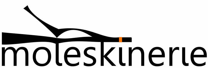
from these drafts i chose to use the front view of a moleskine notebook opened, styled along with the lines of cretan pictographs.
in the design, the moleskine is open, as already mentioned, the pages on the right are held by the elastic band, painted in orange. the pages on the left, a little raised.
once the drawings were finished, they were scanned and transformed into vector, using the corel draw program.
after that, the logo completion stage began altogether with color and typology studies.
the chosen typography for the word "moleskinerie" was gisha, which is a copyright free font.
gisha was chosen by the fact that it gives a very good word readability, it´s modern, clear, simple and makes a great composition with the graphic symbol.
the word is placed just below the picture of the notebook, working as a support and adding unity to the symbol. because of that, the dot of the letter "i" was removed, and the orange square, reminding the elastic band of the notebook, became its dot.
so in order to maintain this unity in the whole word, the other dot of the second "i" was also removed, since it doesn´t disrupt the readability of the word.
i intended to use the most basic colors in this logo.
so i used black in the whole picture, reminding that black is also the basic color of the moleskine standard notebooks and orange in the elastic/dot since it´s the color that, used along with black, gives almost one hundred percent of visibility, capturing the eye of the audience to the logo.
it can be easily reduced or magnified with no damage to its readability.
reproduction can be made in any type of media.
its symbol is captivating, not difficult to understand, and it clearly reminds the moleskine notebooks.