looking up by german nieva from uk
designer's own words:
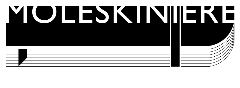
'looking up' aims 3 main things = moleskin's notebook synthesis (from the bottom) + simplicity + gestalt
I believe this logo is easy to remember, recognise and understand and allows a vast number of variations and scales.
the fact that 3/4 of the text has been cut off enables most background and permit the logo to be linked by the side or the top easily.
looking up_b&w
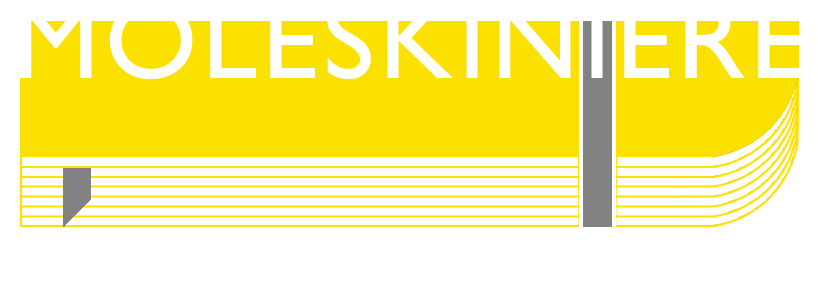 looking up_yellow+grey
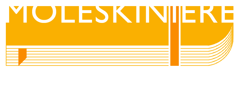 looking up_orange
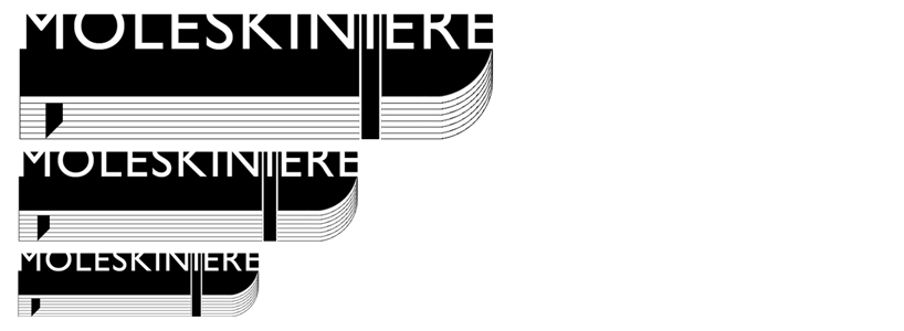 looking up_scaled
shortlisted entries (2162)