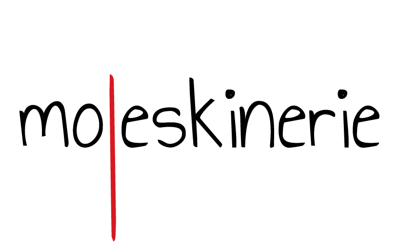
bookmark. by anja rankovic from croatia
designer's own words:
whether it’s a start of a new day, a start of a new project, a start of a new idea - it all starts with a new page in our moleskine notebooks. we carefully turn the new page, put the ribbon bookmark in its place and start. start writing, start sketching, and underneath it all - we start thinking.
that is how I started my moleskinerie logo design - with my ribbon bookmark. and that’s where I finished.
'bookmark' design focuses on the ribbon bookmark found inside every moleskine notebook. the letter l in word 'moleskinerie' in prolonged so it looks like the real bookmark. logo works in color (red letter l) and also in black&white.
design is related to the notebooks and its bookmark, but also the blog - as visitors should bookmark the moleskinerie as a daily 'stop-point'.
moleskinerie logo