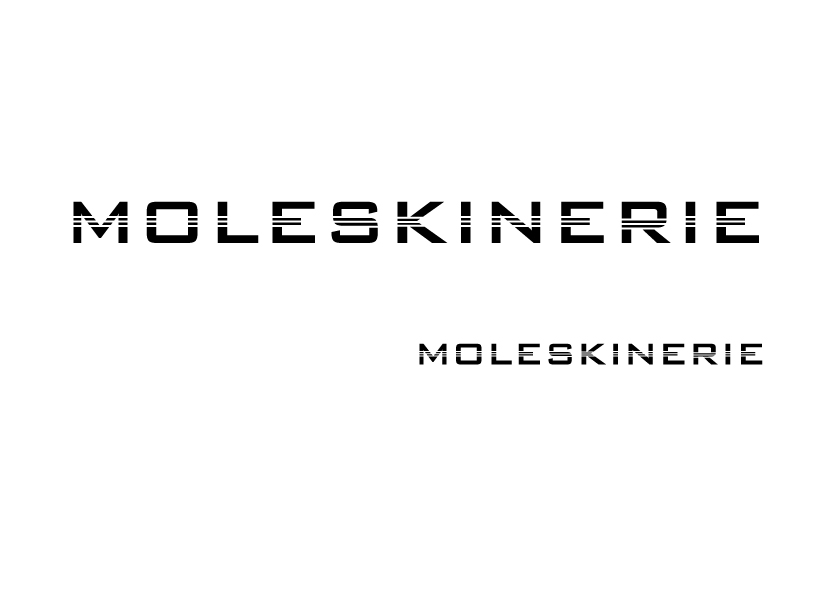
strap by luka gobin from croatia
designer's own words:
the concept started by analyzing the current identity of moleskine, which, at present, contains the font copperplate gothic, which is not really sans-serif as it stands in the name because it has a small, peculiar serif that perfectly complements the strength of moleskine identity.
next, the idea was to find a similar but yet "softer" font, which should seek to maintain the fundamental attributes of the current font, and likewise, to add new features that moleskinerie blog brings. after searching for some time, we chose the bank gothic font, font that is quite similar to original, and on the other hand square shaped, so it gives us the possibility to play with certain symbols. the mere fact that bank gothic font is indeed sans-serif, it's softer, and because of that it offers almost imperceptible transformation from tangible writing material, like moleskine notebooks or diaries, into more 'softer' virtual version, for moleskinerie blog, the place reserved for all moleskine lovers.
with this type of font resembling the current one, the projected solution is only partially done, so some additional value had to be added. we moved on to explore compliance of some of the moleskine products characteristics with the written word 'moleskinerie'. we took the motif of the characteristic elastic strap, as one of most recognizable elements on moleskine notebooks and so, that element was reinterpreted embedded in the word 'moleskinerie' which gave the strong visual feeling of uniqueness and recognition.