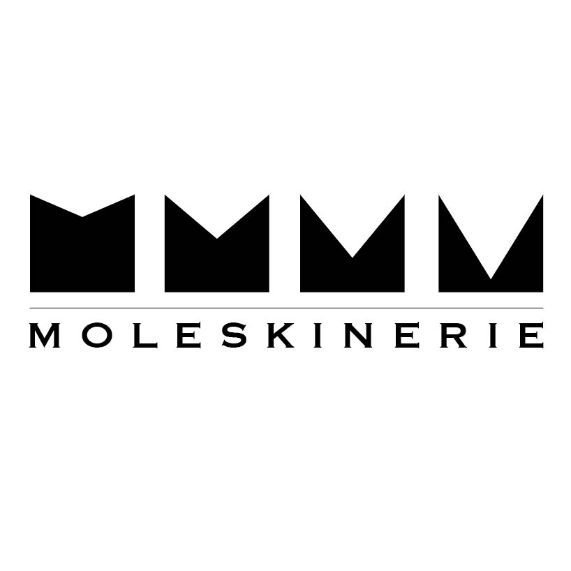
BigBlackM / LaChaise by pierre berthelot kleck from france
designer's own words:
as students, as travelers, as parisians always stucked on terrasses both emilie and i have always carried moleskine's sketchbook in our bags or back pockets. that has led us to work together on this project regardless of many differents aspects that has made this experience a real challenge.
we have wanted a logo as simple as it can't be. powerful and graphic but without any specificities.
a 'm', a notebook, the same font it has always be. that's it.
as a moleskine, everything is hidden inside.
here, it contains reference to the history of moleskine and to the uses and users of the moleskine product.
Moleskinerie seems to be a way to show the creative part of moleskine. in order to reproduce that we have tried to hide behind the black leather notebook, or the big black 'm' some very childish design less serious than the whole minimalist atmoshpere that emanates from the logo.
also we have though of a contributive purpose of the logo. it could be the results of the best submissions of the week in a "who is going to be part of the moleskine logo this week?" contest.
a cool way to let the contest keep going and to bring people to moleskinerie.