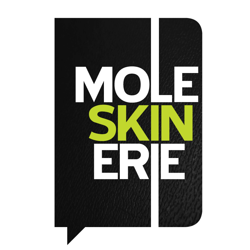
logo moleskinerie by works by susana leite from portugal
designer's own words:
this logo proposal intends to ilustrate the image of the reference product moleskine. the book.
to this reference form of moleskine we added the idea of dialogue, suitable for a blog or something more interactive as intended.
the usual tape marking the book is here transformed into a speech bubble.
the lettering is developed around a line that acts as an axis (guideline). The elastic band in the usual books. All other letters are distributed in space
with emphasis on the central area “skin” were we highlight the word in a brighter color, illustrating the color bars involving the books.
We hope to have contributed positively for one more initiative of moleskine that we admire and love.
Hope that you love our work too.
Best regards


shortlisted entries (519)