moleskinerie logos matthias plenk | stefan brabetz by stefan brabetz from austria
designer's own words:
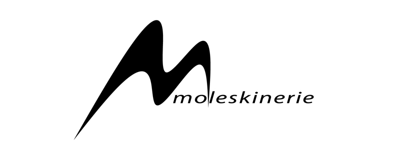
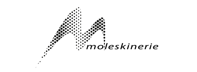
each of the suggested logos consists of simple letters combined with an m-shaped graphic indicating the letter m which makes the logo easy to remember. in the future the logos could also be reduced to the graphic symbol only. they are all using just black and white and therfore can be also used inverted and in combination with all kinds of backgrounds and colors.
shortlisted entries (2162)