balloon by marco bencivenga from italy
designer's own words:
moleskinerie logo is developed by using pure shapes, such as circles and squares, in order to balance its geometric configuration.
the font is ocr-a, a monospaced font that is both machine readable and human readable. It allows the words to have fixed-width so that they all are aligned in a grid centred in the external square that reminds to a stylized speech balloon whose tail is represented by the lower left corner.
the logo is simple in design, easy-readable, and can be used in different colours.
logo
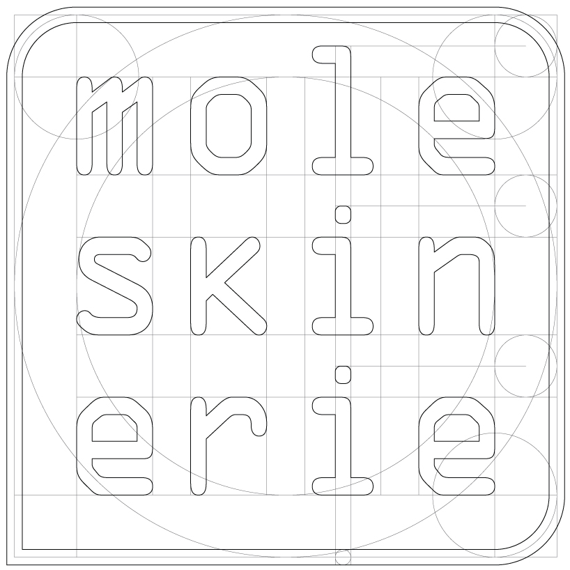 logo building
 greyscales
 sizes
sizes
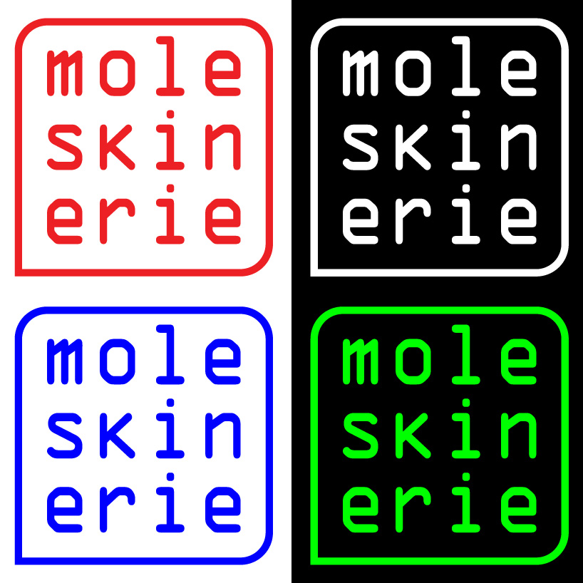 colours
shortlisted entries (2162)